Showing posts with label Sal Buscema. Show all posts

Tuesday, September 20, 2016

Would You Rather...? Great Bronze Age Runs


Doug: Here's a poser for you, spinning out of last weekend's conversation on our buying zeniths. In terms of greatness, readability, sustainability, influence, and yada yada yada, would you rather go to the first 50 (I use that term somewhat loosely) issues of the All-New, All-Different X-Men, or the Avengers encompassing the "Kree/Skrull War" through the "Celestial Madonna"? I don't know about you, but that's a tough choice for me.

I'm going to have to lean toward the X-Men on the greatness of the art alone. And then there was the awesomeness from issues 97-104 as classic baddies like the Sentinels, the Juggernaut, and Magneto rose up to attack our new band of mutants.

Of course, on the other side there's Neal Adams. And the bi-weekly "Avengers/Defenders War". And Englehart's time/space opera that ran from Avengers #129-135 and included three Giant-Size issues. Can I reconsider?

For our purposes, your "50"-issue runs are:

Giant-Size X-Men #1
X-Men #s 94-143
X-Men Annual #3


Avengers
#s 89-135
Giant-Size Avengers #s 2-4


Monday, September 5, 2016

Doug's First "Rubber Mask" - Captain America 179


Captain America #179 (November 1974)(cover by Ron Wilson and Frank Giacoia)
"Slings and Arrows"
Steve Englehart-Sal Buscema/Vince Colletta

Doug: I didn't own this comic as a youngster, but a close friend of mine did. We were great pals, spending all our summer days reading comics, drawing, and playing Megos in his basement. Along the way we listened to AM radio and sang along with Wings, Elton John, and whatever one-hit wonders came our way (I'm looking at you, Carl Douglas, and your Kung fu Fighting). I'd missed the whole of the "Secret Empire" arc, but having the Cap Mego and having enjoyed some of the animated Tales of Suspense adventures on reruns of the Marvel Super-Heroes show, I was all-in to read this issue. Then, and especially now with my adult fixation with rubber mask reveals, it didn't disappoint.

Ah, the rubber mask. What is it about that corny comic convention that appeals to me? How about HOW INCREDIBLY STUPID IT IS?? Really... any "master of disguise" schtick is going to require a large helping of suspension of disbelief. But when some shmoe does it and gets away with it? No way. See this Man-Bat story if you don't believe me. How in the world does one obtain or create such a lifelike mask, only to later reveal something like an iron mask or a furry face, or even humongous bat-ears lurking beneath? The mind boggles. And that, I suppose, is why I like it -- for sheer lunacy. Zanier than our boy Bob Haney, that's for sure.


Sink your teeth into a 100-Word Review
Just three issues removed from the fall-out of the Secret Empire adventure, Cap and Falc have split ways. Cap has stuck to his word of hanging up the shield, and he’s settling into a civilian life alongside his love, Sharon Carter (SHIELD’s Agent-13). But a new menace has attacked – the Golden Archer. A sun-hued relic seemingly from the age of Robin Hood, he attacks Cap multiple times. Subplots involve Falc trying to beat the Harlem mob, Cap telling Peggy Carter that they’re through, and more would-be fill-in Caps across the country. Cap finally bests the Archer, who turns out to really be…

The Good: Usually I begin by lauding the art team. I'll get to that in a moment or three. But what struck me as I read this was the pacing of the story, and its organization. Many authors are masters of the subplot (John Byrne comes to mind specifically). Here Steve Englehart gives us a whirlwind of topical points between the comic's 18 story pages. We see our main arc for four pages, then a Falcon vignette, back to Steve Rogers for one page, then to a biker gang whose leader wants to become the new Captain America. A page later we're back to Steve for five pages, then one page to see how it turned out for our wannabe shield-slinger. The book concludes with a five page climactic battle between Steve and the Golden Archer. It's nicely laid out, with each interlude serving to heighten suspense for what was really a pretty basic plot in the main tale.

Englehart chose some sort of old English form (which is certainly debatable, I'm sure) of speech for the Golden Archer. The "real" Golden Archer had actually appeared in Avengers #85 as part of the Squadron Supreme. His costume was different from what we see here; the next time we'll see the Archer, he will be in this same outfit. I liked the Archer's depiction here -- very much a swashbuckler, and the fact that he was stalking Cap and could turn up at any time was fun. In fact, the Archer seemed to know some of Steve Roger's habits, patterns of movement...

I was not enough of a regular Cap reader to make too much of a judgement on the Steve/Sharon/Peggy love triangle, but I will say that from a distance the Steve and Sharon pairing made more sense than the Steve and Peggy relationship. That being said, Steve seemed to sort of take advantage of his fountain of youth, trading in for a younger model. His prerogative of course, but the ditching of Peggy in this issue seemed cruel. Come to think of it, why is that in the "good" category? I guess because the relationship, any relationship, humanizes Cap -- he of the "duty first" devotion.

Although the Falcon's solo adventures were on hold for 90% of this issue, I really liked in this era that he got to be featured as his own guy. A solo series would have been an easy sell to me in the Bronze Age; I enjoyed his one-off in Marvel Premiere.

Lastly, the big reveal at the end of Hawkeye as the Golden Archer, rubber mask and all, was excellent. What a dopey scene. Sure enough -- ol' Hawk's mask popped right up into form, no mashing or flattening at all. It's just silly -- silly as a Silver Age DC -- but I love it. And I loved how Hawkeye threw some shade at Thor's Asgardian-speak.

The Bad: Wait, you say -- you didn't talk about the art. You are correct. I saved it for this space. Oh it isn't bad bad. In fact, it's really pretty consistent from what we'd seen throughout the "Secret Empire" arc. But for whatever reason, in this issue I am seeing Sal Buscema and I am seeing Vince Colletta. Not a conglomeration of the two, as in previous issues. Instead, I just see Sal's forms and Vinnie's feathery inks. There's no blending here. It's tough to put my finger on, and I don't know if you'll get the same vibe from the art samples provided (perhaps my best example is the full page scan at the top of the post). But if you use the link just above and check out some of the books from a few months prior, I think you'll see that Vinnie's inks were a little heavier in general. I just see all the featheriness that many of his detractors cry out about. So it's not awful. But I noticed. In my opinion, I shouldn't notice. I should see the combination, the sum of the parts, and it should be pleasing to me as an art gestalt. Tell me if I'm off base.


The Ugly: Nuthin'. Unless you thought Steve was a HUGE jerk to Peggy. Then you might be mad.

Overall this was another fun one. I have come to really enjoy most of the solo adventures of my favorite Avengers -- Cap, Iron Man, and Thor. There were some solid creators on those books in the Bronze Age. Sure, sometimes there was a little hit-and-miss, but more often than not one could certainly get their quarter's worth of fun. Makes me want to be a kid again and feel that as I stand in front of the drug stores shelves.

Happy Labor Day to our Stateside friends. Enjoy the holiday!

Monday, May 2, 2016

When Your Protagonists are Antagonizing... Super-Villain Team-Up 2


Super-Villain Team-Up #2 (October 1975)(cover by Gil Kane and Frank Giacoia)
"In the Midst of Life... the Way to Dusty Death!"
Tony Isabella-Sal Buscema/Fred Kida

Doug: Continuing a week's worth of Civil War-themed posts, what about bad guys fighting bad guys? This was the first issue of Super-Villain Team-Up that I ever bought, and I stayed with the series (when I could -- you know, distribution woes) until the end of the original run; I did not know until years later that there was a 16th and then a 17th issue (each released waaaay after the 15th issue). Super-Villain Team-Up seems typical of other short-lived series at Marvel in that (in my opinion) sub-par and oft-rotating creative teams doomed it. Case in point: during its 17-issue run (plus Giant-Size issues), the following writers and artists helmed the series --
Giant-Size SVTU #1 -- Roy Thomas-John Buscema/Joe Sinnott (framing sequences)
Giant-Size SVTU #2 -- Roy Thomas-Mike Sekowsky/Sam Grainger
#1: Tony Isabella-George Tuska/Bill Everett/George Evans/Frank Springer
#2: Tony Isabella-Sal Buscema/Fred Kida
#3: Jim Shooter-George Evans/Jack Abel
#4: Bill Mantlo-Herb Trimpe/Jim Mooney
#5: Steve Englehart-Herb Trimpe/Don Perlin
#6: Steve Englehart-Herb Trimpe/Jack Abel
#7: Steve Englehart-Herb Trimpe/Pablo Marcos
#8: Steve Englehart-Keith Giffen/Owen McCarron
#9: Bill Mantlo-Jim Shooter/Sal Trapani
#10: Bill Mantlo-Bob Hall/Don Perlin
#11: Bill Mantlo-Bob Hall/Don Perlin
#12: Bill Mantlo-Bob Hall/Don Perlin
#13: Bill Mantlo/Keith Giffen-Giffen/Don Perlin
#14: Bill Mantlo-Bob Hall/Don Perlin/Duffy Vohland
#15: Larry Lieber-George Tuska/Wally Wood/Mike Esposito (reprint)
#16: Peter Gillis-Carmine Infantino/Bruce Patterson
#17: Peter Gillis-Arvell Jones/Bruce Patterson
So if you're scoring at home, that's six writers (I won't count Lieber due to the reprint), 11 pencilers, and (wait for it) 13 inkers. That's right -- 13 inkers working on 18 issues in the series (again, not counting the reprint). Granted, they doubled-up a few times, but still... If that's not a major reason why a book would look different month to month, I don't know what is. And regardless what you think of a guy like Herb Trimpe, when you place him under the influence of Don Perlin... well, let's just say it ain't Trimpe under John Severin! I will say, though, that the Bob Hall/Don Perlin issues look pretty good.

Doug: There's something for you to chew on as we now get on to the task at hand -- reviewing what's sort of a bridge issue, but fun nonetheless. We pick up the trail on one of our favorite Bronze Age conventions -- the visi-screen! I mean seriously... if I can't have a couple of panels with a rubber mask reveal, then just hit me upside the head with a visi-screen! Here's your 100-Word Review of the plot of this issue:

After a battle near Hydrobase, Namor has fallen under the combined might of Attuma, Tiger Shark, and Dr. Dorcas (now there's a moniker for ya). But somewhere distant Namor's would-be ally Dr. Doom watches, and reflects on the brief history of his and Namor’s alliance. Doom is found out, forcing his hand. Seeking to liberate Namor, Doom encounters the transformed Betty Dean Prentiss, former love of the Prince during the War. Doom infiltrates Namor’s prison, but in the melee Betty is killed trying to save Namor from Dr. Dorcas’ blast… she falls just as Namor breaks free. “Avenging Son”, indeed!
Doug: If I were an editor working at Marvel in the Bronze Age and I wanted to stabilize a book either to keep it on schedule or to smooth out its "look", I'd turn it over to Sal Buscema. That's not to say that he was the best artist Marvel had at their disposal, but he could crank out the "house style" in an efficient manner. I don't know if that is why he was tapped for this particular issue, but in the looks dept. his presence makes this one of my favorites in the entire series. So...

The Good
: Obviously the art. I really don't have a lot of experience with inker Fred Kida, or at least I don't think that I do. Maybe that I can't recall Kida's work is a good thing? Perhaps you immediately inferred that he's not a memorable artist. Maybe that's his strength, because when I look at this I see Sal Buscema. It's no Joe Sinnott production, that's for sure (and you all know I love Joe Sinnott). At this stage of his career Sal was a grid guy, utilizing 4-8 panels on a page. Only the double-page spread (pages 2 and 3) rejects the notion of borders; every other panel in the book contains the art. So if you're looking for anything resembling the better design aspects of Jim Steranko or Neal Adams, you won't find it here. And that's OK. As I said, if someone felt this book needed a steadying hand, they got it.

There is one specific panel that I think is genius. I've provided it here -- Tiger Shark emerging from the ocean. Look at his right hand. He skims the water with the backs of his fingers, just like you or I would if we were walking to shore, thinking or watching. I just find that bit of familiar motion fascinating -- what a detail. I also have a love/hate sense with a single panel of Doom holding his chin in the crook of his thumb and index finger. While it's an image that conveys the motion of stroking one's chin and it fits Doom's mood in the scene, it does seem somewhat odd that a fellow would place a hard metal finger beside a hard metal chin. Not exactly the pensive beard-stroking one might think of. The emotion on the final panel of the book leaps off the page. Fabulous ending (see the end of this post)!

Earlier I mentioned the visi-screen. Unlike in the past, when our would-be world-dominators are just able to kick back and look at these things as if possessing some sort of universal clairvoyance, here we actually find the source of the images Doom is perusing. Doom had devised a mechanical fish that looks to me quite a bit like a Joker fish. Even though Tiger Shark spied it and wrecked it, I did appreciate that we got a "plausible" explanation for Doom's spying capabilities.

While I'll take issue with Tony Isabella's characterization here in just a minute, I must compliment him here on making me root for the main character of the magazine (the Marvel Universe's alpha super-villain) against all other characters -- especially when everyone in the book is a bad guy! Namor's rogue's gallery is bereft of true heavyweights, so of course Doom would be able to out-smart them, out-tech them, etc. But there was still the sense that I wanted Doom to be the victor (no pun intended) here. I don't say that in he pages of the Fantastic Four.

Lastly, I've been on record for years stating that I love this life-giving suit that Namor wore in the early-mid 1970s. Love the look! It's certainly more regal than trying to rule or lay waste to the world in a green Speedo.

The Bad: Let's go right into my scripting complaint. If you would be so kind, hop back to my review of Sub-Mariner #8, written by Roy Thomas. That issue was narrated by Betty Dean Prentiss, who is a major supporting character in today's story. You can see some narration boxes in the art samples -- those were "written" by Prentiss in her diary. Got her voice? Yeah, Isabella must have just ignored all that, because I think he took her character profile (she worked for the NYPD) and just wrote her as some hardened beat cop-type of person. It's really off, and I think I'd feel that way even if I had not known the character from that other book. The way she addresses Doom is pretty stupid, as well. I'm all for bravado in the face of extreme adversity, but c'mon... the monarch of Latveria could have vaporized her on the spot. I guess I'd rather she'd been written differently.


Note - You may notice that some of the "human" characters, like Betty Prentiss, are amphibians. This was apparently a development in the last issues of Namor's solo mag, which was cancelled around six months before Giant-Size SVTU #1. I don't know if this is necessarily a bad thing as a plot device, but I'll put it here since I was discussing Betty Prentiss.

The Ugly: Tiger Shark's teeth. You know -- like a shark. Boy should have had braces! That being said, are his teeth uglier than Attuma's whole face? Discuss.

Doug: I am hesitant to read the entire trade Super-Villains Unite: The Complete Super-Villain Team-Up, which I have used for today's festivities. As I said, the art is a real turn-off at times. And that's a shame to middle-aged me, because my memories of this series are better than the reality of it with which I am now faced. "Hold up"? Umm...


Doug: For conversation starters, what other instances can you come up with where super-baddies fought super-baddies? Were there some memorable tussles? Who would you have liked to have seen -- where were two guys (or gals) who may have conceivably had a beef with each other?

Friday, April 1, 2016

Guest Review -- The Spectacular Spider-Man (1976) 1


The Spectacular Spider-Man #1 (December 1976)
"Twice Stings the Tarantula!"
Gerry Conway-Sal Buscema/Mike Esposito

Doug: We received this review via email from Thomas F. Thomas had some thoughts on his mind regarding this first issue of a mag I've always simply called "Peter Parker"; the official name (according to various databases), as you see above, is The Spectacular Spider-Man. Whatever... I can guarantee anyone reading this that when I saw this mag on the spinner rack way back in the autumn after my 10th birthday, I couldn't say "Take my money!" fast enough. We'll see if Thomas feels the same way. Thanks, Thomas!

Thomas F.: Peter Parker, the Spectacular Spider-Man was Marvel’s third monthly Spider-Man title after The Amazing Spider-Man, which debuted in 1963, and Marvel Team-Up, which was launched in 1972. (A fourth Spider-Man title, Marvel Tales, was a reprint book that reproduced classic stories taken from The Amazing Spider-Man for newer readers who had missed the early issues of the 1960s the first time around.).

Some readers may have felt that a third monthly Spider-Man book was excessive, but bear in mind that Spider-Man was Marvel’s flagship character, and most fans couldn’t get enough of ol’ Spidey. Plus, other popular Marvel characters including the Hulk and Captain America were appearing in more than one regular monthly book. Hulk appeared in The Defenders and a reprint book of his own, Marvel Super Heroes; and Captain America appeared in The Avengers and the reprint books Marvel Super Action and Marvel Double Feature. This, of course, was in addition to their own individual books.

Peter Parker, the Spectacular Spider-Man is a rather long title, in my opinion. It’s definitely a mouthful. Later on (as of issue #134) the title was truncated, omitting the first two words and modifying the title font so as to resemble that of The Amazing Spider-Man.

The first issue was scripted by Gerry Conway, responsible for a number of notable Spider-Man storylines in the 1970s, including the death of Gwen Stacy, the introduction of the Punisher, and the original Clone Saga.


Many people didn’t like the Clone Saga, perhaps because it seemed to stray too far into the realm of science fiction for a Spider-Man book, but as a sci-fi aficionado myself, I thought it was intriguing and entertaining. For such a young fellow (as Gerry Conway was in the 1970s—he started writing The Amazing Spider-Man in 1972 when he was only nineteen), his scripts are surprisingly good.

Interestingly, in a note midway through issue #1, Gerry Conway explained that characters and subplots in Peter Parker, the Spectacular Spider-Man would be coordinated and “overlap” with the events and situations occurring over in The Amazing Spider-Man, so that the two books would mesh together “in a carefully structured ballet.” Not a bad idea, and over the next two decades, this worked fairly well.

PPTSS #1 was drawn by Sal Buscema, who had a long tenure at Marvel. Sal had a very distinctive style, and as the decades went by, his style became even more pronounced—overly so, in my opinion. On a positive note, he was good at conveying characters’ emotions through their facial expressions. But personally, I find his pencils somewhat rough-looking. Compared to his older brother John, a first-rate penciler, Sal’s artwork is weak, and I consider him a mediocre artist (at worst) and average (at best). He’s no John Romita, Sr., a definitive Spider-Man artist.

That being said, Sal’s 1970s work, at least, was decent, particularly his early work on The Incredible Hulk, The Defenders (1972-1976 run), and Captain America (1972-1975 run). I would even venture to say that some of it is classic material. But this quality did not last, in my view.

Sal Buscema returned to The Spectacular Spider-Man for a nearly unbroken decade-long run from 1988 to 1998. Unfortunately, by the early 1990s the characters drawn by Sal looked as if they had immense jowls, and the characters’ stances looked stiff and unnatural, like pasted cutouts. Characters’ faces looked pretty much identical, and characters—particularily men—could really only be differentiated from one another by their unique hairstyles and clothing. Oh well, we can’t all be Jim Steranko or Neal Adams.

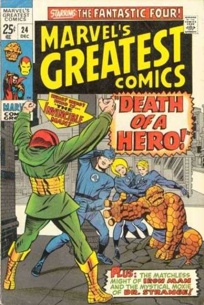
Just to throw it in there, why do Sal Buscema’s characters have mouths that look like trapezoids? Many examples of this are found throughout PPTSS #1 itself. Just a few samples:


And now, to get on with the synopsis: the story opens on a Monday morning outside the Administration Building of Empire State University, with Spider-Man dangling from a gargoyle above a crowd of students who are listening to a speech by the university’s vice-chancellor, Edward Lansky. Lansky, standing resolute at a lectern, reiterates the importance of quality university education and urges that regardless of the city’s “financial crisis,” the city’s commitment to funding the university must be upheld. In the audience are two familiar supporting characters, Flash Thompson and Mary Jane—both students at Empire State and friends of science student Peter Parker.

Meanwhile, Spider-Man takes photos of Lansky, hoping to earn some extra money for his pix later from J. Jonah Jameson, publisher of the Daily Bugle. We learn that the Tarantula and several of his masked thugs are also attending the pep rally, although they are partially hidden by leafage and they are as yet unseen by the public.

The Tarantula is a terrorist from Delvadia, a fictional republic in South America, and he was physically trained to be his nation’s equivalent of Captain America. Clearly Marvel didn’t want to besmirch a genuine South American nation by associating it with a rogue like the Tarantula, although they obviously had no qualms about villains being from Soviet Russia or Red China, or if set during World War II, Nazi Germany.

Before long, the Tarantula betrayed his country’s fascist/authoritarian government and turned to crime in America, which proved to be more lucrative. One of his characteristics is that the Tarantula occasionally speaks in Spanish, particularly when agitated.

As far as I’m concerned, from among Spider-Man’s rogues gallery, the Tarantula is a colorful B-villain at best. Probably a C-villain. I found that he simply didn’t seem to pose as great a danger to Spider-Man as, say, A-list villains like the Green Goblin or Dr. Octopus—he’s not as cunning—although he certainly exhibits much wanton cruelty and ruthlessness.The Tarantula had last appeared in The Amazing Spider-Man #135, where the treacherous bandit had a run-in with Spider-Man and the Punisher aboard a cruiser.

Suddenly the Tarantula and his cohorts burst onto the scene. They accost Vice-Chancellor Lansky and announce their intention to kidnap him. Shocked, Spider-Man jumps down from his perch and into action. The webslinger manages to avoid the Tarantula’s deadly kicks (the razor-sharp tips of his pointy boots are spiked with lethal poison) and manages to stun the Tarantula with a shot of his webbing. The Tarantula reels off balance, disoriented. Meanwhile, the Tarantula’s cronies are forcing Lansky into a getaway car. Flash Thompson, Peter Parker’s athletic friend, joins the fray. He charges the Tarantula’s henchmen, ignoring Mary Jane’s shrill cry not to interfere, but a muscular henchman knocks him to the ground with a brutal roundhouse punch.

As the Tarantula lays sprawled, Spider-Man approaches him. But as Spider-Man gets near, the Tarantula, who was shamming all along, fiercely kicks Spider-Man in the gut, knocking the wind out of him. Why didn’t his trusty old spider-sense warn him? By rights, it should have. In any case, this gives the Tarantula the chance to escape, and he leaps on top of his getaway car, digging in with his toe spikes while his underlings speed away.

With the fight over, the angry students jump to the conclusion that Spider-Man might have been in cahoots with the Tarantula and his gang. They try to apprehend him, but Spider-Man easily swings away, annoyed that the students, who are usually on his side, decided to turn on him. Spider-Man chides himself for allowing the thugs to escape with Lansky. The irrationality and danger of enraged mobs who seek a malefactor to punish, often an innocent one, has been well-documented throughout history, and Sal Buscema conveys the ugliness of the hostile crowd effectively enough.

When Spider-Man retrieves his camera, which he had left suspended from a strip of webbing from a nearby rooftop, he discovers to his chagrin that his webbing had snapped and his camera had fallen to the pavement, shattering on impact, unsalvageable. Dismayed, Spider-Man realizes that he won’t earn any extra cash for photos this time, and he angrily punches the stone wall, cutting his right hand. Ol’ Spidey should exercise some more self-control!

Less than an hour later, Peter Parker arrives home at his modest apartment in Chelsea. He’s wondering who will pay Lansky’s ransom when his attractive neighbor, Gloria Grant, chats him up. She notices that Peter has an injury on his hand, and offers to bandage it. As she dresses the wound, she tells Peter that she’s looking for a steady nine-to-five job, as the “modeling biz” hasn’t been going very well lately. As for me, I’m left wondering whether this is because there aren’t many modeling opportunities available, or whether the modeling gigs themselves just don’t pay enough—Gloria didn’t specify which it was.
Mary Jane then spontaneously shows up at Peter’s door—which seems rather contrived to me—and there is clearly some tension between them. Peter is irked that Mary Jane has been seeing a great deal of Flash, and when he mentions it, Mary Jane airily tells him he’s just “imagining things.” The trio sets off for the Daily Bugle, and as they pass City Hall, Peter’s spider-sense tingles. He notices the Tarantula’s escape vehicle in the street, a limousine, shrewdly identifying it by the hastily-concealed puncture marks on its roof. Making an excuse, Peter begs off and in a restroom quickly changes into Spider-Man. It seems as if Peter Parker is always making sudden excuses to withdraw for one reason or another. You’d think that his friends would eventually have grown suspicious of his spontaneous comings and goings and perhaps put two and two together.

In the parking garage beneath City Hall, the Tarantula and his crew are receiving instructions from an unknown man in a car. Who is this mystery man? That won’t be revealed until issue #3, and this subplot helps add suspense and establish that there is a behind-the-scenes conspiracy. A talented writer, Gerry Conway was good at piquing his readers’ interest and making them want to find out more.

The criminals are to kill the mayor and make it appear to be an accident—a kidnapping gone wrong. The Tarantula and two of his cronies make their way into the building, and the Tarantula kicks a policeman in the back. This time the chemical on the tips of the Tarantula’s boots is only a knockout drug, not the usual fatal poison. I don’t see why the Tarantula bothered to change the lethal poison on his toe spikes to a soporific. It’s obvious that the Tarantula has no regard for human life; it would be more in character for the Tarantula to kill a police officer without scruple.
Probably the editor didn’t want a Marvel comic book—Spider-Man, no less—to actually portray a villain openly killing a policeman. Such a thing might convey the wrong message to young readers.The criminals are making their way down a corridor when they come across Spider-Man standing upside down from the ceiling, obviously anticipating them. The Tarantula and his accomplices are utterly surprised. Spider-Man renders one of the Tarantula’s men unconscious with a quick blow, and the other one seizes him from behind. A well-placed punch knocks out the other thug, and Spider-Man pursues the Tarantula. Unfortunately the Tarantula has taken the mayor’s personal elevator up to the mayor’s floor, and the door is three inches of solid steel and accessible only by key—which so happens to be in the Tarantula’s possession. Digging in with his fingers, Spider-Man uses every ounce of his spider-strength to tear out the reinforced elevator door and climbs up the elevator shaft to the mayor’s floor.To me, this didn’t make much sense. Why didn’t Spider-Man spare himself all this effort and just access the mayor’s office through a window from outside the building? That kind of dramatic entrance is one of the wallcrawler’s signature moves.

Meanwhile, in the mayor’s office, the mayor and his aide Ogilve are quibbling over monetary matters—the city budget—when the Tarantula brazenly enters. The mayor mistakenly thinks that the Tarantula intends to hold him for ransom, and informs him he won’t get “a red cent,” but the Tarantula contemptuously retorts that he isn’t after money, but the mayor himself.

In a full page spread, suddenly Spider-Man leaps into the room, tackling the red-garbed Tarantula from behind. This kind of page-sized action scene is remniscent (to me, anyways) of the full page action shots in Amazing Spider-Man Annual #1, where Spider-Man is portrayed in combat six times, each time with a different member of the Sinister Six—classic Steve Ditko.


A battle between the two combatants ensues, with Tarantula kicking ferociously and Spider-Man nimbly dodging the attacks. Incensed by the Tarantula’s endless prattling, Spider-Man tackles him again and they crash through the window, plummeting downward.
Unfortunately, just before the pair broke through the window, the Tarantula had managed to grab the front of the mayor’s suit and pull him out as well.

Spider-Man has a choice: either capture the Tarantula, or save the mayor, and obviously he chooses the latter.

The Tarantula saves himself and makes good his escape—for the second time. Spider-Man catches the mayor, and using his webbing, descends carefully to the street with the mayor in his grasp. The mayor is concerned that the Tarantula will return; Spider-Man tells him that if the Tarantula comes back, he will be ready and waiting. The mayor doesn’t find this very comforting at all. Spider-Man bids farewell to the mayor and swings away, having left Gloria Grant and Mary Jane waiting for him outside City Hall.

Overall I enjoyed this suspenseful story and looked forward to its continuation. At the bottom of the final page, it was revealed that the main antagonist of issue #2 would be Kraven the Hunter, and I was curious to see whether Kraven the Hunter and the Tarantula would be able to work together. Both of them are alpha males with large egos, and it seemed likely to me that there would inevitably be friction between the two of them, even if they were both taking orders from the same mysterious, unknown figure.


Friday, January 29, 2016

BAB Classic - Ain't Nothing Like the Real Thing, Baby

This post was originally published on July 7, 2009

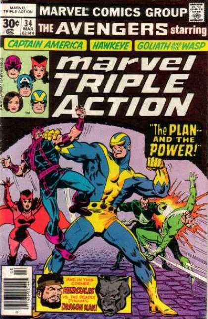
Doug: Almost from the very beginning of the Marvel Age, Marvel Comics began to reprint their Golden and Silver Age material for the benefit of not only a buck, but hopefully with an altruistic eye toward filling in the newer enthusiast. For books like Marvel Tales and Marvel Collector's Item Classics, covers were done with several panes, each showcasing a character or story within. However, as the Marvel line began to expand in the late 1960's, new titles were created for the purpose of keeping material from the seminal days of the Fantastic Four, the Avengers, et al. on the stands. Hence, we saw the rise of titles such as Marvel's Greatest Comics and Marvel Triple Action, respectively.


Doug: Below are some examples of covers that were used on the original titles and on the reprint mags. You'll notice that in some cases the following scenarios were applied (NOTE -- unless otherwise stated, all cover images are from http://www.coverbrowser.com/, and all creator information was obtained from the Grand Comic Book Database, available at http://www.comics.org/) --
  • the cover was reproduced faithfully in form and color
  • the cover was reproduced in form but not in color
  • the cover was redrawn
  • the cover was completely different, but somewhat faithful to the topic within


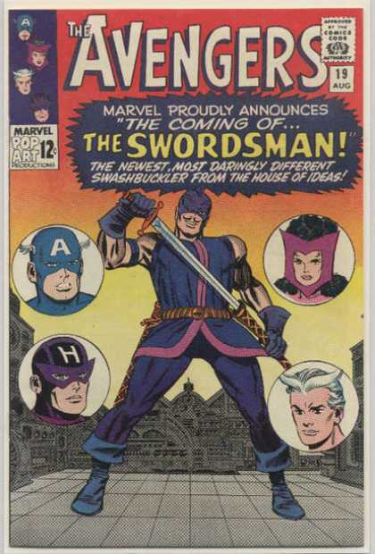
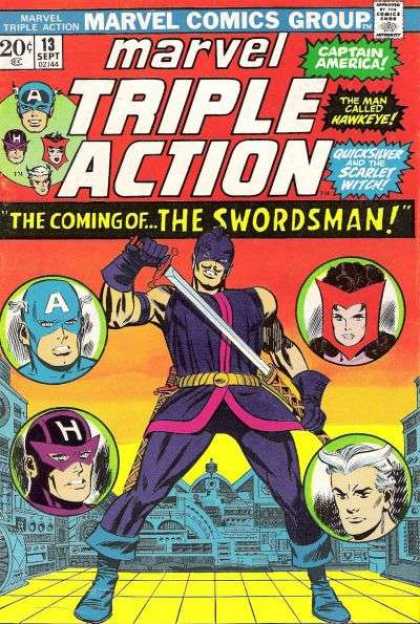
Doug: The covers above hold a special place in my heart, particularly the Marvel Triple Action on the right. This was the first issue of the Avengers I ever owned -- it was given to me by a girl whose family was friends with our family. I can almost recall the day she gave it to me; prior to that, I believe I had a copy of a JLA/JSA crossover and a couple of funny animal comics (Mickey Mouse or the Looney Tunes, maybe?).


Doug: As you can see, these covers are basically the same with a few very minor exceptions: the coloring of the floor, color has been added to the floating heads circles, the Cap head in the corner box is larger and a different rendering, there has been a removal of some text from the call-out, and the lowering of the artwork to make room for the larger masthead. In this case, it's my opinion that each of these changes actually improves the look of the cover -- score one for the revamp-guys!

Karen: The reprint does look sharper, but is some of that due to aging on the part of the older comic? In any case, very minimal adjustments were made to that cover.


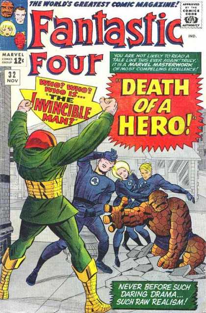
Doug: Similarly, the two covers above show only a difference in coloring (with slight size alterations to the call-out graphics), which for me is better on the updated version. Keep in mind, however, that the royal blue uniforms are what the FF was currently wearing when this issue of Marvel's Greatest Comics hit the newsstands.


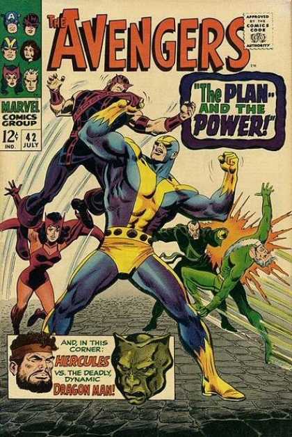
Doug: I've always had a slight problem with the John Buscema/George Roussos cover from Avengers #42. Certainly it's not the art -- that is splendid, indeed. It's more the white cover. I know my copy, which isn't in the greatest shape, is yellowed pretty badly. Let's face it, the publishers never intended that the materials would hold up over a 40-year period of love. But overall, Avengers #42 sports one of the many spectacular efforts Big John dispensed throughout his Silver Age tenure on the title. The reprint, however, has some problems. 

Doug: We can start with the color scheme. I'd take dingy-white over this black/lavender/purple trainwreck any day. Beyond the color choices, the incredibly large masthead near-necessitated that Buscema's pencils be altered; had the book been allowed to maintain the original artwork, it would either have had to have been shrunken or permitted to obscure the title. It's been documented (specifically in regard to a Neal Adams draft effort of X-Men #56) that Marvel wanted no monkeying around with the titles/logos to their books -- Martin Goodman felt that the book wouldn't sell if people couldn't read the title. So I'm guessing that the only viable option was to redo the Goliath figure. The cover art on the right is a combination of the Buscema/Roussos pencils from Avengers #42, with touch-ups by Ron Wilson (http://www.samcci.com/). It looks to me like the Hawkeye figure was repeated, although tilted to the right with the left leg and chest redone. Whether due to space or style, Wilson drew Goliath's head larger in proportion to the rest of his body than Buscema had -- the result is a much less menacing Hank Pym, in my opinion. Wanda's cape has also been elongated. I'll take the original effort on these two.

Karen: What's amazing to me is how much space the title takes up on the Marvel Triple Action book. That's easily a third of the cover! No wonder the art has a squished look to it. Hands down, the original is superior!


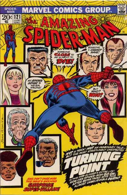
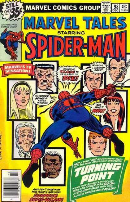
Doug: Here we have an example of a cover that is near-duplicated from original to reprint version. However, upon closer inspection there is one obvious difference and a few more-subtle changes. Randy Robertson gets the shaft for the UPC code in the corner, and for some inexplicable reason the call-out in the lower right corner is re-formatted. Now, if you look closely you'll notice that all three women on the cover are shown with some type of garment (Was this Code? None of the men are shown with collars, etc.) and the colors on each of them have been changed. Why? No clue, as the color scheme of each cover is virtually the same palette. About the only other difference, and it's even more subtle, is the shrinking of the artwork to accommodate the larger logo as well as the "Marvel's TV Sensation!" call-out.


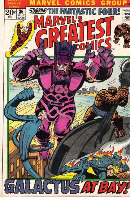
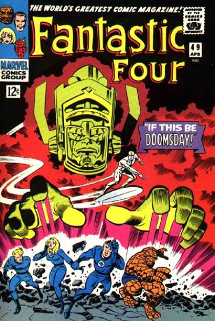
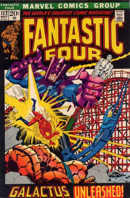
Doug: In the above duo, the left side depicts the iconic image of Galactus (FF #49 is the first cover appearance for both Galactus and the Silver Surfer) by Jack Kirby and Joe Sinnott. On the right is the cover to the reprint of the same story -- this time around the cover is pencilled and inked by Our Pal Sal Buscema. I'm a Sal-fan, but at first glance I really couldn't understand why editorial chose to go away from what many Marvelites might consider to be one of the finest covers of the Silver Age. However, upon doing a little research I think I came to a pretty fundamental answer -- simple cross-marketing among titles. Take a look at the cover to Fantastic Four #122, which is cover dated May 1972; Marvel's Greatest Comics #36 is cover dated July 1972:


Doug: The cover above is by John Buscema and John Romita. The proximity of Galactus to the FF, the frame around the cover art (typical of the 20-cent period in Marvel history), and the general style of the pencils show that Marvel intentionally used Sal's artwork to piggy-back on John's 4-part epic from only a few months earlier. Again, while Kirby/Sinnott had unleashed a classic cover back in 1966, the follow-up effort certainly had its motivations from a dollars standpoint.
Karen: I think this is a good guess on your part Doug. I distinctly remember reading both of these titles when they came out, and it took me some time to understand that one was current and the other was "historical" - or at least that was the way I thought of it as a youngster.

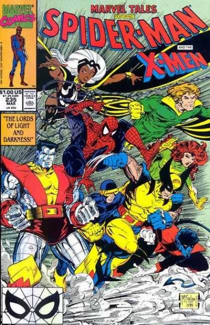
Doug: Here is another example of a reprint where the cover art used was strictly due to the "hotness" of the artist. On the left is the original Marvel Team-Up Annual (1976) with cover art by the original artist of the All-New, All-Different X-Men, Dave Cockrum. However, by the time the Marvel Tales on the right was published, Todd McFarlane was breaking all kinds of sales records with his rendition of Spidey. No wonder, then, that he also got the gig doing covers for Marvel Tales in addition to his work on Amazing Spider-Man in this era. Nevermind that there is absolutely no connection with the more recent cover to the story within. Hmmm... trend developing?


Karen: The Cockrum cover is vastly superior in my opinion. It has a nice clean layout which gives you an idea of what's in the book. As you point out, MacFarlane's cover is simply a pin-up of the characters. I don't know exactly when this trend started but I wish it would go away! The cover should give an idea of the story in the book - something to draw the reader in. X-Men and Spider-Man fighting a giant robot: OK, I'll check it out. X-Men and Spider-Man running: not really all that intriguing.

Doug: So what's the overall evaluation of reprint covers in general? I guess out of sentimentality I'll have to side with the originals. Despite the improved technology that allowed for a richer color palette on the reprints, and in spite of more modern marketing strategies that placed then-hot or -current artists reinterpreting the covers, those new covers sort of disconnected with the original stories. I think for long-time fans, there's that relationship between cover and story that perhaps today's younger readers don't understand. With so many "portrait" covers, a good ol' fashioned cover that makes the reader have that "can't wait!" feeling. Even on a Marvel Triple Action or a Marvel Tales, knowing that what was within was as good as what was on the outside was just a great sense of anticipation.

Related Posts with Thumbnails