Doug: Just too much of a good thing...
Showing posts with label Joker. Show all posts
Tuesday, November 1, 2016
Monday, August 29, 2016
Buried Treasures - Super Powers Mini-Comics, part one
Doug: No review this week, kids. Busy, busy, busy with moving our youngest son out of the house (probably permanently) and on to graduate school, and school of my own just kicking my butt to start this year. So, although I meant to bring you something off my beaten path with a review of an old Walt Disney's Comics and Stories, it will wait until a later day. Instead... it's back to the auction block.
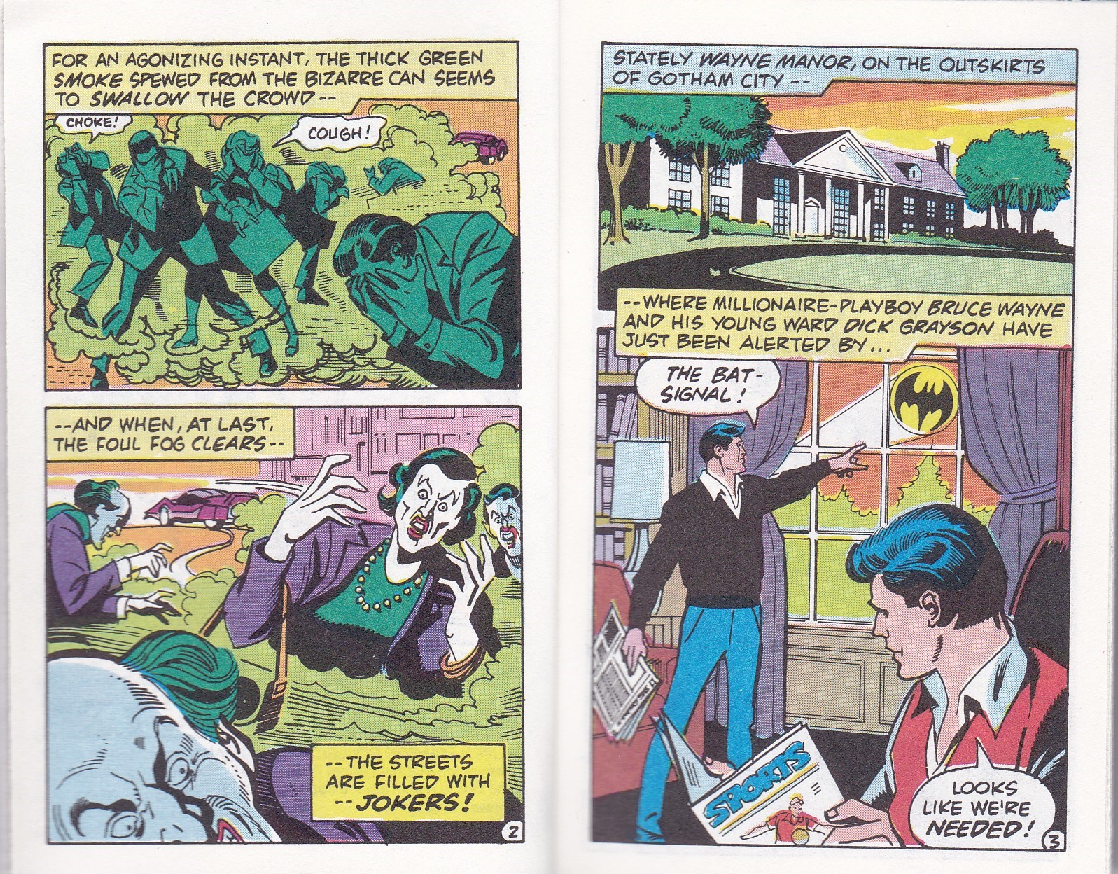
Last week we finished a look at some 4-panel comics that adorned the back of the packaging on Mattel's Secret Wars action figures. Now I'm selling my Super Powers stuff and what did I find but several mini-comics! Yay! For your discussing pleasure (but you'd have to leave a comment, you know) I scanned the seven comics that I had. Not all of them turned out perfectly, so we'll take a look at two of the better ones today, and another two at a later date.
I am frustrated, however, that I am having the same difficulty with these that I had with the Secret Wars comics -- who in the world created them? While both the Grand Comics Database and the Comic Book Database have entries, neither site lists creators definitively. So see what you can come up with as you read - recognize anyone's work? Looking through all of the comics, I sometimes got an Ernie Chan vibe; at other places I was feeling the work of Irv Novick.
Have fun!
Monday, August 22, 2016
Comin' In On a Wing and a Prayer: Batman & Captain America
Batman/Captain America (October 1996)
"Batman & Captain America"
John Byrne
Doug: It's hard to believe this, as well as many of the other latter-day wave of DC/Marvel crossovers, is 20 years old. Seems like only a few months ago I eagerly awaited this offering to reach my 30-year old paws. Even in the mid-90s, if John Byrne was involved, a project was still going to be big news. But... did this disappoint then, and what about now as seen through the eyes of a curmudgeonly middle-aged school teacher?
No, in answer to the first question, it did not disappoint then. John Byrne's one of those guys who "gets" comic book history. Well, for the most part (the Vision debacle, for which he shall never be forgiven on this space, aside). This book is one big homage, or love-in, or whatever else you want to call it with the Golden Age of these two lead characters. Right from the Batman's first appearance, we can see that Byrne is emulating the style of Dick Sprang, mostly fondly remembered for illustrating the adventures of the Dark Knight Detective in the 1950s. But here I go again, getting ahead of myself. Of course we first need to give you that nifty little plot summary called the 100-Word Review:
Toward the end of the War, Captain America and Bucky are
ordered Stateside in order to investigate millionaire Bruce Wayne, believed to
be secretly bankrolling sabotage of the Gotham Project (known to history as the
Manhattan Project). Batman and Robin are tracking down the Joker, who has been
stealing secrets of the Project. During Cap’s surveillance of Wayne, he and
Batman learn one another's identities and collaborate to find the Joker. They
find that the Joker and the Red Skull are themselves collaborating, but the unpredictable
Joker soon turns on the Skull – and that means war of another kind!
If you've never laid eyes on this book, it's a 64-page prestige format graphic novel. And it looks great, which brings us to...
The Good: Yes, it does look great! The art is splendid throughout and the coloring (credited to Patricia Mulvihill) is phenomenal. I don't know that I'm qualified to discern or discuss coloring innovations of the 1990s, but it's fairly obvious that Mulvihill was able to employ then-modern computer coloring techniques without losing the four-color charm that many of us cling to.
Byrne's pencils are magnificent. Some criticisms (maybe just of mine) of Byrne in this period are that his art had become flat, or scratchy, or that his figures' torsos were sometimes oddly elongated. None of that is here. In fact, if you ask me to compare eras of Byrne's career, I'd gladly put this alongside his work in the Claremont/Byrne/Austin heyday of the Uncanny X-Men or his collaboration with Dick Giordano in the Man of Steel limited series. It's that good.
His writing is spot on as well. I mentioned at the top the homages to Dick Sprang's art. Byrne captures the spirit of the era in his writing as well. It's not over-the-top sappy or dated in any negative way. But you can just hear Cap or the Batman talking "that way" if you were watching this on film at a Sunday matinee. The inclusion of Sgt. Rock and Easy Company, when Sgt. Fury and his Howling Commandos would have been included, was a nice touch. Great job of further blending the universes.
There are a few twists in the story that caught me off guard when I read this the first time twenty years ago, and again a couple of weeks ago when I re-read it. That the Joker would double-cross the Red Skull because the Skull was a Nazi seemed strange -- was it the racism, the world conquest, or the supreme egomania that turned off the Clown Prince? It was never stated, but the Joker's seeming patriotism struck an odd note. I'm not saying it was bad... not at all. In fact, it was good because it was so unexpected.
In addition to the wonderful splash of the Batcave, late in the story there is (of course) a perilous trap, timed to kill Batman and Bucky (the crossover with the sidekicks was fun). It definitely hearkened to the days of the cliffhanger endings popular in the serials of the 1940s as well as to the 1966 Batman television series.
Byrne gives a "thanks" to Roger Stern for the epilogue of the story. It's a nifty "What If?", as 20 years after the War Batman and Robin are patrolling the ocean for any signs of the Joker... Junior. "Jr.", huh? Well, this ain't yer daddy's Batman and Robin. Nope -- this is Dick Grayson wearing the mantle of the Bat and Bruce Wayne, Jr. as Robin. And as they pilot the Bat-sub, what's in that ice floe they find up ahead? I think you know what (or who) it is...
The Bad: I guess if I have one complaint it's that Bucky got a little short-shrifted in this story. He has a moment here and there, but largely it's Robin who does the more-heroic stuff. Bucky sort of comes off as a whiner, which I felt was interesting given that I'd have assumed Bucky to be older at that time than Robin -- maybe a little more mature. Too, and if we are to believe the Winter Soldier retcon (which obviously wasn't a thing yet when Byrne penned this story), I'd have liked to have seen Bucky as a bit more take-charge. But then, and as I've said, whenever I was reading the Invaders I never thought of Bucky as carrying out any "collateral damage".
Oh, and another thing -- when the Joker stole the atomic bomb, Fat Boy, and it went off in the Atlantic after our heroes worked their (lucky) magic, what are we to assume? In our reality, the bombs dropped on Japan were nicknamed Fat Man and Little Boy. So in this story was there only one bomb, and if so, was the atomic destruction of Hiroshima and Nagasaki not to pass? This is in no way a situation that ruins this story for me. Far from it. But it just left me to wonder. Sooooo many universes! Someone should write a Crisis...
The Ugly: Nada.
Check this out if you're able. It's been reprinted in one of the Crossover Classics volumes, and can probably be found at your LCS or online for only a buck or two. It was a nice half hour diversion, and one I'm glad that after all these years I read again.
Monday, July 11, 2016
Laughing His Way Into Cancellation - The Joker 9
The Joker #9 (September/October 1976)
"The Cat and the Clown"
Elliot S! Maggin-Irv Novick/Tex Blaisdell
Doug: There might be a reason this was the last issue of The Joker. Or, maybe the story was written as is because the creators already knew. So who killed what is perhaps moot -- this still isn't what you'd call a Bronze Age gem.
And it should be -- the cover is great, and darned if Mike W. Barr, Alan Davis, and Paul Neary didn't have some fun with this same concept. Not so much here.Maybe we've had this discussion before -- over seven years, I'm guessing that we have -- but let's start with it here. It is very difficult to publish an ongoing series where the protagonist is a mass murderer or some other evil-doer preoccupied with world conquest. In my mind, the only way to make it work is to feature a hero as foil to the bad guys. Had the DC Implosion not occurred, Secret Society of Super-Villains might have succeeded. It was genius to take a character largely unknown to then-current readers (Captain Comet) and make him the steady hero throughout most of the series. It also seemed a nice decision to include various heroes as team-ups, including Kid Flash and Hawkgirl. But this Joker-headlined comic seemed a tougher sell. The bad guys who populated SSoSV were more bent on outwitting their primary nemesis (in most cases, the Flash) and less on widespread property destruction or loss of life. One cannot say that about the Joker. In this issue, the last in the series and pretty goofy all the way around, at least three deaths are featured and the last of them is of a quite malicious nature. Even Catwoman's appearance, and she's much more sympathetic, does not soften what's gone on once you sit back and think about it. And obviously this title could not have featured any of the Bats in that foil role, as that would have made it just another Bat-book.
100-Word Review:Benny Springer is a Hollywood legend for playing Buster
Keaton-type comedy roles. Just as popular as Springer, however, is his cat
Hiawatha. The two are to star in a new motion picture, “The Clown and the Cat”,
but Springer is knocked unconscious by a disguised Selina Kyle. Little did she
know, though, that she’d captured the Joker masquerading as Springer. Already
confused? The Joker leaves a trail of bodies on his way to Catwoman’s lair,
where he ends up fighting… himself? Springer becomes the Clown Prince’s
doppelganger and the two clowns fight nearly to the death. Of course the bad
guys lose.
The Good: I've always felt that Irv Novick was an able penciler of all things Batman. I liken him to Aparo and Adams, but a few steps below. Perhaps a more apt comparison would be to Dick Giordano. We primarily think of Giordano as an inker, but when you've seen his pencils of Batman... similar to Novick's in my mind's eye. I cannot speak much to the inks of Tex Blaisdell. We've encountered his work before over Dick Dillin and Bob Brown. A far cry from "lush", he's in the Vinnie Colletta camp; maybe not that feathery, though. So while I seem to be making excuses for these creators (if you like that, then you'll like this, only not as much), there was merit to the pictures. It's just that they didn't have much to go with because...
The Bad: Elliot S! Maggin's script. As I said above, it's like everyone knew (and I'm sure they did) that this book was on its way out the door. This story seems cobbled together quickly and with not much care. I've argued, maybe unfairly at times, that Silver and Bronze Age DCs were written for 10-year olds. Having been one of those myself (and this would have been on the stands right around the time I turned 10), I don't know if I'd have liked this story. First of all, it's really confusing near the front when Catwoman kidnaps Benny Spencer. At the same time, the Joker is impersonating Spencer, and we see Catwoman out of costume (assaulting Springer... er, the Joker in disguise) and in costume (kidnapping Springer and his cat from the movie studio's screening room). How did this shake out? I read it three times, for detail, and couldn't get it down. No way I'd have made sense of it as a youngster. NOTE: In fact, on the fourth read while preparing the scans, I'm not sure now if it was Selina Kyle who ambushed the Joker. But if it wasn't, then that plot point is even more vague. What's more, the intentions of both the Joker and the Catwoman are pretty lame: Catwoman kidnapped Spencer and his cat (emphasis on the cat as part of the crime) in order to hold them for ransom. The Joker wanted Spencer out of the way so that he could impersonate the actor and then star in a movie. Yeah, OK...
Additionally, and also as I mentioned above, there's a body count in this book. Two studio guards and a captured henchman of the Catwoman's all succumb to the Joker's laughing death serum. What's more, they all die on screen. That gives me pause, as I'm back to the "written for a 10-year old" notion: Did DC's editorial staff think that was OK? It's certainly not in line with Marvel's "flat of the blade", which we've also discussed. If the deceased died with a smile, does that mean the Comics Code was bypassed? These are legitimate questions that I have.
One knock on the art is that Catwoman only once appears drop-dead (haha) gorgeous. She seems like a character who should always be drawn as beautiful. She also is written with some pretty clunky dialogue. During the "battle of the Jokers", she sits to the side and watches the skirmish play out. She thinks to herself, using words like "interesting", "most fascinating", "absolutely wild", and "far out"... those just seemed like odd choices for her.
The Ugly: Overall, this book is not very good. I really thought the cover implied a fantastic adventure inside. What I got was farcical at best. It wasn't horrible, in that I don't think I'd have requested a refund of my three dimes. But it certainly didn't advance my love of the Batman mythos. And there were just enough stupid plot points that added to my displeasure, notably during the story's climax when Springer said he gave his cat a signal to behave a certain way. You'd have to read it -- the situation was quite complex, in that the cat would have had to ignore all his instincts and behave in a counter-intuitive manner. I wasn't buying it.
In the interest of ending on a positive note, please see my review of The Joker #4, where I go on in a sunshiney light about Elliot S! Maggin's storytelling. Which further makes this issue disappointing (oh, shoot -- I did end on a negative.).
Tuesday, July 5, 2016
BAB Book Review: Frank Miller's The Dark Knight Returns Gallery Edition
Frank Miller's Batman: The Dark Knight Returns Gallery Edition
Graphitti Designs, May 2016
Doug: Hey, I'm not one to toss about texting lingo, but
OMG
Is this a cool book, or what? (Yes, it's a very cool book, as I think you'll see.)
First off, the nuts and bolts of the book, courtesy of the folks at Comic Book Daily --
Batman: The Dark Knight Returns – Frank Miller Gallery Edition
Includes artwork from Dark Knight Returns 1-4, covers, related art and previously unpublished pieces. Though Graphitti Designs was unable to locate every original from this story, they are pleased to present to fans everywhere the best presentation of the artwork from this historic series ever seen.
- Publication Date: May 18, 2016
- Publisher Series Number: 6
- ISBN: 978-1-4012-6443-7
- Diamond Item Code: OCT150238
- 13″ x 20″
- 216 pages
- $175 USD
- Solicitation
- Initial Reported Sales: 1165
- Variants: Variant Edition, Signed Edition ($275)
Some may see the price and think "no way", and I'd most likely be in that camp as well had I not been earning revenue from the sale of my collection. I pre-ordered this book from Westfield Comics in Wisconsin; I'd done business with them as a subscriber during my college years and was pleased to make their acquaintance once again. They sold me the book in October for $148 (which included S&H), and I waited patiently through two publication delays before getting my mitts on the book on June 9. As you can see from the tale of the tape above, it is big -- way bigger than the average Artist Edition from IDW (though not as large as the twice up John Romita's Amazing Spider-Man or my pre-ordered Jack Kirby's Thor (already delayed and now due to arrive this week)) and weighing in at close to 10 pounds. Not exactly the sort of book one would rest on the lap.
Here are a few of shots of the packaging -- the book's transit appeared to have been smooth. The cardboard "case" is standard for these types of books, as IDW uses the same product. I keep all of my Artist Editions nestled in this original packaging. Note: All images henceforth are photographs -- I'd have gotten a hernia attempting to scan from this monster.
I've also included an image of the inner spine of the book to show the stitching. The craftsmanship is solid, and what's especially nice is that although it's not a "lay flat" book it does not want to close once opened. I could look at it or read from it without having to hold down pages on either side.
Below are shots of the title page, as well as the back cover (just ignore my reflection in that pic). The image of Batman towering over the Gotham City skyline was the cover of the first Warner Books trade paperback (which I owned at one time before a colleague to whom I'd loaned it lost it); it was also a 16"x20" poster, which I also own.
I sent all of these images to Karen shortly after I received the book. One of the things she remarked about was her love of the margin notes. Those of you who have read Miller's collaboration with Bill Sienkiewicz, Elektra: Assassin, know that Sienkiewicz repeated certain images, and often. Note below that Miller's bottom left panel is marked for "stat" and is repeated two panels to the right.
As you saw from the product description above, Graphitti Designs could not locate all of the pages. They do, however, include scans of the published pages for the purpose of completion. Below is a common example; however, when a page in question is paired with a vellum overlay the scanned page is full-size to match the size of the overlay. The coordination of the printing and bindery process in this book was meticulously carried forth.
The two pages below are here to show you the creative process of Miller and Klaus Janson. Lots of white-out, stats, etc. The second of these two pages is my favorite vignette in the entire graphic novel. When I first read this page, I knew this wasn't any Batman I'd known. I had a "heck yeah!" moment during that first reading.
Note Miller's signature on the bottom of the page above (enlarged detail below).
The scene below was pretty tense -- love the splash page of Batman with the chest logo blown open to reveal a bullet-proof vest. Note the creative process in the enlarged detail.
In another example of the overlay, you'll find Miller's pencils to the cover of The Dark Knight Triumphant on the left, and Janson's inks on the right.
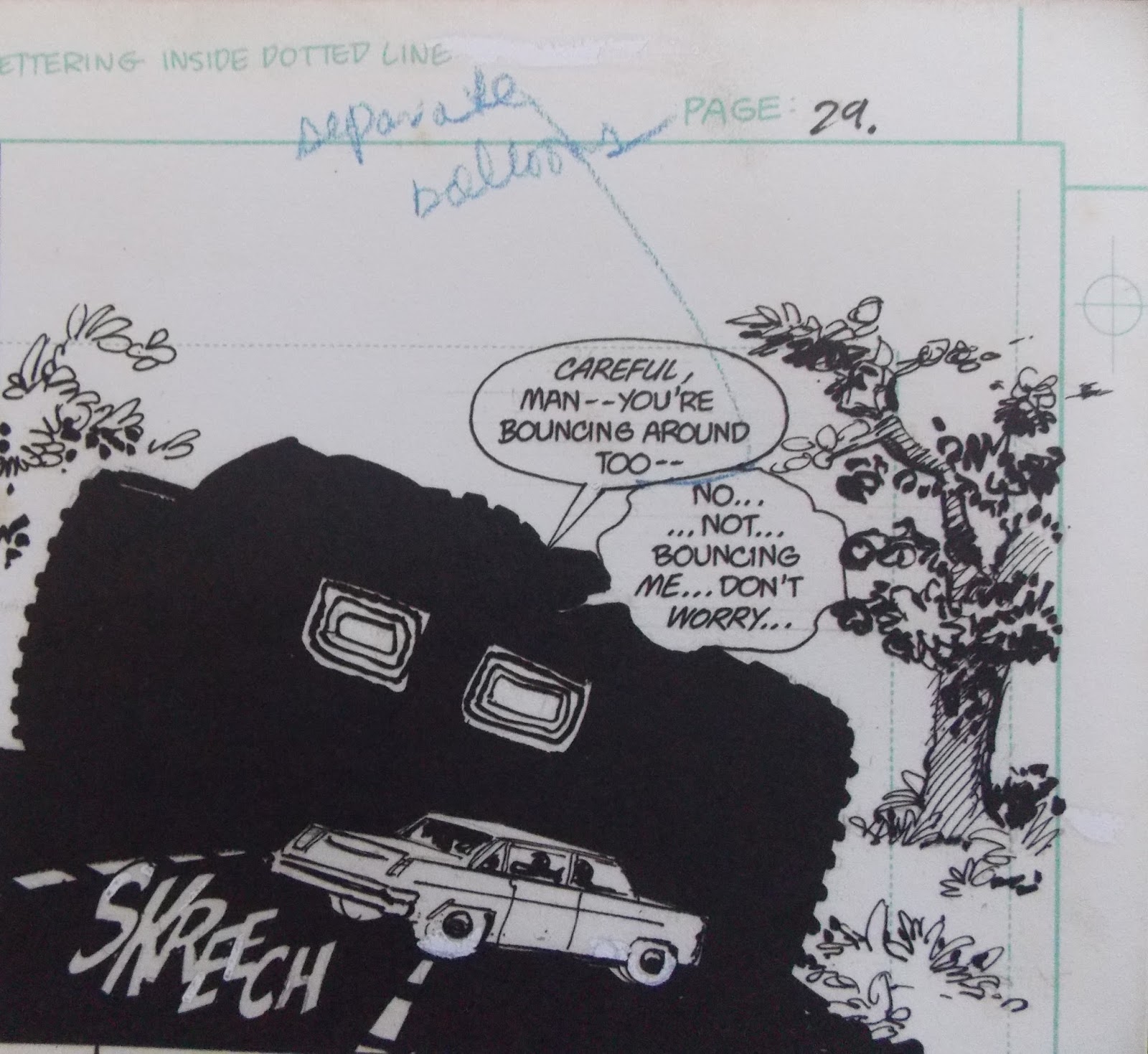
Another example of white-out, as well as Miller laying out a grid system for the building heights and the lettering. Note the margin call-out to the punctuation in the word balloon. Note also that Janson signed and dated this page -- lucky for whoever owns it!
Two more examples of editing and mark-ups.
Great image on the left, below. Given that Janson signed here, and the page above, both in June of 1986 has me wondering if the same collector owned both pages.
Miller and Janson both signed this page. Memorable panel from The Dark Knight Triumphant.
The cover of Hunt the Dark Knight was just plain white, except for the image of Carrie Kelly in the bottom right corner. A graphic designer must have done the Bat logo.
Detail of a single panel, when Bruce and Clark were riding horses and discussing the coming storm. Miller did not care for Janson's inks, so re-inked the image himself. The overlay at right is Miller's version.
I thought this was interesting -- several panels redrawn by Miller. It seemed that as the story wore on he became fussier about the work. For those of us who bought the book as it was released, this might explain the longer and longer delays as the series progressed.
Awesome splash...
Again, enjoy the process. And Miller's tinkering. I'll tell you, looking through this book it struck me how much Miller must feel the same way about this work as George Lucas feels about his original trilogy of Star Wars films. Perfection is an unattainable thing.
Detail. White-out and redrawing. I love seeing stuff like this!
One of the iconic images of the entire series. I thought it would be cooler than it is, but for the most part it looks like Miller and Janson were satisfied the first time. Or, perhaps it's because of the tardiness of the series that there was no reworking here.
Near the end of the book there are several extras. As you may know, all of these original art collections are color scans of the art. That's why you feel as if you're looking at the actual bristol board and it's also why all of the white-out, blue line pencil, and even eraser marks are visible. Near the top you saw that there's no shortage of color images. I was surprised to see this huge fold-out at the back of the book. If you were buying this back in the day, you may recall a large counter display when The Dark Knight Triumphant was released. This is a reproduction of the artwork for that display. Nice touch, Graphitti!
Lastly, here are a couple of other promotionals. On the left is Miller's design for a Dark Knight statue, while on the right is his portion of the cover to 'Mazing Man #12 (June 1986).
Subscribe to:
Posts (Atom)