

Doug: Here we go again -- another sartorially-challenged super-type, or perhaps a fashion plate in spandex? We'll give our opinions -- but you be the judge!
 Doug: Today's victim, er, object of examination is the original Gladiator, one Melvin Potter! Melvin is primarily a Daredevil baddie, although in and around the Bronze Age he did branch out to get his butt kicked by Iron Man, Ghost Rider, and later Spider-Man. But so what -- he looks so cooooollll!!
Doug: Let's start with the color scheme -- you can't hardly go wrong with blue and yellow. College teams everywhere use that combination and it works here. The helmet is a nice touch in this costume -- reminiscent of the Legion's Ferro Lad. There's something about a guy with his whole face covered that shouts out "Hey, man -- I'm mysterious!" and Melvin is pulling that off. His footwear, while functional, evokes days gone by with the razor look -- I'm sure this was all the rage among Roman slaves about to be thrown to the lions! But of course what we really are drawn to are those two nasty little buzzsaws mounted on ol' Melvin's wrists -- just all kinds of deviant behavior can be meted out through those bad boys!
Karen: This is a costume that does scream "retro" - but that's not necessarily a bad thing. I do think that it'd be nice to see more of a breastplate for the chest -maybe more evocative of a Roman gladiator. But I do like the helmet and boots. The wrist saw-blades do seem kind of dorky though. But practically anything looks good when it's drawn by Romita Sr.!
Karen: This is a costume that does scream "retro" - but that's not necessarily a bad thing. I do think that it'd be nice to see more of a breastplate for the chest -maybe more evocative of a Roman gladiator. But I do like the helmet and boots. The wrist saw-blades do seem kind of dorky though. But practically anything looks good when it's drawn by Romita Sr.!
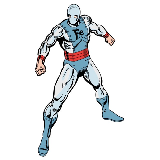
 Doug: Despite his good taste in clothing (if you've ever seen Melvin without the helmet... well, you'd be thankful that he usually has it on), the Gladiator usually comes up on the short end of the stick when it comes to super-hero bashing. I guess you could say that Mr. Potter is more often than not the "bashee".


.jpg)


3 comments:
Gotta admit, I always felt the Gladiator had one of the coolest non-Ditko costume designs of any comics character ever...especially in those early stories.
Hey, Steve --
It is an eduring design.
I didn't care for David Mazzuchelli's interpretation, a much more classical interpretation of the (a) gladiator, as seen on the cover of DD #226: http://www.coverbrowser.com/image/daredevil/226-1.jpg
Take care --
Doug
It works better with the mini bust's color scheme, instead of the green. But I agree it works in general for the character.
As for the Mazzuchelli design; well, it's cool, but... it's too easy to dress a villain called "Gladiator" in an actual gladiator get-up.
Post a Comment