
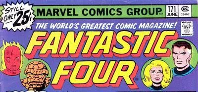
Doug: Leading off this time is Marvel's flagship title, the Fantastic Four. What we're looking at here is the third logo that appeared on the cover, and debuting in FF #160 (July 1975) and lasting to FF #218 when the original logo returned. This logo is "my" logo, as it was on the covers during most of the time I was buying comics -- until I went on hiatus during my high school years. I really like the font, and I'm a sucker for italics -- as I said last time, it just adds a dynamism to the lettering. I also really like the headshots, even though they are in place of the standard corner box.
Karen: This is where we part ways, Doug! I liked the logo that preceded this one; in fact, after the old Avengers logo, it's probably my favorite. I also loved the old corner box with a charging Bashful Benjy!

Doug: Ghost Rider is the third sort of creepy title we've looked at (following Marvel Chillers and Doctor Strange), and it's no less creepy than those that have come before. Great font choice on "Ghost", and the wispy box that surrounds the lettering is very atmospheric -- they wanted to get a message across and I think they did. Additionally, the more modern look to "Rider" sets us up that maybe this isn't a horror title. And you simply cannot beat the corner box. Great art and it definitely shows the prospective buyer what's in store.
Karen: You're right, visually, the logo and corner box are great. That's sort of how I've always felt about the character too; visually great, but never got drawn in by the stories.

Karen: Yeah, fairly unexciting logo. You know, I used to read Hulk regularly as a kid, but really can't recall any great storylines or feel much sense of enthusiasm for the book now. I may have to go back and reread some titles and see how they hold up.

Karen: Blah. About as much effort was put into that logo as it was making the book a success -that is to say, very little. They never seemed to get a fair shake, although I enjoyed the Roy Thomas/Neal Adams Inhumans stories in Amazing Adventures. And hey - "the most uncanny heroes of all"? Shouldn't that be the X-Men?

Doug: Since the name "Iron Fist" has to do with a fist that is hard as iron and not with iron itself, I'm a little unclear as to why art director John Romita approved a logo that had rivets on it. Works for the next guy, seems sort of dumb here. Killer corner box, though!
Karen: You are absolutely right - that's pretty hilarious now that you point it out!

Doug: One of Marvel's top logos. Ever. It's just perfect.

Doug: Now I hope you don't call me a hypocrite, because there's not a heckuva lot of difference between the Ka-Zar logo and the Inhumans logo just a couple of images above. But this one works great for me. It's the same 3-D view of the lettering, with wording on the left side of the block. But the font is just rugged enough, and the additional coloring at the bottom of the letters gives off a dirty, or rustic, or even vegetation-type of look. This logo does what it's supposed to -- it tells me that this is an adventure book. And help me out -- is Zabu the only animal to get his spot in the corner box in the Silver or Bronze Ages?
Karen: You're not crazy or a hypocrite Doug - I feel the same way about this logo! This one looks like it was carved from stone and has an appropriately primitive feel to it. I think Zabu must have been the only animal to be featured in the corner -I don't recall Redwing or Lockjaw getting their own spots. Maybe some of the western comics might have had horses - but they probably were being ridden.

Doug: This was one of my favorite arcs of the Bronze Age! Beginning in Invaders #5 and running through this issue, the four issues were really fun! This logo, like the Captain America logo we discussed last time, is perfect -- patriotic, the right color scheme, and in spite of the rather bland font it works. Hey, the 1940's were a simpler time and this logo honors that. The Marvel Premiere logo isn't bad, either, but I was glad to see this Liberty Legion story when I was culling covers for this post.
Karen: I'm fond of this one too, for the same reasons as you. I need to replace these issues -they were in the box that disappeared when I was moving years ago.

Doug: I think we remarked last time that some of these logos could be done by any shmoe with a computer and WordArt. This one fits that bill, but you know what? I like it. I think the way the word "Guardians" is arched gives off a protective vibe. And isn't that what these guys (and gal) were all about? Love the corner box, too. Even though it's the same motif as the Dr. Strange art that I didn't like (main character, profile of the right side of the head), this group shot is nice. Yondu's fin is cool! Oh, and the Marvel Presents logo -- meh...
Karen: I like the corner box art (Romita?) but don't care much for the logos themselves.


.jpg)


5 comments:
I always felt this incarnation of the Iron Man logo was great, with one small exception:
Tilt it UP!
Having it tilted down just always seemed wrong. I thought tilting it up would have brought more "pop" to the cover.
Cheers!
Steven G. Willis
XOWComics.com
I can never get enough of logo talk - and these two looks at some 70's Marvel logos have been great.
The Fantastic Four logo, though, never did anything for me. I was surprised to see it revived for the most recent run; I can't recall if the preceeding logo has ever been revived?
I always loved the Fantastic Four logo of the mid 70s.It really got you excited along with the cover art,that this issue was going to be something special.My favorite Hulk covers were in the late 60s and early to mid 70s.The power of the single letter "H" alone had an impact that the reader was in for some "rock 'em,sock 'em" action galore.The "ULK" didn't hurt either.Iron Man was awesome,but could've used "a face lift".Liam
The "new", somewhat modernistic logos were already in place on the FF, Avengers and Hulk when I started regularly collecting those mags,and while I liked that Avengers logo, I actually prefer the original FF logo and that big granite blocks lettering used on the first few years of the Hulk. I liked that Ka-Zar logo too; very distinctive.
All --
It's interesting to discuss "branding" of a title or company. Maybe one day we'll pick just a mag or two and track the cover logos through that magazine's history. I always think Marvel's and DC's cover representations are interesting, as well. Keep watching for this...
Best,
Doug
Post a Comment