 Doug: It's time to put Dr. Henry Pym under the microscope. That's an Ant-Man joke... Get it? OK, yeah -- so I knew it wasn't funny when I wrote it. Anyway, today we're going to take a look at the super-suits of ol' Hank, a fella who's had about as many outfits as his lovely wife, the Winsome Wasp.
  So, to begin, let's go ahead and hearken back to the Ant-Man days and the beginnings of the Marvel Age of Comics!
Doug: When Hank first appeared way back in January 1962 in the pages of Tales to Astonish #27, he was just a guy in civvies. Nothing to speak of, but given the fact that he looked like Wally Cleaver, I'm going to vote "fashion disaster"! Hey, you dress like that and then shrink yourself, you deserve to get chomped on by green ants (where the heck had Kirby seen green ants??)!
Karen: Just an aside here: I actually used to have Tales to Astonish 27. I inherited it from my uncle. I wound up selling it on eBay about ten years ago. I really wish I hadn't, but que sera, sera. And yes, Doug, I think green ants are pretty weird.
Karen: Just an aside here: I actually used to have Tales to Astonish 27. I inherited it from my uncle. I wound up selling it on eBay about ten years ago. I really wish I hadn't, but que sera, sera. And yes, Doug, I think green ants are pretty weird.
Doug: In the fall of that same year, the Ant-Man was brought back, but this time as a superhero. Hank now sported some longjohns (complete with the standard superhero jockey shorts worn on the outside of the pants!), and I'll say that this is a good look. I always liked the red/blue combination, and I've always liked Hank's cybernetic helmet. I'm not sure exactly what Kirby was going for with the design on the chest, though. Oh, and the vials on the belt are sort of cool, too (although not pictured here). Good-looking Silver Age suit!
Karen: You know, I've always liked it too, although there's precious little here that says "ant".
 Sure, the helmet is vaguely ant-like, although as a kid it always made me think more of astronauts. But I dig the red and blue color scheme. Is the dot on his chest supposed to symbolize the ant's thorax? I dunno, I would say that's reaching but I'll throw it out there.
Doug: Of course Hank couldn't sit still -- must be the scientist in him, always greedy for more information, the successful completion of new experiments. By Tales to Astonish #49 (November 1963) he had changed not only his name, but his powers as well. Now calling himself Giant-Man (and interestingly not reverting to the Ant-Man identity for many years -- Hank did not grow/shrink as one might have expected), Hank's costume was inspired by his former Ant-Man duds. He could still control ants, but the cybernetic helmet was now built into his mask. I'm sure some of Tony Stark's transistors helped in that innovation!
 Love this suit, too, in all it's variations. My favorite, though, and perhaps it's because it's so darned ugly, is the G-M outfit with the huge blue helmet that he wore c. Avengers #16. Wow -- nice chapeau, dude! Oh, and regarding the cover to TTA #49... Is this a refugee from Silver Age DC, or what?
Karen: He was already sort of schizoid even way back when, as he couldn't entirely ditch his Ant-Man persona, keeping the ant design even when he became Giant Man. He might not have had the helmet -which was the coolest thing about his original costume -but he did put little antenna-like deals on his mask! That other outfit though -holy cow, that's a pretty ugly one!
Doug: My personal fave was designed by Dandy Don Heck and debuted in Avengers #28, one of the first issues of that mag that I ever laid eyes on (albeit in the reprinted version in Marvel Triple Action). Man, I still love that story! The first Goliath outfit is a classic with the blue and yellow, the visor (that Hank would sport really for the rest of his career, or at least until pretty recently), the lines running up the arms and legs that accentuate his height...
 It's just a very well-thought design, and one that really wouldn't look too bad by today's standards. Even though Hank switched out the blue/yellow for red/blue later and added antennae to the mask, this is still the costume I see in my mind whenever I hear or think of "Goliath". And the name's great as well -- I'd assume the kudos for that are headed for Stan, Marvel's great wordsmith. Color scheme, design, mask -- all combine to make either version of the Goliath costume a success.
Karen: I have to say I miss the red and blue, but it's not a bad outfit. Though he still retains some of the ant elements - I always thought the goggles had a sort of iridescent, insect eye look.
Doug: Lastly, we come to Hank's Yellowjacket look. A departure from the growth powers led Dr. Pym to reinvent himself as a companion hero to his wife's Wasp. Never mind that this also began the downfall of Hank Pym to anti-hero, wife-slapper, and general whipping boy of the Marvel Universe. Let's stick to the clothes. The Yellowjacket costume is quite inspired. First drawn by John Buscema and debuting in Avengers #59, the yellow and black color scheme is very eye-catching. The focal point of the outfit, though, are the wings.
 While very cool-looking, I have to question the functionality of the design. My biggest question, and this varies greatly depending on the artist of the given story, is how does he have any peripheral vision? If the artist draws the wings too much to the fore of the suit, then there is no way that Hank could see beyond them. If, however, the wings are drawn as primarily to the rear of the suit, that vision would be restored. It would just be sitting down without leaning forward that would be a problem. So because of this slight design flaw, I'm going to have to say that this is a great-looking outfit, but withhold my utmost praise on questions of outcomes.
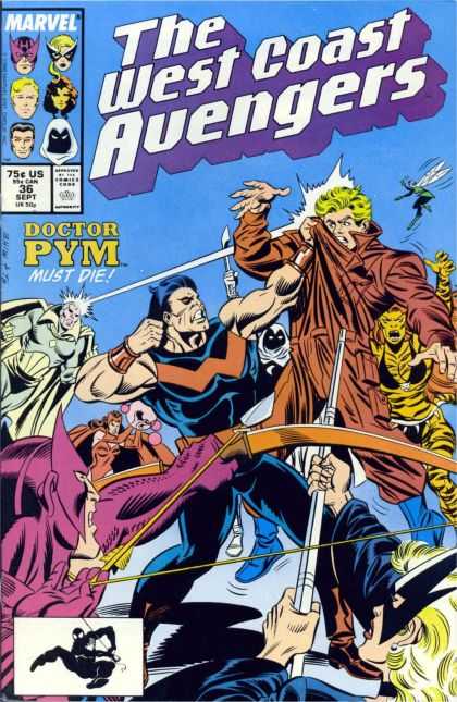 Karen: I was never sure how those "wings" even functioned. They're just big shoulder pieces! But it's a pretty decent look, especially when the dark portions are colored as black or a deep purple.
Doug: Oh, I suppose we should mention one more set of clothes, since said look did fall into our Bronze Age timeframe, and that would be Hank's appearance while simply known as "Dr. Pym". Yeah... Well if you thought he was lame in his first appearance, I think he's broken the lame-o-meter with this exit. And he should exit the look as quickly as possible!
Karen: Well, he really didn't wear a costume during the "Dr. Pym" years, just some funky coveralls. I don't know which was less inspiring, that or Wonder Man's 'safari jacket' look. I'm not even going to bring up his latest outfit, the one he's worn as "The Wasp". I'm not reading Avengers Academy so I don't know if he's keeping that name. Ugh.
Karen: All in all, I'd give Hank the thumbs up, particularly for his Ant-Man look, which is such a classic.








5 comments:
In retrospect, where I feel Jim Shooter really fell down in his downfall of Hank Pym storyline, is that none of the other long-time Avengers who had worked with him for years ever stopped to ponder, "hey, this isn't like Hank at all! Something is seriously wrong here and we ought to help him." Seems Shooter was just intent on writing a yarn in which a good guy goes bad that he lost focus on the characterizations built up over the previous 20 years or so.
Definitely among the Hank Pym fans who think Shooter really f***ed it all up by turning him into an abusive husband (both physically and verbally). In fact, I pretty much stopped reading Avengers a few issues after that (I did, however, pick up the early issues of Stern's run where he sort of redeemed Hank).
As for the point of this post - I first started reading comics when Hank was Yellowjacket, so that always seemed his "natural" identity and costume to me. However, I'm also a fan of the original Ant-man costume, and think there were quite a few Marvel staffers who were fond of it as well. I'm pretty sure the whole reason for introducing Scott Lang as the new Ant-man in Marvel Premiere was simply to put that costume back into circulation.
My Marvel fandom began in 1966 when I convinced my dad to buy me a copy of Avengers #34 - he was a fan of the Avengers TV series and I sort of misrepresented the comic to him. Anyway, that's the best Hank Pym outfit in my book, that yellow and blue costume without the antenna.
I remember reading an interview with Stan Lee a long time ago when he was talking about writing most of the Marvel line in the mid-60s and how hard it was to remember things (that's why the names were alliterative)and come up with new villains. He specifically remembered that he picked up an artist's electric eraser and was inspired to create the Living Eraser.
Wow.. Can't believe I hadn't seen this post on ol' Hank..!
Conveniently ignoring the whole Jim Shooter 'Unstable Hank' arc (..please.., don't get me started again..), his outfits were always inspired. With the best art, it's really a toss-up which outfit I enjoy the most out of these top three: Antman, yellow/blue Goliath, and Yellowjacket.
The edge goes to YJ, since I was 'really' introduced to Hank in his brief Defenders stint, drawn by the always-excellent Sal Buscema. The YJ outfit always oozed 'coolness', especially drawn by Byrne or either Buscema, especially with the 'single lens' across his face instead of the separate eye-shades.
As for the wing effectiveness, as you know, it was explained in Avengers 195(or around that ish, I believe..?) that they vibrated to rustle up energy for his glove laser blasts.
Post a Comment