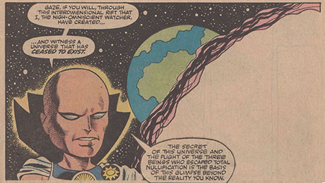
Doug: ...and its antithetical question, also True or False: Bad Writing Ruins Good Art. Have at 'em!
 |
| Exhibit A is for the art -- I'm not saying the dialogue is akin to Shakespeare |
 |
| I'm not saying this art is good, but hey -- the writing is by Bendis... |


34 comments:
True, true true, a million times true. In a predominantly visual medium, bad art ruins good writing. I tried reading this story recently, almost painful to look at:
http://www.supermegamonkey.net/chronocomic/entries/giantsize_creatures_1.shtml
Definitely true. Two examples that spring to mind are 1) Rich Buckler doing a carbon-copy of Jack Kirby in FF - as a big Kirby fan it was really irritating....and 2) Marvel's adaptation of Star Wars which I read just before seeing the movie - I liked the story but the art was horrible. I saw some of it again recently and it's still horrible.
I'll elaborate, if 'The Dark Phoenix Saga' or 'The Panther's Rage' or any of Starlin's Bronze Age cosmic epics featured art by Robbins & Colletta, they wouldn't be regarded as classics.
True. I'd like to say that I can separate art and writing, but I just know that the art influences my overall enjoyment of the comic, and that I'm sure that I've had less than enthusiastic feelings about a comic with bad art, even if I might have otherwise enjoyed the writing. And that's without really much considering the storytelling aspect of the artwork. If I can't stand the art, it's just tough for me to appreciate the writing.
I think it's true either way but moreso bad art pretty much ruins everything. And Doug I pretty much agree with your choice of whipping boys. When Robbins took over CA&F it made it really difficult enjoy. And although I haven't read much post-Bronze stuff, I don't think I care for Bendis either.
Tom
Not a big fan of Bendis, but I shudder to count the multitude of great and near-great stories drawn by the waning days of Heck, Robbins, Milgrom, Kubert, the list goes on (some early George Perez on Avengers counts too....).
Unlike Kirby, whose mid-70s art was iconic, yet scoffed by many judging him to be 'past his prime', is still beauty to behold for diehards.
C'mon guys give Bendis a break...at least he knows to team-up with a decent artist...most of the time.
Oh, and my tidbit towards the debate... Avengers; writer Roger Stern, artist Al Milgrom...followed by Stern and Big John...WHAT a difference!!
While both, yes, are generally true I do think it may be a bit more true for Thesis 1 than Thesis 2. Sort of elaborating on JA, Tom & dbutler's points-- comics are a gestalt medium, like any venture that requires a creative team rather than an individual talent, so when one element is weak, the whole project suffers as a result, it's unavoidable of course. But, since the artwork in comics also requires solid storytelling abilities apart from the writer's, it's certainly able to "save" an otherwise-bad issue, I'd say. Or at least make it palatable. An example? How about Avengers #188? "Elements of Doom"-- a passable issue at best in the midst of, I think, a Shooter/Michelinie with other writers bouncing in and out to keep things on track. Not a strong outing at all, scriptwise-- but John Byrne's art was just as lovely & engaging as always, and the issue comes across as basically satisfactory.
One big (and rare) example of good, enjoyable writing managing to stay afloat above mediocre-to-awful art was basically about the last 2/3's of QUASAR's run. Gruenwald's terrific, bright, valentine of a series was almost criminally underserved by a string of perpetually third-rate (albeit well-meaning, I'm sure) artists until the book was finally axed.
Geeze-- the Bendis-written panels you included honestly made me start feeling bad all over again. It's almost to the level of a conditioned response-!
HB
Anonymous --
I won't give Bendis a break, ever, for sucking the joy out of the Avengers. As we've well-documented through the years, the book was not always a home run. However, the advent of wall-to-wall ninjas and Luke Cage kicking Elektra in the groin was and will continue to be unforgivable. Sorry if I come on strong about that, but he's closely associated with my personal demise of Marvel.
For those of you who have been around, think back to that Brave & the Bold I reviewed featuring Batman and Flash. Of course it was written by Bob Haney but with art by Neal Adams. You might recall that it was the story where the Flash ran to the sun. Got it? Totally ridiculous story, but at the end of the day I still have Adams's pictures to look at.
So if I have my choice, I want good art. Bad art is going to keep me from even wanting to crack a book back open.
Doug
PS: This is my first comment in over a day. No dancing robots sighted on this front... yet.
I'd agree with HB, but point out that most really great comics come from writer/artists (don't forget that the "Marvel method" basically made the artist at least co-writer) or close collaboration.
The modern approach of starting with full script effectively reduces the artist to just an illustrator (made worse by an overemphasis on finished rendering) and doesn't leave room for the kind of auteurs who basically created the form. Hard to imagine anyone like Kirby at Marvel or DC today.
And yes, I am aware that makes me sound like a moaning old git. But its still true.
-sean
Oh, and meant to say --
David, I think Joe Kubert is really strong. Granted, I think he works best on certain characters and/or settings, but I really like him.
Kirby's 70s output? I think I am a victim of today's question -- when the art is sub-par and the story is oft-bordering on incoherent, that's really a tough sell for me. I respect the man deeply, but he was never the dialogue guy he thought he was.
Doug
I would say true to both suggestions. Though I would agree that perhaps art has a larger influence. I think I would prefer mediocrity in both rather than awful in either category. For instance, I put up with a lot of Marvel Two In One that were not great in either aspect, but they were not bad either. The Marv Wolfman/ Ron Wilson product was enjoyable. And I would purchase them religiously. When Byrne or Perez contributed to the art, my impression skyrocketed but I suppose in most cases the writing was not much better (I am excluding Project Pegasus from this example as in that case both were great). When Tom DeFalco took over Two In One, I was really disappointed. Ron Wilson's art is good on the issues (not great but really good) and with better dialogue and plot I suspect I would have been content.
Marvel Team Up follows a similar trend. I think for the most part those books that team up characters for single issues tend to be utilitarian in the writing, but the art can carry it. If the writing drifted toward repetitive melodrama with predictable outcomes, good art was not good enough.
Regarding Kirby, was it his art or writing that affected his image in the mid 70s? His Captain America stories were odd, and I think that just exacerbated the opinion of the art. If you looked at the art on its own (even if you don't like Kirby's style), it is well done. His Cap, Black Panther, Machine Man were hurt (in my opinion) by the plot and script. His Komandi drifted somewhat aimlessly. Maybe he needed Stan to refine it and focus the writing.
To me it is the right fit has to be there for both writing and art. I like Robbins work on Invaders and hate it elsewhere. It is like his art fit the WWII era story and meshed well with Roy Thomas. Its the same art, so it has to have been mitigated by something else.
I like Byrne everywhere, but his Alpha Flight was much weaker than his X Men or Avengers (where he did not write). On the other hand, his FF was strong. His best in my opinion was with the XMen, Iron Fist, and Team Up when he was partnered with Claremont. They may have had it with each other by the end, but maybe the push and pull leads to better output somehow. Maybe McCartney needs Lennon and vice versa.
I think Bendis was suited for Ultimate Spider Man, but horrible everywhere else.
John Romita Jr art ruins almost any story for me. I would actually prefer Robbins over any Romita Jr.
I like Perez everywhere (so far), but if he was teamed up with Bendis would the story be better?
I am not sure if I can name a writer that is consistently great and that I would gravitate to (other than Stan in the early years).
I think I just confused myself. Should have kept it short: true to both.
This is going to be a drive by so no song, hum amongst yourselves today! Kree-Skrull Saga ended with some really rushed/bad art, but it is still a classic! Is this the exception that proves the rule? Power Man and Iron Fist had a nice run but some really bad art.
I'd like to see that Robbins page inked by Dick Giordano or Bob Layton. I think they'd look quite good. Cap's dainty back toe in the third panel doesn't do it for me though.
I don't know, Garett-- I don't think there's an inker on earth that can fix that horribly-executed third panel. It's almost Escher-like in its unresolvable angles, placements, and fumbled perspective. If Cap is chained to that wall, there's no way the big guy w/ the truncheon could occupy that space-- let alone while Cap is flailing wildly away downstage of him. Cap's hand cannot be that far behind him in relation to where his foot & leg are. Nor could that left leg occupy that short distance that way between him and the wall.
GNRGGNNGHH!!!
Right at the end of the paragraph above, there, I got up from my desk to try to recreate Cap's body position, and I subsequently caught the most HORRIFIC charley-horse in my left hamstring whilst contorting myself into it!! Geeze-- don't try this at home, kids!!
HB (ow-ow-ow-ow-ow. . . )
HB you have merely just demonstrated what makes Cap so awesome!! Only he can pull off that move (and Robbins captured it perfectly).
. . . maybe if I started infusing a bit of powdered Super Soldier Serum into my Nestle's Quik. . .
HB
Doug, I agree on both your points.., Kubert to me was always 'too strong' to the point of being harsh-on-the-eyes. Almost the complete opposite end of the artistic spectrum from, say, Byrne's sketchy '80s FF (the final year or two..).
My mention of Kirby only reiterates that while his writing (or lack thereof..) seemed anachronistic by '70s standards, and perhaps his layouts being over-the-top blocky.., there's still his legion of fans who'll think it's still the best.
And more power to 'em.
To most here, there's agreement that Englehart's departure and Kirby's return as writer/artist on Cap was perhaps a bit too jarring. Certainly was for me, anyways.., but at least it was a life-saver from Robbin's more 'unpopular stylings'.
J.A, GREAT elaboration on this point.
Also agreeing with Colin on Buckler. I liked some of his earlier DC and Marvel work, but his FF was channeling a bit too much Kirby for me, especially after enjoying Buscema/Sinnott as much as I did.
I've always been kind of a "writer" guy, so I can put up with bad art as long as the writing's good. On the other hand, good art can't save bad writing for me. I'm the same way with songs...good lyrics can make me like a song, even if I don't really love the melody.
The dancing robot must have been an April Fool's day thing...too bad, it looked kind of cool!
Mike Wilson
Late to this one today, but I have an excuse that pretty much everyone here will appreciate: an assignment for one of my jobs today involved interviewing several local comic book artists in their recently-established studio. Among them were a few who often work on the US market, including Goran Sudzuka and Dalibor Talajic.
Anyway, on the topic at hand: yes, I definitely agree that a good story can be ruined by bad art, and this is crucial in a visual medium like comics, as others have noted.
And yes to the counter-question as well, i.e., good art often cannot save a poorly written story. A rather recent example of this that comes to mind is this series called FX that came out in about 2008 - the art by John Byrne (like Martinex, I like him everywhere) could not make the story anything but mediocre.
By the way, HB, don't agree with you about Avengers #188. I thought that was an entirely solid issue in a very strong run that went until the unfortunate #200.
"good art often cannot save a poorly written story."
Pretty much sums up comics in the 1990s for me.
With Frank Robbins run on Captain America and the Invaders...I just couldn't stand it. I don't know where the Miltion Caniff influence was because all the figures looked like puppets with the strings cut. The Robbins run was very painful for me in the invaders. Supposedly Frank was creating a homage to Caniff in the Invaders but I compared both comic strips and could not see the similarity. Caniff's art was cartoony but nice to look at. Robbins , for lack of a better term, just threw the characters on the page.
Ditko in his later years became very bland, however it was a long time before his work deteriorated to the point where I couldn't stand it anymore.
Rich Buckler to John Verpoorteen in regards to an assignment;
RB : “Do you want it done fast or good?”
JV : “I want it done now!”
Bad art, huh?
This is a topic that I really find hard to comment on because, for the life of me, I can't begin to define what that is! Comic book artists find themselves in a particularly tough position as they often have to design, pace and narrate while trying to maintain consistency and do it all on a deadline.
That's above and beyond having a visually pleasing style. An ascetic that changes with each new editorial regime.
Every artists have their strengths and their weaknesses: Kirby was unmatched in his ability to put concept and design on page, Gene Colan had the ability to put motion on paper, I could white-out the word balloons in a Sal Buscema book and still follow the story. Each gave up a lot to achieve this, Kirby's pencils have no sensitivity, Colan could easily, and did, outpace the story and Buscema lost all sense of spontaneity.
So can bad art ruin a good story? Yes, it can! But the problem is, how good of a story was it before it was given over to the artist? I've seen the scripts from very respected writers that are so heavy in detail and demands that I could not have even begun to render them. The fact that they were and were published in a form that accommodated the script, and at least one of them was penciled by an artist who has been found . . . wanting . . . in this blog, makes this topic a quagmire to me.
Yours in the hopes of infinite patience with my ramblings;
pfgavigan
I can remember years ago when I tried to re-read the entire run of the Invaders and I barely got halfway through when I gave up. Robbins was way past his prime when Roy Thomas put him on the Invaders. I have seen some of Robbins earlier work and it's solid. If only he could drawn Captain America in the 40's and 50's.
Other artists I can think of:
Sal Bucema, however his clean style always came through and didn't hurt the writing.
Don Heck: He was great on Iron Man
in the late 60's, but in the 70's he
really lost all his dynamic approaches to panel design. When I read how he had a lot of health problems and family tragedy, I could understand what was happening to the man. Back before Marvel became a corporation, Stan would employ artists that were sometimes down and out..but he put them on fill-in stories and second tier books.
I may indeed be judging too harshly, edo. That was my take on that particular issue the last time I read it several years ago--- but things like that can be influenced by mood, fatigue, and lots o' peripheral intangibles. . . so I'll go back to giving it the benefit of the doubt, eh?
So-- I wonder, can anyone think of another example? Where bad writing ruins good art?
Aaaaaaand what in the world am I saying??? I flippin' OWN that 2nd New Avengers arc (a confusing miasma of tale that takes place largely in the Savage Land), and the art in general for that title was often pretty good for the first year and more--- but geeze, by the middle of that arc I found myself throwing the book down in disgust after finishing it every month. Truly and literally. And it wasn't because the art was awful.
(Sorry there, anonymous-- just can't keep it bottled up, I'm afraid. . . !)
Touching on a point brought up earlier-- it's been a reeeeeally long time since I've read the original OMAC run, but I think maybe that book (and KAMANDI to some extent) could indeed be held up as examples of the art (albeit highly stylized) and the broader concept successfully overcoming some serious deficiencies in the scripted page itself.
OMAC had moments of flat-out stupidity (all of the world's oceans compressed into a single, massively-dense little cube? That OMAC LIFTS??!?)-- and yet, the book had such an idiosyncratic look and "feel" to the art, that you just kind of let things like that go by. Kamandi maybe moreso, because, as we've talked about before, the characterization and writing really struggled to rise to the level of being even TWO-dimensional (thus achieving the status of a flat plane--), and yet I still looked forward to that book month after month for a good three years.
HB
Pfgavigan makes some good points. Which comes first the chicken (writing) or the egg (art) in the complex construction of a comic? And how much of the appreciation is pure subjective assessment of the style rather than a critique of the storytelling? If it is pure storytelling, then Sal Buscema would be at the top. In the creation process there would need to be almost a symbiotic relationship. Am I drawing the intention, or do you have to retrofit text to the action?
My own dissatisfaction with John Romita Jr.'s work is that to my eye his characters' faces and expressions look the same. I perceive stiffness and sameness and scratchiness when I would like fluidity and neater line work. Other people love his work and he is popular. I don't think he is a bad storyteller. I just don't like the "look". I prefer Buscema's Thor to his. I prefer Byrne's Spider-Man to his. But I also prefer Colan's Daredevil to Miller's.
It would be interesting to see multiple artists draw the same script to compare the outcome.
Martinex --
Not sure if you've ever seen this, but we did do a side-by-side comparison of Barry Smith's and John Buscema's versions of The Tower of the Elephant, both written by Roy Thomas. Check it out --
Doug
Doug, I had not seen that post until now. Thanks for pointing it out. Fascinating. I've always favored John Buscema on Conan but being able to compare side by side with Smith is cool. Thanks.
Hmm - OK I'm with Doug, bad art does ruin good writing although in my opinion the opposite is not always true, i.e. bad writing ruins good art. As my ol' buddy JA Morris pointed out, comics being a primarily visual medium the art is always going to be the main factor on how good a comic is going to be rated.
I can't think of a good example at the moment but like Doug said there are comics which have a totally crappy storyline yet which also boast of good art. These I can tolerate; we can say 'well the plot's rubbish but hey it looks so darn good!'. Bad art on the other hand can take a well written comicbook down several notches. Even if the plot is compelling, the bad art is a turnoff to me. I'd rather read a novel and form the mental pictures in my mind.
- Mike 'bad artist and bad writer' from Trinidad & Tobago.
Every story Alex Toth ever illo'd had at least a mediocre, if not a downright BAD script. Art trumps all, although I have read hundreds of comics with bad art or story or both, happily. Comics lifer.
Very few superhero comics have ever fired on both levels, let alone all the time. Most reach entertaining, some are charming, some beautiful, some even profound, but rarely consistently for more than an issue are they "great".
I can read the comics of my youth with a nostalgic filter, and it's fun, and most days that is enough. Great writers in comics who I would read in any circumstances I can name maybe a dozen. Great artists who are at least worth looking at for a panel or two are too numerous to mention. Hundreds.
(no robot but I have seen a few this week)
This is a tough one; I mean, I stuck with Invaders quite awhile despite absolutely hating the art, because I so wanted to read about superheroes in WWII. But eventually the art did kill it for me.
But would I pick up a book full of pretty pictures and a terrible story? I can't see that happening. I have to have something there to catch my imagination.
I guess in the end I am more story-driven; if I like the story, I'll put up with mediocre art.
It depends.
I used to be more forgiving of art as a kid. . . I find that a lot harder these days.
I think good art definitely can't make up for bad writing. . .
As I'm reading the Mister Miracle collection at the moment I agree his art was still great but his writing almost kills it
Bendis wouldn't be able to fit his dialogue in Perez's tiny panels (assuming he still does that)
Post a Comment