
This post was originally published on July 7, 2009
Doug: Almost from the very beginning of the Marvel Age, Marvel Comics began to reprint their Golden and Silver Age material for the benefit of not only a buck, but hopefully with an altruistic eye toward filling in the newer enthusiast. For books like Marvel Tales and Marvel Collector's Item Classics, covers were done with several panes, each showcasing a character or story within. However, as the Marvel line began to expand in the late 1960's, new titles were created for the purpose of keeping material from the seminal days of the Fantastic Four, the Avengers, et al. on the stands. Hence, we saw the rise of titles such as Marvel's Greatest Comics and Marvel Triple Action, respectively.
Doug: Below are some examples of covers that were used on the original titles and on the reprint mags. You'll notice that in some cases the following scenarios were applied (NOTE -- unless otherwise stated, all cover images are from http://www.coverbrowser.com/, and all creator information was obtained from the Grand Comic Book Database, available at http://www.comics.org/) --
- the cover was reproduced faithfully in form and color
- the cover was reproduced in form but not in color
- the cover was redrawn
- the cover was completely different, but somewhat faithful to the topic within
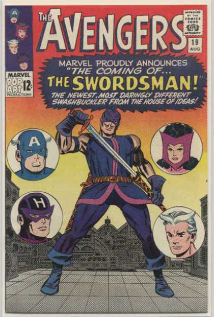
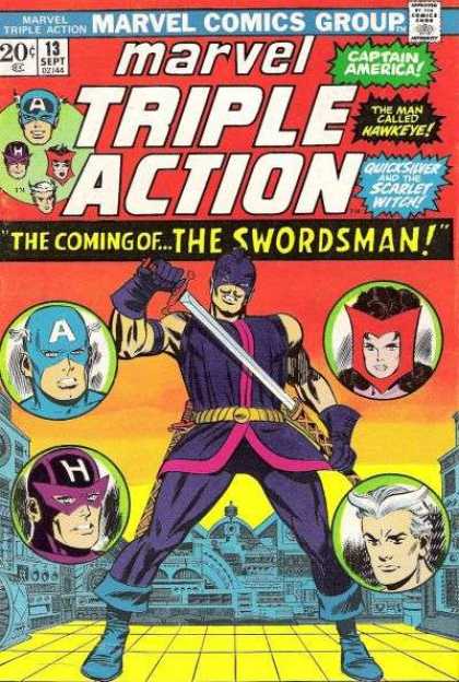
Doug: The covers above hold a special place in my heart, particularly the Marvel Triple Action on the right. This was the first issue of the Avengers I ever owned -- it was given to me by a girl whose family was friends with our family. I can almost recall the day she gave it to me; prior to that, I believe I had a copy of a JLA/JSA crossover and a couple of funny animal comics (Mickey Mouse or the Looney Tunes, maybe?).
Doug: As you can see, these covers are basically the same with a few very minor exceptions: the coloring of the floor, color has been added to the floating heads circles, the Cap head in the corner box is larger and a different rendering, there has been a removal of some text from the call-out, and the lowering of the artwork to make room for the larger masthead. In this case, it's my opinion that each of these changes actually improves the look of the cover -- score one for the revamp-guys!
Karen: The reprint does look sharper, but is some of that due to aging on the part of the older comic? In any case, very minimal adjustments were made to that cover.
Karen: The reprint does look sharper, but is some of that due to aging on the part of the older comic? In any case, very minimal adjustments were made to that cover.
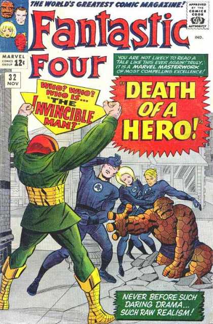
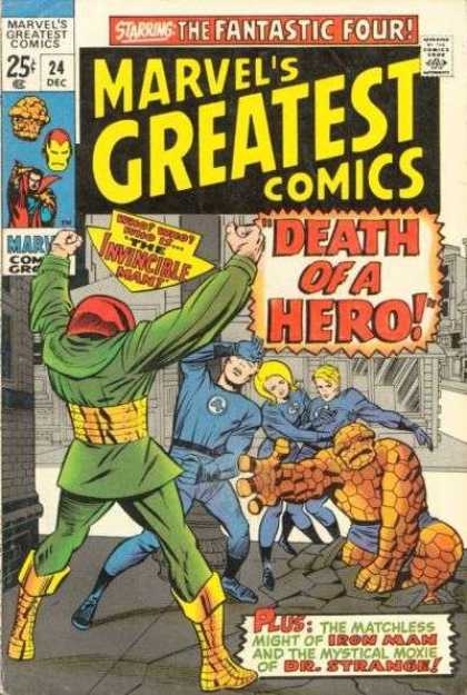
Doug: Similarly, the two covers above show only a difference in coloring (with slight size alterations to the call-out graphics), which for me is better on the updated version. Keep in mind, however, that the royal blue uniforms are what the FF was currently wearing when this issue of Marvel's Greatest Comics hit the newsstands.
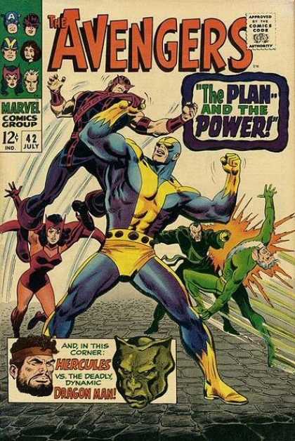
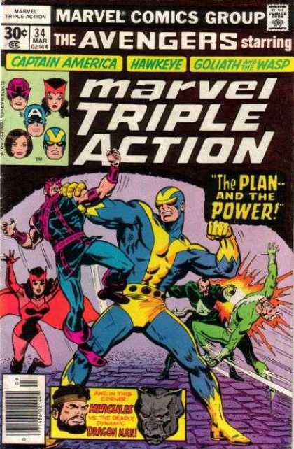
Doug: I've always had a slight problem with the John Buscema/George Roussos cover from Avengers #42. Certainly it's not the art -- that is splendid, indeed. It's more the white cover. I know my copy, which isn't in the greatest shape, is yellowed pretty badly. Let's face it, the publishers never intended that the materials would hold up over a 40-year period of love. But overall, Avengers #42 sports one of the many spectacular efforts Big John dispensed throughout his Silver Age tenure on the title. The reprint, however, has some problems.
Doug: We can start with the color scheme. I'd take dingy-white over this black/lavender/purple trainwreck any day. Beyond the color choices, the incredibly large masthead near-necessitated that Buscema's pencils be altered; had the book been allowed to maintain the original artwork, it would either have had to have been shrunken or permitted to obscure the title. It's been documented (specifically in regard to a Neal Adams draft effort of X-Men #56) that Marvel wanted no monkeying around with the titles/logos to their books -- Martin Goodman felt that the book wouldn't sell if people couldn't read the title. So I'm guessing that the only viable option was to redo the Goliath figure. The cover art on the right is a combination of the Buscema/Roussos pencils from Avengers #42, with touch-ups by Ron Wilson (http://www.samcci.com/). It looks to me like the Hawkeye figure was repeated, although tilted to the right with the left leg and chest redone. Whether due to space or style, Wilson drew Goliath's head larger in proportion to the rest of his body than Buscema had -- the result is a much less menacing Hank Pym, in my opinion. Wanda's cape has also been elongated. I'll take the original effort on these two.
Karen: What's amazing to me is how much space the title takes up on the Marvel Triple Action book. That's easily a third of the cover! No wonder the art has a squished look to it. Hands down, the original is superior!
Doug: Here we have an example of a cover that is near-duplicated from original to reprint version. However, upon closer inspection there is one obvious difference and a few more-subtle changes. Randy Robertson gets the shaft for the UPC code in the corner, and for some inexplicable reason the call-out in the lower right corner is re-formatted. Now, if you look closely you'll notice that all three women on the cover are shown with some type of garment (Was this Code? None of the men are shown with collars, etc.) and the colors on each of them have been changed. Why? No clue, as the color scheme of each cover is virtually the same palette. About the only other difference, and it's even more subtle, is the shrinking of the artwork to accommodate the larger logo as well as the "Marvel's TV Sensation!" call-out.
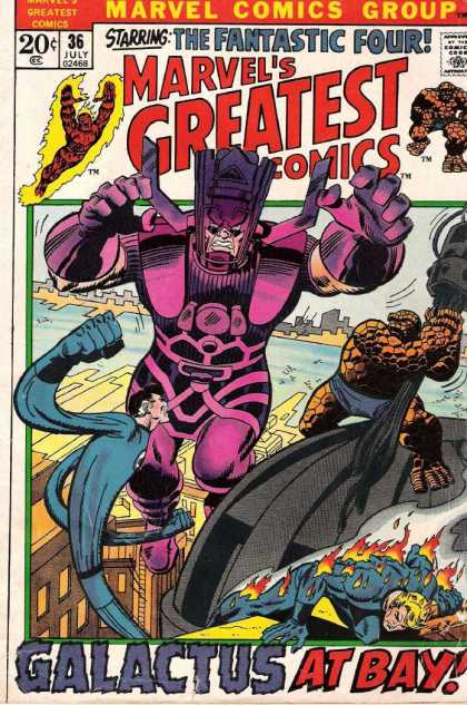
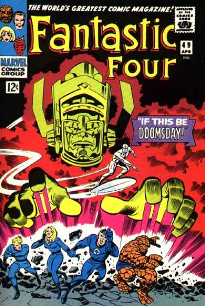
Doug: In the above duo, the left side depicts the iconic image of Galactus (FF #49 is the first cover appearance for both Galactus and the Silver Surfer) by Jack Kirby and Joe Sinnott. On the right is the cover to the reprint of the same story -- this time around the cover is pencilled and inked by Our Pal Sal Buscema. I'm a Sal-fan, but at first glance I really couldn't understand why editorial chose to go away from what many Marvelites might consider to be one of the finest covers of the Silver Age. However, upon doing a little research I think I came to a pretty fundamental answer -- simple cross-marketing among titles. Take a look at the cover to Fantastic Four #122, which is cover dated May 1972; Marvel's Greatest Comics #36 is cover dated July 1972:
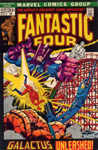
Doug: The cover above is by John Buscema and John Romita. The proximity of Galactus to the FF, the frame around the cover art (typical of the 20-cent period in Marvel history), and the general style of the pencils show that Marvel intentionally used Sal's artwork to piggy-back on John's 4-part epic from only a few months earlier. Again, while Kirby/Sinnott had unleashed a classic cover back in 1966, the follow-up effort certainly had its motivations from a dollars standpoint.
Karen: I think this is a good guess on your part Doug. I distinctly remember reading both of these titles when they came out, and it took me some time to understand that one was current and the other was "historical" - or at least that was the way I thought of it as a youngster.
Karen: I think this is a good guess on your part Doug. I distinctly remember reading both of these titles when they came out, and it took me some time to understand that one was current and the other was "historical" - or at least that was the way I thought of it as a youngster.
Doug: Here is another example of a reprint where the cover art used was strictly due to the "hotness" of the artist. On the left is the original Marvel Team-Up Annual (1976) with cover art by the original artist of the All-New, All-Different X-Men, Dave Cockrum. However, by the time the Marvel Tales on the right was published, Todd McFarlane was breaking all kinds of sales records with his rendition of Spidey. No wonder, then, that he also got the gig doing covers for Marvel Tales in addition to his work on Amazing Spider-Man in this era. Nevermind that there is absolutely no connection with the more recent cover to the story within. Hmmm... trend developing?

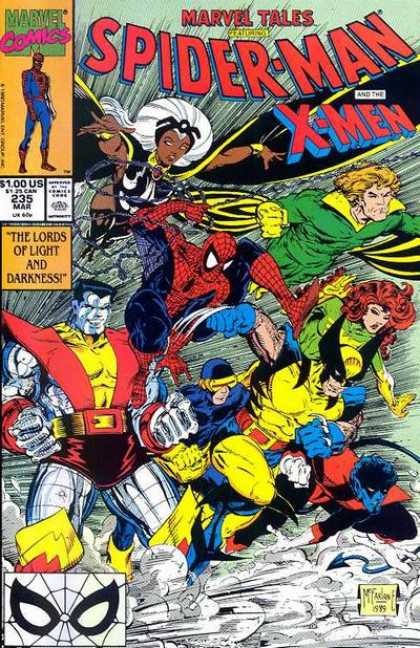
Karen: The Cockrum cover is vastly superior in my opinion. It has a nice clean layout which gives you an idea of what's in the book. As you point out, MacFarlane's cover is simply a pin-up of the characters. I don't know exactly when this trend started but I wish it would go away! The cover should give an idea of the story in the book - something to draw the reader in. X-Men and Spider-Man fighting a giant robot: OK, I'll check it out. X-Men and Spider-Man running: not really all that intriguing.
Doug: So what's the overall evaluation of reprint covers in general? I guess out of sentimentality I'll have to side with the originals. Despite the improved technology that allowed for a richer color palette on the reprints, and in spite of more modern marketing strategies that placed then-hot or -current artists reinterpreting the covers, those new covers sort of disconnected with the original stories. I think for long-time fans, there's that relationship between cover and story that perhaps today's younger readers don't understand. With so many "portrait" covers, a good ol' fashioned cover that makes the reader have that "can't wait!" feeling. Even on a Marvel Triple Action or a Marvel Tales, knowing that what was within was as good as what was on the outside was just a great sense of anticipation.


19 comments:
What a great topic! I'ts interesting to see how, when, and why Marvel changed covers for reprints. I agree that in the cases of the total re-draws, the original was much better.
Agree with dbutler16, this is a great subject for a post, and one you wouldn't see a lot of other places (or maybe you would; perhaps I don't surf the Net enough). Like you, I got a lot of my early Marvel masterworks through such reprints, and swear by them to this day. I was always pleasantly surprised by how many of them did retain essentially the same artwork, which of course is preferable in my mind. Bravo!
More! More!
First, I have to mention (or rather reiterate) my fondness for Marvel's various reprint titles of the '70s/early '80s, esp. Marvel Tales and Marvel Triple (later Super) Action. I caught up on so much of Marvel 'history' that way.
As a general comment, I have to say I agree with your complaint about the logos on the reprint titles being a bit too big.
As for the covers you posted here, the only one I recall having is Marvel Tales #98 which, as you noted, is not much different from the original, and has the same impact. Generally I'm with you on preferring the original covers, but to be quite honest, I like the cover to Marvel Tripe Action a little better then the original (I find it a bit more eye-catching) and I also like Sal's completely different image for that Fantastic Four story.
Another reprint series I liked while it lasted was the re-launched Amazing Adventures that reprinted the earliest X-men stories. The main story was usually split into two issues (with some back-up features from later issues of X-men to fill in the extra space), so the concluding issues always had new covers. My favorites were these two by John Byrne.
This a great topic. Reprints, specially modern ones with color "enhancements" more often than not ruin the art. In my opinion the medium is the message, and the coloring techniques suit better the art, paper, printing methods of the specific time period than a new improved technique, that might be better but not necessarily gets along with the old art and style. I know it is not exactly what we are talking about, but it's sort in the line.
Outside of the super-hero genre, Tintin has amazing reprints that are a bit more expensive but they are facsimile and try to respect the original art as faithfully as possible. In France there is a collection of Carl Barks work that has been re-colored and used blends instead of plain colors. It's horrible.
There's really not much talk about the graphic design/printing aspect of comics and in my opinion it's a huge factor.
I always liked the early Bronze MGC comic covers redone by Steranko or Sal Buscema, such as MGC 38 and 39.
https://s-media-cache-ak0.pinimg.com/236x/3e/7f/df/3e7fdfbe5766a51ccff42edb61721473.jpg
Just great venues for serving up reprint stories, adding a lot of pizazz (no pun intended) to the mix. I liked them far more than simply mimicking the old cover, although I have no beef with reshowing some of the classic old FF covers.
I do like when colors are brightened/updated like on the Avengers 19 reprint.
How in the world did this topic not get more response in its initial incarnation??
Well-researched, nicely presented, and solid commentary-- it's a forgotten gem!
I guess all of the cut & pasting, jiggering, sizing, and recoloring that happened in the re-print process (not to mention the horrific editing that sometimes occurred inside the books to trim them to 17 or 18 page stories!) just goes to show the mindset that these books were a "product" first, and that their artistic legitimacy was, frankly, not really in the discussion, y'know?
The coloring changes to my eye do generally offer a little bit of improvement. And honestly, I like both of the Goliath covers. NEVER liked how much space the stupid Marvel Triple Action logo took up, though! It made me tired to look at it-- and it's not like it was a compelling, character-associated trademark logo, right? My response to it was ALWAYS, "why Triple-Action?? What does that even MEAN? What does that have to do with the Avengers??"
Hey, if you do a quick image-search for Avengers #65, you'll come across the original red-background cover that we're all familiar with (Gene Colan). A darned good cover. But there's also a version that. . . doesn't seem to be a reprint, but has an entirely different, purple/blue palette that I find to be even more striking than the original. Anyone remember where that alternate version came from? Anyone?
HB
HB - thanks for your incredulity!
It's tough to say, because over the past few years we've moved some of our earliest posts forward as "BAB Classics", but I believe today's post was among our first 7 or 8 offerings. We just didn't have much of an audience back then.
Glad we do now!
Doug
I like all the originals better except for the first one.
The X-Men are sure kickin' up a lot of dust on the McFarlane cover! It's like a cartoon stampede. The Cockrum cover is nice, but the coloring is odd-- yellow UPC code, and that green/yellow/white fade in the background. This one could be colored better.
Y'know, that McFarlane cover becomes worse upon even slightly closer scrutiny. I'm no artist, but even I can tell that the composition makes no sense at all-- exactly the kind of carelessness that my college design prof would have merciless ridiculed Mr. McF for. . . at length (and in front of the class, I'd wager-!).
Every figure has pretty much their own forced perspective that is inconsistent with the figures around them. This is particularly evident with the relative positions of Spidey and Colossus and their individual body parts. Who is in front, exactly?
Colossus in NOT RUNNING, so how could Spidey (and others) be directly in front of him whilst in mid-swing/stride? Impossible-- and that's truly a high-school level of mistake. Could Wolverine have gotten around him from that position, as well?
The faces are almost uniformly askew in their perspective. Again, McF didn't have a good hold on how to draw a 3/4 view of a head-- and it shows badly. Not unlike the problem that Infantino had, in fact. Or Alex Saviuk in the Spiderman comic strip.
Oh, I just hate it (and I liked McFarlane when he was on top of his game)-- it's all, "Look how kewl I can draw!", w/out in fact having a grasp of some very basic fundamentals of truly being a good overall artist. Ugh.
Hey, the whole Poster Cover trend? Oddly enough, there was a pretty early experiment with it 'waaaaay back when the Defenders (The New Defenders) run was winding down. We had several months where it was just sort of "artistic", painted group poses (or similar). But I've never understood the reasoning behind going that route in the last 10 to 15 years-- can it possibly have been shown to improve sales? Or perhaps it was easier/cheaper because there was so little editorial effort then involved in producing the covers? That would make sense, actually. No back & forth-- just an appropriate image to identify what book it was-- sort of like Oprah's "O" magazine. . .
HB
I prefer the original covers, generally, but I liked some reprints having new covers. Art Adams and Mike Mignola Classic X-Men covers were often good. Often, however, the new coves weren't by Kirby, Ditko, Colan, Buscema, etc., and the McFarlanes of each era couldn't hold a candle to them.
I also liked the new covers provided by the original artists for Deluxe reprints of the early '80s. The originals could be better, but getting new Kirby New Gods covers or Berni Wrightson Swamp Thing covers was cool.
- Mike Loughlin
Great topic indeed. HB, well noted regarding the design fundamentals of that McFarlane cover. Just who is in front? It's like M.C.Escher tried a superhero cover...
Used to hate the cut-length stories in some of those reprints. Did love some of the cover variations, though. Particularly the great new Romita cover on the Marvel Tales reprint of ASM 61, and the sharp new coloring on the Mysterio cover from ASM 66.
I generally prefer originals to redone covers, but sometimes the new covers are good too. Mike Loughlin mentioned the Classic X-Men covers by A. Adams, M. Mignola, and Steve Lightle...great stuff.
I used to have Marvel Tales #98...I think I have an old photo of me holding it up (along with Dr. Strange #32). I still have Marvel Tales #235; McFarlane was doing all the MT covers at the time and none of them beat the originals as far as I'm concerned. Check out McFarlane's covers for Marvel Tales #228 and Marvel Tales #229.
Now look at the original covers from Spectacular Spider-Man #17 (by John Byrne) and Spectacular Spider-Man #18 (by Gil Kane); I think the originals were much better, and that seemed to be par for the course with those McFarlane covers.
Mike Wilson
I generally prefer the original covers too. But yeah, Arthur Adams' covers on Classic X-men were great, better than the then-new retconned back-up stories.
Back-up stories/scenes-between-scenes. . . yeah, I remember those too, J.A. I bought
Classic X-Men for a ridiculously long time, and then I think I dropped it at right about the point where I'd stopped buying ANAD X-Men. . . which was just confoundingly stupid, y'know?
But beyond the obvious cash-grab while riding the X-Men uber-success wave, it's hard to understand how the editors couldn't grasp the obvious folly of putting lesser artists' work (John Bolton, was it? I mean, he's certainly fine, mind you) side-by-side WITHIN THE SAME STORY as some of the finest visuals to have graced comics pages up to that point. "Get in there, Slugger! You've got the stuff!" It's just unfair.
And I can say that I don't remember one single facet of those in-between additions, y'know?
HB
While most of the in-between scenes in Classic X-Men were filler, there was some good stuff in some of them. Sabretooth stalking Wolverine on his birthday was genuinely creepy. The two Magneto origin stories were heartbreaking. Wolverine daring Nightcrawler to walk down the street without an image-inducer was fun. I also liked the stories of Scott Summers in an orphanage run by Mr. Sinister, although they weren't anything special.
John Bolton's art on the in-between stuff was, as HB put it, fine. He went on to be a good painter, though, who did a lot of work for Vertigo in the '90s. I particularly like his art on Books of Magic 1.
- Mike Loughlin
Absolutely love this topic. I am fascinated by the subtle changes on some reprints. I remember looking at a reprint and there were just very small changes to the position of the character's hands and I always wondered why. I also liked how the Sub Mariner reprints in the 1979 Tales to Astonish gave the mirror image on issues 1 and 9 vs the original; and how they changed the photo part of the background of the 7th issue.
I also like to see some of the UK covers that fill the gaps as they serialize the stories.
HB I have no idea where that Avengers 65 variant comes from. Cannot find anything on the purple version to place it.
I have to say I did not like when they put reprints within an ongoing series and recovered it so you didn't immediately know it was a reprint (i.e. Captain America 216). I bought some of those and probably should have spent my quarters more wisely. Doh!
Maybe there is a dollar challenge theme brewing. Thanks Karen and Doug for reprinting this reprint blog.
Fun topic! Would love to see more examples, too! I have to admit, for the most part I prefer the originals (even the coloring), excepting the Marvel's Greatest #24 with Invincible Man where I think the revised colors work better. But definitely just a personal preference on all that.
And while I wouldn't dare say the Sal MGC Galactus cover was *superior* to FF#49, I will say I absolutely love the Sal cover in its own right. The storyline you point to as cross-marketing was also one of my all-time favorite FF storylines from my childhood -- from the appearance of Gabriel right down to the end.
Thanks for another great post.
As another one who grew up during the 70s, those reprint issues (next-door neighbor had stacks of them - all in order - and was away at camp) were one summer's way of understanding the development of the characters from their beginnings; especially loved those Marvel Tales. This site is such a feel-good place every day. Thanks to all of you.
Post a Comment