Doug: An apology to those readers expecting to find the conclusion to our reviews of Frank Miller's Dark Knight graphic novel. As today approached Karen and I knew that we didn't have the review in the condition we desired. This has been a special series of conversations, and we hope you'll indulge our need to take a few extra days to "get it right". The review that follows was actually in the queue for next week, so we are just trading places with TDKR #4. Thanks, and enjoy!
Silver Surfer: Judgment Day (October 1988)(cover by Joe Jusko)
Stan Lee -John Buscema (plot by Buscema and Tom DeFalco)
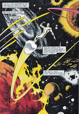
Doug: Do you have this one? This is from the era when hardcover graphic novels seemed to become "a thing". Of course, this would also have been during the era when I was a sucker for any new presentation innovation that came my way -- not only hardcovers with dust jackets, but perfect binding, acetate covers, variant covers, etc. Yes, the 1990's were only a short time away! Besides the classic creative team, this book also boasts an unusuality (made that word up just now) in that it is told entirely in splash pages. If I recall, the fact that I was going to see John Buscema art at a larger size (8.5"x11.5") trumped the fact that despite it's 68 pages, I'd only be getting 68 Buscema panels.
Doug: I'm going to break today's review into some components. First, I'll start you off with a 100-Word Review in case you've not read this prior -- it's always important to know what the heck is going on, right? And then I think I'll just fall back to a common format I've used in the past, revealing my thoughts on The Good, The Bad, and The Ugly of the book. So shall we begin?
The Surfer evades the clutches of Mephisto by denying himself three women seductively posed at a gateway, promising him anything he desires. He later meets up with and has a fun romp through space with Nova, the herald of Galactus. She also faces the same temptation of Mephisto, falling for it. Tricked into “loving” Galactus, Nova will do anything to please him. As she leads him to life-sustaining worlds, the Surfer knows something is awry. The story culminates in a battle royal in the depths of the Realm of Flame and Darkness as Galactus comes to reclaim his lost herald.
The Good: It would be a coin flip, with a coin that has many sides to try to decide what I liked best about this story -- Stan Lee with the character he fancied his own and writing him as such, the pulse-pounding pencils of Big John Buscema, the presence of Galactus, or the messianic Norrin Radd tempted in the wilderness of Mephisto. All of these things conspire to make a really fun story. Stan wrote a preface, and in it he remarked, "To say that this volume is a "first of its kind" is to not fully do it justice. It is truly a watershed moment in the history of publishing. Visually, stylistically, dramatically and artistically, John Buscema and Marvel Comics have made a totally unique contribution to the illustrated epic genre." You would have been disappointed if Stan had not employed a little bombasticism, wouldn't you?
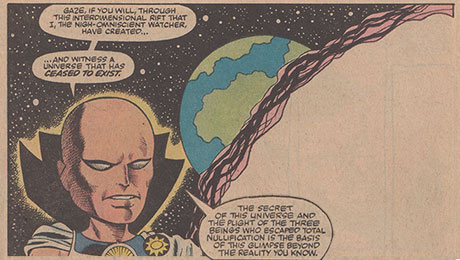
Buscema's art is a wonder. Of course every page is packed with energy, every figure rendered by a master of anatomy. The grotesque characters are just that, yet the peaceful denizens of a doomed planet are cute little humanoids, ugly in a different way. Mephisto is a villain deserving of a treatment similar to Victor von Doom; he gets that in every appearance under Buscema's pencil. At times I've thought that Jack Kirby's fascination with the gods has been balanced with the ghoulishness (oozing with bad intentions) of Buscema's demonic characters. And we get what we pay for when we read a JB Surfer comic -- Norrin Radd is lithe and noble, Galactus is imperious and densely built, and Mephisto is delightfully devilish. Oh, and did I mention that the women are voluptuous?
However, and maybe this is where I segue to the next section of my thoughts, I am not always the biggest advocate of JB inking himself. I am placing this paragraph in the "good" category basically because a happy John Buscema (and he was when he did the full art chores) should make us all happy. But I got a little Vinnie Colletta vibe from some of the art now and again -- not that Vinnie's all bad. The man has a reputation, but I think we've all enjoyed his work many times over (OK, maybe not when erasing Kirby Thor pages). Buscema's brushwork just seems a little feathery or sketchy in some panels. His faces and figures don't really lose any majesty... but it's just not as polished as I'd like it. Some of us have said Joe Sinnott could bury a guy. But the finished product always looked slick, right?
The Bad: As big a fan as I am of Buscema's art in just about any genre, I've always found a quibble here and there with his faces. It's almost like he sometimes forgets what emotion should be conveyed and instead a character will be left with a facial expression akin to "Uhhhhhhhhhh..." Galactus seems this way a time or two, as do the Surfer and Nova. It's not a huge deal, and I wouldn't say it detracts from the overall enjoyment of the story. But it's noticeable. I've provided several examples of the Big G in various fits of boredom and rage. Please judge for yourself -- maybe I'm off base.
There was a mention of Shalla Bal, and of course the Surfer pined for her. We get it, dude. Even in 1988, it had been 20 years. C'mon, bro...
I found the plot point of Nova being manipulated by the Prince of Darkness to the reality that she would bring Galactus to worlds with sentient life an uncomfortable element of the read. Much as I was drawn into the horror of such a reality with Galactus's unceasing hunger, I must say that perhaps this belongs in the section above. Lee and Buscema wanted to raise the stakes and invest the reader in the story by playing on the sensibilities of a civilized morality; they achieved that.
The Ugly: Mephisto and his demons. That's about it! There wasn't anything about this story, the design of the book, the price point (a steal even back in 1988 at $14.95) -- nothing -- that would fall into this category. Count me a satisfied customer. BONUS -- Below is the cover to the paperback edition of this graphic novel. Which cover (both by Joe Jusko) do you like more?


7 comments:
Great choice for a book and nice review, Doug!
I actually read this, sometime in, I think, 1990 or 1991, leaning against the shelf in a bookstore (Barnes & Noble I'm pretty sure). I tended to do that quite a bit back then, and yes, I know there are some (like John Byrne) who consider this stealing...
I don't remember much about the details of the story, I just recall being spellbound by those beautiful splash pages of Big John's art. This is indeed a handsome book. Both covers are quite nice, too, but I think I like the paperback one a little better.
A watershed in the history of publishing...? Stan Lee's idea that dialogue like "the grander the gift, the greater the price to be paid" was profound, and the Surfer marked some kind of literary breakthrough was always baffling; ridiculous hype, even by Marvel standards.
This would have worked much better without the word balloons. as a purely visual work. Buscema's art is fantastic; normally I like his inks - he had a kind of minimal approach creating plenty of movement that suits regular superhero comics, and its a shame we didn't get to see it more often; but here, something else seems called for. I'm thinking of that Surfer short from the first issue of Epic, where Rudy Nebres on inks and Rick Veitch colour looked amazing (terrible writing, of course)
Somewhat surprisingly, I haven't even mentioned the Surfer's creator...
-sean
A side note: Paul Ryan, Marvel artist on Squadron Supreme, Fantastic Four, and Amazing Spider-Man (including ASM Annual #21), passed away over the weekend at the age of 66. While not generally a creator whose name comes up on this blog, it's always a bit disheartening to hear of the passing of a pro whose work you read, and of course at a young age.
Doug
Oh, man. Sad news, Doug.
I've never even heard of this, but I'm sorry I missed out on it!
Very sad to hear about Paul Ryan. A talented penciller, and an excellent storyteller.
RIP Paul Ryan.
Well, nice review Doug! Yeah, when you have Stan writing one of his favourite characters and Big John on the art chores you just know this comic is gonna be good! 68 panels of Big John equals 200 panels of some other artists in my book!
As for Buscema's 'feathery' inking of himself here, I'd probably chalk it up to the dreaded deadline doomsday - I'm sure the art would have been more polished given more time, or even the contrast of a different inker. I recall a similar case in Thor #382, the end of Walt Simonson's legendary run on Thor. Here, Our Pal Sal Buscema did the artwork, and while I generally love his artwork, to me in this issue the artwork looked too rushed and sketchy, not something one usually sees in Sal's art. Walt of course acknowledged Sal coming in to help him but while I loved the story the art to me did not come up to Sal's usually high standard.
- Mike 'art critic' from Trinidad & Tobago.
Post a Comment