

Martinex1: Captain America's costume has not changed much over the years that he has worn it. Sure there were some more noticeable fashion updates in the past decade, but for the most part our star-spangled Steve Rogers has been known for his red, white, and blue, for his stars and stripes, for his winged head and his pirate boots, for his chain mail and his shield.
It is interesting to see how different great artists depicted the American hero. So this $1 Challenge has a simple premise; here are 14 covers with Cap in charge, but all handled by different artists. Pick your favorites and discuss why that is. There were so many great covers to choose from, so if you have a favorite you'd like to share, be my guest.
These are all in the Quarter Bin, so get a bang for your buck... four comics, four colors, four quarters...what can be better?
Captain America #109; Jack Kirby.
Captain America #110; Jim Steranko.
Captain America #132; Marie Severin.
Captain America #140; John Romita.
Captain America #183; Gil Kane
Captain America #222; Ernie Chan
Captain America #225; Frank Robbins
Captain America #230; Ron Wilson
Captain America #241; Frank Miller
Captain America #254; John Byrne
Captain America #260; Allen Milgrom
Captain America #263; Mike Zeck
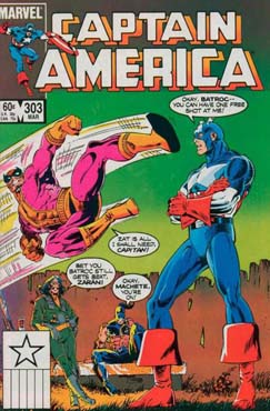
Captain America #303; Paul Neary
Avengers #340; Ron Lim (Okay this is a great Wasp cover too, but it is one of my favorite Cap covers of all time).


26 comments:
If I can pick 4 I'll take:
1.The Zeck cover for 263 because I like it, the story inside is ridiculous but fun and it's the only cover here that I bought off the spinner rack.
2.Byrne, because I remember a classmate in 3rd grade bringing that issue to school.
3.Kirby, because I've always been a fan of covers that feature characters busting through the cover.
4.Chan's cover for 222. Because even by the standards of the Bronze Age, it's ridiculous, but it's a cover that is guaranteed to get your attention.
Nice selection of covers. Interesting also that I six of these (if you count #110, which I had in a reprint book).
Anyway, my picks, based just on how good they look, are:
#110 - Steranko, baby
#241 - Miller during his heyday as, among other things, a cover artist
#254 - one of my favorite covers in my favorite run of Cap issues
#260 - outstanding work by Mr. Milgrom!
Cap #263 was narrowly edged out of my choices; Zeck otherwise drew some wonderful Cap covers - your whole post could have been dedicated to just those. My personal favorite is this rather Batmanesque one from #284.
Very good selection of covers today, Martinex1! Ol' Cap has enjoyed quite an array of comics' top illustrators depicting his covers. And again, a generous 25 cents apiece ( boy, wish I could find the dealer with this quarter box). Think I'll grab:
Issues 110 and 112 ( Kirby and Steranko; how could you not?). Two classic covers, one issue gives you Cap's origin and the other gives you the Hulk. Can't beat that. And that Steranko cover just gives you chills, rarely seen the Hulk appear so ominous...
Issue 254 (Byrne, a favorite all around. Love the green color scheme on this unusual cover.
Issue 260 (Milgrom). Since I already have issue 241 (Frank Miller and the Punisher; yes Doug, the cover made me buy this comic), I will go with this one. Al Milgrom doesn't get as much positive publicity as some others, so I'll give him cred for this gem. Very striking cover, the design element of the bars and their shadows is quite dramatic and effective.
Thanks for the cover gallery today, Martinex!
1) Byrne. Arguably the best Cap artist of them all. My first issue of Cap was during his short run and it made an indelible impression. So dynamic and fluid.
2) Zeck. He really has a knack for drawing Cap. His physique is a bit exaggerated - giant shoulders and a massive jaw - but there's just something so appealing about Zeck's take. He remains one of my favorite Cap artists.
3) Steranko. I love how lean his Cap is. In Steranko's hands he comes across as agile and lightning quick. Just a masterful artist. How lucky we were he tried his hand at Cap. A depiction for the ages.
4) Kirby. Because his Cap was always exploding into action, coming right at you, tearing through a teeming pile of henchman, an unstoppable force. Long live the King.
I've always had issues with scale on the Steranko cover (which goes back to our conversation on the Thing from a few days ago). Rick Jones is drawn as if he got a dose of Pym Particles (and I looked at the ground to see if I'd just missed something with perspective; but the lines on the floor tell me 'no'), and could this be the first appearance of the 10-foot Hulk?
Design and emotion -- excellent. I've just never cared for the execution.
Kane for sure. Back in the days when they were all still under instructions to be as Kirby-esque / house style as possible, Kane found a way to make that his own. Kirby’s endomorphs became ectomorphs under Kane’s pencil, and I think it started with Cap’s title, but some of my favourite Cap/Kane panels are actually the Cap phantom in Captain Marvel 17.
Steranko. Not even going to bother.
Byrne – I loved that little Stern /Byrne run. I loved the way he drew Cap’s costume. Byrne was always one for the broad strokes, but I loved the attention to detail in his Cap, esp. the little fish scales.
Gonna have to cheat for #4. Big John. So many great Cap pics, esp. in his first great Avengers run.
Honourable mentions: Perez for his Avengers issues. Glad everyone mentioned Mike Zeck - I seem to recall, after my time, some great looking covers, one where Cap is being fished unconscious out of the river and another where he’s unconscious in an alleyway being gnawed by rats. He seemed to get knocked out a lot in the 80’s.
Also, apropos our conversation about the size of the Hulk and the Thing yesterday, Steranko’s is a properly hulking Hulk!
Richard
I bought most of these off the rack back in the day, but since they're 4 for a dollar, I'll take:
1) #254 - The Byrne & Stern run was my all-time favorite era of Captain America. I still consider it a crime against humanity that because of bad office policy they were not permitted to complete their planned 3-part Cap vs. The Red Skull story arc before they left the book. I can only speculate that it would have most likely been one of the greatest Cap stories ever told. But, alas, we'll never know.
2) #230 - This book is one of my personal faves by "Our Pal Sal" Buscema and writer Roger Mckenzie. Their excellent run on the book was my very close second favorite Cap run ever.
3) #140 - I liked it when the Falcon used to wear the green suit. It was just such a random color choice for a guy called the Falcon. He looked like he should have been called the Parrot instead. But I liked it anyway. And you can't go wrong when the villain is the Grey Gargoyle.
4) #241 - Unfortunately the interior art does not match the quality of the cover. But I still remember liking this issue. (But I'm sure I only initially bought it for the cover).
Four?
The Kirby and Steranko, obviously (duh), even though neither of those are particularly great covers. The other two by Steranko, for instance, were a lot better.
Gil Kane was a great cover artist - he was all over the mid 70s Marvels - and thats a good one here; can't say I care for the comic itself though. Thats the problem with Cap during the 70s - generally not well written, and no one seemed to have much of a clue about the character (the exception would be the return of Kirby, although I suspect somehow not everyone here will be with me on that one.).
But I've nover actually read the Byrne/Stern run. Assuming the Byrne cover is part of that, I'll give it a try.
-sean
ps Re the Steranko Hulk - a huge Hulk is fine. Its more the relative proportions - the head compared to the body - that doesn't quite work for me.
But, you know, if only other artists got things wrong like Steranko...
-sean
True, Sean -- I'd not disagree with your last statement.
Doug
Thanks for all the early comments guys.
Steranko seems to deal more in perception (the fear of confronting the Hulk) vs a realistic approach. Assuming the Hulk is some distance from Cap, standing upright he would be like Giant Man.
I know it is just an action pose, but I don't mind the Frank Robbins cover as much as I thought I would.
Which do you prefer regarding the colorization...the dark blue costume or the light blue? I'm partial to the lighter coloring
I realized after Williams comment that I left off our pal Sal as a cover option...oops.
These are some fantastic-looking covers. Four for a dollar? Some of these cost an arm and a leg these days... My choices:
1. Kirby. The definitive Captain America artist. I'm a major Kirby fan---his Cap is so dynamic and vivid.
2. Steranko. Stunning artwork. True, the Hulk is immense on the cover of Captain America # 110, perhaps overly so, but his size does continue to increase depending on how enraged he becomes. Bucky looks like someone might step on him by accident, though.
3. Miller. His late Seventies and early Eighties cover art is spectacular, no wonder he became a superstar when he burst onto the scene. Too bad he didn't do the interior pencils on that Captain America #241---that would have made it a real prize. Incidentally, I also like Miller's cover for Captain America #255.
4. Zeck. His Cap looks like a real powerhouse, rugged and tough. His cover of Captain America Annual #8 is a favorite of mine, by the way.
I'd probably go with: Kane (I liked what was going on in the title back then); Byrne (I agree with William, that Stern/Byrne run was short, but had some great stuff); Zeck (I've always liked his art, and I generally like DeMatteis's scripts); and Neary (I'm a sucker for a good Batroc fight, and I think that was the one where Batroc and his Brigade actually managed to steal Cap's shield).
If I was going strictly on covers, I might go for the Steranko, the Miller (though I remember the story being not as good as the cover), and the Chan, cause I love Ernie Chan's art in general. I actually have that Avengers issue; it's a fill-in so the story is nothing spectacular, but I liked the banter between Wasp and Cap...it feels like they're old friends.
Mike Wilson
Edo,
I just had a look at that cover of Captain America #284 by Mike Zeck---that is a thing of beauty. Mike Zeck's covers for Captain America #272, #321, and #332 are also incredible and worthy of a glance or two, to say the least.
Thomas F.
Hi Sean - Kirby's Cap was better written than Englehart's?? And even though you anticipated being challenged on that, no one did. Please, talk us through that. I have a soft spot for the Mad Bomb war, but the Englehart/Buscema run on Cap was practically definitive.
Cheers
Richard
Oh, I saw his comment, Richard. I just assumed he'd been on the drink or something... ;)
Doug
Yep, Thomas, as I said, a whole post can be dedicated just to Zeck's Captain America covers.
Hi Doug - there ISN'T that much drink ! R
I had 8 or 9 of these. Such a terrific bunch of covers. I started reading Cap when Jazzy Johnny Romita was on the title and I have always loved his version of Cap. I really dig the cover to Cap 138, with Spidey -pow! It blew my young mind.
The Ron Lim cover with the Hulk's massive fist slamming into Cap's indestructible shield is unforgettable. I don't remember the story but I'll never forget that cover.
The Miller cover is also very effective.
I have to be honest and say that when Kirby took the book over from Englehart, it just killed me. I was already bummed out because we had seen Sal Buscema traded for Frank Robbins and his frenetic, twisted figures, and on top of that, Englehart went south with the 'Sam Wilson was a pimp programmed by the Red Skull' debacle. But still, it was all preferable to the sheer mindlessness of Mad Bomb. All the development we had seen with Cap and Sam was gone. It was just awful.I liked Kirby over on the Eternals. There he was free to do whatever he wanted, and it was inventive and cool. But on Cap, he really went backwards.
Hey, Richard - ok, finished drinking for the day, so before I get the papers out:) -
Basically, I was making a general point about Captain America not being a particularly good read for most of the 70s - thats just how it seems from my memory. I just added the Kirby comment because... well, it was the only time I read Cap regularly.
Yes, yes, I really like 70s Kirby - so sue me.
Io be honest, its a long time since I've read any of the Englehart stuff, so I may well be underestimating it.
I have to say though, generally I'm not hugely keen on Englehart's work (apart from his fantastic run on Dr. Strange). But, you know, we all have different tastes.
ll the same, I still think most writers and editors didn't have much of a clue about Captain America back then
- sean
Didn't the Hulk in that story turned out not to be the real Hulk but a robot or sci-fi effect in a movie or something? That would explain his weird proportions.
Where's my No-prize?
M.P. (I'm somewhat bothered by the fact that I knew that)
The Steranko story, I mean.
M.P.
M.P.: nope, it was the real Hulk rampaging through town in the Steranko story, which is why Rick Jones (wearing the Bucky uniform on the cover) showed up. Also, in the story itself, he was drawn much smaller than on that cover, i.e., more like he was usually drawn in all other books at that point and not like the towering giant featured on the cover.
What can I say. Cap has had good artists, but if I have to I just might buy Kirby's Cap 109 four times over.
Rip Off
MP - I think you're thinking of Iron Man #9 (which was reprinted in #76 around this time). Iron Man fights a Hulk who turns out to be a robot. But sent by the Mandarin. Not the later Hulkbot activated by the Eternals. Or, more surprisingly, the one that Lex Luthor used against Superman. (True story).
Richard
Post a Comment