
Karen: Welcome to our latest edition of a little thing we like to call "The Fine Line". Last time, we checked out various artists' renditions of Ben Grimm, aka the ever-lovin' Thing. This time we'll be giving the treatment to your friendly neighborhood Spider-Man!
Karen: There's no bett
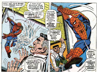
 er place to start than with the original Spidey artist, the one of a kind Steve Ditko. Ditko's quirky style really seemed to work well with Spidey, back when he was just a skinny, nerdy kid, and not a muscular titan like so many other heroes. The panel to the left is from Amazing Spider-Man 8.
Doug: I don't think there's any question that Ditko was unique. I think Stan as the EIC did a great service to his consumers in the books he assigned to Ditko and to Jack Kirby. Stan was able to find subject matter that fit each artist's strengths. I don't know that any other artist has captured Ditko's flare for spider-y movement and twisted anatomy, unless it's perhaps Mark Bagley's work on the Ultimate Spider-Man book.
Karen: Of course, even Ditko's version of Spidey could look heroic -this iconic page from ASM 33 has been published in a number of books, and the second Spider-Man film featured a scene near the end which resembled it strongly.

Doug: I think, like you said, that the image at right is iconic, but to me it looks more iconically Romita than Ditko! Don't you think there is so much more depth and roundness to the musculature -- yes, I know this is an image where every muscle would be strained to its utmost. But I just think more of John Romita when I see this than Ditko.
Karen: I think that Ditko's Spidey changed over time, and got progressively more super-heroic. But I do understand why you'd say it looks more Romita-ish!
Karen: Of course, Ditko didn't actually design the Spider-Man look; that was the omni-present Jack Kirby's work. Personally, I always felt that Spidey was one character Kirby didn't draw all that well. He just didn't seem suited to him. As you said Doug, Lee's decision to give Ditko this title rather than Kirby was probably a key to its success. Here's a scene from
 ASM 8, part of a back-up feature drawn by the King.
Doug: And let's not forget that the King drew the cover of Amazing Fantasy #15, Spidey's first appearance. I wonder if, at the time, fans noticed that the powerhouse on the cover was not the same wiry kid that appeared between the covers?
Karen: After Ditko left the Spider-Man title, Jazzy Johnny Romita would take over with issue 39 (Aug 1966). For me, Romita is THE Spider-Man artist. His Spider-Man is the one I see in my mind when I think of the character. He gave Spidey a more muscular look, wh
 ile retaining all his agility and flexibility (the art to the right is from ASM 53). But even more important, he made Peter and his supporting cast much more appealing. One could complain that from Ditko to Romita Peter went from an unremarkable everyman to a good-looking swinger. But Romita can't help it! Particularly when it comes to drawing women -they all come out gorgeous!
Doug: The image you chose at right, Karen, is perfect -- it shows that more-muscular Spider-Man, but with the quirky Ditko-esque foot angles. Personally, I enjoy Spider-Man as drawn by Romita more than any other artist. And I think when you mentioned his version of Peter Parker, you were getting at what really strikes me about the strip at that time -- it's the cast of supporting characters and the depth Romita brought to Peter's friends and acquaintances.
Karen: We've put together some images of the supporting casts done by each artist. I'd say that even under Ditko, Peter gradually became better-looking. He ditched his glasses and went from scrawny to at least respectable in build. And Ditko's Gwen was a lovely girl. However, Romita's style is just so clean and fluid, it really makes everyone -even Aunt May and J. Jonah Jameson - look great! See for yourself below. Ditko's work is on the left, Romita's on the right.


Doug: I always thought Ditko drew Gwen as so much prettier than Betty Brant. Romita, however, drew all of the ladies well. Obviously this is an early rendition of Gwen for Romita, as she appears sans the famous headband. While Mary Jane is very much looking like we'd see her throughout Romita's run, Gwen to me looks just a bit harsh. I like this particular set of panels you've chosen, because I think we see Romita's stamp on JJJ, but at the same time his faithfulness to Ditko's interpretation of the Osborns (no, not those Osbournes!!). Funny, because it was the whole flap over Norman Osborn that caused Ditko to leave the strip after ASM #38.
Karen: Romita had a number of inkers over the years, including himself, Mickey Demeo (aka Esposito), Don Heck, Jim Mooney, and Frank Giacoia.
Karen: The image to the left below is of a Romita-Heck collaboration from ASM 63. I have to say I really prefer Romita inking himself over Heck inking him. It just seems like something is lost here.
Doug: One of these days I'm going to have to climb a mountain and meditate on what Don Heck means to me. I mean, I just find myself maligning the poor fellow constantly. However, when I think of my top two or three favorite eras of the Avengers, the issues during the Kooky Quartet years are always near the top! But I think you're right -- Heck's style didn't mesh with too many people, particularly as the 1950's faded from view.
Karen: To the right is a Mooney-inked piece from ASM 75. To some extent I feel the same way about Jim Mooney's inks- they're heavier than Heck's but you still lose a bit of that Romita flair.


Doug: I thought Jim Mooney was one of the unsung stalwarts of Spidey's exploits. If I have a knock on him, it's that his female faces often bore more of his own stamp than Romita's. But hear me -- that's not a totally bad thing, as anyone who's seen his Supergirl, Legion, etc. work over at DC can attest to the beauty of his line. I just think when you're inking John Romita, you need to let John Romita shine.
Karen: One doesn't often think of Spider-Man and John Buscema, but he did dr
 aw the wall-crawler's adventures in issues 76-81. I think he did a solid job, although I would say that, much like Kirby, Spidey was not a character that meshed well with his style. Here's the splash page of ASM 78, inked by Jim Mooney.
 Doug: Buscema is at his best when he's allowed to be graceful in a bombastic sort of way. I mean, the man can draw a good-looking lanky guy (or girl). But let's face it -- Big John was never meant for Spidey, Daredevil, characters like Batman... you get the idea.
Karen: Romita would return to the strip after Buscema's brief run, and then another name strongly associated with Spidey would take over: Gil Kane. He was actually the artist on the book when I began reading it, but I was also reading Marvel Tales at the same time, and I have to say I preferred Romita's web-head to Kane's. Doug, I think we've both found Kane to be an acquir
 ed taste. As much as I get annoyed with looking up everyone's nose, I have to say he drew one of the most limber and athletic Spideys. To the left is a full-page from ASM 89, with a layout that I am positive I've seen Kane use again and again. But it works. Here, Kane is inked by Romita, and I think that was a great combo.
Doug: To say Kane is an acquired taste is an understatement. Ross Andru was my guy, but Kane did so many covers, Marvel Team-Ups, the reprints, etc. that I was fully aware of the nose upshots, etc. As an adult I've come to really appreciate his style -- I don't hold him on the same level as Romita, Buscema, Kirby, or Adams, but he's definitely in my next-tier of artists. His DC work on Green Lantern and the Atom is great. As to his run in ASM, he was involved in so many important stories (the drug issues, the intro. of Morbius and the Man-Wolf in the post-Code world, and of course the deaths of Gwen and the Goblin) that it's very difficult to separate the Bronze Age Spidey and Gil Kane. He was all the best of Ditko, and when Romita inked him what the consumer got was a nice amalgamation of the previous eight years worth of art.
Karen: Some later work by Kane, from the immortal ASM 122, shows a quiet moment. This was inked by the team of Romita and Tony Mortellaro, who brings a heavier look to the art.

Karen: This seems like a natural break point for our examination of Spidey artists. Stay tuned for part 2!


2 comments:
In our concurrent poll, John Romita Sr. won by a landslide as your favorite Spider-Man artist, with Steve Ditko coming in a distant second. Thanks for voting!
Hi, Karen,
Responding late to this, but regarding your statement that "Ditko didn't actually design Spider-Man's look -- that was the omni-present Jack Kirby's work", from what I've read, Kirby's design was never published and was quite different from the iconic version, which was indeed designed by Steve Ditko. Kirby's unused design apparently included buccaneer boots and half-covered mask (similar to Captain America's costume), along with a ring by which Peter Parker transformed himself into Spiderman and a gun with which he shot his webbing. Ditko noted to Lee that the premise was verrrrry similar to that of the Fly, which Kirby & his former partner Joe Simon had worked on for another company a few years before. And indeed, the Fly was a revision of a spidery character Simon had initially come up with (but never saw print).
So, ultimately, it seems Lee & Kirby were brainstorming for a new character to add to their superhero roster, which at this point only had the FF and the Hulk (you might include Ant-Man, but Hank Pym hadn't been fitted out with a costume and gotten his regular series yet). Kirby likely came up with the ideas for both Thor and Spiderman, contrary to what Lee wrote in Origins of Marvel Comics (just a few years before, a Kirby one-shot Thor story had been published by DC, so both ideas had been floating around for some time). Both were accepted, but Stan rejected Kirby's version of Spiderman and it was left to Ditko to revise him, which I'm sure most Spidey fans will agree was a good thing! Kirby's vision was great for the FF & Thor, among many others, but ill-suited for Spider-Man as we came to know him.
Of course, Kirby did do that first Spidey cover that adorned Amazing Fantasy #15, but that was a revision of Ditko's original version. Kirby did once claim to have designed Spider-Man's iconic costume, but later admitted he was wrong and publicly apologized to Ditko.
BTW, in one of his very few public statements, Ditko discussed how he decided Spider-Man should have a mask that completely covered his face as a means to hide his youthfulness. In Kirby's version, that didn't matter because Peter was transformed by the ring from a skinny kid into a muscular adult (hmm, very similar to the original Captain Marvel, not to mention Thor, even if Donald Blake was a skinny adult rather than a kid).
Post a Comment