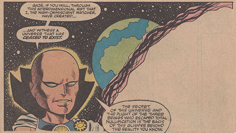
 Doug: Karen's away, so Doug will play! Actually, Karen posted this subject in the queue, but then vacation planning got the better of her. So, she said have at it, or come up with something altogether different. So putting my nose to the blogging grindstone, I came up with today's love-fest. How about we toss a little affection toward Artie Simek, Joe Rosen, Gaspar Saldino, and the many unsung heroes who've toiled before and after them -- all the way down to today's computer studios, a la Richard Starkings and Comicraft.
Doug: I don't know about you, but for years I never really gave it much thought as to the look of the text of a comic, nor really to the sound effects. I just took those elements for granted. But stop and think: In the Golden, Silver, and Bronze Ages, long before computers, PhotoShop, etc., the look of a particular comic was all from the creative hands of the artists.
 From the book's cover logo to all of the word balloons and effects, it was the letterer who brought us the consistency of the look month after month -- no wonder we took those guys for granted. Talk about steady! You know what else now impresses me? They never had a bad day printing! Now that comic book lettering is a font in its own right, available for download to our favorite word processing program, it truly is an afterthought. But think of how much concentration it must take to handwrite comics in a consistent style, no matter the deadline or length of script -- or any other variable.
Doug: So what's your opinion? Do you actually have a favorite letterer? Is there an artist who caught your eye long ago that you've appreciated through the years? Give a shout out to these guys (and maybe gals -- shoot, I don't know...) who've really contributed so much to our four-color enjoyment over the years.


11 comments:
Lettering is indeed the invisible art of comics. You only notice it when it gets in the way of the story.
I didn't really pay much attention to it at all, until I got hold of some Charlton books and saw artists like Jim Aparo and Pat Boyette who did the pencils, the inks, and the letters for themselves.
That kind of distinctive touch made me take notice of lettering and I began to appreciate it more.
Sadly as good as modern lettering programs can be, the human touch is missing.
Rip Off
Great topic this morning.. I'd have to comb through my collection to better refer to my favorites (ah, what a great excuse to rummage through on a Saturday morning..), but certainly folks like Artie, Syd Shores, or any of the great Letterers of the day really provided the 'fabric' of what banter, thoughts and well, war cries that reverberated through the panels.
One example of what struck me in college, was when they were changing the voice of ol' Vish. Yes, again, during the Shooter Age, when they started dropping the electronic voice boxes, giving Vision a sense of humor, he lost that distinctive edge that was so apparent since ish 57. Juxtaposing that with the likes of Thor, Clint, and Janet, it added a cool layer to the scripted action. It was not a good move.
Not to subtract from the heralded Letterers, but how do folks feel about artists doing their own lettering..? Didn't Steranko and Byrne do that a bit..? Did it add or subtract from the distinctiveness, or meshing of different contributors..?
Artie Simek is my favorite letterer because he didn't just put the script on the book but actually augmented the energy of the storytelling. His work is FUN.
Lettering? I know a little something about the subject, at one time having done it for a living for 15 years.
My favourite letterers are Art Simek & Sam Rosen. Sam had the edge when it came to display ltg (logos, sound effects, etc.). Marty Epp (no doubt short for something), who lettered the Iron Man tale on TOS #41, was also excellent. His work had a nice spontaneous touch to it.
In Britain, Gary Gilbert and Richard Starkings (when he lived here) were two of the better letterers, along with Annie Parkhouse and one or two others.
Moebius once pompously claimed (in the Silver Surfer book he drew) that, as it reflects their personality, all artists should letter their own work, and that it should never be trusted to a "hired hand". (One might argue that, based on that kind of 'logic', all artists should ink, colour, print and distribute their own work also.)
He's talking nonsense of course. The purpose of art is not to say "Look at me" (the artist), but to say "Look at that" (the subject). Of course, in doing that, the work will reflect some aspect of the artist's personality, but that isn't its primary purpose. (Unless the artist's purpose is just to massage his own ego.)
One need only look at John Byrne's computer lettering (developed from his own hand style) which appeared in some of the books he drew for Marvel back in the '80s (I think) to see what I mean. Although serviceable, his lettering really didn't enhance his pages in any way. Did it reflect something about the artist? Sure - it reflected that he wasn't a very good letterer.
Same for Moebius; his loose, scratchy, undisciplined, hard to read lettering in the Surfer book impedes the flow of the reader. I'd love to see this book completely relettered by someone who can do justice to Stan Lee's script and Moebius's art.
Dave Gibbons is an excellent letterer (as well as artist), whose style is somewhat reminiscent of Marty Epp. When an artist can letter as well as DG can, I have absolutely no problem with them lettering their own work if they want to. However, if they can't - they shouldn't.
I might be running out of space here. With your kind indulgence, I'll continue in a follow-up comment.
On the subject of computer lettering, if it's done well, I don't think the reader cares or even notices the switch. RS's Comicraft do a good job in the main, but I have one problem with computer lettering in general - it takes the 'art' out of the process and reduces it to a mere skill.
What do I mean? I know of some computer letterers who couldn't hand-letter if their lives depended on it. They are completely dependent on the computer fonts originated by other hands. Just because you can type someone else's fonts doesn't make you a 'real' letterer. I've seen some pages ruined by inept balloon placement that wasn't sympathetic to the requirements of the art. (And, of course, some computer letterers will be good at balloon placement - even 'though they still can't hand-letter a page.)
I don't have a problem with traditional hand-letterers using a computer programme of their own fonts to accomplish the work. They're just using a shortcut, in essence, to do the job quicker. However, I DO have reservations about those who couldn't do it any other way without using a computer. To my mind, they're not letterers - they're only typists.
As I said 'though, it doesn't really affect the reader one way or another.
Yes, please, more indepth discussion\insight would be SUPER.
A corney favorite of mine was the self-humor Stan or Roy would resort to with using "FOOM" every so often, with the resulting 'wink' in the caption.. THAT'S what made Marvel fun..
Without a doubt, place Gaspar Saldino at the top of the Hall of Fame list. Saldino crafted the great majority of logos for DC's Silver Age, including the iconic new Flash.
I believe he might have been responsible for spiffing and sprucing the Superman logo as well, and that's got to count in the heavy weight category.
I would have to say John Workman, even though he may have come in on the tail end of the bronze age. He melded so perfectly with Walt Simonson on his Thor run it really enhanced the look of the book.
Hey, everyone --
Thanks for the comments! I wasn't sure about this topic, as although the worth of letterers certainly is immeasurable, they are just not a group of creators who generally get their due.
Kid -- great information and opinion. We appreciate your contribution to today's topic!
Carry on!
Doug
Ken Bruzenak and Tom Orzechowski are two of the more modern letterers whose work is noteworthy...Abe Kanegson's contributions were very much a contributing factor to Eisner's "Spirit" work, too, in my opinion.
Kid, if you're still about, what do you think of the late Tom Frame's work? In some ways he just seemed like a dependable workhorse, but the sheer volume of material that he worked on, and the consistent quality, must surely elevate him to some kind of rank.
What did I think of Tom Frame's work? Well, you know how they say that, aerodynamically, bees shouldn't be able to fly? Tom's lettering was a bit like that. (I'm talking about his work in the mid-'80s, when I first started giving it any attention.) From a technical standpoint, it was too narrow, his balloon shapes were a bit rough, and his sound effects and display lettering were kind of average. (Although that might've been down to editorial direction. Some editors didn't like anything that was suggestive of Marvel.)
Having said all that, his eyesight in the mid-'80s was not at its sharpest, so that may account for some of the rough edges. So, it shouldn't heve worked - but it DID - especially on Judge Dredd. Some artists didn't feel their pages were finished until Tom had lettered them and given them the 'Dredd look'.
I've seen some of his early work in comics from the '60s and his work is perfectly professional. Alan MacKenzie, one of the best sub-editors 2000 AD ever had, helped Tom put his fonts onto a computer programme (some years before Tom died) and that helped him a great deal. Initially, his balloon shapes were still a bit rough, but even that was ironed out eventually. It was still recognizably Tom Frame lettering.
When I first started on 2000 AD, I wouldn't have been surprised if Tom (and other letterers) had resented me effectively diluting the work available to him/them. However, whenever I met him in the 2000 AD offices, he was always perfectly friendly, sociable and a perfect gentleman. I can't claim to have known him terribly well, but I'm sad he's no longer with us. Seemed a top man to me.
Post a Comment