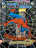
Doug: Now here's a post we haven't run in ages! A long time ago in a galaxy far, far away, Karen and I had some great times checking out the sartorial non-splendor of everyone from Gambit to Hank Pym to Phantom Lady. And speaking of Phantom Lady, we'd like to look at some equally-garish costumes today. Yesterday we had a fun ride checking in on the Legion of Super-Heroes; today we'd like you to sound off on the costumes of the quite-groovy Dave Cockrum and Mike Grell eras. As your art sample, we are running the cover to Back Issue! #61 (due out in mid-November) -- an all-treasuries retrospective! Have fun with this, friends!
Doug: By the way, we had a more general version of this conversation, though centered around the Legion, many months ago. You can check it out by clicking here.
PS: dbutler, this was in the queue a couple of weeks ago! You must be clairvoyant in suggesting this post yesterday...








9 comments:
I don't have much to say that hasn't already been said in the couple of columns posted before on this.
It is of interest that the Grell/Cockrum outfits convey a stylish slinky, perhaps utopian/futuristic existance for the Legion, more so than a functional battle uniform, largely based on the mid-Bronze eye-catching look/feel. Perhaps others here can share their views on what ideas are brought forward here.
It seemed to me the Silver Age Legion costumes were less extravagant, more like uniforms with the Curt Swan influence using bland primary colors, perhaps saving time rather than using more obscure color shading.
Not that heroes always had functional clothing, i.e. Wanda's bathing suit or Wonder Woman's corset always being of suspect. We also see this later on Dazzler and other post-disco creations.
In other words, they're not exactly styled for endurance in pitched battle, but what do they reflect in the 'Legion community'..?
I always liked the way all the costumes looked together in images like the one you posted (and obviously, on the treasury edition cover where the original appeared). And many of the redesigned costumes really did look better, e.g. Lightning Lad, Star Boy, Timberwolf, Colossal Boy, Shrinking Violet, Princess Projectra (even with that kind of odd missing front held together by shoelaces), and I like the designs for some of the Legionnaires introduced in the 1970s, like Wildfire and Dawnstar.
That said, there were some misfires as well: Cosmic Boy's bondage outfit, obviously, but also Karate Kid with that in(s)ane collar, Element Lad and Saturn Girl with their hip-boots (Cockrum really loved those, didn't he?) and Tyroc's little white elf boots.
Lightning Lad's costume is really sharp; I always liked it a lot. I also dig Wildfire's outfit, and Timber Wolf's. I can't believe that anyone thought his old outfit with the checks was a good idea!
My favorites were Ultra Boy with his unusual chest logo (does that stand for something?) and Saturn Girl in her pink outfit.
Wildfire and Lightning Lad were good too.
I loved most of the costumes at this time. they were cooler, and seemed impractical until you assume that in that future time they would come out with clothing options that protect like you were wearing oak trees, but can be transparent and so thin, it would pass for skin. People would walk about in tough, transparent clothing. why would ANYONE be such a prude as to cover up? the costumes shown here in this era would be like dress costumes for a ball, but still strong and self regenerating.
I loved all the designs, but Karate Kids Collar was a bit much. Maybe he could see through it when he desired to? I also think they would be hooking up like you wouldn't believe, with each other or just people in clubs. It would be NORMAL.
Garett
From Wikipedia :
Ultra Boy's costume features an emblem some believe represents the beast on his chest.
I couldn't find anything to back this up on Comicvine or other comic sites.
When it comes to superhero design a strict sense of practically was never the point. It's a lyrical sense of design that expresses the characters superhero identity through color and lines in combination with the idealized forms to create a sense of power and nobility.
They're not all hits of course, but for the most part I would gladly take that design approach over leather jackets, random armor, and a gajillion visible seams we see so much of now.
Thanks Anthony. It says he was swallowed by an energy beast or "space whale" to get his powers. Different origin to go with his different symbol!
Cockrum's redesigns were so revolutionary (at the time) and made such an impact with readers that the fan-writers & artists who've supplanted the old guard, keep trying to accomplish the very same thing - so we get endless reboots and restyles.
Gimme these "far out" outfits back anytime and I'll be happy!
Post a Comment