
 Karen: The art on album covers has often been as notable as the music inside. Some album covers instantly draw you in, and grab your attention.There are plenty of famous images -who can forget the covers to Pink Floyd's Dark Side of the Moon, or the Beatles' Sgt. Pepper's, or Sticky Fingers by the Stones? All are iconic images. And what would the 70s have been like without all those trippy album covers by Roger Dean? But today I just want to hear about some of your favorite album covers, ones that you particularly like, or bring back certain memories. Feel free to toss out names of whoever you like. I encourage you to provide links if possible! I'll get the ball rolling with a few that I've always enjoyed.
Karen: The Beatles' first album cover has a wonderful simplicity to it. Featuring the faces of all four band members with one side in shadow, it has a very dramatic effect, and creates a memorable image. It's also been copied and spoofed many times. One of my favorite versions is shown below, Meet The Franks. I don't know who the author of that graphic is but I think it's hilarious.
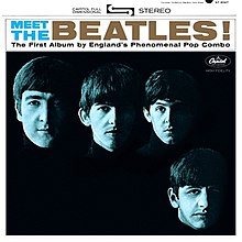 |
| Meet the Beatles -The Beatles |

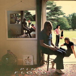 |
| Ummagumma -Pink Floyd |
Karen: Pink Floyd has had a number of great album covers, but I've always liked the one on Ummagumma, with the repeated image -although actually, the image is different in each inset, with the band members changing positions in each one.
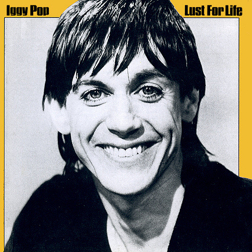 |
| Lust for Life-Iggy Pop |
Karen: Ah, James Osterman, or Iggy, as he's popularly known. I love this cover because he looks as if he's sincerely happy to be here, yet just a wee bit unhinged, so you really don't know what to expect from him. It's an uncomfortable feeling. It goes so well with the music on the album, where desperation oozes from every track.
Karen: All right -your turn.


27 comments:
The cover of Born to Run had a huge impact on me. Here's the fully open exterior image:
http://goodrockingtonight.files.wordpress.com/2012/12/cover.jpg?w=584
I can't find a decent example of the interior image, a big photo of a smiling Bruce (along with the lyrics). Everything about this cover works: the beautiful typography, the image tone, the photograph itself. The album also had a high-gloss finish that not only felt nice but had a nice smell; I wouldn't encounter this again until Springsteen's recent MAGIC, which emulated many aspects of this albums design . . . and had that same scent.
Meet the beatles is a rework of With the beatles, their 2nd
album. Still a really distinctive cover. Classic photo of the lads from Liverpool.
Abbey Road of course is an unforgettable and classic image of them as well.
I like the Greetings from Asbury Park cover, although it's not a record I olay much. E Street Shuffle & Born to Run I play the most. Born to Run does have a very striking cover.
What did it smell like?
Bat Out of Hell by Meat Loaf and Jim Steinman sticks in my noggin. The Rich Corben cover art literally and figuratively jumps at you.
Meat Loaf kept that general theme through many of his later abums, and I think there's one by Berni Wrightson too.
Here's a site which features many of them.
http://sleevage.com/meat-loaf-bat-out-of-hell-series/
Rip Off
I liked the covers of the so-called Red Album and Blue Album. I had both and always thought it was really cool that they posed for the same photograph those years apart, and the change in each of the band mates...!
When I saw that Karen was starting to work on this post, the first album that came to mind was KISS's Destroyer album. That came out before the Marvel Comics Super Special, but seemed to be an easy step on their evolution to comics characters. The painted art on that cover was just really cool to me.
Doug
Blue and Red cover photos were done for "Get Back" and "Please Please Me." The idea was that they were getting back to their roots, thus the same photo location and poses as on their 1st LP. Since Get back turned into let it be, the photo had no home and they wound up using it
for the Blue cover.
Being a young male at the time (11 or 12) Kiss' "Love Gun" always stood out for me, all those chicks wearing Kiss makeup, groovy!! The art for the "Boston" albums was cool as well.
"Who's Next" by the Who always makes me laugh plus it's a great album. The Yes albums and Asia albums had great covers, always reminded me of Frank Frazetta. Among my favorites are "Moving Pictures" and "Signals" by Rush. Elton John's "Captain Fantastic" was great as well.
Hmm-- I'm having trouble properly copying image links, somehow (I'm rather ham-fisted with these things, I'll confess-). So let me just toss out the info, as an image search is quite easy.
Queen's NEWS OF THE WORLD cover & interior art completely snagged my science-fictiony sensibilities at that time. Kelly Freas was the artist, I believe. It was a great example of what, for me, made the best album covers: Story-in-progress, what's-going-on-here??
Wings' BAND ON THE RUN cover was another one (nonesensical as it actually was).
The cover & interior art of Klaatu's HOPE album was very much the same, except it was very nicely integrated with the story being told on the album.
The cover of the Beatles' "Red Album" was in fact what got me to pick it up from the rack at the grocery store in 1974 (I think), and started me down the path of near-rabid Beatlemania for the rest of my life.
Although I'm by no means a Led Zeppelin fan, the cover for HOUSES OF THE HOLY is the quintessential "What the flyin' flibberty-jippet is goin' ON here????" cover image. But, hoo-boy, you couldn't put it out today-- I do believe there would be a serious public backlash.
And I would like to commend everyone for not going down the Ohio Players path--!
HB
Great topic today.. Geez, where oh where to start..
Ok, if you were to discuss the most 'disappointing cover', which I only bring up because it's so dicotomous to it's contents, it's the legendary 'Pet Sounds', which I've lauded before for it's influence. The band in plain clothes and coats feeding farm animals..??? It's lame cover compared to what's inside is ludricous, but somehow, no one had any better ideas apparently.
Pepper... There was edgyness and artsy stuff before it, but nothing was the same afterwards. No big band dared to put out a boring cover afterwards.
Stones, I strongly prefer the Decca-approved 'Invitation' cover of Beggars Banquet to the original toilet seat concept Jagger pushed. The elegance of the invite underscores the 'plight of the working man' quite stylishly; the graphitti-drawn gas station toilet was just a blatant (and stupid) attempt to shock. I will pick 'Satanic Majesties' as a cool cover concept in 3D, and is one of my favorites; just an awesome album which is either loved-or-hated by Stones fans.
I just read some background on 'Dark Side of the Moon's cover, apparently it was picked in the span of 10 min.. Originally Floyd was just going to have a cover of the band members. IMAGINE how differnt THAT would have turned out. I guess the story was, they didn't want just another nice band picture on the cover.
I'm still trying to buy a cheap copy of Ramones first album 'Ramones' for my man-cave. Just great attitude in a b&w photo.
Matt, totally agreed on 'With the Beatles'. I had the German LP for many, many years. I believe it's still the ONLY release with the 'hi-hat' intro to 'All My Loving', other than a Netherlands release 2yrs later. I guess it's now available in the UK in the 'Beatles Box' CD set.., but for years I had trouble listening to it WITHOUT that introduction, always felt cheated.
I still regret the fact that most kids today miss out on great cover art, it was always such of an important element to bringing an album home...
On a comic note, always loved Spidey's "From Beyond the Grave" album from Aladin, just awesome Romita art.
I hope the JLA album talk yesterday can finally generate interest in those audio adventures, missing some great fun here.
Tony --
Rush's Permanent Waves cover did it for this adolescent boy! Wow.
Doug
How about the cover to Blue Oyster Cult's Cultosaurus Erectus?
Click here.
If my link doesn't work, here's the address:
http://open.spotify.com/track/6JtnDjDz5eJ87GOAd8sDbv
I had this perched on top of one of the speakers for years because it was so cool. (If I had ever seen a poster, I would have snatched it up.)
The actual album had "Black Blade, a song about Michael Moorcock's Elric!
Just a quick shout out for Frank Frazetta's art on the Molly Hatchet and Nazareth "Expect No Mercy" album covers. My older brother had these and were influential to my young mind -- I thought they were so cool! Later on I never really got into the music, but man those covers rocked!!
The Beatles had several iconic album covers, Rubber Soul being another not yet mentioned; then there's the infamous original cover to Yesterday & Today -- a parodic "biography" of the Beatles from 1977 reimagined it as the cover of an album called "Meat: The Beatles" (I can't remember the name of the author but the book itself was called "Paperback Writer", in which the author purpotedly interviews Ringo Starr for the straight scoop on the Beatles, then loses all his notes and has to make stuff up! Fun stuff.
Also fun was The Who Sell Out and Who's Next album covers. R.E.M.'s early album covers were rather enigmatic, particular their first, Murmur -- just evokes something old and strange to my mind. Another classic cover that pops to mind is the one to In the Court of the Crimson King.
it is a shame that Cds are so small the art is
rather meaningless and digital downloads have no accompanying imagery.
How about 50 Million Elvis Fans with the great gold lame suit?
I rather like the Pet Sounds cover
and font, but maybe it's
more because I am a San Diego native and they immortalized our zoo on (maybe) the best
pop album
of all time.
American Pie was the first album I bought, and it's got a compelling cover image:
http://seventiesmusic.wordpress.com/2012/07/26/american-pie-don-mclean-1971/
Thumbs up with the flag-- but then a dark image behind, suggesting to me a hippie-ish critique of America, or introspection in contrast to the extroverted thumbs-up.
How 'bout Rumors by Fleetwood Mac? It's their defining visual.
Matt,
Re: the smell of BtR.
A kind of oily scent, like some sort of finishing agent; heavy ink; a cold smell, never warm.
I agree about Permanent Waves, Doug. Great music as well. If we are talking about teenage boy's dreams though you can't do much better than the Scorpions "Lovedrive" and Roxy Music's "Country Life". Journey's "Escape" was pretty neat, and Triumph's Allied Forces, Thunder Seven and Never Surrender all had great art. And how can anyone forget all those great Iron Maiden covers? Especially "Killers" and "Number of the Beast"
I definitely agree with Tony on the Maiden covers...almost all of their covers were cool. I also remember liking Men At Work's covers (especially Cargo and Business as Usual) and I loved Styx's cover(s) for Paradise Theater...the glitzy "Grand Opening" version, then the desolate "Temporarily Closed" version; the contrasting images really fit with the progression of the album itself.
Mike W.
Fred, I read that same book you mentioned, loved the bit of John and Yoko teaming up with Sonny and Cher about toothpaste or something, quite a funny book.
Incidentally, I have a pasted over mono butcher cover in my possession. Hate to make everyone cring with envy, but my Mom picked it up for me at a rummage sale.. For a quarter.
I miss pre-eBay rummage sales.
I'd certainly agree on the album merits, love the Wilson style of writing and production, and it's influence is unquestioned. It's just the cover seems lacklusterous at best, and I'd agree you're perhaps biased..
My favorites seem to be those with elaborate cover art, so, for example, my favorite Beatles album cover is Revolver. And Karen mentioning Roger Dean really hits me where I live: I love all the art he did for the various Yes albums (especially Fragile, Relayer, Tales of Topographic Oceans). Album covers just don't get any better than this. And Fred, great call on Court of the Crimson King - that's a favorite of mine as well.
Other than that, one of my early favorites was the cover of the cassette release of Waiting for the Sun by the Doors. The distinction is important, because it differed from the original LP and later CD cover, in that it featured the picture from the LP's back cover:
http://www.minilps.net/doors/waiting-for-sun-wpcr-12718/back-cover-22725
Obviously, sans the track listings and all that other tiny black lettering. When I first bought this at about the age of 12, I thought it was the coolest cover ever.
Another favorite will be rather obscure for anyone not familiar with the college music scene in the Pacific Northwest during the 1980s - Law and Order by the Crazy 8s: http://www.discogs.com/viewimages?release=1086934. Sorry, that's the best image I could find of the original cover. There's a 20th anniversary version with additional presidents (http://www.cduniverse.com/productinfo.asp?pid=6774701), but I always preferred the original with Cowboy Ron all alone - the image, by the way, was drawn by the editorial cartoonist for the main Portland daily newspaper, the Oregonian.
As for you jokers who keep bringing up titillation for adolescent boys, didn't any of you ever have Queen's Jazz album? I bought it off the discount shelf of a record store when I was about 13, and imagine my surprise when this poster dropped out as I pulled the record out of its sleeve:
http://en.wikipedia.org/wiki/File:Queen_Bicycle_Race_cover.jpg (and no, I'm not going to provide a link to a bigger image). That pretty much trumps anything mentioned here...
The cover to Cheech and Chongs' "Los Cochinos" was a counter-cultural hoot. No less so were the contents. My parents never knew I had that album; don't think they would have appreciated the humor...
For me it's gotta be that iconic cover for the Abbey Road album by the Beatles. Even if you're not a Beatles fan or even a music fan in general it's instantly recognizable.
All the 'Paul is dead' rumours stemming from this cover were really hysterical too!
- Mike 'I am the walrus' from Trinidad & Tobago
This is another perfect example of why I love this site and the posters so much - comics and music done perfectly.
Doug - I loved the Beatles Red and Blue covers (and albums) too. I often categorize all Beatles music into those categories (Red vs Blue). PS - great back story on those covers, Matt Celis! And I couldn't agree more on the shame of small artwork.
David B - i think a good future topic could be the greatest disparity between album and cover (Pet Sounds is a great primer).
Tony - I used to draw that Allied Forces image on countless school papers (loved that flying V).
My personal favorite album covers: The Who - The Kids Are Alright, The Clash - London Calling; Pink Floyd - Dark Side of the Moon
Edo- I totally forgot about Queen's Jazz album.
Redartz- I had that Cheech and Chong album. I remember that when you pulled out the inner sleeve, it showed the inside of the car door, and their "pharmaceutical" storage compartment. I played that album a;; the time, pretty much knew it by heart.
Post a Comment