

Doug: We're glad you're joining us today for another post from Mike S., aka Martinex1. Last week he led us through some serious nostalgia in regard to our comic book collecting foundations. Today he has a few things to get off his chest in regard to comic book covers (always an awesome topic around these parts). So without further ado...
Martinex1: Recently on the BAB site, there was much discussion aboutJohn Buscema’s cover artwork for Silver Surfer #2. Doug shared from the IDW book both the original artwork and the modified version that was ultimately used for publication. Most of us had an opinion about which was better but understood completely that the choice was subjective. I believe most also thought both were magnificent and we were probably quibbling over the level of greatness.
It begs the question, “How do we define a great cover?” I suspect the old Popeye adage, “I knows it
when I sees it,” holds true.  But I
often find myself contradicting what I think describes the best comic art. I mentioned before that I tend toward covers
that are busy with action and conflict, and that I dislike the cover with a
standard character pose and minimalist background. I also hold to the value that Bronze Age
covers are better than the modern fare. I am challenging myself if that is always true or if my tastes are
slightly more nuanced than that. So I set out searching for covers I like and also covers I
don’t like at all. This is not a hit
piece, but I thought it was important to define what I dislike about cover art
to better identify what I do enjoy. I
also am not looking (for the most part) at covers that would be considered in
the classic and iconic category.
But I
often find myself contradicting what I think describes the best comic art. I mentioned before that I tend toward covers
that are busy with action and conflict, and that I dislike the cover with a
standard character pose and minimalist background. I also hold to the value that Bronze Age
covers are better than the modern fare. I am challenging myself if that is always true or if my tastes are
slightly more nuanced than that. So I set out searching for covers I like and also covers I
don’t like at all. This is not a hit
piece, but I thought it was important to define what I dislike about cover art
to better identify what I do enjoy. I
also am not looking (for the most part) at covers that would be considered in
the classic and iconic category. Starting with Avengers Annual #10, this was a comic book that I nearly did not purchase because of the cover artwork. The cover looked like an in-house advertisement and had no focus. We often talk about covers that made us buy an issue; this was a cover that turned me off. The only reasons I did buy it at the time included a) I was a rabid Avengers collector, and b) I glanced at the wonderful Michael Golden interior art. But this was honestly a situation where I thought about purchasing another issue instead. In retrospect this was one of the best Avengers Annuals ever with great story and art, but the cover was extremely weak.


I have no idea why the cover was designed as such. I can only speculate that it was hastily
crafted after something initially intended did not come together. Since that style of paneled cover was not
common, it gave that impression of a rushed job. It did not pass my litmus test. I also
don’t believe this is representative of the artist Al Milgrom’s normal output;
some of his work on Marvel Presents with the Guardians of the Galaxy was quite
dynamic. The added advertisement across
the top of the book also irritated me (not just here but throughout that
month’s offerings) because it diminished the size and focus of the cover art. For a better paneled cover (the only other
example I could remember), see Avengers #197. Although still not to my liking and despite
the generally weak layout type, this has more clarity and fits the storyline
which amounts to a normal day in the life of the characters.

In my search, I found a cover for the Avengers Annual #10
that was created by the aforementioned Michael Golden after the initial
publication. The very little I could
find on this piece is that Golden had finished some preliminary rough sketches
for the cover of the annual but none were chosen; as a commission he completed this
one. Again, this is just some internet
hearsay, so I am not entirely certain of the history. But take a look at that black and white
artwork. Wow! Now that is amazing and very much to my
liking. There is ongoing action and
struggle with characters strewn about in the rubble, a new villain in Rogue,
the return of Ms. Marvel, and the text that emphasizes not just the physical
defeat but the emotional one. The lines,
though busy, are clean and clear. The
composition is focused. It would have
been interesting to see this colored, to see how an artist would have used hues
to further emphasize the subjects. The
Avengers masthead is of course blocked, so in the real world I am not sure if
this would have made print either. I
think this gives some extreme examples of how a cover could be conceived.
Aside from my preference for action or ramifications of
action to be prevalent in a cover, I also have the counter feeling that I do
not like the posed characters standing with broad shoulders staring out of the
cover. But then I have to consider
Avengers #196. Taskmaster is
definitely postured exactly in a fashion I find annoying in today’s
comics. But this cover is one of my
all-time favorites.
What is the difference?
In my mind there are a handful of factors that come into play. 1) George Perez’ character design is detailed
and wonderful, not to mention that Taskmaster is proportionately correct and
dramatic. The full figure is loaded with
mystery and complexity. Perez is a
master who allows character elements to show through even in individual
panels. It is easy to see the villain’s threatening
confidence and ability. 2) The coloring is terrific. It is not often we have that type of green
background; I can only think of a couple instances (including X-Men #142) that
use that color scheme. The character
just pops; the rogue’s blue and white and orange are in nice contrast to the
backdrop. 3) The conflict is there; it is in the
costume. By that I mean, because the
Taskmaster is holding versions of the Avengers’ weaponry from shield to sword
to bow, the implication is that this single lone lunatic could take on all of
the Avengers. He was the human (or
mutant) version of the Super Adaptoid. The
text expresses as much in reinforcement. I am not entirely certain, but I believe that up until that point in
time this may be the only Avengers cover with a lone villainous figure and none
of the heroes present. It was very striking. In later years, we would see Ultron and Kang
given this headlining honor, but I truly cannot remember many instances. 4) This type of posing rarely appeared at the
time; it was an oddity in that era, not an absolute.


In slight contrast, here in Marvel Team-Up #117 is a cover
with Wolverine and Spider-Man reaching out to the reader. This cover at the time struck me as odd and
not in the same favorable way that the Taskmaster cover did, and I nearly did
not buy this issue. I say “nearly”
because I surely do own the issue as Wolverine was emerging as one of my
favorite heroes around this time. However,
the proportions of the characters seemed entirely wrong and were distracting
even in my youth. Wolverine’s leading
leg is huge and looks unbalanced; it actually looks like the leg was pasted on
to cover something else. The pointy
design at his boot’s knee looks much larger than it should be. The forced perspective is too extreme and is
almost funhouse mirror like. Even
Spider-Man’s extended hand seems overly large. And the layout and background look bland, simplified, and rushed. It was not colored to accentuate any
contrast. I see this dark and shady attribute as more
emblematic of recent covers as well. Now, by no means is Bob Layton a poor artist. Some of his Iron Man covers are iconic. Again, I am not sure what happened here in
the layout and modeling and execution, but it did not work for me.
Often the chosen focus of the cover is a problem. In both Avengers #228 and Fantastic Four #287,
this is apparent. I contend superhero-based comics with a civilian front and center on the cover is not attention
grabbing enough. In the Avengers issue
I would say that having the “Trial of Yellowjacket” depict Hank Pym on the
cover is a mistake. Even if the interior
suggests that it is Hank Pym “the man” on trial, the cover has to be dynamic
and interesting and I am not sure this reached that level. The “H.P” on the central figure’s pocket
handkerchief and the word balloon just exemplify how unidentifiable the
character is to the average comic buyer (it still strikes me that distinguishing between Steve Rogers, Hank Pym,
Clint Barton, and even Dr. Donald Blake in their civilian guises often took
some second looks). The FF issue is no
better. Even with all of the text I did
not know what to expect in the issue and without opening it could not even be
sure the FF would play anything but a passive role. And this cover is by an all-time great, John
Byrne, and despite my love of his work I never purchased this one. All of the rest of his Fantastic Four covers
are really top notch.

Now let’s examine some covers I think capture what I truly enjoy. The
first is Fantastic Four #187. It’s simple
really. It shows the conflict and
struggle of the FF, and it holds the key impact that an overwhelmed and
relatively powerless Reed Richards is the last standing. It shows a villain in Klaw who is obviously
a threat, while holding the coup de grace in keeping the Molecule Man as a
mysterious yet imposing figure. It has
plenty of detail, and essentially in a single panel tells a story and draws me
in. It also has a neat composition
with Molecule Man’s legs bordering the action like a curtain opening. And maybe most importantly, I know what to
expect when I buy the book. It is in a
sense a teaser or trailer for the comic itself.
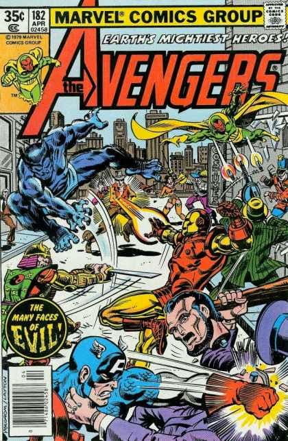
Similarly, Avengers #182 is a nicely rendered battle scene. And although there is no recognizable
villain, it shows the magnitude of the brawl. My eye is drawn to Captain America and the pain and determination on his
face. The image also accurately depicts
what is inside, and what is inside will be exciting. I will point out that this is a piece
created by Al Milgrom and Bob Layton. Not bad at all.
In conclusion, I have narrowed my definition of what I like
on a comic cover and I think it comes down to this: a nice representation of what I am being
sold. It can be a single character, it
can be a pose, and as long as it represents what is inside I am okay with it. It has to have a sense of conflict. I prefer action but that action has to be
representative of the story. And the
characters have to be on model and preferably in costume. The color and contrast is important. Anything mundane and common and small is
less appealing.
What say you? What
do you see? Do you like something I do
not or vice versa? What covers are your
favorites, and what made you say, “Meh”. Have at it folks.


26 comments:
Yet another great post, Mike S. (alias Martinex). First, let me say that I so completely agree with you about that cover for Avengers Annual #10. It is simply hideous. However, buying that issue was a no-brainer for me as soon as I flipped it open and saw that Golden was the artist.
I otherwise agree with your examples of good and bad covers, but I don't think I ever put much thought into why I like the ones I like. I do agree, though, that the covers on comics from the 1960s through the late 1980s are usually much better than those we're seeing now.
I also agree with your points about that Avengers cover with the Taskmaster. I found that one striking when I first saw it, and still do now. However, I'm a bit surprised that you think the green background is uncommon, as my own recollections indicated the opposite, so I went and checked. Since you use the example of X-men #142, I found variations of the green background used a lot, and I mean quite a lot.
And it was not uncommon in other titles.
By the way, one of my favorites with the green motif is from this issue of Master of Kung Fu. I think orange backgrounds were pretty common at the time as well.
Otherwise, here's two of my favorite covers ever, Avengers #187 and Batman Annual #8 by two artists with really different styles, John Byrne and Trevor von Eeden. The first gives you some idea of what you can expect inside, the second is basically a poster. But I find them both simply gorgeous.
Let me first say how much I enjoyed Mike's comic reminiscences in his previous guest post. My own early comic book introduction is quite different (and boring) but I do so enjoy discovering how my fellow comic fans got into this lifelong passion of ours.
As for comic covers, I must take a Freudian/Pavlovian(?) approach in that I either like or dislike a cover based not just on its visual merits, but on my personal associations with the comic itself, whether it be the story or the era in which it belongs. I find a lot of 1970-75 covers to be garish and messy looking; maybe it's the fonts used or the preponderance of Gil Kane artwork, the overuse of black backgrounds, or just the layouts themselves. I really don't know! However, when I see those late-'70s Avengers covers, I think of how much I liked that interior Perez/Byrne/Green artwork within, even if the stories themselves were often lacking (I've never been a big Avengers fan; sorry, Karen and Doug).
I think how covers were presented was a really big difference between British comics and American comics - for British comics covers didn't seem to be that important and were rather bland and generic and with some there was no cover at all as the first strip would be on the cover itself. From the very beginning British Marvel comics just jumped off the shelf as they were so colourful and dynamic - but imported U.S. Marvel comics were not that easy to find till the late '70s so I just bought anything that I saw that was Marvel - the masthead was probably more important than the actual image on the cover, as long as I recognized the comic as Marvel I'd buy it.
Wow, Doug, LOTS to say here with little time (busy day today here at work...).
Avengers 228..? One of the WORST covers ever. My 'Milgrom-hating' was at it's all-time high here. Where were the peaks of the Buscema's or Romita's or perhaps even Perez at this juncture..? A lousy, lousy cover, layered upon continued-dismal interior art (which continued until Buscema/Stern took over..) and a weak/depressing storyline..? Sure I bought it years later to fill my holes and follow the Pym storyline, that's about it. I tried to get excited about She-Hulk joining and Hawkeye returning, but the dismal art killed any joy generated.. Ok, enough said on that.
As mentioned a few times previously.., I typically don't like 'multiple-story image' covers. They are generally weak and aren't what I'd consider 'classic cover' potential. Avengers 197 isn't too bad, it's more like a tabloid-take on Avengers Mansion which I'd categorize more as 'cute'.
Avengers 182 isn't one of my favorites either..: Nice action, but the action isn't 'framed' with proper focus as to where my eyes should go. It's too busy and essentially has no flow to it. Ish 196 is clever with the green background.. (good for St Paddy's day obviously), Perez did an outstanding job here. While it doesn't give me the sense that Taskmaster is strong or evil enough to take on the combined might of the Avengers (especially with Vision, mind you...), but rendering-wise it was pretty polished.
I'm afraid that b&w original art for Annual 10 is entirely too busy as well, but I'd love to see what it would have looked like colored. More is not necessarily better ~ Cover artists really have to have an eye for what will suck in readers. I do like Ms. Marvel over the title, so again I'd love to somehow imagine how it would look colored to fully decide whether it's a killer cover or not.
Like C.K., I also felt most stories around this time were definitely lacking as well.
Thanks, David, but any love for this post and topic needs to be directed to its author, Martinex1.
Doug
Thanks all for commenting.
Edo, yes, I overstated the generalized green comment. What I meant is that for me that shade was less common (than say black or white as we have recently seen) and when compared to other greens. It seems to me to be the same shade as X Men 142, but some of the other greens I have seen are not such a deep shade. At least in the printing I had, it seemed bolder. I wonder if it is a printing thing or if there were actually variations. Also, I expect that green was a hard background to use in that it was a less "natural" background than a skyline blue may have been. It sure could not be used much if the Hulk was present. (Unless of course he was gray or red)! But definitely as you mention the primary and secondary colors were all indeed common; they had to be.
david b, yes, I can see where the framing in 182 is a bit weak. Centralizing a character in the midst of that battle may have helped it more. I still like it though; I think I like that the whole team is represented and not in a typical way. Just an all out battle. If I had less childhood memories about that issue, then I think I would agree even more with you which definitely goes to C.K. Dexter's point on the psychological aspects.
Also, regarding the alternative Avengers Annual 10 cover, I think coloring (good coloring) would really focus the image. Rogue is basically a green costumed character (here we go with the green again). She would be centered in the midst of a lot of red, blue, and yellow in the heroes. Thor's hair, Ms. Marvel's hair and lightning bolt, parts of Iron Man... all yellow. Reds in Iron Man, Wonder Man, Vision's face, etc. Blue in Beast, Cap, etc. If they were all somewhat muted and the rubble was a gray/blue ... I think Rogue would really pop and the central focus would be clear. Definitely coloring would distinguish the character lines a bit; right now it is a bit like finding hidden pictures in the old Highlight magazine. I could actually envision a styling in which all of the rubble and discarded heroes are gray, leaving Rogue and her immediate prey the focus.
I also have to say that I didn't mention DC at all, and probably should have. Some of the Perez New Teen Titan covers were really awesome.
Martinex, I know nothing about the technical aspects of those green backgrounds, but I should say, if it's not clear from my first comment, that I really like it when it's used. I think that's why they stick in my memory so much.
And, by the way, I agree with your view of the never-used Avengers Annual cover. I would love to see that colored as well.
As for New Teen Titans covers, I was just browsing a gallery of the first 50 issues, which were all done by Perez, and there's not a dud in the lot. In fact, I recall that Perez was also doing a lot of covers for other DC titles at the time, like JLA, Legion of Suepr-heroes, Green Lantern, etc. and they were all similarly beautiful. There's also a great deal of variety in the designs.
A cover trope that I generally don't care for is a large central figure with smaller figures running at (or after) him or her. See these Avengers examples with Kang and
Firelord. It's worth noting that those covers were published within a year of each other, and by the same creators.
As to the conversation about green backgrounds, there are a couple of Avengers covers in that same era that have figures cast against a solid red background.
More later, I'm sure.
Doug
I forgot to say that I agree about those horrible banners across the top of certain comics - "Win A Toys R Us Shopping Spree" etc....yuck !
I'll agree, too, Colin. I'd add that I didn't really care for the Bicentennial banners across DCs in 1976, either.
Win a Schwinn Bike!
You Could be in the Superman Movie!
Pfah... Dude, you're crowding out my art!
Doug
Nice job Mike, and a great survey of different cover types. For me, I do want to see a cover tht indicates something about the story within. That's why I got so fed up with covers over the last ten years or so. They all became mini-posters, with no real relationship to the material inside. In fact, they were all so generic and interchangeable that I had a hard time remembering which issues I had purchased -something that never happened back in the 70s or 80s. And no, I don't think it's just due to my increasingly worsening memory (although there is that).
I actually wonder if they just have a ton of pre-produced covers sitting around and the editor just grabs one and slaps it on a book.
But as much as that bothers me, the thing that really gets me is the loss of splash pages. The first page of a Marvel comic now is a long text page. Oh come on! It's a comic book! When I open it up, I want to see art! A glorious, full page of art!
OK, Grandma's gonna go take her meds now.
Great points Karen, much agreed on recent cover art.
Apologies for the slight, Martinex1 sir, I just saw Doug's name and had to rush my comments in before the day started.
I guess I'm an old Silver/early Bronze kinda of guy when it comes to classic covers.
Give me the likes of FF ish 51, Surfer 4 or Subby's ish 2 any.. day.. of.. the.. week.
Ooops, forgot to agree on Karen's great comment on splash pages, once a hallmark of story-telling greatness.., AND YES, will add my disgusted rant about those terrible, oh so terrible 'YOU CAN WIN...' banners.
Sometimes.., it's just best to walk away. It is, after all a business, folks.
Enjoyed this analysis Mike! I'd like to see more covers reviews like this.
Perez always had awesome covers. The Taskmaster one stands out for me as well. He's more dynamic than many modern covers, even though he's a single figure. He's striding forward, his body and limbs are at angles, and his front foot and sword tip go right off the page so that he enters our space. There's an exuberant energy to him, that is often missing in the Jim Lee-inspired vertical poses on modern covers.
One great cover with a green background is Master of Kung Fu #100: http://marvel.wikia.com/Master_of_Kung_Fu_Vol_1_100
I like that Avengers cover by Golden-- striking!
I agree with Karen about the joy of opening up a comic and seeing a good splash page. A variation on this was in the Warlord, where Grell would have a teaser panel page to start, then a glorious double splash on pages 2 and 3!
Karen... oh my gosh don't get me started on splash pages. Honestly, I don't understand the change. If a cover did not grab me at first, I always flipped through and the splash often caught me and dragged me in. I can think of many issues in which I thought the splash should have / could have been the cover. To me the splash has to exist!! One example I can think of is Avengers 165. It was one example of a floating head cover that did not particularly grab me (usually they are awesome); it had Nefaria's head floating over a building as the Avengers are about to get smashed. It was okay, and I grew to really like it. But the splash for that issue was much better I thought.
Doug, I didn't like those covers (Kang and Firelord style) that you sampled either. It always seemed silly to me, like the team was going to blindside tackle the villain who for some reason is posing and facing the reader. I preferred the villain looming over the landscape taking on a team. IE the Super Adaptoid in I think Avengers 45.
I think team covers are more difficult to coordinate than individual hero covers; too often the artist struggles to fit everybody in. Perez, as has been mentioned, was a master of it. As Edo said, the New Teen Titans were brilliant. And many of the covers I listed were his work. He could fit so much action and so many characters in a nice layout with a clear message. It was often so dramatic.
David mentioned Subby. I say the original run of Sub Mariner had awesome covers. Those were really classic and underrated I think. I wonder how they were received back in the day. But his struggle with Tiger Shark, the photo cover of him in the city, the ghost of Doctor Strange in the cemetery, the battle with Triton, Stingray, Thing. Really a great run of cover art on that title (in my opinion).
One last thought... Colin regarding British covers, on some covers it seems like the art was redrawn for overseas. I will have to look up some examples, but I recall seeing some Avengers action scenes from their battle with the Squadron Sinister or with the Invaders (Avengers 70 and 71) that were edited or redrawn in similar positions, yet different. I wonder why they did that. Any idea?
Martinex1- great job on this intriguing analysis of covers! Makes me want to go digging through a long box or two.
Definitely agree with the consensus regarding recent cover art. As Karen noted, so many are indistinguishable pin ups. Worse, the colors are often so muted that the whole cover looks muddy. Take the New Avengers series, for example. With the tones, and the clustering of figures, the action is often indecipherable. This same thing can be seen on many Justice League covers of midern vintage. And I don't. Think it is curmudgeonliness on my part, but rather a lack of solid design. Even with average quality silver/bronze age covers, at least it drew your eye.
Don't have a problem with "pin-up" covers as such; I don't like that they seem to have eclipsed everything else, but... you know, who doesn't like Steranko's cover for issue 4 of Shield?
Its not what you do, its the way that you do it, as they say.
Nice post, Martinex1, and since you asked - covers were frequently edited for the British Marvel editions (main characters enlarged and the edges cropped, that kind of thing) and recoloured (almost always very badly); some redrawing was done, but this was generally just to touch up the images, as they were sourced from poor copies.
There were a few instances of characters redrawn if a cover didn't quite match the continuity; I think the Vision was changed to an earlier Avenger once or twice because the stories inside hadn't yet reprinted his first appearance. Maybe that's what you're thinking of...?
-sean
Another great post, Martinex/Mike! I generally agree with you...I like covers where something is happening, where there's some action going on (even if it's not a scene that occurs in the comic). Like music videos where it's just the band on stage...if you're gonna make a video, do something different, not just concert footage!
I liked a lot of Spidey covers, JLA, NTT; Batman had some cool covers, so did All Star Squadron. I liked a lot of Sienkiewicz's Moon Knight covers, Power Man/Iron Fist had some great ones, so did DD. Kaluta did some great covers, especially for Doorway into Nightmare. I remember buying Dr. Strange #32 back in late 1978 just because of the cover...and I never bought Doc Strange!
http://www.comics.org/issue/32850/cover/4/
I can't even remember the story, but that cover still looks pretty good.
Mike Wilson
Hiya,
Just wanted to leave you with my thoughts regarding the Golden cover for the Avengers Annual. Realizing that this was not a completed piece for use as the cover, I would have to say, and this is just my opinion, that it is way too busy. My eyes, weak as they are, found it hard to focus upon any element in the work, especially as all of the line work seemed to have a similar degree of weight and detail.
Coloring probably would have fixed this, but maybe not.
I would agree that there were some weak covers in this selection, but I might venture the idea that they were somehow thought more representative as to what the issue was about then as to what they should have been, a device to sell said book.
Jim Shooter at his blog related a little story about the use of the color green on covers. Over the years many editors had made suggestions to George Roussos, the primary colorist for covers, about how they wanted things done. Roussos took these to be hard and fast orders and tried to accommodate every one of them, even when they contradicted each other. He was especially reluctant to challenge those that originated from Stan Lee.
Guess what color Mr. Lee had once said he never wanted used for backgrounds on covers?
It took Lee's very positive reaction to the Dark Phoenix cover of X-Men 135 to get him to loosen up a bit.
Thank you for your kind attention.
pfgavigan
Thanks for that insight pfgavigan; that is cool to know. Sounds like a similar reaction to Stan Lee wondering where Iron Man's nose was.
Sean, I know so little about the British Marvel books, but I remember seeing "Avengers and the Savage Sword of Conana" #109 and it had a reimagining of the Avengers vs Invaders. I don't know if stories were split into multiple books so they had to double up on covers??? Also, is "Secret Wars" in the UK different than our "Secret Wars" because I have seen some of the UK covers and they were really different.
It seems even in the States, the reprint books would handle the covers differently. Often the image was flipped left to right, or a character would be slightly moved, etc.
Martinex, Marvel UK would often split stories over two issues so an extra cover would be needed. And sometimes covers were completely redrawn for no reason. There were also (briefly) two comics that were printed "sideways" in landscape fashion which also needed redrawn covers.
You're right, Martinex1/Mike, stories were reprinted over a few issues in the British Marvels - being weekly anthologies, a single US monthly story might be split into three 7 or 8 page segments - so yes, more than one cover might be required. Thought maybe you were asking about the reprinted covers earlier, but "reimagining" could refer to the specially commissioned new covers they used sometimes. These were produced by the (US) parent company and done by any freelancer around who wanted the extra work.
Anyway, they weren't very good so there not much point going into the subject too deeply.
Don't worry if you know little about Marvel UK - you're not missing out on much!
-sean
ps I think the whole flipped cover thing is just the result of a casual, slack attitude to reprinting thats been endemic to the comic biz.
Great job Martinex1/Mike S. Yeah sometimes you just look at a cover and you don't really feel any love for it. It's a shame because I'm sure that there are many comics which had a great story inside both plotwise and artwise but were hampered by a hideous cover like that Avengers annual.
In general, I dislike covers which have too much going on, or which try to cram too many things onto one page. I prefer straight on action scenes with preferably only the hero against one villain. Sometimes artists try something different like that cover of Wolvie and Spidey. I think they were trying to make a forced perspective cover, sort of like viewing the scene from a fish eye lens point of view. I have to agree with Mike S. in this instance it didn't come off too well.
I haven't bought too many modern comics to comment on how covers compare to the ones in the Bronze or Silver Age.
- Mike 'call me Mike X to distinguish me from Mike S, willya! Just kidding!' from Trinidad & Tobago.
This post has made me realize that I need to pay attention to what makes a good cover for me because I haven't given it much thought, as it has not been a concern of mine since I was a kid and usually deciding what to spend my limited funds on by cover at the drugstore (maybe with a quick flip through if I could get away with it).
I usually buy comics because they are a current series I am following because of writer/artist or character I love, so I don't look at the cover much, or it is part of a series I am reconstructing, in which case good or bad cover, I am getting it because it is part of the run I am putting together.
I do love a good cover though, but I wonder if my attraction to certain old covers has to do with nostalgia and connection to the memory of reading that story. Like I have fond memories of that Hank Pym cover (#228) because I loved story line when I was 12 or 13 when that came out, as I did the cover of #197 because as a kid I like the idea of downtime to build characters (while building towards the arrival of Red Ronin)
I will say that I do like in my older covers: word balloons.
These days I like either abstract covers like they used for the current Hawkeye series or the Skottie Young variant covers that kiddify the characters, like the X-Babies from the Mojoverse (I love that crazy stuff).
Aw, you'll always be Mike from T&T to me, Mike.
Some great points about cover design. I'm a Bronze Age Baby but i have to say that one of the things that increasingly characterized the Bronze Age as it progressed was ugliness and odd ball decisions. Sure, classic Silver Agers were still producing great covers, especially Kane, Kirby, Romita, Colan and Buscema (even Ditko did some great Charlton covers in the 70s), and non Marvel and DC books have their own aesthetics, but as far as the mainstream superhero titles of the era, you were lucky to get 1 good cover per publisher per month.
Surely Neal Adams is still regarded as the king of Bronze Age covers?
Perez and Byrne were my faves of the new breed, and that FF with Klaw and Molecule Man is a beaut. I think Byrne has a disproportionate number of "civilian" covers and they never work well. However, Perez did two great "civvies" Avengers covers during the period that are classics: Jarvis with the vacuum cleaner and the famous Henry Peter Gyrich "too many Avengers" cover. Both are helped by having a crowd of costumed heroes around. I have fond memories of the "day in a life" cover as well and Perez repeated the trick for an early Teen Titans cover. Seen in the context of his other covers on the same title, they are a nice break, providing a visually dynamic variety.
Composition is important. The cover has to draw you in. Geometric shapes, frames, odd perspectives, faces, colour, text. Whatever works. From an art collector pov, of course, prominently-featured costumes, heroic poses, dynamic conflicts, and "firsts" are what drive the market and determine the current trends in cover art. And collectors hate words in their cover art.
I love Michael Golden (Micronauts rule!) but that annual commission is too busy and Rogue's arm looks truncated!! However, now that I know he did the interiors to that book, I will correct a 30-year-old oversight and track it down.
Post a Comment