
Doug: Here's another economic decision to make -- you have a dollar, only a dollar. Spend it here, on comic books with photo covers!


Smile for the Camera:
Photo Covers and the $1 Challenge
Mike S.: Take a look at these covers. What do you see? Do you see creativity, an early sense of
cosplay, photographic interplay years
ahead of its time, and your greatest imagination brought to life? Or do you say, “Meh, this is an empty attempt
at marketing and uninspired pandering”?
I have to say I am plowing new ground here on this latest
challenge of “If I Had A Buck…” because these covers do not appeal to me. Yes, it is true; I am a photo snob. If I am buying a comic I would like to see
comic artwork. Give me Kirby, give me
Romita, and Byrne, and Perez, and Kane! This photo trend in American comics
left me uninterested and a little heavier in the pocket, because I did not
spend a dime on these comics! And I did that based on the covers alone.
I understand completely that I may be wrong. I understand that I may have entirely missed
the boat here. Was this any portion of
the inspiration that led to photo realistic art like the work of Alex
Ross? Or was it a misguided attempt to
do something different? Did you love it? Did it jump off of the rack for you? Or is it
best left forgotten?
Now, obviously there are two types of covers here. There are a set of covers from Marvel’s
exploration into realism. And there are
a set of covers reflecting the adaptation of television or film adaptations. The second set interests me more. I liked reading comic adventures of my
favorite television heroes, whether that was the Six Million Dollar Man, the
Bionic Woman, Adam 12, or the Man From U.N.C.L.E., and it made sense that some
of those comics might have the actual actors emblazoned on the covers. Though it is interesting to note that some of
those mentioned above leaned toward traditional pencil and ink rather than
photography; even Neal Adams illustrated Steve Austin.
I am not sure what drove Marvel to attempt this on a handful
of covers. Surely it could not have been
cheaper, could it? With costume
development, set design, models, lighting, and photo sessions it had to be
difficult. But what drove them to go
down the photographic path? I cannot
find any examples where DC tried this; do they exist? And even as much as I loved the Bullpen
Bulletins and Not Brand Echh!, could I stomach a whole issue of Marvel Fumetti?
I have to recognize that photo covers were definitely a
large part of the Silver Age for adaptations, and that trend edged into the
Bronze Age as well.Does it have a place
today? If I saw Robert Downey Jr. and
Chris Evans and Scarlett Johansson on a cover for the Avengers would it
surprise me? Probably not. Would I like it? I just might. Does the modern era of comic super realism
on film make this more palpable? Maybe. Or do I just disdain the
old model because the costumes were just weak? Very possibly.
So tell me, would you spend your money here? If you walked into my shop and saw only
these nine books, these nine oddities, would you bite? On what comics would you spend your single
dollar? Or would you buy Marathon Bars,
Twinkies, Snowballs, RC, and Fruit Stripe Gum instead?
Was it a Photo Bomb or a Photo Shop?
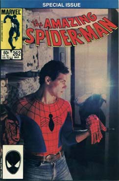
Dazzler #21; $1.00
Spider-Woman #50; $1.00
Marvel Fumetti Book #1; $1.00
Happy Days #6; $0.40
Beneath the Planet of the Apes #1; $0.25
The Mod Squad #8; $0.15
Amazing Spider-Man #262; $0.60
Marvel Team-Up #128; $0.60
Star Trek #8; $0.15


30 comments:
I'm with you on not liking these photo covers one bit. By the time Marvel started doing this, I had already stopped regularly reading Spider-man, Marvel Team-up and Spiderwoman, so the whole trend slipped past me.
However, even as a younger lad, I didn't much care for the photo-stills used on their movie and TV adaptation comics. But faced with your dollar dilema, I suppose I would take the bang for buck option and just get all of the Gold Key (and Dell) titles: Planet of the Apes, Happy Days, Star Trek and Mod Squad - I'm actually quite curious about the latter in any case.
I think the tv comics with photos and the superhero comic with photo covers have different appeal. The Happy Days and Star Trek comics feature images I'd seen before. Before the days of the Marvel Cinematic Universe, we rarely saw realistic depictions of Marvel characters. So that's why those covers impressed me as a kid. Having said that, the only one I bought was the Spider-Man issue. It's actually a fun, somewhat light stand-alone story.
I remember seeing that Dazzler cover but I didn't buy and never read it. So I have no idea what is the "shameful secret of Dazzler's past."
This is a fun theme. I have to have that Star Trek comic! After that, nothing exactly blows me away. I'd spend my next 15 cents on the Mod Squad, which is actually a pretty cool, and appropriately 60's (though it came out in 1970) cover. That leaves me 70 cents, and I guess I'll blow it on the Marvel Team-Up. It's a terrible cover, but they all are other than Star Trek and Mod Squad, and I'm a sucker for team-up books!!
Dell and Gold Key all the way, baby! (Okay, maybe not Happy Days. Who cares about what happens to those guys?) I had stopped buying by the time those Marvel comics came out, and shoddily designed covers weren't going to draw me back in. (Not that the TV covers are well designed. The Trek one's pretty funny: "Here's some of the cast in the transporter! Here's more of the cast in the transporter!" You've gotta love how lazy/efficient/rushed the art director was on those.)
There have been covers which incorporated photos with artwork (Fantastic Four 33, with Submariner; for example) that I absolutely loved. Different animal, I know. As for these all-photo images, not the biggest fan. They did seem more enticing on the racks if they were tv or film actors; as Dell/Gold Key used so often. One of my favorite covers of this type is a Munsters issue from about 1966; Fred Gwynne in all his glory; with a weird psychedelic back cover to boot!
Thus, my choices today are Mod Squad and Planet of the Apes ( a total bargain at 40 cents for both), leaving 60 cents for Amazing Spider-Man (just for the title, not the cover...).
Gee, can I have $2.00? You picked some pretty expensive comics this time to only have a buck to spend. lol
Not a big fan of the photo cover. They may be able to do it better today, but back then, graphic art and printing technologies just weren't quite up to the task of making them look any good.
That said, I bought both the Amazing Spider-Man and the Marvel Team-Up. Not because of the "cool" photo covers, but because I was already buying those books every month anyway.
Ah, maybe I'll swap my Marvel Team-Up for that Planet of the Apes after all, and use the leftover money for a Snickers bar. Those still cost a quarter, right?
The only covers that look good are Dazzler & Spider-Woman. I'll go with Spider-Woman because she's not Dazzler.
- Mike Loughlin
I have (or had) three of these. The Dazzler and ASM books are still part of my collection. The Fumetti book was a gift to a friend who he eventually got signed by John Romita wife, Virginia who appears in it (she worked for Marvel for years).
We were at a charity signing for John Romita Jr, and Sr. showed up and did some signing too and when we saw that Virginia was there he got her to sign the Fumetti book - she was really touched and spent a lot of time looking through it and laughing b/c it had been so long since she'd seen it.
Anyway, I don't mind the photo covers. . . My favorite are the artistic ones that Sienkiewicz did, mixing photos with drawings.
BOOO! Down with Dazzler hate! I love Dazzler.
As a rare one-off I don't mind it. I remember buying Spider-Man 262 new since it was still at the very tail-end of my regular collecting days, and I kind of liked it for that issue (it was an oddball story anyhow). Fantastic Four 268 was another one (mask of Doom photo) I thought was kind of a cool one-off as well.
I had stopped buying Spider-Woman by that point, but actually, that cover makes me want to pick that one up. But again, would not want any of these other than very rarely, much prefer regular art. I do agree with a couple of people who have mentioned the mix of photo and illustration, some of that collage stuff can be pretty compelling.
I don't know about them inspiring the Alex Ross realistic style, maybe in part. I kind of feel more like he took pretty the same traditional technique as some of the guys who did the painted covers back in the day like Bob Larkin (I still remember as a kid seeing a Fireside collection cover he did and wishing I could have a whole comic book that looked that way), and brought that forward again in the 90’s in a high profile way (particularly by doing the full interiors on Marvels and Kingdom Come).
But if I WAS going to spend my $1 on treats instead, I’d probably grab an RC and bag of Royals (points to anyone who remembers those).
And Dr. Oyola, yes, Dazzler is awesome.
Going purely by the covers I would purchase Spider-Woman #50.
It is historically interesting because stylistically it is the closest of the bunch to the modern trend for photorealistic artwork. On my little phone screen it looks like an Alex Ross or Greg Horn cover.
Besides, last issues are cool, like following characters into an oblivion they don't see coming.
Thanks all for commenting. I honestly wasn’t sure if there would be any interest in discussing the photo covers. So the friendly discussion is much appreciated.
To back up Dr. Oyola I submit to you that Dazzler fought the Enchantress, Terrax, the Absorbing Man, Rogue, Dr. Doom!! And Galactus!!!! All while on roller skates!!!! (And probably while listening to the Bee Gees, Trammps, and Shalamar). Show me anybody more daunting than Dazzler…. she’s so cool she could get the world eater dancing on Soul Train!
And check out the series of Sienkiewicz’ covers on her title.
On another note, I did not include mixed media covers where comic art was combined with photos. For some of those covers I had the exact opposite and positive reaction. IE. Sub Mariner #7; I love seeing Subby flying over a New York parade. Awesome!
I too would buy the Gold Key and Dell comics this time around. Although that Happy Days one is just so odd; the blurb “Can muscles be the answer to Richie’s girl troubles?” just doesn’t sell me.
So a little left over for a Zagnut. No idea what Royals are, but I’ll try anything once (at least as far as candy goes).
That's artist Joe Jusko dressed as Cap on the MTU 128 cover. From Joe: "That's me in the Cap suit on the cover, circa 1982. While the flash makes it look as if we're "dropped in" the picture, rest assured we were on the roof of Marvel Comics running around on VERY slippery tar paper! The things I did to insure I got work in those days! LOL"
http://joejusko.deviantart.com/art/Marvel-Team-Up-128-108795645
Ewan- yes, Brach's Royals! We used to get those as part of a big candy mix at the self-serve bin at Kroger. Along with the Royals, I had to get a few chocolate creams, jels and of course, Brach's caramels...
I was never big on photo covers, but sometimes they work. Spider Woman #50 was a good issue if I remember right, but it was also the last issue; too bad, I would've liked to see where Ann Nocenti was going with the character.
So, I'd probably go for either Amazing or MTU...I'm leaning toward MTU since it was Spidey's first encounter with Vermin and I remember it being pretty good. To go along with the MTU...I dunno, maybe the Star Trek? I've never read a Gold Key Star Trek (and from what I've heard, they're not great), but the price is right.
Mike Wilson
Hiya,
In most cases I agree that the drawn cover is superior. Those things weren't just someone doing a quick sketch but rather the editor and the artist often spending hours designing the layout to maximize effect. These photo covers were limited by the technology of the day so that leaves me wondering what could be accomplished with modern computer programs like Painter.
That said, I will confess that the models for the Dazzler and the Spider Woman comic immediately grabbed the attention of the hormone bomb that I was at the time and I think I still have both books. So obviously someone at Marvel knew what they were doing.
As a side note, I read that Ann Nocenti occasionally wore the Spider Woman outfit for promotions and such so does anybody know if that might be her on that cover?
seeya
pfgavigan
If I had a buck to spend, I would buy the Marvel Team-Up, a bag of Bak-In pork rinds and a RC soda. If I was short, I would put back the Marvel Team-Up. Mmmmm......pork rinds..........
I was bouncing around at Mike's Amazing Newsstand and I was surprised at how long Marvel stayed at 60 cents!!!
(I went to a zoo once and the only animal they had on display was a dog. A DOG!!!! It was a shih tzu.........)
@pfgavigan: According to this, Ann Nocenti is Tigra (in the background) and Spider Woman is a secretary named Lynn Luckman; there are credits for the other "actors" in the scene as well.
Mike Wilson
The Sienkiewicz covers on Dazzler were awesome! The interiors, however...
(I am curious about the Paul Chadwick issues, being a huge Concrete fan, but not enough to actually read them)
Hey, everyone's character is somebody's favorite. Dazzler just happens not to be mine. I don't detest her (she's not Gambit), but the few issues I've read from her solo series didn't do anything for me. Not to mention the pile of badness that is Dazzler: The Movie... Actually, I love the story in X-Men Unlimited 32 that was "Dazzler: Behind the Music." It's by Will Pfeifer & Jill Thompson, and it's hilarious.
- Mike Loughlin
Thanks for the link Mike W. That's some interesting background info and it's cool to know that it's a bunch of creators costumed in the Spider Woman cover. I like the tidbit that all of the costumes were from Mark Gruenwald's collection.
I know many of our readers have a much better reach across comics genres than do I. How was the art inside the Dell books? The photo covers were always eye-catching, but did the interiors pay off?
Amazing Spider-Man and Beneath the Planet of the Apes for me, by the way.
Doug
Hmm OK trying to convert TT to US, gosh, I gotta get a little more than $6 at the current exchange rate! Just kidding. OK lessee here, I'd take the POTA for 25 cents, then Star Trek for 15 cents, and finally MTU for 60 cents to end up with an even buck to spend. You just can't go wrong with apes, Kirk & Spock and Spidey and Cap!
- Mike 'looking to find a real buck to spend now' from Trinidad & Tobago.
Hiya,
Doug said
know many of our readers have a much better reach across comics genres than do I. How was the art inside the Dell books? The photo covers were always eye-catching, but did the interiors pay off?
BWAHAHAHAHAHAHAHAHAHAHAHAHAHAHAHAHAHAHA . . . gasp ! BWAHAHAHAHAHAHAHAHAHAHAHAHAHAH . .
oh, wait . . . you're serious?
Really tough question to answer. By this time Dell and Golden Key were two different companies and it definitely impacted both. Sometimes old guard artists were on inappropriate books like Al McWilliams on Star Trek. A lot of European talent was used on books, which wasn't for the best when it was a media tie in like the adaptations of King Kong or Star Trek and the artists had never seen either works.
seeya
pfgavigan
Doug- of the Dell/Gold Key art I have in my dusty longboxes, most of it is pretty workmanlike. Not bad but not much memorable, although some of the Ripley's Believe it or Not! and Twilight Zone stories had some nice illustration...
When DC tried integrating photos onto their covers in the early 70s, it was generally in service of a teaser for the story, as opposed to a generic photo of the character involved. Even so, the results were generally pretty muddy. Ones that come to mind straight away are Flash #203, Superman #263 and Shazam #2 and #6 (OK, those two were generic).
Of the bunch you're presented, I'd go for the Beneath The Planet Of The Apes one - it was one of the earliest comics I recall buying, I was young enough to have no idea it was a sequel, I couldn't make any sense of the story....and loved every page of it.
Doug, I had a few of the Dell and Gold Key movie adaptation comics back in the late '70s, and I think Redartz pretty much sums it up aptly, i.e. workmanlike is the term I would use as well. Also, I recall that the lettering always looked really plain, almost like it was typed in, which added to the overall lackluster appearance of the art. That just goes to show how important good lettering is to comics.
Mike W., thanks for that link. That is quite interesting. And I have to say, even though I still don't like these photo covers, I completely agree with Mike Carlin about Lynn Luckman: she does indeed look awesome in that suit.
I like them all. But as novelties. The real treat of course was reading the story inside drawn by an artist and written by a writer.
Joe Jusko as Captain America it must be mentioned- Joe is a former cop and bodybuilder so he makes a good Cap.
Post a Comment