Silver Surfer #1 (June 1982)
"Escape -- to Terror!"
Stan Lee/John Byrne-Byrne/Tom Palmer
Doug: For those of you still hanging with me after my reviews of some subpar fare from the Big Two (Thor #269 and The Joker #9), thank you! Today I promise I'm going to present a more positive experience -- and I hope you'll leave this space feeling buoyed as well. My choice today is a comic book that I actually did not know existed until I purchased the large tpb, Silver Surfer Epic Collection: Freedom. I bought it to replace my 1980s Silver Surfer series that went bye-bye in the "big sell-off" of my collection. I had enjoyed the Steve Englehart-Marshall Rogers collaboration in the early years of that series and wished to hold onto the stories.
 What I did not know is that it contains the story above, as well as the short tale from Epic Illustrated, "The Answer". Bonus, and bonus. So here we are. Let's get right down to business then.
100-Word Review: Alone and brooding in the former home of the Inhumans, the
Silver Surfer reflects on his life since becoming the herald of Galactus. He
decides to test Galactus’s barrier once more, only to be repelled. But seeing a
strange beam arcing from the Earth toward the barrier, he pursues it until he
encounters the Fantastic Four. Reed Richards believes he has found the means to
free the Surfer from his fate. But there will be only one chance, and if
reversed the barrier will revert. The Surfer flies through, and straight for
Zenn-La. Once there, he is met as a traitor…
Obviously there was more to the plot than that -- after all, this issue was a 48-page monster! So to cheat just a bit, the Surfer encounters the father of his lost love, Shalla Bal. The old gentleman is not kind to Norrin Radd, telling a tale of a return to Zenn-La by Galactus. Although the space god had made a bargain with Norrin Radd, trading the planet's survival for Radd's tenure as the herald of Galactus, the Surfer's betrayal on Earth seemed to negate the deal. The Devourer no longer was compelled to avoid Norrin Radd's former home. But Galactus, not without honor, allowed the people of Zenn-La to evacuate the planet before its destruction. Once drained of its lifeforce, the people returned to nothing but desolation on their homeworld. When asked the location of his daughter, the father told the Surfer that she had been taken by one who exuded utter evil. At this point the Surfer became aware of his true enemy -- Mephisto. And it had always been Mephisto, even manipulating Dr. Doom some years before. Can you say: Showdown!
The Good: Where to start? A script by Stan Lee over a plot by John Byrne, with art by Byrne and Tom Palmer? That's as good a place as any. This reads like a classic Silver Surfer book. No one writes the Surfer like Stan does -- and I'll say for better or worse, depending on your perspective. When I think of the Surfer I think of his nobility, his perseverance, his dedication to his true love and the hope that someday he'll see her again. Stan provides that.
I mentioned that the book is long -- over twice as long as a standard 20-21 page comic. That was OK, although I did feel my stamina waning a time or two. I'm going to write that off to time of day during my reading rather than boredom. This was a really good story. I can probably argue with you about whether or not this was something I'd seen before (Silver Surfer #3 comes to mind, as does the Surfer graphic novel Judgment Day (published six years after this story)). I'm going to call it "comfort food", or a well-worn pair of blue jeans.
Take the flashbacks, for example. Again as I mentioned, the Surfer's origin from Silver Surfer #1 is recapped, as are his early appearances in the Fantastic Four (circa #s 48-61) and the Dr. Doom 3-parter from FF #s 155-157. Sometimes I find this sort of thing, particularly if I know the prior stories, tedious. Yet here it's woven together in such a way that the historical elements fit seamlessly into the current context. Byrne thought this through, and knew his Marvel history. I think that's why I believed in the Surfer's passion to break the barrier, it's why I admired Reed Richards's selflessness in working tirelessly to design a means to get through the barrier, and why my heart leapt when the Surfer landed on Zenn-La and fell when he saw its condition. Comfort food.
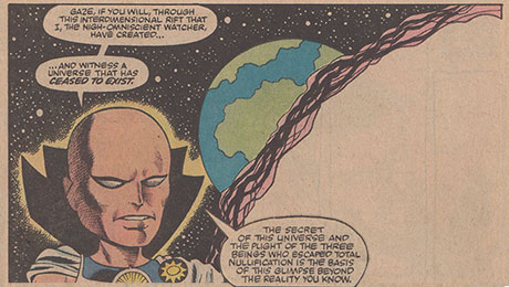
There are images throughout the story that are just great. The Surfer's recoil upon striking the barrier at his fastest speed, the regality of Galactus, the aversion to the Surfer of the people of Zenn-La, the evil of Mephisto, and the beauty of Shalla Bal. Figure work, settings, pacing -- the artwork is fantastic throughout. Note the two images of Galactus above (one closer to the top, one immediately above to the right) -- see his power in all three panels, but note the emotion in the close-up. Stern, driven, surviving. Love it. And I could go on and on with what I liked, but let's face it -- not everything came up roses. So...
The Bad: Some of you might look at the art samples and think this is one darned good looking book. I concur. But, if you wanted a John Byrne Silver Surfer book, my sense is that like me you find Tom Palmer's inks overpower Byrne's pencils. I can see Byrne throughout in some of the figurework ("stock poses", if you will)... one example is in the horizontal panel above right where the Surfer reaches out to Shalla Bal. We've seen Byrne use that pose during just about any tenure on any book he's ever drawn. It's not bad at all -- I'm just saying that it's there that I am seeing him shining through Palmer's inks. Another example would be the facial movements of Shalla Bal's father's speech, also above right. Palmer is wonderful across the breadth of this story -- he is of course in that top tier of all inkers in the Silver and Bronze Ages. So I really have no complaints, just observations. And it's not so bad.
The Ugly: There was nothing about this story that would fall into this category. It was creatively pleasing, paid off satisfactorily, and had I purchased this from a newsstand or more likely a comic book store, I would have felt great about parting with my dollar.
I chose not to delve too deeply into the intricacies of the plot for this review, as once I started looking for images to scan I landed on full pages. While I don't show many pages that ran consecutively in the story, I think you can glean meaning from those that do appear. The page above right, with Shalla Bal now gifted with the power to restore life on Zenn-La would segue into the next Surfer project...
Marvel Comics has done us all a favor in publishing this Epic Collection line of trades. Each volume contains 20-25 issues, some organized by continuity, some by theme. The best aspect of this new line of trades is that they are not published in chronological order -- we can get our mitts on good stuff from throughout the Silver and Bronze Ages. The extras included, as in this trade, are excellent. At the conclusion of this volume is a full reprint of Marvel Fanfare #51, which contains a lengthy story by Steve Englehart, John Buscema, and Jack Abel. It's a presentation of an early version of the project that became Englehart's 1987 Silver Surfer series (in collaboration with Marshall Rogers). You know I'm the biggest John Buscema fan, but I'm grateful that Englehart took the Surfer where he did, rather than what appeared in Marvel Fanfare. Let's just say I was much happier with the reuniting with Shalla Bal, as opposed to settling down with a lady friend who incessantly refers to herself as "this one", and who also communes with plants. You know what I mean.
Marvel Comics has done us all a favor in publishing this Epic Collection line of trades. Each volume contains 20-25 issues, some organized by continuity, some by theme. The best aspect of this new line of trades is that they are not published in chronological order -- we can get our mitts on good stuff from throughout the Silver and Bronze Ages. The extras included, as in this trade, are excellent. At the conclusion of this volume is a full reprint of Marvel Fanfare #51, which contains a lengthy story by Steve Englehart, John Buscema, and Jack Abel. It's a presentation of an early version of the project that became Englehart's 1987 Silver Surfer series (in collaboration with Marshall Rogers). You know I'm the biggest John Buscema fan, but I'm grateful that Englehart took the Surfer where he did, rather than what appeared in Marvel Fanfare. Let's just say I was much happier with the reuniting with Shalla Bal, as opposed to settling down with a lady friend who incessantly refers to herself as "this one", and who also communes with plants. You know what I mean.


7 comments:
Thanks for the review, Doug, I enjoyed reading it.
I pulled out my copy of this (the actual comic book) and re-read it last night in anticipation of this review. I agree with your general assessment: it's a good read, kind of like comfort food - although seriously, don't most of the superhero comics we love so much here fall into that category?
In its general themes, no new ground is covered here at all. The Surfer's confrontations with Galactus and Mephisto also seem familiar when reading this story, as do his typical moping and the tantalizing (again) separation from Shalla Bal. Even so, for covering so much familiar ground, I agree that it is a well-crafted story, with the flashbacks adding to rather than weighing down the narrative.
One thing I'll say about the art, though, is that I find it oddly inconsistent and, given that Byrne was the penciler, a bit off-kilter. I'm really glad you posted that page with Surfer and the FF on the roof of the Baxter Building (the fourth image posted). That's one that jumps out at me every time I read this, because I'm pretty sure Byrne didn't draw it all, or if he did it was just bare sketches while Palmer did everything else. The faces in particular don't look like Byrne's style in the least.
Nice review, Doug; and definitely a feel-good book. Nothing earth-shaking or edgy, but solid. And that artwork is pretty nice. I agree that Palmer's inks tend to overshadow Byrne's pencils. The look is smooth, attractive and pleasing, but perhaps less stylish than otherwise might have shown through with another inker. Nonetheless, a book worth looking for. And that final page makes a great pinup...
Ahh great review Doug!
Nothing beats a classic Silver Surfer tale, plotted by Stan & Byrne, with art by Byrne and Palmer. Yes, the artwork looks like 80/20 percent Palmer/Byrne, but hey that's not a bad thing considering the quality of these two artists. While I've never been a big fan of the Surfer's almost mopy attitude (you'd think someone wielding the Power Cosmic would be more upbeat!) he definitely goes on a heroic quest here. You can tell the Surfer was one of Stan's favourite titles to write.
- Mike 'does Mephisto like devil's food cake?' from Trinidad & Tobago.
Another good review, I'm in agreement with Doug on the art. I picked this up around 1985, when I was trying to buy every issue ever penciled by John Byrne (I never did and never will, since his X-Men issues are way too expensive). I wanted Byrne art and it looked more like "Palmer art" to me. I generally like and respect Palmer's work, he did a great job embellishing John Buscema, Gene Colan and Neal Adams. But I felt like his style overpowered Byrne a bit to much. I'm guessing this was done when Byrne was busy writing, penciling and inking the FF, which meant Marvel needed Palmer's help to finish the job. I feel the same way about the Byrne/Palmer art several years later in Star-Brand.
Fascinating that everyone so far seems to have the same impression of the Byrne/Palmer art ("It's really good... BUT...") and that's pretty much how I've always felt about it too, only more so. It's not just that Palmer's inks overpower Byrne's pencils, their styles simply don't seem to mesh very well at all. This was at a time when Byrne was at the very peak of his abilities, he'd found that delicious sweet spot between "realistic" and "cartoony", and Palmer pushes the needle way too far in the "realistic" direction. Much of the quirky charm and personality of Byrne's pencils has been lost. When I look at the pages posted here, and I think about what they could have looked like with a more sympathetic inker -- alas!
I seem to remember reading an interview with Byrne where he expressed his own disappointment of the book as well. He had always loved the X-men issues by the Adams/Palmer team and had expressly asked for Palmer to ink the job -- and then when he saw the results he was all "Well, that didn't really turn out how I expected"
I agree with everything said about the art. It was over inked a bit. In fact when this came out, the cover turned me off (I still bought it but I was so looking forward to a clearly Byrne cover). The musculature on the surfer looks too extreme and the face too shadowy and defined. The last page shared in contrast is much better. It's interesting how there are glimpses of Palmer greatness though too like the page with the Surfer in space or the panel where the back of the Surfer is seen as he blasts something. Those are nicely done. Just a weird art combo. And I think I was taken aback by how different the FF looked in their own book at the time ( also by Byrne) compared to this story. The Thing looks good but Reed is not the thin and lean Reed of the Byrne era. I really wonder how this project came together and over what timeline. I do like it though and I recall there was a lot of hype about the Surfer being freed from the Earth boundaries. Thanks for the review Doug.
Great review/overview!
Especially in Doug's analysis of the art. I agree, over-inked, but some classic Byrne poses that are easily recognizable, I'd say with the exception of characters we are not used to seeing (like Shala Bal's father) the faces seem like the weakest part.
The Silver Surfer is one of my all-time favorite characters.
While it may not appeal to some of you here, the current Silver Surfer series is pretty dang good (issue #11 won the Eisner for best single issue) and Mike Allred's Art is fantastic and mind-bending.
Post a Comment