
Sunday, May 31, 2015
John Romita Was Still Jazzy in the 1990s
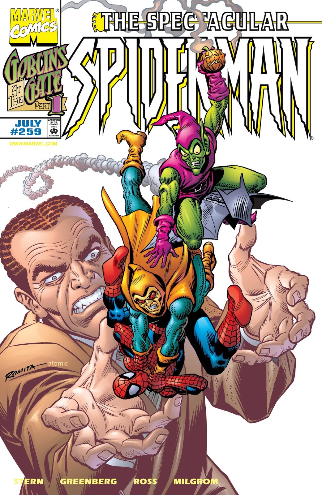
Doug: As I was readying a large lot of 1990s comics for eBay, I came across a series of covers that I'd forgotten. The book in question was Spectacular Spider-Man (known to Bronze Age Babies simply as Peter Parker...), and right before the title ended there was a little 3-parter featuring the Green Goblin. Long-time Spidey artist John Romita, Sr. was tapped to do the covers, and what a nostalgic trip it was. See for yourself:


Subscribe to:
Post Comments (Atom)


8 comments:
I have no memory of whether I have these issues or not. They were perpetually cancelling and re-starting new Spidey titles so often in the 90's that there was a point where I FINALLY surrendered and simply didn't pick up the next "blockbuster" first issue that was gonna blow my mind, etc, etc. I think it was when WEB OF SPIDERMAN was 86'd, but right there in the "Final Issue, Folks" announc't they were stumping for the release of . . . whatever the next title was going to be. . . the very next month. One that I particularly liked the title itself of was FRIENDLY NEIGHBORHOOD SPIDER-MAN, 'cause it had such a neat, warm association with the character himself, rather than just another generic, titular "grab" word.
It's so nice to see Romita's work here! While not necessarily ground-breaking, he still has an undeniably knack for being able to catch the eye and design a layout. Strangely enough, these covers make me think of Sal Buscema as well. These covers. . . might have Made Me Buy These Books!
HB
Yeah, don't know what's going on inside those issues, but those are some truly nice-looking covers. But then again, what else could you expect from JR Sr.?
It's interesting to see Romita's clean Silver Age-style art mix with computerized coloring. I'll say it's not a look that is very pleasing to the eye.
But in the first and last covers, doesn't everyone pictured just look "right"?
Doug
Doug, in terms of composition, I think all three of the covers look great. As for the coloring, I think it's only an issue on the last one; that is, I think that one is really hurt by the newer technique and would probably look much better with those so-called "flat" colors all of us cranky old-timers like.
There was a '90s prestige format one-shot scripted by Stan Lee & drawn by Romita Sr. called Spider-Man/ Kingpin: To the Death. It looked good, even if I don't remember much about it. I do recall one page in which Romita draws a bunch of character cameos, including Wolvetine. I wonder if it's the only Romita-drawn Wolvetine to appear in a published comic book.
- Mike Loughlin
IIRC (and I could be mistaken), Mike, the veryveryvery first panel with Wolverine- at the end of Hulk 180- was a Romita re-do pasted over Herb Trimpe's original attempt. Seems like that tidbit popped up on a letters page not long after. . .
HB
Still jazzy indeed! Romita also penciled a good 1-shot in the 1990s called 'Spider-man/Kingpin:To The Death that's worth seeking out.
http://www.amazon.com/Spider-Man-Kingpin-Death-Stan-Lee/dp/0785106537
Post a Comment