


Doug: Welcome to another $1 Challenge, where Martinex1 will challenge you to feed your comics addiction on a strict budget. This is the first of two such posts -- we'll run ol' Mike S.'s other submission in just one week.
Mike S.: Here is a simple question… has the color of a comic cover ever caused you to buy it? For me, I know the answer has been “yes.” So I have ravaged my collection and offer these covers for you to choose in a game of “If I Had a Buck”.
I think colorists are underrated in the impact of comic art. I really enjoy looking at original comic line art like the samples Doug has shared from various IDW offerings. When I see those pencils and inks and imagine how they might look in finished form, colored and printed, sometimes my expectations are met and exceeded with the actual production and sometimes the finished work falls flat.
Speaking for myself, I am attracted to certain aspects of coloring on cover art. Here are some things that attract me:
- Secondary colors. Superhero comic characters (particularly heroes) tend to bathe in the primary colors. So many costumes are heavy in blues and reds. When a cover instead emphasizes oranges and purples and greens and pinks, they stand out. I think you will see some of that below.
- Monotones. Less color is sometimes more. I like when a single color floods the landscape or fills the cover; those books always attract me. In Moon Knight’s first series, many covers limited the color use. I think that is because the hero’s costume is essentially black and white, and too much garishness around it caused the figure to “disappear”. A graphic designer might need to comment, but whatever the reason the effect was dramatic.
- Tying all elements together. When the logo and corner box all match the cover color scheme, it seems like coherent art. I believe that when John Byrne designed the famous Alpha Flight #3 cover (with Aurora in a background of black and white rods) he wanted the logo and marketing points to be in black and white also; instead they were colored yellow. orange, and pink. Mistake or not, I think complete consistency helps.
- Pastels. I noticed that I enjoy pastel colors in contrast to bold solid colors. DC seemed to master this technique. Aquaman in the late ‘60s used a nice color palette that offered varied hues. DC’s coloring at the time seemed more experimental.
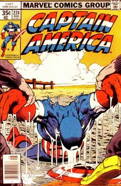
- Unexpected choices. I originally saw the Mike Zeck art for the Captain America issue (below) in black and white form. I expected it to be a nighttime or stormy scene (because of the cloud and the dreariness and bleakness of the action). When I saw the actual cover, I was taken aback. It was not dark greys and deep sea blues like I expected. Instead, it was perhaps “dawn’s early light”. Nice. Plus the orange really contrasted well with Cap’s costume colors and the logo.
Unfortunately, I cannot find credits for who colored the twelve
samples below. And I don’t want to
assume that the interior colorist handled the cover art or that the penciler
had any input to the color scheme (although that may be the case). So any input about that topic is appreciated.
What draws your eye to a comic on the stands? Is it all content or are there subtleties in
color or technique that catch your fancy? Make your choices from below, and if you have any comments about
particular storylines, artists, layouts, and design please share that as
well. I appreciate all commentary (and
it only costs you an imaginary dollar).
I’ll throw in some dialogue balloons for free.
Aquaman #37. Cover Price $0.12. Aquaman: “Hang on Ariel! I see Mickey, he’ll know what to do!”
Avengers #85. Cover Price $0.15. Wanda: “Why does that say
‘Sinister’? What kind of strange
alternate world is this”?
Captain America #224. Cover Price $0.35. Cap: “BLUUURFFFF!”
Defenders #103.
Cover Price $0.60. Casper: “Will you be my friend”?
Doom Patrol #119. Cover Price $0.12. Robotman: “If he steals my
mind, there’s really not much left!”
Flash #286. Cover Price $0.40. Flash: “I taste lemons, cherries and
oranges! Curse you Fruit Stripe Zebra!”
Iron Man #152. Cover Price $0.50. Iron Man: “Shhhh!”
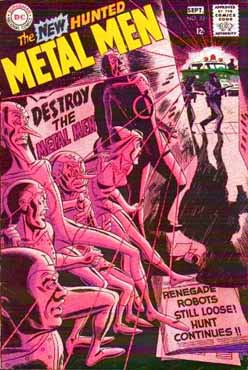
Metal Men #33.
Cover Price $0.12. Iron: “That
headline’s a little on the nose, isn’t it?”
Moon Knight #3. Cover Price $0.50. Freddie Mercury (off panel): “Super powers
always fighting. But Mona Lisa keeps on
smiling”
Namor, The
Sub-Mariner #8. Cover Price $1.00. Head: “When they said ‘Floating Head Cover’, I had something else in mind
entirely”.
Teen Titans #14.
Cover Price $0.12. Robin: “I know
smoking will be the death of me”.
X-Men #138. Cover Price $0.50. Cyclops: “I haven’t washed my civvies since
Muir Island!”


15 comments:
Good subject criterion for your "Buck" challenge today, Martinex1! The color scheme of a cover can be an integral part of it's appeal, and consequently it's likelihood of purchase. Oddly I never really contemplated the identities of the cover colorists, perhaps it was, as you mentioned, the assumption that the interior colorist was responsible. Food for thought...
As to my choices today: Avengers and Iron Man (I have a weakness for monochromatic covers, it seems), plus Doom Patrol (a hit of 60's psychedelia) and Aquaman (very nice coloring, wonderfully subtle). Wow, pretty good haul for a buck today!
Plus, you have inspired me to go longbox wading to find other cover color standouts. Tonight, after work, that is...
Sorry, man, but pure calculating greed colored my choices today, which are: Aquaman #37, Avengers #85, Captain America #224, Doom Patrol #119, Metal Men #33, and Teen Titans #14. Six comics for a buck (or 98 cents to be precise)! Haven't had a haul that good since Rob's recent 10-cent flea market post...
However, there are some great covers in there, regardless (esp. Teen Titans).
To address your question, while I did occasionally buy a book simply based on the overall art, I'm not sure if I ever bought a comic based on the cover's color scheme alone. For example, back in the day I had those issues of Flash, Moon Knight, Iron Man and X-men, but I was already reading those titles anyway - although I'll readily admit that I find the color schemes on the Iron Man and Flash covers in particular quite attractive and eye-grabbing.
"Cyclops: 'I haven’t washed my civvies since Muir Island!'" Haha! Beautiful.
I'm most impressed with the Aquaman and Teen Titans covers, color-wise, so I'll take those two straight away. I'll round out my haul with Flash and Doom Patrol, making this trip to the dream store an all-DC affair. Each of those covers are just so striking, and they do their job perfectly: I want to buy the issue and read the store inside.
I remember buying that Iron Man issue off the rack. The cover floored me. Stealth armor! That wicked-looking armor contrasted with the photo background made for one of the all-time best Iron Man covers in the history of the character. Great story too.
I'd have to go for the Moon Knight and X-Men, since I'm familiar with both and know how good they are. I used to be something of an "impulse buyer" when I was a kid...a really good cover could get me to try something I didn't normally read, but for me it was more about what was happening on the cover--action over colour scheme.
Mike Wilson
Sorry...., I know it's off-subject. I love some of the covers.., truly dynamic, but I still won't forgive the companies for those terrible ad mastheads. It's hard to fight past that. Worse that the terrible UPC box.
The Silver Age entries here are so much more artsy, yet simple in style.
My favorites are the first 3. Aquaman and Captain America even use the color of the logo really well, as you mentioned. Avengers, the ghostly blue surrounded by all the hot colors is striking. For my dollar, I'll have to go with the remaining 3 12-centers.
For reading, I'd go with Moon Knight. I'm finished reading my Epic Moon Knight (issues 5-22) book, and it's so awesome I'm reading it through a second time!
Glynis Wein has been mentioned here before as one of the best Bronze age colorists. I think color made a bigger impact in the older comics, as they didn't have the special effects of today's colorists. They relied on color contrasts to make the work pop out.
Thanks all for commenting and playing along with this color madness game.
Redartz, I will be curious if you find any color inspirations in your longbox. As I was pulling this together, I realized that many of my favorite comic purchases were color influenced. Like the listed Defenders issue… I don’t think it was a great story (heck, I don’t even remember the story), but I can remember getting that off of the rack and how the blue color stood out to me. I’ve often wondered how others would have colored that and if the choice was an aesthetic choice or an easy path of least resistance choice.
Edo, I hear you. For me also, it is so hard sometimes to determine if I loved the books because of the art and story or if the cover and color influenced me more. The X-Men shown here is for some reason one of my favorite X-Men books despite the fact that it is just a retelling of their history. And even though it is surrounded by classics like the “Dark Phoenix “ and “Days of Future Past” stories, my eye just goes to this book when I compare. So I have to conclude that the cover had some influence, and I do think that pink color with Cyclops so bold in the foreground and the whole team a soft blue in the background is classic in and of itself. But let’s face it, the Claremont Byrne run was awesome back in the day, so it probably could have been stick figures of any color and I would have bought it.
JJ, yes, that Iron Man issue is awesome. It is a really cool design and I believe it is one of the first armors that really seemed to have a clear and distinct use; and the book has the Living Laser (one of my favorites) as a villain also.
Garett and Mike W. That Moon Knight run deserves a review someday. It was so good. It had a different and interesting approach to the hero myth. I think that is a title that would have benefitted from not going direct sale only toward the end.
David_b. I think that is very on topic since we are discussing covers. I almost didn’t use the examples with the advertising mastheads because I really dislike that trend also. I find it interesting that the Metal Men and Doom Patrol issues actually went the other way and modified their logos’ size and position to accommodate the art. But in the Marvel “You have a chance to win…” issues, the art gets squeezed. It is too bad because those covers would have been even better if the art was larger. I also never understood why the UPC had to be on the front cover; put it on the back and lose a square inch of ad space.
Thanks again for commenting. Color in comics is something I like to talk about.
Martinex1- indeed, it didn't take long to find numerous examples of powerful covers of which the color scheme was the big attention grabber. Looking through John Byrne's classic Fantastic Four run, I found several great ones (such as issue 259, with Dr. Doom's dark green visage absolutely leaping off the graded pink/magenta background, and 275- with the verdant She-Hulk framed by a blue/black window screen). Makes me wonder how much influence Byrne had on the cover coloration, or if he actually did it himself. \
Another very striking color usage is found on DC's Star Spangled War issue 138. All black backgound, setting off the image of Enemy Ace in frosty blue, in the foreground are two WWI planes, striking in fiery red and yellow. A Silver Age Kubert masterpiece.
Garrett- you make a good point about today's coloring effects. Too often modern comic coloring just looks like enhanced computer game graphic color. To be fair, though, there are certainly some fine coloring examples yet today. Check out Francesco Francavilla's
creepy, effective colors on "Afterlife with Archie"...
Sorry to diverge a bit from your fine examples today,Martinex,but I could discuss color with you till the scarlet sun goes down!
Just going by the covers and with the proverbial buck in my pocket, I would grab Cap and Moon Knight. That is quite an image of Cap and the promised fight between Moon Knight and Bat-Man. I know, it's not literally Bat-Man, but we know, you know. Now, I've got 15 cents and the rest of the day........wonder if that's enough for the Weider Super Arm workout!?!
(Where were you
When I needed you
Well you could not be found
What can I do
Oh I believed in you
You're running me around
Well you can take it as a warning
Or take it anyway you like
It's the lightning not the thunder
You never know where it's gonna strike).
Redartz that Enemy Ace cover is great. That's a nice layout in addition to the coloring. I honestly never saw it before ( or don't recall). I don't mind at all any divergence from examples. I always hope these dollar challenges trigger broader discussion.
Regarding the FF examples, I have to believe that some cover artists have a say in the coloring and definitely envision it a certain way. The FF books of that era always looked sharp with nice contrasts and some bold choices. There was a cover with Blackbolt raising Attilan against a white background; I always thought that really popped.
Redartz, while Byrne may have given some instructions about coloring, there's no way he colored any covers (or anything else for that matter), because he's color blind. I recall reading a post on his site once in which he noted that when he was just starting out at Marvel he thought Iron Fist's costume was brown (not green) because he couldn't tell the difference...
Anyway, all that talk about greens on covers reminded me of a cover with an absolutely stunning color scheme, Master of Kung Fu #68, and also Master of Kung Fu #83 - I would understand completely if someone bought those based on the covers alone (although the stories and art inside wouldn't have disappointed).
Also, when Redartz mentioned the Star-spangled War Stories cover, it immediately brought to mind the cover of Weird War Tales #80, another Kubert masterpiece turns around the color scheme, the pale gray of the plane set off against the fiery background.
Edo- thanks for the info on Byrne. I had no idea; would never have guessed. Reminds me of my days at Art School- one of my roommates was color-blind...
That Weird War Tales cover is nice, indeed. Kubert really was a cover master. Appropriately enough for this tread today, the Enemy Ace cover I mentioned; I bought it two years ago at a convention specifically for the cover and it's stark coloring (cost me quite a bit more than one buck, however)...
Hey Redartz, yes those colors by Francesco Francavilla on Afterlife with Archie look good from the pages I see online. I still have to read his book Black Beetle-- bought that one a while back. I also remember liking the coloring by Val Staples on Criminal. There are talented people in every era.
Edo, that Master of Kung Fu 83 is fantastic.
Garett, re: Black Beetle. That's another book you have that's on my wish list...
SOOO late to the party, but I think I selected the same EXACT list Edo put up! (before reading the comments) And, no surprise I was a bargain hunter. I regret not affording X-Men, but I owned that at one time and would like to try some new stuff, so Aquaman, Avengers, Captain America, Doom Patrol, Metal Men, Teen Titans.
Thanks to Martinex1 for another fun post!
Post a Comment