

Here's the one that began it all -- the X-Men #1 from way back in 1963. I've always felt that the "X" was akin to the lettering in the Thor logo. I'm not sure what look Stan was going for when he approved this logo; I also always think the ends of the X look like the tops of paper sacks! The corner box showcases three of our heroes: Cyclops, Marvel Girl, and Iceman. All of these figures appear somewhat stiff.


With issue #4 the Angel took a place of honor atop the logo. I always have liked the Angel; in fact I generally like the flying heroes, such as Hawkman or even Red Raven from back in the Liberty Legion days! I like the revised corner box, and the addition of the Beast, along with the Angel on the logo brings all five team members to the cover.


With issue #24, the Angel was bumped from his perch atop the magazine's title and replaced by none other than the headmaster himself, Charles Xavier. Two issues later, however, Warren found a new home in the corner box -- which was becoming quite crowded!


The corner box of issue #40 reflected a big change that had taken place the previous issue -- the team had "graduated" and was no longer required to wear their school uniforms. The now brightly-clad youths strutted their stuff atop the January offering. Another big change that happened shortly thereafter was the shrinking of the logo in favor of huge call-outs announcing what event or which characters were to be featured therein. I find this especially odd in light of the static Neal Adams would get around the release of the Living Monolith issues, as drafts he submitted were rejected due to the lettering of the cover logo being obscured.


BIG changes took place with the 50th issue of the X-Men. Fans will recognize the logo we've known and loved for years, as it debuted on that Steranko cover. Then, ten issues later the tag line, The Strangest Teens of All! was added to the top of the logo. Doing so really hearkened back to the first two issues. And then, and then at the height of creativity the book went down the tubes with several years of reprints.


The logo on the left was the primary corner box art during the reprint era; however, the image you see from issue #88 (which is actually reversed from the cover of #39) appeared then and only then. Issue #89 reverted back to the old-school Angel.


I'm not sure there's a more significant midstream change in any book than the one that took place in X-Men #94. What a complete turnaround! I loved the Dave Cockrum headshots in the corner box, and they remained there for many issues -- although by #101 the circle-motif had been replaced by a more vertical arrangement. Brooding, yet ready for action -- just like the All-New, All-Different team!


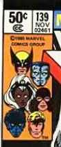

To close out this installment of our cover-love, we'll look at the John Byrne corner boxes. The lay-out was basically the same as Cockrum's, and it's perhaps surprising that it took Byrne two years to make the art his own. You'll notice on the cover of issue #130 that Banshee is no longer present, having lost his sonic powers. With #139 Kitty Pryde and the Angel joined the crowd, and then on #146 Kitty got some big '80's hair!
EDIT: Thanks to reader The Groovy Agent for pointing out that the corner box from #146 features art by Dave Cockrum during his second run on the book.
Hope you had fun with this -- Cropmaster Flash, signing off!
EDIT: Thanks to reader The Groovy Agent for pointing out that the corner box from #146 features art by Dave Cockrum during his second run on the book.
Hope you had fun with this -- Cropmaster Flash, signing off!


5 comments:
Great article. I love these posts on the logos and corner art. Btw, that last corner box sports Dave Cockrum art (heralding his riotous return).
Yep, Groove -- you nailed it. I think because the images are so different from Dave's first run on the book, it went right past me. In my opinion, Storm is the only headshot that is undeniably Cockrum; Nightcrawler is especially a departure from the caricature we saw when the All-New book began.
Thanks for the correction -- that's appreciated!!
Doug
Doug:
Continuing to love these. I found it interesting that the classic, Bronze-era logo kept getting "squattier" as time went on.
Keep these coming!
Cheers,
Andrew
ComicsBronzeAge.com
Thanks,love the logo & corner posts too!
Back in the 80s(before the days of Masterworks & DVD-ROM),the best way to read early X-men stories were the 70s reprint issues. I remember buying this back issue:
http://www.comics.org/issue/24436/cover/4/?style=default
Look at the corner box in the link. The issue reprints 'X-men #20',when they still wore the "school uniform" costumes. The corner box is taken from the issues where they wore their own individual costumes. They just re-colored them so they'd look like the school uniforms?. How cheap can you get? Shows you how much Marvel cared about the X-men back then.
I guess this was just another comic to fill space on the racks to fight the competition,like many of the other early 70s reprint titles.
I bought the Neal Adams/Roy Thomas X-Men run (56-63) recently, and I think the addition of the tagline `Strangest Teens of All" really adds something to the book...we kind of forget now, as all these characters are ancient, that they were depicted as teens...plus, the story and art in these issues is ridiculously great...in my mind, maybe the best x-men run outside the dark pheonix saga...that teen tag line might have kept the book from getting cancelled if it had appeared earlier!
Post a Comment