

Doug: After previous examinations of the Thing and Spider-Man (and even Spidey's cast of offbeat co-stars!), we're back at it with a look at our favorite Avenger. The Vision has been a stalwart on the roster since his introduction in Avengers #57; but what sort of treatment would he get as he headed into his second decade? Well, funny you should ask...
 Sal Buscema, 1970. How about Our Pal Sal? While always overshadowed by his big brother John, Sal was (in many people's estimation) "the look" of Marvel throughout much of the Bronze Age. The sample at left is from Sal's first run on the book and shows off a powerful Vision. One of the things I've always admired about Sal was his ability to make just about anyone in the Marvel Universe look good -- maybe not great, but good. Vizh is buff but not too much, tall but not a giant. He's pretty much right in the groove.
Karen: I think you put it just right. Sal can draw everybody well, but I never think of him as a spectacular artist. Still, I never complained when he was the artist on a title.
 Neal Adams, 1971. In contrast to Sal's rather sturdy-looking Vision, here to the right we see a typically lithe Neal Adams figure. Adams could make just about anyone look 6'5" and strong. Of course this is a page from the "Kree/Skrull War" and showcases Vizh's power of intagibility as he slugs it out with the Super Skrull. By the way, I love the way Adams draws the cape clinging to the synthezoid's body in the first panel.
Karen: I love Adam's depiction of the Vision -and pretty much everyone else! Vision is very unearthly here. The work with the cape makes him mysterious. I especially like the way Adams draws his face and eyes-with just that little spark in a field of darkness.
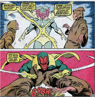 Barry Smith, 1972. I don't know about the rest of you, but I'm pretty hot and cold with Barry Smith. I think his earliest Marvel work is quite atrocious (OK, maybe that was a bit strong, but c'mon -- it wasn't worthy of being called a "Kirby clone"). However, by the time we got past the first few issues of Conan the Barbarian, he was putting out some beautiful pictures. I think this little stretch of the Avengers (#'s 98-100) was in the latter mold. This sample at left is pretty solid. I really like the dynamism of the first panel, and the panel on the bottom is pretty good -- although I'd argue that the hands look just a bit off. Too small? Overall nice work.
Karen: It's certainly better than his early work on Avengers, but I've just never cared much for Smith's super-hero work. I think his style was great on Conan and even Dr. Strange, but these issues really didn't do much for me. His Vision is decent enough.
 Rich Buckler, 1972. I think Buckler's stint on the Avengers (just after Barry Smith's short tenure) is among his best work -- ever. We just finished a series of posts showcasing his pencils on the FF; this sample at right really looks nothing like it, despite the fact that both series were inked by Joe Sinnott! Here we see a brooding Vision, and I absolutely love the third panel -- that's what the Vision should look like. Again, he's leaner than Thor or Iron Man, but more muscular than Quicksilver. Buckler, at least in these pages, "got it" about his stature and musculature. The face, again, is just super.
Karen: This is some of Buckler's best looking work in my opinion, but I suppose this was when he was aping Neal Adams! It's really hard to believe that Sinnott inked this, because I don't see much of his influence at all, and I consider him a very heavy inker. The Vision looks great here; mysterious and dark.
 Don Heck, 1973. Ah, Don Heck. I've gone on record 100 times to say that Don Heck was the guy who taught me about the Avengers, back in the reprint series Marvel Triple Action. But just a few years later, into the Swingin' '70's, the Dashing One had lost it. Big time. Look at how stiff the Vision is in the page sample. His body looks to be out of proportion as well, unless those are the biggest artificial pectorals in history. Heck could tell a story well enough -- moves the action along, etc. But his figure and facial work by this time had really become a liability. And I'm always sorry when I talk this way.
Karen: I'm sorry but no; just no. As you say, his work had really deteriorated. Perhaps this was due to age or illness, and I feel badly for putting down his art, but by the 70s Don Heck was in second place for the artist I least wanted to see in my books (Frank Robbins held down the top spot).
 Bob Brown, 1973. Now Bob Brown... Bob Brown could also tell a story. But alas, his figure work could be a little strange. Always liked his Daredevil (even if he did draw weird boobs), but his work on the Avengers was hit-and-miss. In fact, we have a Brown Avengers/Zodiac story on our to-do list. The first two panels here at right show some good stuff at top, but the three face-shots at the bottom are not good. Yeah, it's a Bob Brown face, no doubt -- but he's got the eyes all wrong! Go back up to Buckler's close-up... you've got to have the glimmer! Oh, and do you ever wonder why Ultron left the teeth white when he made the skin red? Why not purple teeth, or orange teeth? Maybe that was beyond the suspension of disbelief.
Karen: Bob Brown was acceptable, but I was never excited about his work. It was sort of flat looking. And yes, the eyes should have a tiny glimmer.
 Dave Cockrum, 1974. Man, I like those Giant-Size Avengers issues that Dave Cockrum drew during the "Celestial Madonna" saga. I know we're all thinking of the X-Men when we think of Cockrum, but he really had a pretty varied career at the House of Ideas. The panel sample here is from a slugfest against Wonder Man, at the time a member of the Legion of the Unliving, and Vizh's left arm hung by a thread (or wire, or duct tape...). I think the fourth panel is really fun -- it's really a quite acrobatic move for a guy we either think of in terms of a) stealth, or b) strength.
 Karen: Those GS Avengers by Cockrum were awesome! I don't even think this sample really does his work justice. If only he could have been the regular artist on the book! We had such a boatload of mediocre artists during Englehart's run.
 John Buscema, 1974. Big John Buscema was called upon to perform his magic on the Avengers in between the runs of the aforementioned Bob Brown and John's own brother Sal. This is a real interesting sample for two reasons. The first is that it is unmistakably inked by Dave Cockrum (sheesh -- is everyone in this section aforementioned?). The second point of interest is the first panel. Doesn't that just strike you as a very human posture for our hero? Karen and I have long debated the Vision's humanity. I usually stand as a small but somewhat vocal minority. But I really like that panel.
Karen: You're right, looks more like Cockrum than Buscema to me. Of course Big John may have just done rough layouts for this book. But what can you say about John Buscema and the Vision, other than he drew the best Vision ever? He's my pick for the number one Vision artist of all time, and heck, I would say that based on just one image alone:

Karen: Of course that's from 1968, and we're talking 70s, but still -the guy is Vision artist number one in my book.
 George Tuska, 1975. When I think of George Tuska in the Bronze Age, I think of the Champions. While Tuska had a relatively short tenure on the Avengers (known mostly by me for one of my favorite stories -- #'s 139-140), we had to include one of the scenes from Vision's and Wanda's honeymoon, with Vizh chillin' on the beach! Guess he couldn't sunburn, huh?
Karen: I've never been a fan of Tuska's art. Particularly when inked by Colletta. I don't like his anatomy, his facial expression -just not my taste. So I can't really say anything about his Vision. Although seeing him out of costume is always a weird thing.
 George Perez, 1976. We ran this panel earlier when we did the Squadron Supreme story. Really, nuff said about its greatness.
Karen: He's another one that draws everybody well -but he can also be spectacular! The Vision looked good here. I wasn't quite as happy with his efforts when he and Kurt Busiek were doing Avengers. His Vision during that time period had a very thin face and I liked the more full-faced version, like Buscema's. But that was when Perez was giving everyone different facial features.
 Jack Kirby, 1977. This is the cover of Avengers #158, which is another of my fave stories from the Bronze Age. The King is in all of his blocky glory here. I really like, however, that he shows the reader a whole lot of what the Vision can do -- all in this one panel! Talk about getting someone up to speed.
Karen: What can you say? It's Kirby, everyone is built like a brick house. There's no subtlety at all to the Vision here!
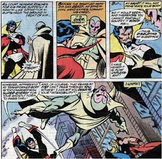 John Byrne, 1977. Lastly, we'll close this one out with one of the masters of the 1970's-'80's, John Byrne. As we both remarked back when we reviewed the Count Nefaria stories, Pablo Marcos wasn't the best candidate to ink Byrne's pencils. I think the muddy look doesn't help this at all. But let's focus on Byrne's interpretation of our poster boy. The one thing that really stands out to me is the way the cloak clings to the Vision's body -- an attribute that's as much Vizh's as it is Batman's. Also, the way he reaches out toward Nefaria with the intent of disrupting his molecules (or whatever the heck it is he does) is really creepy -- good representation of that power.
Karen: Byrne does a good enough job. Vizh is suitably dark and spooky. Thankfully he's still in his green and gold togs and not the hideous all white suit Byrne gave him after he lobotomized him.
Karen: For my money, I would go with John Buscema as my all-time favorite Vision artist, but Neal Adams, George Perez, Rich Buckler, and Dave Cockrum all did very nice work on the android avenger.






7 comments:
Nice article, I agree with you regarding Heck and Tuska. Cockrum's work on Giant-Size Avengers #2 was superb.
I wish the one and true Vision would return to the Marvel Universe. Someone asked Tom Breevort on CBR about this -- he said to keep reading Avengers Childrens Crusade to see what unfolds there.
I liked the "bleached" Byrne Vision from the tail-end of the 80s but I also enjoyed the work Englehart had done to "humanize" him in the Howell limited series.
Perhaps it's a blessing in disguise that this mainstay of the Avengers doesn't appear in the Bendis books. I don't think that ubiquitous,snarky Spidey-voice would suit Vizh...
Wow.., a long wait finally over..!
Yes, the Vision. It's interesting how one character can suddenly appear and become the cornerstone of an existing team so quickly. It's down to a great concept, excellent back-story and personality writing (done with care..), and excellent art.
Karen, WOW. Totally agree on Heck, Robbins, and Tuska, took the words right out of my mouth. I got used to Tuska on IM, but anywhere else..? Just didn't work for me, as opposed to someone like Colan, who could do DD, Cap, and IM as a fill-in artist and make it work seemlessly, like a friendly old uncle coming to visit for a while..
Robbins, his work on CA&F was like the worlds WORST hangover after Sal's memorable stint with Cap's super-strength recharge, Sam Wilson's wings and the 'Secret Empire' arcs. Coupled with Steve Englehart's characterzations, Sal's art was pure 'poetry in motion'.
Mr. Heck? If Avengers wasn't bad enough, I put up with him on Batman Family for WAY too long.
I guess I'd favor John Buscema as my favorite on Viz, since he was the artist on ish 57 and has always done Viz's posture and brooding in a very natural way, a bit like Brown.
To me, Kirby drew everyone a bit too intense and blocky, despite his other talents.., which Buckler mimicked often with FF. It's just his style.., and it was integral in FF becoming the '60s piller for Marvel
And here's a nice plug for, lest we not forget..: Jim Steranko. I really liked his Vision rendition both in Cap 113 (my first comic ever..) and the beloved FOOM Poster.
And for a 2nd plug for everyone's Silver and Bronze Age 'unsung hero', it's Joe Sinnott's inking that typically evened everthing out regardless of artist.
To me, the Vision was the heart and soul of the Avengers, in the same way that the Thing was the soul of the FF and Wolverine was the soul of the Chris Claremont-era X-Men.
The fact that the Vision was so often the sole Avenger in the upper left hand box proves that, I think.
Partly that was because Roy Thomas and John Buscema came up with such a great concept. The other reason was that the Avengers had so many other great creators working on it. Come on, was there a comic that maintained a consistently higher standard that was also published throughout the entire Bronze Age?
Sal Buscema: It's hard to say anything about Sal's work without it seeming like a backhanded compliment. Which is odd because there is nothing wrong with his work. I think the problem is that his approach lacked any individual flourishes; He was content to do things in the Marvel style and leave it at that. There is something to be said for that kind of selflessness. Sal was always about telling the story, not saying "look at me!"
Barry Smith: Gee, I must be alone in liking his early Avengers work. I think it rocks. Yes, he is aping Kirby -- like that is a bad thing! -- but does it well, and avoids some of of Kirby's flaws, like the blockiness of the figures.
Neal Adams: This is a marriage that just doesn't work in my mind. His eye for detail can be oddly too precise, especially in stories that take on an epic scale. His versions of the Avengers look like real actors in costume for a live-action movie, if that makes sense.
Buckler: He's kind of underrated, though not so much from people dismissing him as from the fact that he just doesn't get mentioned as much as the others. I'm not sure why. I think he just may have been unlucky in that he didn't work with as many writers who were at the top of their game.
Don Heck: I hate to be mean, but I think Heck was always a mediocrity. There were worse artists out there and his 60s Silver Age Avengers work is probably his best, but he never developed beyond that. His presence on a comic told me: "The editors couldn't find anyone any better."
Bob Brown: I'm not familiar enough with his work.
John Buscema: Really, he is the definitive Avengers artist, no? His work with Roger Stern in the mid-late 80s was probably the last hurrah for the Bronze Age. Everything just looked the way it should when he drew it. Characters were larger than life without being cartoonish. No matter what happened, no matter how crazy, it looked fluid and normal under John's pencils.
George Tuska: Another Don Heck, in my opinion. There's nothing specifically wrong, but it always seemed tired and uninspired to me.
George Perez: His early stuff was good. And then he became Awesome. His work was so detailed, his lines so crisp, so precise, yet fluid, his anatomy and facial expressions so good that everything seems to pop off the page. Even the colors seem brighter on Perez's work.
Jack Kirby: Kirby runs hot and cold for me. Much of his Silver Age stuff is great of course but by the 70s to say his style had evolved did not go far enough. It had positively mutated into something totally at odds with the then-current Neal Adams-inspired trends. His lines got thicker, his characters got blockier and more angular and any attemnpt at realism was tossed away.
It didn't work for everything he did, but I love his Avengers covers in the 70s. They are all aggression and energy in a style so unusual it seemed every bit as innovative as his 60s work.
It's a pity he only did the covers and never a full issue in the Bronze Age. Then again, considering some of his own writing in this era and his refusal to work with other writers, maybe his only doing the covers was the best thing.
John Byrne: What can be said about Byrne that hasn't already been said? The man was good, damn good and he drew for the Avengers when he was just getting his grove on. I looked for flaws in his work in this period and cannot find any.
Doug, Rebecca,
I seriously believe we need a few more days on ol' Viz.
Inkstained, excellent comments on Adams. Geez, you all seem to verbalize my thoughts on these artists better than I can..
Adams was a nice treat, and I can't really comment on his X-Men stint since I never followed 'em, but his artistry just never worked comfortably at Marvel, for much of what Inkstained said. Totally agreed on Heck, Tuska, and your keen assessment on Smith..
I really liked Smith's Avengers issues as well He contributed a sense of 'starkness' to his characters, sort of Kirbyesque with a dash of Steranko. Barry's a great alternative artist for a nice change of pace..
Who the heck is Rebecca?! ;)
I was dismayed seeing Heck on JLA in the early 80s but now, much later in life, I've come to appreciate his costume designs for Avengers.
Am I correct in assuming that he was responsible for Power Man, Goliath, Living Laser and Beehive Black Widow?
Post a Comment