Friday, September 30, 2016

An Exercise in Speculation on Our Favorite Stories, and What Could Have Been...


Redartz: Happy Friday, everyone! Just for fun, to start off the weekend, here's a little brain teaser. A game inspired by a recent comment from Martinex1, in which he speculated on the Avengers' "Celestial Madonna" arc, if it had been done by Steve Englehart and John Byrne/Terry Austin. The object of the game is deceptively simple: pick one of your favorite stories, and devise a creative team that might have made that story even more awesome. Blending eras is fine. For example: say, Jim Starlin inking Jack Kirby on the "Galactus Trilogy", or Steve Gerber handling Disney's Uncle Scrooge (now I would have read that...).

I will start off with a pick not too far removed from Martinex's posit: What if the Avengers/Defenders War had been brought to life by Englehart, Byrne, and Austin?  We know what a great co-plotter  John Byrne has been -- who knows where might that story have gone? And oh, the artistic possibilities... Byrne's skilled at drawing just about everyone; we saw him on Avengers -- he would have been loads of fun on the Defenders. Plus, with Terry Austin inking, we might have had Popeye make a background appearance in the domain of the dread Dormammu!

OK, now it's your turn. Can you think of a great story that might even have been greater? It's open season, and all's fair. Let's see what you've got!

Thursday, September 29, 2016

The Splash Page Made Me Buy the Comic!

Martinex1:  We have frequently discussed covers that have made us buy a book, and there are indeed numerous examples of the great and colorful cover art that caught my eye from across a room.   But today let's talk about some of the splash pages that captured my attention.

As a kid purchasing comics in the late '70s on a very limited allowance, I typically circled a spinner rack numerous times as I considered all of the options for my precious fifty cents or dollar.   Sometimes even my favorite titles didn't totally draw me in and had to compete against all of the other four-color choices.  It wasn't always a slam dunk that I would buy Avengers, Fantastic Four, or the Amazing Spider-Man.  Sometimes the store proprietor wouldn't want me to flip through the book's pages but when given the chance I definitely took a peek to get a glimpse of the story.  And often it was the splash and not the cover that sealed the deal.  Here are a few examples of those experiences from my early collecting days:

One of the very first comic books I purchased was Avengers #164, the start of the Count Nefaria conflict, so it would seem natural that I would grab issue #165 as soon as it hit the rack.   But that wasn't the case at all.  I have to admit that today when I look at the George Perez art for that cover I admire it, but when I was nine-years old it did not grab me.   I can clearly remember thinking how small the team members were on the cover.  And I did not like the floating red Nefaria head screaming at them.  And on top of it, the white logo and lower right corners were a bit mottled from the printing.  Where was the hand-to-hand combat that I was expecting?  Where was the epic battle following the closing moments of #164 when Nefaria absorbed the strength of Power Man, the speed of Whirlwind, and the energy of Living Laser?  But once I opened the book, the John Byrne splash page answered all of my questions!  Nefaria just decked Captain America and Black Panther easily and he is totally unscathed; the villain is just standing there gloating.  This is going to be a huge fight; he's going to kill them all!  At least that is how I interpreted it in my youth.   As it turned out, I am glad I saw the splash page and snatched that issue up because the Count Nefaria storyline has remained my all-time favorite.  Looking back at the art, it may not have been Byrne's best but I loved it.  Here is the cover and splash of which I speak:
 

That very same month, August of 1977, nearly the same thing happened to me with the Fantastic Four.   However, this had a bit of a twist.  I had previously read the Len Wein penned and George Perez penciled FF issue #187.   I was mesmerized by the team's battle with Klaw and the Molecule Man.  That book had so much great art and suspense that I just could not put it down.  The last page overwhelmed young me.  It was monumental and shocking when down-on-his-luck Reed Richards picked up the mystical rod and transformed into the Molecule Man himself!  I know that I stared at that page for a long time.  Reed looked so creepy.   I looked at his jagged lips and his treacherous scowl and I just had to have the next issue.   What a great cliffhanger!

But when the next issue showed up at our local pharmacy, I was seriously underwhelmed by the cover.   "Seriosuly!  They are fighting a giant walking building!  How dumb!" young me thought at the time, "It looks like a silly cartoon not a dangerous battle. It is not scary at all."   In retrospect, it reminded me of one of those Twinkie advertisements we talked about a couple of days ago.  And again, the white background did not help.  It was a struggle to buy that book; it really was.  What carried me through was the memory of the closing splash of #187.   That crazy Reed in the green costume stuck in my head; so the previous issue's final splash made me buy issue #188.  Here they are for your viewing pleasure:


Hey!  Wait a minute!  That is bizarre!
The final example for today's post is Marvel Team-Up issue #70 that was on sale in March of 1978.  It had a perfectly fine cover and in fact I liked the cover a lot.   It was dynamic and cinematic.  I just wasn't particularly a Thor fan at the time so I wasn't convinced.  But when I flipped it open, the John Byrne art took my breath away.  I had seen giants numerous times in comics before, but this one looked monstrous crashing through the building, scaring the citizens, and getting ready to put a squeeze on the tiny Spider-Man in his right hand.  I had to have it!  Looking at it now, the inking is a little overdone for my taste.  It still packs a wallop, but I cannot take my eyes off the citizen in the foreground who looks like a zombie.   When I was young, I could only focus on the size of the Living Monolith.   Take a gander.


So there you have it - three splash pages that captured my cash. I cannot explain what hit me on such a visceral level, but it was definitely the interior art that I so clearly remember doing so.  What do you think?  Do you have any examples that you would like to share?   Cheers all!

Wednesday, September 28, 2016

Star Trek at 50: Harlan Ellison' s City on the Edge of Forever graphic novel


Star Trek Harlan Ellison's The City on the Edge of Forever The Original Teleplay
Original Teleplay: Harlan Ellison
Adaptation By: Scott Tipton and David Tipton
Art by: J.K. Woodward
Covers by Juan Ortiz and Paul Shipper

Karen: Back in August I reviewed what many consider to be the finest episode of Star Trek ever made, "City on the Edge of Forever." In that post I discussed that there were huge differences between author Harlan Ellison's story, and the resulting final episode. The changes that were made in Ellison's story had nothing to do with quality of the writing -the show's staff all agreed that the script was brilliant -but it was felt that it veered too far from the established norms of the show.

Karen: Ellison's original story has been published  since the episode aired, so fans have had a chance to read it for themselves. But of course, we've never been able to see what it would have looked like if the episode had been produced using his script -until now. In 2015, IDW, with Ellison's blessing and assistance, produced a mini-series that told Ellison's story in five issues, and this was collected in a very nice hardback, which is what I used for this review.


Karen: The art in this book is by J.K. Woodward, who I profess I have never heard of before, but seeing as how I don't regularly buy comics now, that's no slight on him. Woodward utilizes a painting method, similar to Alex Ross, who, based on comments around here, folks seem to either love or hate -I'm in the love camp. I also appreciate Woodward's style. He captured the spirit of the show well. There were times when clearly he was working from photographs of the actors, and while it was obvious, I didn't mind really - it wasn't distracting to me, except a couple of times. When he was depicting characters who were not regulars on the show, such as the story's antagonist, Beckwith, the character's appearance seemed perhaps less defined. I think it was a smart decision to depict Kirk and Spock in the same clothes they wore in the episode. In the notes in the back, Scott Tipton says this was a conscious decision to both provide familiarity and present the story as if it were an alternate version of the filmed episode. Juan Ortiz and Paul Shipper both provided covers for the individual issues and they are reproduced in the book. Ortiz created the brilliant Star Trek: The Art of Juan Ortiz poster book a few years ago.


Karen: The story reads quite well, and from what I can gather, the Tiptons essentially translated Ellison's work to the comic page. They've done a fine job. It is engaging, thoughtful, and more lyrical than the actual episode. I've read a couple of collections of Ellison's short stories. I've enjoyed his work and I've always felt he brought a quality of surrealism to his stories. It is the same here, particularly in the depiction of the actual 'city on the edge of forever,' which combines elements that seem purely dreamlike with the more realistic science fiction setting of Trek. In the episode, the Guardian of Forever is a strange, oval-shaped entity, neither being nor machine -or maybe both; here, in the original story, there are multiple Guardians, tall, bearded men, ancient, drained of color, who almost seem to be a part of the icy mountains surrounding them. Could this have worked on the show? I don't know. It seems almost too fantastic. Why is it easier to accept a lop-sided donut than nine-foot tall men? Perhaps it is simply my bias from seeing the televised episode so many times.


Karen: The instigating point of the story is completely different here than in the episode. In the show, McCoy accidentally injects himself with a drug, cordrazine, which causes him to go temporarily insane. He beams down to the planet below them, from which they have been monitoring time disruptions. It is McCoy's departure into the past and his actions there that cause the timeline to change drastically. In Ellison's original story, an officer named Beckwith, who has been dealing drugs on board the Enterprise, flees after another officer threatens to turn him in, and Beckwith kills him. I have to admit, I can understand why this was changed for the show. Given how the crew was portrayed, and the general standards set forth by the network, I don't see how this was going to work in any case. But here, taken as the idea of almost an alternate universe (a Star Trek What If? perhaps) it's intriguing to consider. 

Karen: Another major divergence between the two stories occurs after Beckwith jumps through the Time Vortex, altering reality. The landing party beams back up to what they think is The Enterprise, only to find that they are aboard The Condor, a pirate ship! They fight off the pirates and secure the transporter room, and leave Yeoman Rand in charge -yes, you read that right -with Kirk and Spock beaming back down, to convince the Guardians to let them go back to try to fix things. This entire sequence was excised from the script for the episode, it seems chiefly due to expense. It's interesting that Ellison provided a much more capable representation of Rand. Of course, by the time the story was filmed, Grace Lee Whitney was no longer a part of the cast.


Karen: Once in the past, the Captain and First Officer find themselves on a street corner in New York in 1930. A crowd is gathered around a man standing on a crate, ranting against immigrants -wait a minute, what year is it again? "What kind of country is this where men have to stand in bread lines just to fill their bellies? I'll tell you what kind! A country run by foreigners! All the scum we let in to take the food out of our mouths, all the alien filth that pollutes our fine country!" Spock is uncharacteristically offended; he remarks to Kirk, "Is this the heritage Earthmen brag about? This sickness?" Kirk responds, "This is what it's taken us five hundred years to crawl up from." The mob spots Spock and the two have to make a break for safety. I truly wish they had filmed this rather than the insipid scene with the policeman and the silly 'rice-picker' dialog. I know they were injecting some levity into the episode but I think this commentary was-and unfortunately still is -timely and worthwhile.


Karen: One of the things that became quite apparent reading this book was how different Edith Keeler was in the original story. She's still appealing, but she seems to have a little less iron to her spine here. There are a couple of scenes from the episode that stand out which aren't in the original story: the one where Edith confronts Kirk and Spock in the basement, and the speech (however corny it might be) that she gives in the mission. In fact, in the episode, she is shown several times in the mission, and it gives us a sense of her devotion to her cause. Here, we see her speaking to groups of people but mostly we see her with Kirk, and the focus is more on how he is affected contemplating her loss. In this case, I felt that the episode provided her with more of a voice.


Karen: But Kirk's sense of impending doom is just as real here. Although Ellison has Kirk and Spock arrive at their discovery of Keeler's importance, and her fate, through somewhat bizarre fashion, Kirk's desire to be with Edith is tangible. In a discussion with Spock over Edith's role as a catalyst, the Vulcan presses his Captain, as he senses that he is becoming too involved with this woman, who must die for their future to live. The Kirk we see here is far more alone than the solitary figure we saw in the first season of the show; so much so he even contemplates bringing Edith forward in time! But Spock tells him that Edith must die in order to preserve the future. The sequence is portrayed by Woodward in black and white, as Kirk is recalling it from memory, and it heightens the drama of the exchange.


Karen: Spock is able to calculate where and when Beckwith will appear, but they make a mess of catching him. Kirk enlists the aid of a disabled World War One veteran called Trooper (drawn to resemble Ellison) to be on the lookout for Beckwith. After some time (it is difficult to tell exactly how much -a couple of days?) Trooper comes back with information that Beckwith is hiding out in a back alley. Kirk and Spock go after him, but again fail to catch him -and he uses a phaser and disintegrates Trooper. Either later, or another night, Edith is again speaking on a corner, trying to inspire hope in the downtrodden. Spock speaks admiringly of her. Edith finishes and sees them, and crosses the street to join them. But she doesn't notice a truck coming down the street. Kirk and Spock realize that this is it: the moment of her death. Suddenly Beckwith appears on the opposite side of the street. He too sees the truck barreling down towards her. Amazingly, Beckwith runs into the street, to save Edith. Kirk staggers forward, torn about what to do. But Spock races out and tackles Beckwith, preventing him from saving Edith. She turns, too late, as Kirk can only watch in horror as she is struck by the vehicle. 


Karen: This is just as gut-wrenching as it was on the show. Woodward clearly used Shatner's expression from these scenes for his art in the book. The way this was resolved in Ellison's story versus the finished product was a bone of contention between the two camps for many years as I understand it. I have to say, I find the episode more compelling, for a few reasons. In the show, Kirk not only doesn't save Edith, he is responsible for preventing McCoy from saving her. He is the decision maker; the ultimate responsibility for what happens falls on his shoulders, not Spock's. I think this makes Edith's death and Kirk's grief even more tragic, as he knows his direct action resulted in the death of the woman he loved. Also, having McCoy be the potential rescuer for Edith allows for a real dramatic impact. When the three men are reunited on the steps of the mission, it's pure joy, but only for a few fleeting seconds, as Edith's fate is imminent. McCoy's angry reaction, when Kirk restrains him, is also powerful.


Karen: However, the denouement of Ellison's work is really quite beautiful, and it's sad that it couldn't have been retained in some way. Back on The Enterprise, with time restored, Spock comes to Kirk's cabin, ostensibly to relay information from the bridge, but really the Vulcan appears to be checking up on his Captain, who is lost in thought. Spock calls him 'Jim' and says, "On my world the nights are very long. The sound of the silver birds against the sky is very sweet. My people know there is always time enough for everything. You could come with me for a rest. You would feel comfortable there." It's pretty. I don't know that it's Spock, really, but it sounds wonderful. (This scene actually reminded me of the final scene in the third season episode "Requiem for Methuselah" where Spock uses the Vulcan mind meld to make a distressed Kirk "forget" -did they crib it from this?). Spock tells Kirk that he is troubled by why Beckwith, a thoroughly deplorable person, would try to save Edith, risking his own life. Kirk talks about how sometimes "even the worst among us does the great noble deed." The conclusion reminds me so very much of a typical Outer Limits episode, which of course Ellison wrote some of the best. With Beckwith, we are able to examine the confusing, conflicting duality that exists in us. This is something the episode does not have. 

Karen: But does it need it? As it stands, it focuses much more squarely on Kirk's sacrifice -his sacrifice of Edith, his love, his potential happiness, to restore reality. The episode is strong without it. But the original story, which has a slightly different emphasis, and some alternate twists and turns, is certainly worth exploring. I could see that this might have been an excellent Outer Limits actually - although probably cost prohibitive but it would have worked just as well if trying to get across the idea of man's duality rather than focus on one man's tragedy.

Karen: On a somewhat related thought, I was thinking about the various Star Trek films lately, and Generations popped in my head. I've never been fond of it, for a variety of reasons, one being Kirk's death. But it occurred to me that one thing I would have loved to see is that when Picard went to find Kirk in the Nexus, he arrived in New York City, circa 1960. He sees Kirk, playing with some kids in the street. They are talking excitedly about the nascent space program, and Kirk tells them some day all the nations will work together and travel to the stars. A woman's voice comes from a doorway, calling for Jim. He turns and we see Edith come out. They have been reunited, and are deeply in love. This makes it even harder for Kirk when Picard tells him he needs his help and he has to leave the Nexus. But Edith herself tells him he should go -and she'll be waiting for him. Man, I would really prefer that over the Shatner horseback-riding ego-stroke that we got.


Tuesday, September 27, 2016

An Advertising Match Made in Heaven... Hostess Snacks and Comic Books!

Martinex1: What could be better than running to the local dime store, grabbing your favorite comic from the spinner rack and with your extra money adding a Hostess Cherry Pie (or Ding Dong, Cupcake, Twinkie, Snowball, Suzy-Q or Ho Ho)?   Super-heroes and the sugary treats seemed to go hand-in-hand back in our youth.
  
And somebody quite brilliant who handled the marketing for the Hostess brands and Continental Baking Company back in the day approved in-comic advertisements.  These one-page ads, numbering in the dozens, featured characters from the various companies in short adventures in which the outcome inevitably involved eating one of the tasty treats.   Marvel, DC, Archie, and Harvey all participated.  Warner Brothers characters also made a few appearances. Villains were foiled, heroes were satisfied, and comedy ensued, but the tasty baked confections were always devoured.
 
During my initial collecting heyday, these ads were ever-present.  I believe some of the Marvel examples featured Sal Buscema and perhaps Marie Severin art, but I cannot be sure on any of it. If anybody can help identify the creators, that would be great.   For more than 250 examples go to tomheroes.com where I captured today's samples.  It would have been fun to find some of the original art for these. In the early 80's, John Byrne parodied the Hostess style in First Comics - that is also included below. 

Enjoy these jewels of yesteryear and share your memories on the nostalgic treats.


Monday, September 26, 2016

An Obscure Midnight Story - Iron Man Annual 4


Iron Man Annual #4 (1977) - Midnight story
"Death Lair"
Roger Stern-Jeff Aclin/Don Newton

Doug: You might think that it would be strange if I sought out the Midnight story when the main yarn in that summer extravaganza boasted pure Bronze Age heaven. Well, it would be strange, and I did not. But in reading this annual I did see the Midnight story tucked near the end, thought that in itself we had an oddity, and so bring it to you today. Think the story's obscure? Heck, Midnight's obscure!

Many among my Bronze Age brethren (and sisthren) were kung fu fighting during the 1970's. I was a pacifist in my pudgy pre-teen days, so was not. OK, that's not entirely true, because I did beat up my neighbor Donald one day because he'd irritated me one time too many. My issue with the kung fu books was strictly monetary. With only so many quarters in my pocket and out on my horizon, I wasn't going to stray too far from the superheroes I knew and loved. It was more of a nominal genre allocation problem than anything else. So without any sense that I didn't like those sorts of books in my youth, I will truthfully plead ignorance and trudge forth today. After all, this is only a 5-pager; if I don't like it, then we really won't have wasted much of our time, right?

I did know of Midnight back in the day, as they say. Everyone knows the Avengers was my mag, and everyone knows that the "Celestial Madonna" arc is one of my all-time fave stories. And who should appear in Avengers #131-G-S Avengers #3? Yup - Midnight. But that's all I knew of him. I had a copy of Iron Man Annual #4, but honestly did not remember this story until I laid eyes on it again several weeks ago. I'd wager that when I bought this as an 11-year old I didn't even read the back-up. As I said at the top... Iron Man and the Champions? Take two quarters!


I'm going to present this story in its entirety, so you can make your criticisms along with me, just below. I'll start by criticizing myself and my inability to provide a good scan when using PowerPoint to bring a .pdf file over from the DVD-ROMs. Just looks drawn... sort of like watching analog television in widescreen.


No 100-Word Review today -- that was so short, it probably didn't take you much longer to read the whole story! So, on with --

The Good: This was a compact story with no beginning and no end -- just a whole lot of middle. But I didn't mind that. Roger Stern's words and the art team of Jeff Aclin (I got nuthin'... anyone familiar with his work in other places?) and Don Newton moved things right along. Characterization on the toughs was pretty standard comic book fare, which was OK -- nothing campy or contrived. Without much background beyond his appearance in the Avengers, I am uncertain of whether or not I should root for Midnight. This Half-face guy was also a mystery to me. I think that's part of the appeal of this tale for me -- it has me curious. I am planning to somehow acquire the upcoming Deadly Hands of Kung fu Omnibus that reprints the '70s black-and-white magazines of the same name. I don't know if Midnight appears anywhere within, but I kind of hope he does.  

Tell me -- is it always a thing in martial arts comics to use the various weapons? Because that really ups my stress level, people start throwing stars and such. Man... those guys are super bad.

I'm also digging the ads adjoining that last page sample.

The Bad: My scans. Hate 'em. Other than that, really nothing to report. For a back-up story, and I'm left wondering what sort of stock filler this must have been, it was just that: filler for a large comic.

I like Midnight's look when wearing his coat and cape, but he really gives me a Death-Stalker vibe. When he's in the all-black body suit, I felt like he should have been lighted a bit more than he was. Otherwise he just shows as a void on the page. But maybe that's the point.

The Ugly: Nada.

That's it. Pretty short collection of thoughts for a really short story. But hopefully some of you who stopped by today will leave a thought of your own. I'd certainly appreciate some of our readers taking the time to educate me on Midnight, but also on kung fu comics in general. Thanks in advance.


Saturday, September 24, 2016

I Gotta Have It! But, How'd You Get It?


Doug: Last weekend we had several long-timers as well as a nice representation of new/recent commenters join the fray in discussing their peak buying years. The conversation veered to when and why that first wave waned, books that got us back into collecting, etc. Toward the end of that weekend, one of our Twitter followers (@conrad_eric) asked us if we'd ever run a post where we asked our readers just how they got their comics. To the best of my recollection those sorts of stories have been told through the years, but I don't believe ever in one place. Well... that's today, and the rest of the weekend.

We'd love it if you'd get specific with certain vendors' spinner racks and magazine shelves, locations of drug stores or groceries, mail order companies, and maybe even trading partners. I know I'd love to hear memories of how our readers acquired certain books, what age they were then, and if they still have the book or not. Talk about our community finding some common ground for nostalgia!

I can start this off today, and will most likely chime in again with a comment at some point: As a child, I can recall magazine racks at a drug store at the corner of S. 76th St. and Howard Ave. in Milwaukee. I can see Fantastic Four #161 in front of my hands in May, 1975. I later bought FF #163 at the same store. Those might be the earliest memories I have of buying my own comics, which is puzzling since I'd have been 9 years old. I know I had several comics by that time. Anyway, other regular venues through the years included Osco Drugs in Kankakee, IL, where I purchased Peter Parker #1, Belscot in Kankakee (a poor man's Wal-Mart), where Marvel Treasury Edition #s 19 (Conan the Barbarian) and 21 (Fantastic Four) left in my possession, the Weiner's mini-market on River Street in Kankakee, IL where I purchased an issue of Super-Team Family, the Convenient Food Mart in Bourbonnais, IL where I bought many an issue of Secret Society of Super-Villains, and of course my most famous one-time purchase of Avengers #161 at Mickey's Books and Novelties (you know...). In college, the Rexall Drugs in Eureka, IL got me my fix of Crisis On Infinite Earths and volume two of The Official Handbook of the Marvel Universe. Shortly thereafter, I started buying comics from mail order businesses such as Westfield Comics, Mile High Comics, and M&M Comic Service. All are still in business.

So thank you to Eric for the suggestion/request. I hope our conversation this weekend is as rich as last weekend's was.


Friday, September 23, 2016

Discuss: Price guides and comics, a boon or a bust?

Redartz:  Welcome, everyone! We all share a love for comic books, and many of us have at some point in time accumulated a sizeable collection . Aside from enjoying the art and stories, we also may find ourselves interested in the historical aspects of the comics. Who were the early comic creators; where did Green Arrow first appear; how many issues of Marvel Tales were published? Then there is always the question asked by many collectors (of comic books or otherwise): "how much is this  comic worth?". Of course, the initial answer to that is "as much as I'm willing to pay for it", and how special that item is to the individual. 

That said, there has long been a desire for some overall guidance as to how much a given comic might cost to acquire. Illustrated below are two of the most familiar sources of such information: the Overstreet Price Guide, and Wizard magazine. 


The Overstreet Guide has been published since the early 1970's, and Wizard had it's heyday in the wild, speculative 90's. And now,in this current internet-based era, we have ComicsPriceGuide.com, a site listing thousands of comics and continually updated with market information. All of these, and other sources, provide pricing information on a wide range of collectibles. The Overstreet guide, in particular, has a wealth of data on first appearances, artists, crossovers, and other minutae. Which brings us to our topic today: What do you think of the various price guides, and what do you think their effect has been on our hobby? Have they been a helpful source of needed  information? Have they been culpable in the problems the industry has faced in the last couple of decades; do they promote investment at the expense of esthetics? Or has their effect been neutral, just another part of the comic collecting field- no different than with other hobbies? Go ahead and vent!

Thursday, September 22, 2016

Who's The Best... Marvel's Corner Box?


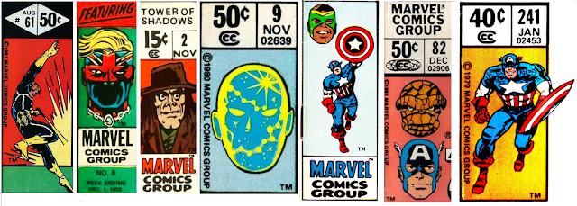
Martinex1:  Marvel really had something special going on in the upper left hand corner of their comics.  From nearly the beginning, they carved out space on the cover to identify the characters within.   The heroes were easy to see on the shelved newsstands as the comics were layered for visual access.  The company quickly realized that they were onto something as they even advertised to "Watch for the  Greatest Symbols in Comics!"   It may have been Stan at his hyperbolic best, but I have to say that there were actually times that the corner box made me buy a comic.  Looking back at the history of that iconic marketing tool that lasted decades, I cannot believe how many variations existed.  In this post I share more than one-hundred examples, and I dare to say that I have only scratched the surface.  


During my comic purchasing peak, I inspected the cover and looked for the sometimes subtle changes in the corner box.  My favorites varied from the John Byrne floating head depictions to the rotating spotlighted team members in books like the Micronauts.   One of the most clever examples included a run on the Incredible Hulk in which the Hulk in the corner box transformed from a scientist into the rampaging character if the reader handled sequenced issues as a flipbook.  (The proof of that down below came from the thejadegiant.com website).


What were your favorites?  Which were the best?  And which were the worst?   Enjoy!


Related Posts with Thumbnails