Showing posts with label John Romita. Show all posts

Friday, September 16, 2016

Buried Treasures: Aurora Comicscene Model Kits


Redartz:  Greetings, everyone!  Under the banner of "Buried Treasures", we have been treated to glimpses of various Bronze Age rarities pulled from the dust of time (and storage box). Today I'll share a story of 'buried treasure' which might be better described as a 'reacquired treasure': the 1974 Aurora Spider-Man model kit, and it's accompanying comic.


 In 1966 Aurora Plastics started a line of model kits featuring superheroes from Marvel and DC, including Superman, Batman, Hulk,  Captain America and Spider-man. They were produced until 1970, and then in 1974 they were revived. This newer release featured an instruction book which also contained a short comic story telling the tale of the assembled model scene. In the case of the Spider-man kit, the comic was written by Len Wein and drawn by Spidey's own John Romita! 

1974 also happened to be the year when I caught the comic fever, and when I saw that Spider-Man kit on sale at the local Woolworth's, it was ordained. Had to have it. Thanks to my kindly, understanding parents, that cool plastic face-off between Spidey and Kraven was soon sitting on my bedroom shelf. And so it stayed for some years...until somewhere at college it vanished. Never found it, and figured it gone, and basically forgot about it. 

Until, that is, my wife and I attended a local flea market earlier this year, and lo and behold: sitting on a table was that same Aurora Spider-Man model, boxed even!  The dealer didn't think the comic was still there, but I opened it up to see if the kit itself was intact. Amazingly, not only were all the pieces still there, but so was the comic- and in brand new condition! Well, just like that day years before, I was hooked. Took it home, took two weeks to assemble and paint it (the webbing was the biggest challenge). This time thanks went to my understanding wife, as I spent each evening after work upstairs with a very tiny brush and tube of Testor's cement.

The finished product:


And now, as many of you may never have seen this item, here are some pages from the instruction 'comic', beautifully rendered by the Jazzy One. Incidentally, page 5 shows only the background, as it was provided for use as a display for the model kit. Enjoy!


Does it strike anyone else that Spider-man seems rather unconcerned that his webbing was responsible for the destruction of some valuable, historic tapestries?


Dangermash commented today on the likelihood of the Spider-Man model kit being based upon Amazing Spider-Man 34. Here's a  panel from that issue- no Kraven, but the pose and setting are certainly similar...

And that's my tale for today. Anyone else have this, or one of the other kits? How did the assembly work out for you? Any details on the other instruction comics? Tell us all about it...

Friday, July 22, 2016

Guest Post: Convention Stories


Doug: A few weeks ago William was relating a story about an encounter he had with Will Eisner. As it seemed like he'd picqued the curiosity of many a BABer, I emailed him and asked if he'd be interested in sharing more. We're really excited today to be able to present "the rest of the story", as they say. Thanks, William!


William: Back in 1993 I had the very good fortune to attend a "Comics and Sequential Arts Workshop" taught by the great Will Eisner. It was an eight week night class that was offered at a local community college in my home town of Davie, Florida (located just west of Fort Lauderdale). The class even got a write up in the local paper. 


My old friend from art school, Tony Diterlizzi, attended the class with me. He went on to become a pretty well known artist in the industry, writing and illustrating many children's books and co-creating "The Spider Wick Chronicles". But I digress.

In each class Will would give a demonstration of a certain art and/or storytelling technique and then give us a homework assignment based on that weeks lesson. Then the next week Will would critique the work of each student and then he'd give us another demo and another assignment and so on. It was a lot of fun, and I thought Will was a really great teacher, and a really nice and guy.


He usually did just rough pencil sketches for his demonstrations (sometimes no more than stick figure drawings), and afterward he'd give the pages to whoever wanted them. Well, one night he did an inking demonstration that included much more detailed drawings of figures and such (all fully inked). After he was done I half-jokingly blurted out "I'd like to have that one." Everyone laughed, and then Will said "Sure, no problem." Then he signed it "Will Eisner, Done By Hand" and gave it to me. I almost fell over, and the rest of my classmates were fairly green with envy (to say the least). The next day I showed the piece to my friend who owned a comic-book store, (and was an avid comic art collector as well). He was pretty blown away and said, "Wow man, you just paid for that class and then some." Because Will Eisner did not sell his original art, so it was very hard to come by.


During this same time there was a comic convention in Fort Lauderdale that featured John Romita Sr. and John Romita Jr. as guests that year. So, my friend Tony Diterlizzi, my wife, and myself decided to go check it out. Shortly after we arrived who should walk through the front door but Will Eisner himself. We see him, and he sees us, and he comes over and we all start talking. Well, it isn't long before we are surrounded by other convention goers who recognize Will and stop by to pay their respects. My wife looks at me like "what is going on?" Even though I'd told her that Will Eisner was like the godfather of comic art she did not realize what a legend he was to most comic-book geeks (like myself).

Unfortunately the big crowd around us soon attracted the attention of the convention organizers and they swooped in and, even though he wasn't a scheduled guest, they begged Will to join the other creators up at the tables. He agreed (sort of reluctantly) and before he left us he said "You know, I would have much rather just stayed down here and hung out with you guys all day." (My wife thought that was very sweet and still mentions it to this day).

Later on we got in line to meet the Romitas -- Sr. and Jr.. and I had them sign a couple of comics I'd brought along (including my copies of Amazing Spider-Man #s 39 and 40 for Sr. to sign). John Sr. was also doing free sketches of either a masked Spider-Man head or the half Peter Parker/half Spidey face. I chose the fully masked Spidey. (I think my friend Tony got the other). I remember John Jr. turning to his dad and telling him he was nuts for doing all that work for nothing, and John Sr. was like "Ahh, I don't mind." John Jr. was also flirting with my wife big time. He was saying things like "You don't see many women who look like you at these things." and "What are you doing with these guys?" and so on. And she was eating it up because he's not a bad looking guy at all. It was all in good fun, and instead of being put out I was like "Cool, John Romita Jr.'s hitting on my wife." LOL


I think that probably remains the best (or at least most memorable) comic book convention I ever attended. Although shortly after that I went to another one where I got to meet Stan Lee. But that's a story for another day.

Thursday, April 14, 2016

If I Had a Buck... The Many Artists of Captain America


Martinex1: Captain America's costume has not changed much over the years that he has worn it.  Sure there were some more noticeable fashion updates in the past decade, but for the most part our star-spangled Steve Rogers has been known for his red, white, and blue, for his stars and stripes, for his winged head and his pirate boots, for his chain mail and his shield.   

It is interesting to see how different great artists depicted the American hero. So this $1 Challenge has a simple premise; here are 14 covers with Cap in charge, but all handled by different artists. Pick your favorites and discuss why that is.   There were so many great covers to choose from, so if you have a favorite you'd like to share, be my guest.

These are all in the Quarter Bin, so get a bang for your buck... four comics, four colors, four quarters...what can be better? 

Captain America #109; Jack Kirby.
Captain America #110; Jim Steranko.
Captain America #132; Marie Severin.
Captain America #140; John Romita.
Captain America #183; Gil Kane
Captain America #222; Ernie Chan
Captain America #225; Frank Robbins
Captain America #230; Ron Wilson
Captain America #241; Frank Miller
Captain America #254; John Byrne
Captain America #260; Allen Milgrom
Captain America #263; Mike Zeck
Captain America #303; Paul Neary
Avengers #340; Ron Lim (Okay this is a great Wasp cover too, but it is one of my favorite Cap covers of all time).


Tuesday, April 12, 2016

Inaugural Post: The Ever-Changing Blue-Eyed Thing


Doug: Ever have an idea percolating in your brain for... forever? This is that. For many months I've been wanting to do something on the blog with one of the greatest aspects of the end of the Bronze Age and beyond. In the early-mid 1980s Marvel Comics published a periodical encyclopedia called The Official Handbook of the Marvel Universe; the Distinguished Competition's entry in the genre was the equally entertaining Who's Who in the DC Universe. There is a nearly bottomless mine of good stuff for us to discuss, so we'll see if today's inaugural foray gets any kind of commenter love. And I don't want to hog this idea -- if anyone reading wants to submit a post in this vein, by all means email us.

Doug: Below you'll find the entry for the Thing, as it appeared in the second volume (1986) of The Official Handbook of the Marvel Universe:


Doug: My focal point for today's discussion is the height of Benjamin J. Grimm. From the moment I first laid eyes on this issue of the Handbook I was a little skeptical as to the accuracy of whatever tape measure was used to check the Thing's height. However, doing a quick image search for the purpose of researching my accusation that something must have been amiss, I found that by and large through the Silver and Bronze Ages the Thing was drawn at about the same height as Reed Richards. In the Handbook, Ben Grimm is listed at an even 6'0", while Reed Richards is a bit taller at 6'1". See the images below from superstar FF creators Jack Kirby, Joe Sinnott, and John Buscema. Nowhere do we find the Thing towering over his teammates --


Doug: Additionally, we can use the Hulk for comparison's sake. From the earliest days of the "splash tops" that ran on page one of Bronze Age Marvel Comics, we knew what we were dealing with in terms of the Hulk's massive scale:


Doug: And here are some visuals in support of the Thing's "diminutive" stature:


Doug: Going hand-in-hand with the Thing's relatively short height is his weight of "only" 500 pounds. So at 6'0", 500 pounds, the Thing is certainly not imposing in the presence of She-Hulk's 6'7" height, Thor at 6'6" and 640 pounds, or even Captain America (6'2", 220 lbs.). But then the "Image era" began and Benjy grew... and grew... and grew (please excuse the glorification of Sue's assets (ahem) -- after all, it was the 1990s):


Doug: Obviously there are many more points of interest in the Thing's biography. But today let's center on the man's scale, particularly as compared to his fellow denizens of the Marvel Universe. How's that stature? Too small for you? In the Fantastic Four films of a few years ago, featuring Michael Chiklis made up as the Thing, Ben was no taller than his male teammates. But then, what of some of the latter samples I posted -- too large? In the FF film from last year, the CGI Thing seemed more in line with the art above. That being said, I suppose Ben would still be in scale with the Hulk, as ol' Jade Jaws is now never depicted on film as shorter than 10 feet (or so it seems). Have at it, and thanks in advance for your thoughts.

Friday, February 19, 2016

How to Make Comic Covers the Marvel Way

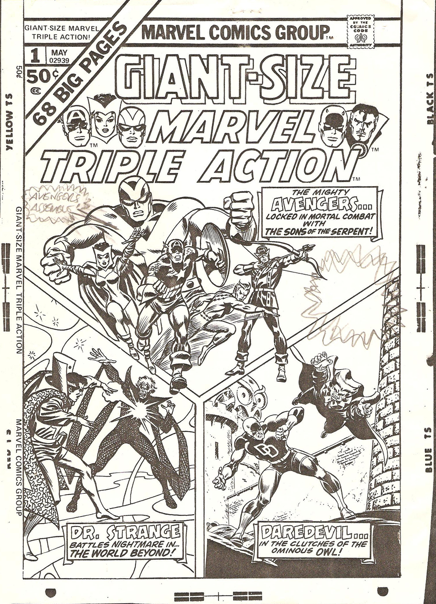
Karen: I recently had the good fortune to chat with Scott Edelman, well-known former Marvel staffer in the 70s, who not only was involved in a wide number of projects during his time at the House of Ideas, but also has become a virtual historian on that time period. Luckily for all of us, Scott kept a number of memos and art and has been publishing them on his blog, www.scottedelman.com. Scott told me that he had a story related to the cover of the most recent Back Issue magazine (#86, on sale here), which featured art from Giant-Size Marvel Triple Action #1. 

Karen: It seems that Stan Lee had sent out a memo regarding this cover,  finding it dull, and describing ways it and other Marvel covers should be changed to make them more exciting to the readers. Please hop on over to Scott's page linked here to see Stan's memos and learn the whole story  (and check out the rest of his blog while you're there -it's a treasure trove!). I think it shows just how much Stan cared about doing things right -I mean, the Marvel way! Below you can see the cover rough and the areas Stan marked up, as well as the final cover and how it changed (note Giant-Man's more aggressive expression).


Doug: Man, that's a subtle change, isn't it? I guess it does punch it up a bit, but much like I had some qualms about editing the cover submissions of Big John Buscema, Johnny "Ring-a-ding" Romita would also seem to be above that. Guess not. To the best that my eyeballs can discern, the facial expression on Goliath is the only change that was made. Stan knew what he wanted, and of course could provide the rationale to support his preferences.

Karen: Hawkeye's expression is very slightly altered but you'd have to see it up close. There's also that blurb on the right-hand side about "More Madcap mayhem" which Stan had suggested. They did not, however, incorporate his suggestion of "Avengers Assemble!" on the left-hand side of the cover. You can see he pencilled this in on the rough cover.

Doug: The cover I think of most often when our conversations turn to comic book covers that were amended or rejected is the cover to X-Men #56 by Neal Adams and Tom Palmer. Below left is the rejected version and to the right is the famous published cover.


Doug: As we've mentioned in the past when discussing this cover, apparently Stan did not like that the logo was obscured by the hostage mutants. I'll go to my grave liking the rejected version better. You can see these covers, as well as 19 (!) other rejected X-Men covers by clicking here. If you jump over to Nic Caputo's blog, you can find a rejected Gene Colan DD cover, as well as another Silver Surfer cover from John Buscema that never saw the light of day.

Doug: I don't have any sort of inventory of these things myself, but I did ask Karen if it would be OK to do a gallery of published covers from the Marvel Comics Covers Artist Edition. She thought that would be great, since we love this topic. So feast your eyes on a dozen and a half such gems, from a wide range of Marvel luminaries. NOTE: Please keep in mind that the Artist Editions are huge books, so you're looking at photographs rather than scans. I wish it could be the other way... but no way.

Karen: I love seeing the rough versions! Thanks Doug. So here's a question for you all: what comes to mind when you think of a 'Marvel-style' cover?


Related Posts with Thumbnails