

Karen: It seems that Stan Lee had sent out a memo regarding this cover, finding it dull, and describing ways it and other Marvel covers should be changed to make them more exciting to the readers. Please hop on over to Scott's page linked here to see Stan's memos and learn the whole story (and check out the rest of his blog while you're there -it's a treasure trove!). I think it shows just how much Stan cared about doing things right -I mean, the Marvel way! Below you can see the cover rough and the areas Stan marked up, as well as the final cover and how it changed (note Giant-Man's more aggressive expression).

Doug: Man, that's a subtle change, isn't it? I guess it does punch it up a bit, but much like I had some qualms about editing the cover submissions of Big John Buscema, Johnny "Ring-a-ding" Romita would also seem to be above that. Guess not. To the best that my eyeballs can discern, the facial expression on Goliath is the only change that was made. Stan knew what he wanted, and of course could provide the rationale to support his preferences.
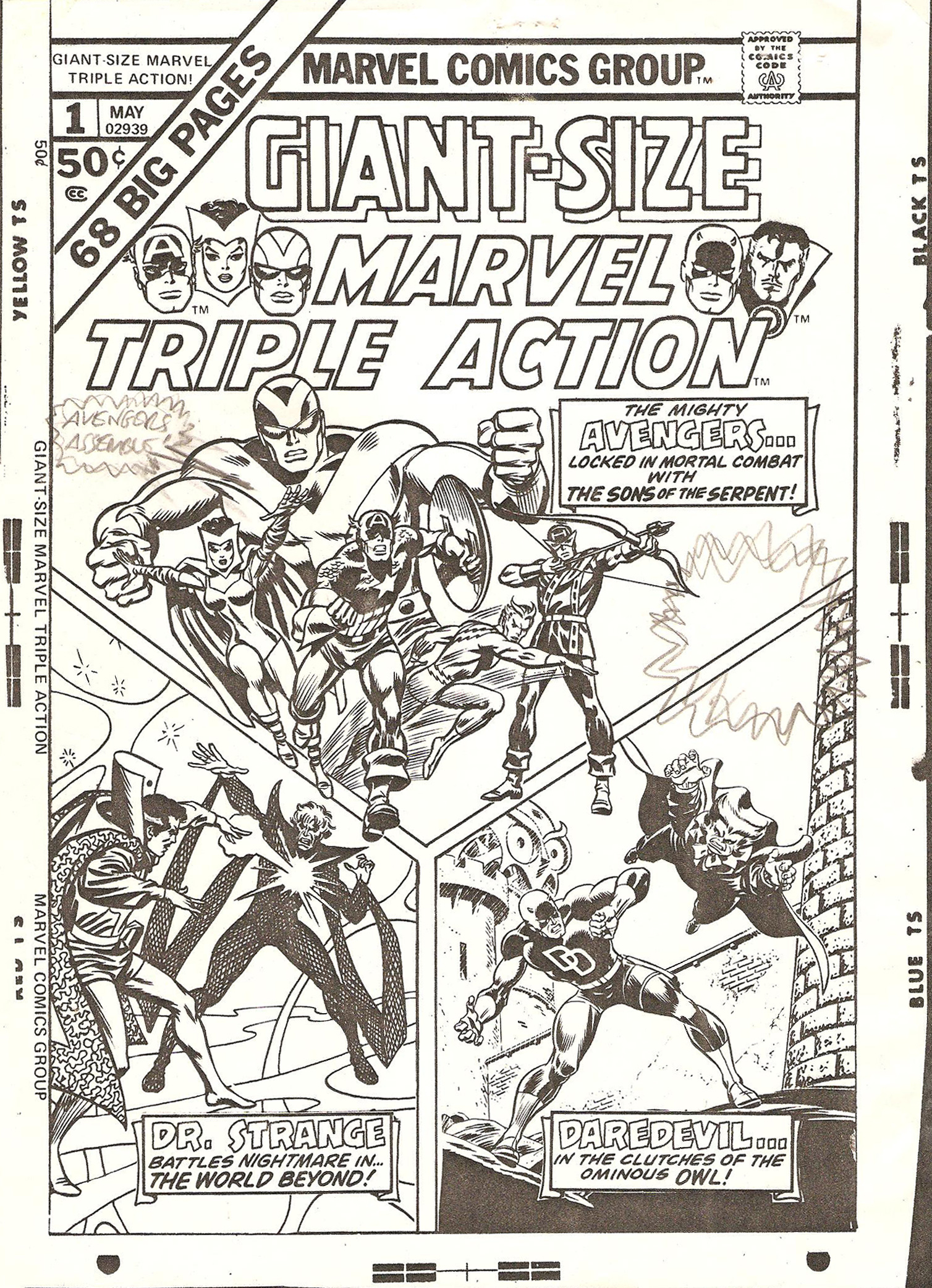
Karen: Hawkeye's expression is very slightly altered but you'd have to see it up close. There's also that blurb on the right-hand side about "More Madcap mayhem" which Stan had suggested. They did not, however, incorporate his suggestion of "Avengers Assemble!" on the left-hand side of the cover. You can see he pencilled this in on the rough cover.
Doug: The cover I think of most often when our conversations turn to comic book covers that were amended or rejected is the cover to X-Men #56 by Neal Adams and Tom Palmer. Below left is the rejected version and to the right is the famous published cover.


Doug: As we've mentioned in the past when discussing this cover, apparently Stan did not like that the logo was obscured by the hostage mutants. I'll go to my grave liking the rejected version better. You can see these covers, as well as 19 (!) other rejected X-Men covers by clicking here. If you jump over to Nic Caputo's blog, you can find a rejected Gene Colan DD cover, as well as another Silver Surfer cover from John Buscema that never saw the light of day.
Doug: I don't have any sort of inventory of these things myself, but I did ask Karen if it would be OK to do a gallery of published covers from the Marvel Comics Covers Artist Edition. She thought that would be great, since we love this topic. So feast your eyes on a dozen and a half such gems, from a wide range of Marvel luminaries. NOTE: Please keep in mind that the Artist Editions are huge books, so you're looking at photographs rather than scans. I wish it could be the other way... but no way.
Karen: I love seeing the rough versions! Thanks Doug. So here's a question for you all: what comes to mind when you think of a 'Marvel-style' cover?


.jpg)


11 comments:
The first thing that comes to mind about a 'Marvel style' cover would be the box in the top left corner. I remember buying X-Men #135 in 1980 with Dark Phoenix holding aloft the crumbling X-Men masthead and I thought wow, what a fantastic cover - I didn't discover till many years later that it had been a homage to the X-Men cover shown here.
If you read the Steve Does Comics blog you can see what Marvel UK covers looked like in the '70s - they were so utterly different from other British comics.
Yeah, I'm with Colin - the first thing I think of when someone mentions a Marvel-style cover is the corner box, as well as that "Marvel Comics Group" at the top of the cover above the title logo. Otherwise, I guess I think of some momentous and senses-shattering scene, fraught with excitement and drama as only Marvel can deliver, which tells this True Believer to hang onto his hat, because he's about to read the most pulse-pounding epic ever stapled between the two covers of a comic bo-- oops, got a bit carried away there...
Otherwise, I definitely agree with Doug about that rejected X-men cover.
I found that memo from Stan at Edelmen's blog (agreed, it's well worth reading) is quite amusing - I love how his persona remains intact even in interoffice correspondence, e.g. "the competish" *snort*
Wow. That IDW Cover Artists Edition leaves me wide-eyed (quite an accomplishment as I'm still trying to wake up). Makes one want to scour the entire book...
A Marvel style cover? For me it is a clean, solid sense of design. Striking use of color, and the action is portrayed dramatically yet clearly. This is a fault with too many modern comics covers, imho: absolutely no design sense. The covers are cluttered with too many figures and beyond-the-pale amounts of over-rendered detail. Colors seem muddy, and you struggle to identify just what the heck the cover is trying to show (not all modern covers, of course, but way too many). Compare this to, say, the Daredevil and Warlock covers you shared above. Both have a lot going on, but are still clear and eye-appealing. That is the key to a Marvel cover for this reader.
Totally agree the rejected X-Men cover was much better... but my criteria for what makes a great cover isn't necessarily the same as that of an editor, more concerned with sales (although it doesn't follow that they actually know what sells).
I'm reminded that around the same Stan Lee didn't like the cover for SHIELD 4 either. But Steranko argued that his unusual black and white approach would stand out on the racks because it was different. After all, if all comic book covers are "exciting", then none of them are (as a kid, I learned fast that the covers of US comics were unreliable!)
Not that Steranko's SHIELD run is known for its high sales though....
-sean
I agree, Scott Edelman is a very nice guy. When I wrote about Marie Severin last year, on my Assistant Editors' Month blog, I went looking for recent photos of her. I found some on Edelman's site, he was kind enough to let me use one of them.
I like the alternate cover for X-men #56. But I like Alex Summer is a bit distracting in the foreground, makes the cover a bit too "busy."
Marvel covers, to me, are typified by tension. The cover has to show the reader that there is some peril inside that the hero(es) will be hard-pressed to figure out or overcome. I think that's why the subtle alterations of the countenance on the faces of Goliath and Hawkeye is just great. What looks perfectly fine to us at first becomes even better under Stan's watchful eye and his investment in what it meant to be Marvel.
I went through the Marvel Covers Artist Edition and first wanted to provide you a nice selection of Marvel's cover artists. Next, I tried to choose interesting covers with varied camera angles, numbers of characters, etc. I was really drawn to the Jack Kirby Tigra cover, as I feel it's just a trainwreck! There is so much going on there that it's difficult to even discern the main character. I'm sure the color version would solve that problem for me.
The Kirby Cap cover is also interesting, as Batroc's name appears in the call-out, yet Batroc himself is a minor character on the cover, his size being the same as the Swordsman and the Living Laser.
The camera angle on ASM #122 is the best aspect of that cover, in my opinion. How is Spidey going to gently set down the corpse of his love and face this head-on charge from his greatest nemesis, all in what is probably going to be the space of 1 second?
I could go on, but I'll stop to wait for others' comments.
Doug
PS: And any cover, I don't care from what company, should be true to what lurks inside that front cover. Don't bait-and-switch me, or even flat-out lie as to the story inside. Man, that irks me.
Marvel-style covers? Good guys fighting each other! And, in the 70s, lots of dialogue :) Actually, Marvel had some great covers in the Silver/Bronze Ages; I like covers where something is happening, not just static shots of the hero(es). it's like watching a music video and it's just the band on stage...entertain me, people!
Mike Wilson
I'm kind of in a spot where I can't write at length-- so I can't give examples to support my thesis, but. . .
Could I posit that, during the late Silver & Bronze Ages, Marvel covers tended to capture a precise moment, whereas DC covers tended to sum up a situation? (Obviously w/ exceptions readily available on both sides of that equation. . .)
HB
PS-- Hey, I'm in Kalamazoo, MI today--- anyone else in this neck o' the geographic woods?
Hiya,
I'm in full agreement with Humanbelly on this one. I always thought that the Marvel covers focused upon a point of action within the story that encapsulated the particulars of that issue, hero, villain, conflict and setting. By contrast, the DC covers tended to present an idea of presenting as much information regarding the whole of the book as was possible. A fine example of this would be the Huntress intro book that was featured here recently.
By the way, I really do think that Adams' artwork for that issue of X-Men is very cluttered and confusing for a cover. The second one might not have been as satisfying for him to render, but for a prospective buyer for the book which was on the cusp of cancellation at the time, the second was the superior.
Just my opinion.
Seeya,
pfgavigan
And I in turn shall agree with PFG-- about the X-MEN cover. I do prefer the final one. The less-cluttered logo and somewhat simpler composition really heightens the visual effect to my eye. There's a lot of neat "stuff" going on in the first draft. . . but I don't think it's a bit of a reverse-gestalt in the end.
HB
(HBGirl had an ACES audition at Western Mich University today-! Fingers crossed!)
Post a Comment