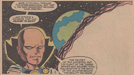
 Doug: So, how do you like your reprints? Karen and I have long lamented the end-product of what seems to be the well-intentioned preservation of history. Some of the reproduction just really throws off the feel of the original.
  While the Marvel Masterworks are great things to have, the paper is so glossy that the re-tooling even of the original four-coloring comes off sometimes as quite garish. The magenta -- man, it can really be magenta!
On the other hand, if you look at the Batman Illustrated by Neal Adams volumes from DC, Adams was allowed to recolor all of his work for the hardcover treatment. While the paper the company chose for printing has a softer, more matte-like finish, the artwork at times looks a bit muddy. I've seen several reviewers and bloggers bemoan the notion that they entertained a re-do by Adams on any aspect of the art.
 Then there's the re-issue of Stan Lee/Jack Kirby's Tales of Asgard in hardcover format, completely recolored using modern computer techniques. I don't think Kirby's art was ever meant for a color palette that bold and varied! I've located some various examples from newsprint, Marvel Masterworks, and the aforementioned Tales... HC for your examination.
Lastly, the Marvel Essentials and DC's Showcase Presents offer lots of bang for your buck -- almost 25 comic reprints per volume -- but all in black and white.


So, what do you think about "updating" the coloring, whether through modern printing techniques or just heavier, glossier paper? Do you like the tpb's that are basically the original newsprint with a new cardstock cover slung around? Certainly durability is an issue when purchasing a tome that the buyer intends to keep for some time; cost also has to be a consideration, though, as some of the premium hardcover collections are well on the other side of $50. What's your take -- what do you buy, and why?


9 comments:
I really like the Showcase Presents/Essential books. For the most part, the art doesn't really suffer from the lack of color. The team of Jack Kirby and Joe Sinnott and Gene Colan, especially when inked by Tom Palmer, looks really great in black and white. In fact, I prefer Colan's art in black and white.
Cost is a consideration, as well. After all, where else are you going to be able to get the entire Lee/Kirby run of Fantastic Four for under a hundred dollars?
I think it can vary. If done properly, I think recoloring the artwork doesn't detract too much. For example, I'm currently reading vol. 1 of the Tomb of Dracula omnibus and I think both the paper and coloring choices were done well. Ditto for the Dark Horse reprints for the Windsor-Smith Conan issues. Up until that point, I was apprehensive about recolorings of any type because my experience had been less than positive due to the colorist using updated styles such as layers of the same color to show something getting progressively darker. Imthink computer coloring can work on older artwork, it just doesn't need to be overdone. The flat coloring method looks best on the older stuff.
Also, I purchased the first volume of the Essential Iron Man and was immediately turned off by the newspaper quality and B&W artwork. I don't think it's any stretch to say I M always had the greatest stable of artists working on the book, so not having any color could be a huge detraction. As Ray said though, Colan and Palmer look great in B&W so it just depends on the artist.
I don't mind reprints on better quality paper - although glossy paper is definitely out - but I hate the modern style of colouring. For me it just detracts from the original images.
I don't mind the b&w reprints at all when it's a matter of something I really want to read, like, say, the original Killraven or Man-thing runs, which would be too much of a hassle and too costly if I went about buying all of the original issues.
Otherwise, I suppose my favorite format is the color TPB editions, and I tend to prefer the more matte paper with coloring as close to the original as possible.
The blends used in todays comics look awful. The characters skin always comes out with a ridiculous glow, on top of that the glossy paper doesn't help!
I was buying a complete Carl Barks collection in Europe, but when I bought the first volume and saw the unnatural blends done on photoshop I decided to quit buying.
I think this kind of coloring is a bad decision (graphic design wise) since it takes out a lot of the essence and the ambient generated on the originals.
So for re prints, if they are not gonna respect true colors I much rather have B&W, that way you can really appreciate the inking.
I read the Showcase and Essential books. I thought the lack of colour would bother me but you do get used to it. I guess what I miss the most with the big reprint volumes is the lack of advertisements. I find the ads really tie a book to a certain era. The Essential X-men books are timeless...until you see Dazzler or Punk rocker Storm.
As for recolouring...it varies. I remember reading the Saga of R'as Al Ghul. The colouring really seemed to bother me...
I got the 2nd & 3rd volumes of the Essential Thor, and yep, they were an economical way to obtain some of Kirby's best work nad I didn't mind too much not having it all in color, although much of it I already have, either from some of the originals I managed to find for fairly cheap prices, or the various reprint mags of the '70s, primarily Marvel Spectacular. Of course, the downside of those old reprints is that they nearly always cut out 2 or 3 pages worth of the original material. Certainly, the old style coloring generally worked best on those stories, although I'm not such a purist that I'm upset when they correct coloring gaffes from the original. From copies of I've seen of Galactus' initial appearance at the end of FF #48, the coloring scheme of the original looks plain goofy, particularly his apparent lack of pants. Perhaps that's what Kirby really intended, but the Big G looked more impressive with his legs covered in blue tights. Oh, yeah, and Galactus also looked much more otherworldly once Kirby excised that big G on his chest.
Ah, well, the travails of four-color fantasy mostly as we like it!
I haven't looked at all the options yet, but frankly, I need the color.. Not saying I can afford the Masterworks editions, but I think the glossy stock can really draw out a LOT of unappreciated details, especially for the Kirby FF glory years.
Again, still reviewing my options, but I typically end up getting the original comics in FN/VF and just baggin' them up..
I got some stick on the DC Boards after I said I preferred the scanned reproductions used in the Kryptonite No More collection - but to my failing eyes it was much better than garish digitised colouring. In reprints/reproductions I want to see the work as it was originally published.
Post a Comment