
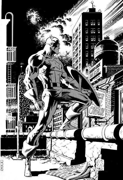
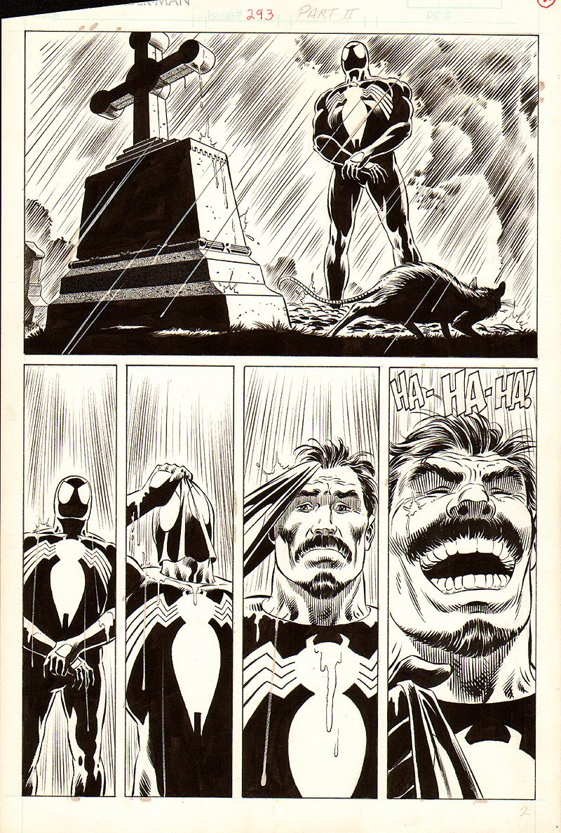
Doug; You may discuss any artist, male or female, living or dead, that you want today. Me? I've had Mike Zeck on my mind lately...
 | ||
| http://41.media.tumblr.com/cfb7ac3045c58621bc8a36e0656b510c/tumblr_mxwgvbpDed1rcp7bmo1_500.jpg |
 |
| https://returntofleet.files.wordpress.com/2014/08/mike-zeck-marvel-art-comics-punisher-captain-america-spider-man-kraven-70s-80s-illustration-covers-rtf-skulduggery-return-to-fleet-6222.jpg?w=724 |
 |
| http://stallonezone.com/zone/2009/z042109zeck.jpg |
 |
| http://www.theshareduniverse.com/wp-content/uploads/2014/03/kraven.jpg |
 |
| http://36.media.tumblr.com/0b94932efe954f2357887df5f7e1f4c2/tumblr_n3fs9qk4rK1r14zwfo1_500.jpg |
 |
| http://www.comicartfans.com/Images/Category_4515/subcat_29892/Batman-417.jpg |


31 comments:
*sigh*
Hal Foster.
I'm sure the still-fledgling comic book industry would LOVED to have gotten him into their stables-- but one has a sense that the success of his early Tarzan comic strip followed closely in 1937 with the launch (with almost unprecedented support from William Randolph Hearst) of Prince Valiant put him well out of reach of the decidedly seedy, shady comic book entrepreneurs of that era.
Mind you, Foster's rather between-the-action-moments story-telling style wasn't a natural fit for the wham-bang-pow nature of comic books anyhow (although, wow, he could certainly depict some stunning action moments and sequences), but his artistic gifts were simply not to be denied or ignored. There are moments in his work- particularly in those first 10 years- where it's obvious that you're looking at a panel or a page that John Buscema himself had treasured as a youngster.
HB
So, Doug, trying to see if you can get about 50 comments from a one-line post, eh? :P
Seriously, though, I like your choice of Mike Zeck. I first became aware of his work in Master of Kung Fu in the late '70s, when his pencils were often inked by the late, great Gene Day. I became a fan right away. He had a good run of nice work on Captain America as well - even though I was really upset when Stern and Byrne left the title, Zeck came in soon after and really did a bang-up job.
My own contribution to this discussion: Billy Graham. Although he had the misfortune of sharing a name with that televangelist, I can honestly say I think of the artist first whenever the name comes up. He mainly worked for Warren and Marvel in the '70s and early '80s. I like his work in Hero for Hire (what I've seen of it) and, especially, in Jungle Action on the the Black Panther stories during McGregor's run.
Some beautiful illustrations you chose, Doug! Mike Zeck is a huge talent. Also must echo the praises HB and Edo shared for Foster and Graham.
And to add another to our young list: Joe Kubert. Many know his work from Tarzan, Hawkman or another from his long list of artistic credits. I came to really appreciate his skills reading "Enemy Ace". The scenes of aerial combat, the detail in the planes, the cloudscapes; a true feast for the eyes.
Love the Zeck! Funny you should bring him up, because I was just looking at some of his old work on "Diversions of the Groovy Kind". A couple of days ago "The Groove" posted an old story from Eerie #108 called "Growing Pains" that was illustrated (and I mean illustrated) by Mike Zeck and it is absolutely gorgeous. The anatomy, the perspective, the shading, and the attention to every detail is rendered masterfully. In fact, I never knew Zeck was quite that good until I saw this. Check it out if you get a chance.
As for myself, I love John Byrne, but we already talk about him quite a bit around here. So, I'll bring up another favorite "Bronze Age" artist of mine that doesn't get a whole lot of attention, and that's Ron Frenz. His original run on Amazing Spider-Man is my all-time favorite (even over Ditko, Romita, and Romita Jr.). His original style was this kind of updated take on Steve Ditko, which I really enjoyed a lot. Later on his style developed into more of a mix of Kirby and Romita Sr., which I still like but not as much as his earlier more rough style of penciling.
You, know that just gave me an idea. Doug, you should do a post about artists whose styles changed over time from how they looked when they started. A couple of great examples would be Bill Sienkiewicz and Keith Giffen. They both started out with pretty conventional penciling styles that later evolved into very unconventional and distinctive takes on comic art.
I'm sure there are many more artists who have radically altered their styles over the years. It might be fun to discuss sometimes.
The in-house ad for Zeck's MoKF is one of those stick-with-you images, isn't it?
Shang-Chi in that ready-pose; furrowed brow; rivulets of sweat running down; the painstakingly-rendered fingers. Kung-Fu heroes, as a rule, held very little appeal for me-- but that ad had me right on the brink, I have to say. What was the ad-copy? Something like, "A new standard in comic book art-", or something like that?
Liking Joe Kubert, too, Redartz. His style doesn't work for some folks (some folks 'round here, even, I think), but for me it always lent a . . . a. . . how do I phrase this?. . . a literary legitimacy to whatever book he was on. Much of World War II exists in my mind's eye through a lens with a Joe Kubert filter.
HB
I'm in the middle of reading a Superman/Shazam reprint book that features Rich Buckler, so I'll talk about him. I've always felt that he was a very talented guy who got a bad wrap because he was specifically told to imitate Jack Kirby, and because he swiped from Kirby. Here's a page that has some nice scans of some good Buckler art:
http://prismcomics.org/display.php?id=1144
I've been reading Justice Society stories in the revived All-Star Comics and it has been a blast watching as Joe Staton arrived on the DC scene still with the style he used at Charlton and watch that style open up and get more nimble with the Earth-2 characters. Staton is currently drawning Dick Tracy and remains in my all-time top three favorite artists of all time.
Who are the other two? "Big" John Buscema and Jack "King" Kirby, so that's pretty good company.
Rip Off :)
Edo, you're onto me.
William -- super idea. Walter Simonson, too?
Love the suggestion of Joe Kubert as a fellow who was just an impressive artist. Like HB said, not everyone's cup of tea, but solid on the war comics and of course on Tarzan. I've said it before -- that guy could draw animals!
I've been spending way too much of my comics proceeds on IDW's Artist Editions, and it's the Mike Zeck book that I've recently had an eye on. The first two issues of the Punisher mini, the first installment of Kraven's last hunt, a 2-issue Cap story featuring Nick Fury and Deathlok, and 1 or 2 of the first issues of Secret Wars. Plus a ton of covers. Not sure I'll pull the trigger on it, but Zeck's work on that Punisher series and the Kraven 6-parter are treasures!
Doug
Hmm, Simonson, really? His style doesn't seem to have changed much to me...
Rip, good call on Staton. I absolutely love his work. And I also like Kubert's work quite a bit. In fact, for all of you who are really big fans, I highly recommend the Joe Kubert Presents TPB. It contains his last published work from the 6-issue series of the same name.
Edo, seriously? You don't think his Manhunter stuff and his Thor work are distinct? I can tell you what year it was by Simonson's style, at the very least delineating his 70s work from his 80s output.
William's right -- we need to have this conversation! Next week, maybe... :)
Doug
I also really like Zeck. Doug, I haven’t seen the IDW book, but the issues listed will be fantastic examples. The Deathlock Cap issues are amongst my favorites even in color, so I cannot imagine how good the B&W would be. My only hangup with Zeck is occasionally his characters’ chins got cartoonishly large. Not always, but enough that I could tell Zeck’s work just by the chins. I know that is a minor quibble, but it just always stood out to me. His use of shadow is really nice. And I think his Cap is amongst the best renditions; Cap always looks strong and athletic…capable of the acrobatics under Zeck’s pencils.
Since we are talking artists in the broad scope, I have a liking for Pat Broderick’s work. It is very stylized and sometimes stiff (I’m not even sure “stiff” is the right word, maybe “posed”). And his faces sure had a lot of lines. But I am attracted to the detail particularly in Micronauts, Firestorm, and Captain Atom.
Frenz has been mentioned, and I too liked his Spider Man and Spider Girl.
Also I really liked Marie Severin. Sometimes I find myself really liking a cover or artwork and wondering who it is and lo and behold… it is work from Marie Severin. I give you Sub Mariner 9, Avengers 73, XMen 65, and Thor 175 covers as examples. Not to mention “Not Brand Echh”. Such versatility. I like to think she should be mentioned in the upper tier artist category more often.
Doug, what I meant was that regardless of Simonson's evolution, he retained his distinctive style and it's usually pretty easy to recognize his art (unless buried under the work of over-enthusiastic and/or overpowering inker). I would say the same applies to Joe Staton, mentioned above, and Sal Buscema. Whereas in the case of the examples William mentioned, Sienkiewicz and Giffen, the change was really noticeable, to the point that (esp. in Giffen's case), it looks like work produced by entirely different artists.
Martinex: totally agree about both Broderick and Severin. Broderick in particular did some great work on Captain Marvel (the original, Mar-Vell) toward the end of his solo series and then in Marvel Spotlight.
Another great artist I think deserves mention is Don Newton - he did some outstanding work in the 1970s and early '80s for DC on Batman, Aquaman and the other Captain Marvel...
I was a Zeck fan on Master of Kung Fu. He had a smooth style with some great action poses. I picked up a Zeck crime book called DAMNED from the '90s that has quite a different art style, haven't read it yet but also looks good.
For Sienkiewicz, sometimes I prefer his early art in Neal Adams mode as it's just so clean and beautiful, but other times like his later art for the unpredictable experimentation.
Joe Staton on JSA is fantastic, with his bouncy energy, especially inked by Bob Layton or himself. Liked him on the Huntress backup stories also. I haven't read E-Man, but just picked up almost the whole first run--looks very fun.
I just read through Warlord 1-50, so I'll put in a word for Mike Grell. It's a joy to watch his artistic development on this series, as the characters start out more compact and later become more lean and elegant. Great story too, as all 50 issues form one big story.
I just picked up Cannon by Wally Wood. Action hero with lots of naked women running around, it came out in '70-'73 in a tabloid for US military personnel overseas. I'm only a mild Wood fan, mostly like his early art for Mad like the superhero spoofs. But I really like the look of the art here so far--sweet black and white with grey tones. Here's a video preview: CANNON by Wally Wood
At the end are a couple Cannon stories by Steve Ditko.
Oh man, I didn't know there was an IDW Zeck Artist Edition, it has exactly my favorite issues in it. I've just blown money on the Gil Kane one and the Romita Artifact edition and swore I was going to kind of stop there, but this one looks very tempting.
Loved seeing Joe Staton get mentioned, 70's Legion is pretty much my all-time favorite run of any series and Staton, along with James Sherman and Mike Grell, was at the heart of it.
Need to add Frank Miller to that artist evolution topic!
Ron Frenz has been mentioned as updated Ditko on Spidey...in the retro vein I'll also throw out Steve Rude as updated Toth! I think his Nexus run was brilliant.
Since this all started with Zeck, and some have praised his work on Shang-Chi, I'll throw out one of his predecessors on that mag - Paul Gulacy. I later learned that many considered him a Steranko clone but in the mid-70s I didn't know who Jim Steranko was. I just knew that I liked the way that book looked.
Tom
In the Bronze Age? Michael Golden. His stuff is just so good.
As for current artists, I love Fiona Staples (who is doing Image's amazing Saga series - written by Brian K.Vaughn).
I also love Michael Allred's work (you should check out his Silver Surfer)
Since Walt Simonson's name has come up a time or three in today's conversation, I thought you might get a kick out of a sketch he just tweeted.
Doug
Doug, thanks for that link! That's all kinds of awesome - and now I want to see him do an entire Thor v. Fin Fang Foom story...
You are most welcome, Edo. Simonson's fun to follow on Twitter, as every now and then he'll post a sketch he's done. For those of us who are fans of original art, it's a real treat.
I am presently crafting the post requested by William and seconded by many -- artists whose styles morphed over time. I think it's important that we'll discuss this as a choice, and not due to the passage of time and it's toll on skill. Looks like next Thursday will be our day. Thanks for the idea and for the encouragement, everyone!
Doug
All great artists, guys. I'll add an artist I was thrilled to meet at the Boston ComicCon last weekend, Jose Luis Garcia-Lopez. His style is so clean and precise, no wonder DC used his art for a lot of their licensing. He could lay out a killer action sequence, too. The comic I can point to that best displays his strengths is Batman vs. The Incredible Hulk. While the story is mostly fun, it's the art that makes it worth owning. I wish Garcia-Lopez had drawn more Hulk pages, he could have been the definitive Hulk artist. The exaggerated proportions are still believable and the Hulk's face is actually menacing in a way few artists have managed. Of course his Batman is note-perfect a la Jim Aparo, and his Joker is my favorite version of the character. In one panel, the Joker is scared and trying but failing not to show it, and it looks believable. The reimagined Bat- & Hulk foes are creative (the Hulk ripping apart a Scarecrow made of straw was my favorite), and the Joker's fantasy worlds get psychedelic while still grounded. JLG-L is the real deal.
He was very nice in person. He was selling some production art for affordable prices and I happily bought a rough Joker sketch. Meeting JLG-L was a highlight of a great day!
- Mike Loughlin
I have always been impressed with Barry Windsor-Smith's run on Conan. I think he truly captured the young barbarian, just getting his feet wet in the world.
And since we're talking about Walt Simonson. I loved his run on Thor! His work on Fantastic Four did not grab me the same way. I don't know why.
Speaking of grabbing, Simonson's Thor 380 is the all splash page issue featuring Thor's fight with the Midgard Serpent. Maybe not Fin Fang Foom, but he was pretty big........
(They don't write 'em like that anymore.
No, they just don't write 'em like that anymore.
Oh, they don't write 'em like that anymore.
They just don't write 'em like that anymore.
They just don't, no they don't, no no, uh-uh,
They just don't write 'em like that anymore)
Mike L., how cool that you got to meet Garcia-Lopez. I would have loved to seen him draw not only more Hulk, but more Marvel characters in general.
Nice link, Doug! Walt Simonson is always good for a look; one of the true greats.
Mike L- enjoyed your convention story. That Joker sketch sounds like it will make a great addition to your wall, framed! Very cool; perhaps one day a 'show and tell' for original art/sketches would be a good topic for further exploration...
Prowl- good call on Barry Windsor-Smith. I recently won the first Conan treasury edition on ebay, specifically to read "Red Nails" in color. Hadn't realized that Barry himself colored the version presented therein. Masterfully illustrated, and the coloring is rich yet subtle.
Yeah like Edo my first taste of Zeck was on MOKF. I didn't really appreciate his style back then but you know the drill - after viewing his work on other titles one gets to realizing just how good an artist is.
Hmm Big John, Sal, Kirby, Romita Sr and Gil Kane are the usual suspects whenever great artists are mentioned around here. What about Tony DeZuniga? I loved his dark style, especially whenever he was inking another great like Big John on a title like Conan.
- Mike 'doodles stick figures' from Trinidad & Tobago.
Hunh--
Y'know, now I'm wondering if the house ad I mentioned 'way above wasn't in fact for Gulacy's MoKF? Anyone else have a sharper memory of that? Naturally I remember the image, and whiff on the artist responsible. . .
HB
Check out this cover to tomorrow's Back Issue magazine, #21. It features a Mike Zeck cover, which is a recreation of the Captain America artwork features in this blog entry.... however it uses Daredevil as the subject! Super cool!
http://twomorrows.com/index.php?main_page=product_info&cPath=98_54&products_id=415
HB I think that house ad was Zeck. I only recall two ads, one used the cover from issue 100 and one had Shang-Chi standing ready in front of a grid of windows; he was shaded red. If it was either of those, they were both Zeck art.
Martinex, on the topic of Pat Broderick: I just remembered this fairly recent post at Diversions of the Groovy Kind, featuring some of his early art for the ill-fated Atlas Comics. As I said in the comment there, it's amazing how polished his art looks even at that rather early point in his career - although I'll readily acknowledge that veteran inker Frank McLaughlin may have had something to do with the fine appearance of the art in that issue.
Thanks for the link Edo. You are right. It has all the classic signs of Broderick's art, even that early in his career. The detailed musculature and the faces, with very defined cheekbones, are all there. I have to say that I think his females seem more relaxed and natural in their posing; also his female faces have always been nice and expressive. I liked his work with Marionette in Micronauts. In this sample, the woman's close up and expressions stand out to me.
Thanks MX-- the second image you refer to is definitely the one I was thinking of. I'm comforted to know that I haven't utterly succumbed to memory-slippage yet!
HB
My all-time fave is still Neal Adams. His artwork blew me away as a kid, and still does today. I even collected his Batman:Odyssey series! Talk about suffering for art!
Post a Comment