Doug: Dark Age, Copper Age, Best-Forgotten Age... Whatever you call the 1990s, there is no doubt some noise was made. Thomas F. is along today to shepherd us through a conversation on one of the decade's (and beyond) iconic artists -- Todd McFarlane.
 Thomas F.: This entry assumes that the reader is a fan, or at least to some
degree appreciative, of Todd McFarlane’s undeniably unique and extremely
detailed artwork. That being said, I fully recognize that the criticism
of Nineties artwork—McFarlane’s included—is
valid. The countless complaints of human anatomy grossly out of
proportion, ridiculously exaggerated muscles, and the gimmicky covers
that were so obviously a cash-grab—all this is undeniably true.
Thomas F.: This entry assumes that the reader is a fan, or at least to some
degree appreciative, of Todd McFarlane’s undeniably unique and extremely
detailed artwork. That being said, I fully recognize that the criticism
of Nineties artwork—McFarlane’s included—is
valid. The countless complaints of human anatomy grossly out of
proportion, ridiculously exaggerated muscles, and the gimmicky covers
that were so obviously a cash-grab—all this is undeniably true.In retrospect, no doubt we’ve all had our fill of hologram covers, embossed covers, glow-in-the-dark covers, foil covers, chromium covers, die-cut image covers, polybag issues, slide motion covers, thermal ink covers, multiple interlocking covers, etc. At least I’ve had enough of them to last a lifetime.
Nevertheless, I believe that there was at least some late Eighties/early Nineties artwork that had its appeal—with plenty of iconic covers—and like many fans at the time of McFarlane’s tenure at Marvel, I felt that McFarlane drew the “spideriest” Spider-Man my preteen eyes had ever seen. Caught up in the craze of McFarlanemania, I snapped up nearly everything and anything he’d penciled.
By the way, for a few dollars I recently picked up a copy of All-Star Squadron #47, from July 1985, “The Secret Origin of Dr. Fate.” The cover and interiors were drawn by a 24 year-old McFarlane early on in his career, just shortly after he’d broken into the comic book industry.


8 comments:
Good topic today, Thomas. I too was impressed by McFarlane's work on Amazing Spider-Man, so much so that I actually started buying the title again after having dropped it a couple years previously. I didn't collect many comics at all by that time, and didn't have any other examples of McFarlane's work until years later.
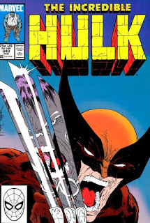
You show a few of my favorites here; the Hulk cover with Wolverine is a beauty. Also the Detective covers for Batman: Year Two were all pretty sharp. Most of my personal choices, though, would be his Amazing Spider-man covers. Particularly, ASM 312 (Green Goblin vs. Hobgoblin, a great issue and a great cover). That, and my favorite, ASM 311 with Mysterio. One of the coolest portrayals of ol' domehead; my copy was signed by McFarlane at a convention a few years back.
Some of his work seems overwrought, and many of his contemporaries in the 90's and beyond went overboard with effect and exaggeration. Painful to look at (I go back to yesterday's work by Curt Swan to give my eyes a rest). But McFarlane has certainly given us some fine artwork and some truly iconic covers.
Crouched Spidey, no contest.
Interesting. Very interesting. I actually am a fan of Todd McFarlane's artwork (not so much his writing). I actually got swept up in a lot of hype and hysteria of the wild and crazy 90's comic scene. (Before it got out of hand and sort of imploded). Still I'd far and away take the stuff they were producing in the 90's over the convoluted soap opera trash they're spewing out these days.
My very favorite statue I own is a 3-D reproduction of Todd McFarlane's cover to Spider-Man #1, and my favorite poster is by "The Todd" as well. It's the one with Spider-Man in his classic costume crouching on a ledge with his black suit sort of crucified on the wall behind him, with lots of webs all around.
I also have a statue of McFarlane's cover to ASM #301 as well, which is another favorite of mine. I got that one as a member of the Marvel Collector's Club (anyone remember that?) The statue was available for the incredible price of only $40 (and it's worth about 10 times that now).
So, I guess my favorite Todd cover is either Spider-Man #1, or ASM #301.
I liked McFarlane at the time, especially on Spidey, but looking back now...a lot of his stuff looks a bit weird (to say the least). For me, his early stuff looks better, precisely because he hadn't developed his signature style yet. I really like his work on Infinity Inc. and he did some cool covers on that title; I especially like #19, 21, 23, 26, 31, 34, and 35.
Mike Wilson
Hiya,
I think I have to go with his earlier covers. He's young and learning here, but the covers have a greater sense of depth, which I tend to like. In the later examples he seems to crowd the figures up against the edges to the point where, eventually, they seem to be trying to break through to the readers.
Nothing especially wrong with it, just not my style.
Sometimes I think we need to give more credit to McFarlane and the other artists who emerged around this time. They had such a short window of opportunity to develop their abilities, especially in comparison to those pencillers who began their careers in the Golden and Silver ages.
Seeya,
pfgavigan
Spawn 1: I don't like the character or the series, but that cover (drawn by McFarlane & painted by Ken Stacey) is just gorgeous. The vivid colors make the art pop, while the swirling cape hides a lot of the anatomical weirdness McFarlane would become known for.
- Mike Loughlin
I really don't like most of those covers - the exceptions being Spider-man #s 300/301 (I do rather like the elaborate way he draws Spidey's webbing) and Detective #576. I haven't really read many stories featuring his art. In fact, pretty much the only one I can think of is Batman: Year Two from Detective Comics. I would have preferred it if Alan Davis had drawn that whole arc instead of just the first issue, but McFarlane's art was pretty solid there regardless.
Redartz — I also very much like the cover to Amazing Spider-Man #311, with a greenish Spider-Man reflected in Mysterio's dome. In fact, that was one I had considered including in my list of favorites. And as for #312, that was a confrontation many fans wanted to see—the two Goblins against each other!
Mike — I'm not very familiar with McFarlane's work on DC's Infinity Inc. although I am aware of it. Thanks for your specific recommendations; I'll definitely check those issues out!
Thomas F.
Post a Comment