Doug: Closing time, kiddies! Today we finish out our alphabetical look at Marvel Comics that were on the shelves in the spring of 1976, specifically cover-dated June. We still have some of the heavy-hitter titles, as well as some second-stringers. As in the past, we're criticizing the cover logos as well as the corner boxes, for my money the most charming aspect of Marvel's covers in the Silver and Bronze Ages. So, without further delay...
Doug: I'm not sure what to make of this one. I've always liked, not loved, but liked Moon Knight -- thought he had a cool costume. But this cover is sort of just... yuck. Too many words, the black text box clashes with the "Still Only 25c" call-out, and the font just isn't appropriate for what I'd think if I was going to advertise a character named "Moon Knight". So I'm just pretty indifferent about this.
Karen: Ditto.
Doug: Hate to be a wet blanket, but I have to claim indifference to this one also. It's just sort of there. There's nothing about this logo that cries out "This is a martial arts book!" to me. As for the corner box art, I always thought Shang-chi looked funny. Of course, years later after watching The Karate Kid, I understand. Hey, I was a pretty sedentary kid, and not one who would have signed up for karate lessons!
Karen: There's just too many words - "The Hands of Shang-Chi, Master of Kung Fu"! Who wrote that, Roy Thomas?
Doug: Mom always said, that if you can't say something nice, don't say anything at all. I can't even say that I like the corner box. I just always felt that the expression on his face, sort of a laughing yell, was weird.
Karen: Yet another 'blah' logo. Never really cared for the whole 'Power Man' ID - and evidently neither did Marvel, as he's just known as Luke Cage nowadays.
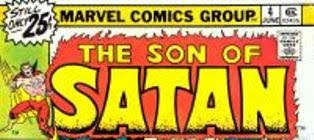
Doug: Now we're talkin'!! Yeah!! Great logo, great corner box... It just seemed like the books above hit the shelves with little inspiration behind the titles. This one has a great font, great "burning" background, and the figure is quite dynamic! This is one of Marvel's best offerings.
Karen: It certainly invokes the concept of the character! I'm still amazed that Marvel put out a title with "Satan" in the name. I guess there wasn't as much fear of publicity or a backlash then like their might be now.
Doug: But, then we're right away back to ho hum. I will say, though, that I love the orientation of Doom to Namor. It's perfect. Are there two more volatile personalities, outside the Hulk, in the Marvel Universe? As Doom's lording it over the Sub-Mariner was a staple of this title, the corner box here is excellent.
Karen: SVTU, one of my favorite 70s books! Yup, it's a lame logo, but man that book was awesome!
Doug: I'm mixed on this one. Of course this logo was on the cover forever, but I do think there were improvements later on. I always thought the H looked like a couple of paper bags next to each other, and I always wondered if some frost giant took a bite out of the O. I do like the regality of the Thor figure, which I'd mentioned some months ago when we looked at the corner boxes of 1972.
Karen: It's a classic logo, in my opinion. It has a certain starkness to it, and a kind of ancient-quality, as if the letters were carved from stone -notice the missing parts. I dig it.
Doug: You could probably argue that this one's a Batman rip-off, and I think you
 'd have some steam. But it's really fitting, from the background to the font to the lay-out of the words. Another winner! And Colan's moody Count in the corner box is right on.
Karen: Or you could argue Batman's a ripoff of Dracula! In any case, it goes well with the title, although again -too wordy! That "Lord of Vampires" doesn't need to be there. It's Dracula, we get it already!
Doug: Love this one. I love the slanted letters. I love the faces piled on each other in the corner box. And even the plainness of "The All-New, All-Different" works here.
Karen: Ah yes, can you feel the waves of nostalgia emanating from this logo? I'm in total agreement with you on this one Doug.
Doug: I'm no dummy -- I know this one's Karen's baby, and I'm smart enough to get out of her way. So finish it up, Miss!
Karen: My pal Adam! I always thought this was a memorable logo, although it honestly has that sort of primitive look that is probably better suited to Conan or Ka-Zar. Nothing about it screams, "outer space adventure!" or "Paranoid schizophrenic superhero!" But it works.
Doug: This was a fun little exercise, and I hope everyone had a good time. I know for me it brought back the thrill of seeing the very top part of a book peeking out on the spinner racks. Maybe we'll do this with DCs sometime in the future.


5 comments:
The Moon Knight one, or Marvel Spotlight, would have been improved if Marvel had kept the original 'spotlight' from the first four issues of the series - always thought that was a great look.
http://www.comics.org/issue/24643/cover/4/?style=default
I agree that most of these in Part 3 are a bit blah. However, I have always liked the Thor logo. Paperbag resemblance not withstanding, it represents what I know as the Thunder God - thick, powerful, and a bit antiquated.
I really enjoyed this series of analyzing the Marvel cover logos. You have a great blog here - keep it up and thanks for the time you both put in!
Terence and Joseph --
Thanks for the comments. We'll be traveling through June 1976 DC logos very shortly and it will be... a different experience, to say the least. There truly was a different marketing philosophy at the Distinguished Competition.
Best,
Doug
Lordy, I'd never noticed what a bunch of stinkers Marvel had. Look at Todd Klein's blog and you really get a sense that logos mattered at DC, whereas at Marvel a lot of them appeared simply slapped together.
You picked the perfect year for this delicious stroll down memory lane, since I've narrowed down my choices for favorite Marvel annum to 1975 or 1976. And Karen, I'm with you on the SVTU and WARLOCK love. Keep 'em coming! (Yes, I know you already have for more than a year, but you know what I mean.)
Post a Comment