

Doug: Today's topic spins out of requests made in last Friday's post about artists whose work you really admire. We're discussing artists whose styles changed (completely or subtly, but enough that it was noticeable) due to their personal choice or evolution and not due to age or illness.
Walter Simonson --


Frank Miller --


Sal Buscema --


Keith Giffen --


Bill Sienkiewicz --


23 comments:
Jack Kirby. His characters all looked underweight in the early '60s but by the mid '60s they were all musclebound. And the way he drew faces and poses and everything looked completely different.
Doug, you provided fine examples for all the artists I would have thought of! Simonson and Giffen come to mind first, and in both cases I enjoyed their style at the beginning, and still loved it following their artistic evolution. Giffen's Defenders were some of the title's best visually, and he provided some dynamite covers. His work on the Legion was stellar. Later, his quirky 'cartoony'style may have been off-putting to some, but I found it unique, creative and ofttimes amusing.
With Sal, I admire his later work as a bit of boundary-stretching. It is still recognizably "our pal Sal", yet shows some new perspectives and more individualized poses.
I agree with Colin about Kirby that his art evolved through the decade. In his case , though, I prefer the earlier work; more detailed and lighter in rendering.
One artist to add to the list: John Romita, Jr. His early work on Spider-man was very nice and helped make those Roger Stern issues so memorable. JR Jr's current work, though, to me seems stilted and unappealing. Ah, art; so subjective...
This is a very cool topic-- glad we jumped right back to it-! Nice job on the homework, Doug. Sheesh, a bit of a surprise-assignment research project, eh?
Man, I wish I knew how to attach images to these posts-- there might be even greater contrast to be squeezed out of Keith Giffen's body of work. The early part of his OMEGA MEN run was clean, conventional and reminded me of, say, Rich Buckler-- good visuals, clear storytelling. That could be contrasted with his nearly-incomprehensible work late in the run of HEX (Jonah Hex in the future) and on an issue or two of Daredevil where his self-indulgent experiments with abstracted minimalism were an abomination to the eye. As a friend of mine put it at the time: "Keith Giffen-- that's the guy they give a title to when they want to kill it. . . "
Another fellow who is very impressive in his ability to shift his visual style with the shifting sands of popular tastes is Mike Deodato jr. He came in with that whole 90's crowd of Hot Artists-- but was definitely a cut above even as he emulated that style and thrived in it. Terrific work on both HULK and the foundering THOR in those early years. He then came back to Hulk a few years later (in the dreadful Jones run) and provided simply astonishingly rich, detailed, realistic visuals. And I believe that's likely his current style, yes? You would never believe that it's the same artist at the helm in those two eras.
HB
Keith Giffen's change was a heartbreaker. If you were reading his classic Legion run with Levitz at the time circa 82-83, the guy was positively a rock star at that point up until "the change" that started in Legion 307. Honestly, it briefly felt like he might be the next Byrne or Perez.
The quirky style he changed to was great for humorous and offbeat stuff (Ambush Bug, the Legion of Substitute-Heroes special, etc.), but for something like mainstream Legion, it just looked terrible (I remember feeling a tremendous sense of relief when Steve Lightle stepped in on Legion).
And then to find out he had either "heavily borrowed" or "stolen" his new style depending on your viewpoint from another artist made it even worse.
The most striking artistic change to me was always Bill Sienkiewicz. He went from having a very nice Neal Adams-ish kind of thing, to going totally off the reservation into full blown surrealism. And surrealism just doesn't work for me in a storytelling medium. I couldn't stand to look at his later work on titles like The New Mutants, and others.
Redartz brought up a good point about John Romita Jr. radically changing his artwork from a pleasing, clean cartoon style to a flat and stylized sort of thing. I much prefer his earlier stuff.
I think that what happened to JRJr, also afflicted Frank Miller. By the time he started working on Sin City, his art had devolved into a much more flat and graphic style with a lot of nonsensical lifework all over the place. I much prefer his earlier more traditional work on Daredevil.
On the other side of the coin, I prefer Keith Giffen's later stuff. Especially his work on Legion of Super Heroes. I thought his early stuff was just sort of so so. Kind of a mediocre Marvel style. But when he broke out and developed his own quirky look, I liked it. It at least made him unique. That said, he sometimes took it too far into the surreal and would lose me.
Another artist who you could tell made a conscious decision to change up his style was Ron Frenz. (One of my personal favorites). His earliest work on Amazing Spider-Man and Marvel Team-Up had a very distinctive Steve Ditko influence. Whereas his later stuff looked more like John Romita Sr. and/or Jack Kirby (usually depending on which character he was working on). I preferred his earlier Ditko-esque style because it was just so raw and uninhibited. I wish he'd stuck with that style. But I enjoy his later work as well.
If JRJR could just learn to draw noses again, I'd be somewhat happy! This is a great topic because it's just interesting to see the different reactions to the styles. What I didn't see in Giffen's change, some people liked. I actually thought Sienkiewicz on New Mutants was brilliant, one of my favorite 80's runs (though I tired of his approach shortly thereafter, stuff like Elektra Assassin never quite grabbed me the same).
I'm kind of backwards when it comes to Ron Frenz, I never liked the earlier Spidey Ditko style (much as I wanted to), it felt a little too angular to me, like Ditko a bit exaggerated in a less pleasing way. Peter just looked oddly over geeky to me, not in the charming 60's "wallflower" way. But I did like a lot of Ron's later work.
Kirby really had three distinct styles. The earliest being his pre-WW2 style (Captain America, Newsboy Legion). The second, a bit cleaner and more refined, from the late Forties through early Sixties (the romance books, Boys Ranch, Challengers of the Unknown and the early Marvel super hero and monster comics). And then his third, much more stylized,graphic phase that he worked in from the mid-Sixties forward.
In fact, in the late Sixties a friend of mine honestly thought that the guy who drew the Fantastic Four stories in the reprint books was a different artist than the one who was drawing the monthly title.
Interesting topic and good examples Doug! I prefer Simonson's earlier look, with more naturalism and detail. For Sienkiewicz, I like both styles, depending on whether I'm in superhero or fine art mood. Kirby is fun in his 1940s curvy style, and powerful in his later blocky style. John Romita Jr. I like his early style which was again more naturalistic, instead of his later simplified graphic style.
So I like artists' later styles if they have a expressive payoff for the loss of naturalism--Kirby it's power and Sienkiewicz experimental fine art distortions. Van Gogh started out more earthy, then burst out his bright colorful palette later on.
Hey, everyone --
Thanks for the positive comments on the art samples. I wasn't sure if I always found what I was intending -- everything today is an Internet grab, so I was at the mercy of others' scanning.
Great suggestion on John Romita, Jr. He may be the single artist who typifies what we're after in this post. I enjoy his 1980s Marvel output in ASM and Iron Man, but really do not care for his Miller-esque style of the past 12-15 years. Like others around here, I like my superhero art in a pretty straightforward, "house" style. So count me (I've said this before) among those favoring Walt Simonson's first run on Thor when he was following John Buscema. I don't want to denigrate his later run, as it's obviously considered a classic. It's just a wee bit too stylized for my tastes.
Doug
Hmmm, I must be more of a grognard than I thought...of the artists you mentioned, I prefer the older stuff for all of them except Giffen. Another artist whose later stuff I prefer is Rich Buckler...I thought his stuff looked a lot better when he stopped (for the most part) being a Kirby clone; he did some great covers in the 70s/80s.
Mike Wilson
Mike --
Love Buckler's covers and a lot of his DC stuff!
Doug
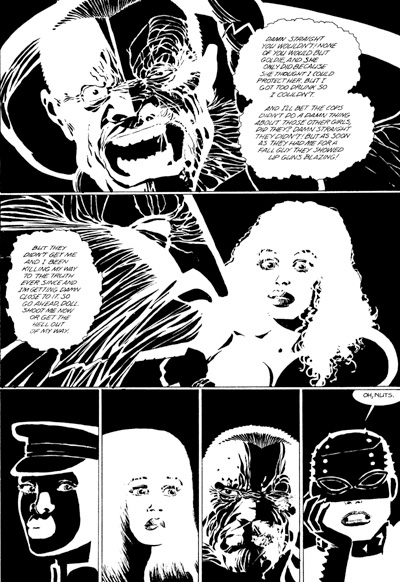
Hi Doug - I think you may have provided an incorrect example of Frank Miller's Daredevil work in the post. I that's the team that followed Kalus Janson's run as the artist on the title. I forget the names. At any rate, I don't believe that's Miller's and Janson's art. My apologies if I'm wrong. -JJ
typo: "I *think* that's the team..." -JJ
John Byrne I think is someone who never lost anything in terms of actual drawing ability but something about the look of his work changes after a certain point but I don't think anyone has been able to successfully pin down what that is and usually just saying "his old stuff was better" which I think is a bit of an unfair way to put it because that would imply some deterioration of skill or some form of carelessness that I don't think is what happened.
For my part let me qualify that this is ultimately personal preference. The same as me preferring Kirby's more blocky style to his early Marvel and WWII stuff. Again no skill had vanished but there's a different approach consciously or unconsciously.
I prefer the look of Byrne's work in his Marvel Team-Up years and through to around the end of his tenure on Superman. Granted there's even some difference within that particular block of time (Out of the Superman stuff the issues inked by Karl Kesel I think look the slickest of all). Something seems to happen around the time of Next Men where the look takes on a more gritty or muddy quality whereas the earlier stuff was much, much cleaner. Prettier even. I don't want to call if softer because there was plenty of power in his work but something about the older stuff seems more refined to me than the later stuff even though logically the guy is learning more as he goes further into his career.
This might be due to Byrne inking himself more and maybe even his wanting to play with textures but I'm still not sure that's where the change lies.
Getting back to Superman ever since Generations I swear it looks to me like he draws Superman at least a head or two shorter and with much less muscle mass but again I can't tell if that's a deliberate artistic choice, something he's doing unconsciously or just the way my own eyeballs are reading it for whatever reason.
Thanks, JJ. Like I said, it's an Internet grab from a search I did.
I'll try to swap out the image.
Doug
Anyone remember when J.H. Williams III drew in a style akin to Scott McDaniel? Way back in the '90s, his art was nothing special. Fast forward to today and he creates lush, gorgeous, highly-detailed yet almost abstract imagery unlike any other in comics.
Stuart Immonen's art has changed drastically over time. It went from solid-but-unspectacular to either painterly illustration or slick cartooning over the course of about 5 years. Final Night looks fine but it's not the beautiful Superman Secret Identity nor the kinetic Ultimate X-Men.
Art Adams inspired Joe Madueira, who drew in a faux-Adams style before switching to faux-manga.
Alan Davis inspired Bryan Hitch who went from a Davis clone to the heavily-detailed, "widescreen" guy.
- Mike Loughlin
You found a whopper of a Miller DD page, Doug! And that's my answer as well. I enjoyed his initial Sin City but he became progressively more cartoonish as he went, intentionally drawing massive hands and feet on his figures, along with other affectations. I have a Comics Journal interview book here wherein he states: "I realized at one point that I was never going to be in the family of Alex Raymond. I don't have the skills and I don't like to do it, don't like to try it. I've been pursuing more actively a much cartoonier style..."
I did enjoy 300, but I lost interest in his art when the last Sin City story and DK2 were released. -JJ
I have to say that this discussion really makes me think of how much the style of some of the 'elder statesmen' among the comics artists, the ones who started out in the 1940s, changed/evolved over the years. As noted above, Jack Kirby is a good example (although it's important to note that much of his art in the '40s and '50s was done in collaboration with Joe Simon), but I keep thinking about two examples posted rather recently by our pal the Groovy Agent, one featuring Gil Kane and the other Joe Kubert. I have to be honest, in both cases, if I hadn't been told the art was by them in those stories, I don't think I ever would have guessed it.
Hiya,
I tend to think that most art styles evolve as the artist in question learns more about what they need to put in and what they don't. That's not a slam at them, not by any means. It's just that after a certain point all the detail that is put in gets lost once the artwork is reproduced and printed at a smaller size. At that stage a lot of these individuals really took off as story tellers, able to convey maximum amount of information per panel and really get the ball rolling.
And I gotta admit, these are some really great examples.
seeya
pfgavigan
I loved Frank Miller's early stuff in Daredevil--very unique.
John Buscema is probably the most talented anatomy artist who's ever drawn comics--never an awkward pose. Ever.He was astonishing.
Tom Palmer as an inker made even the most ordinary pencils look great.
Rick Buckler. His work was uneven over the years, but when he was good he was very, very good.
Michael Golden: He drew that classic Avengers Annual where the group fought the Brotherhood. Talk about original! Great with anatomy, too.
Gene Colan: When inked by Tom Palmer, he was hard to beat. His painterly style was unlike anybody else's. When he drew something, you knew who it was.
Deodato Jr is just amazing. His work in the Avengers was just incredible.
So many artists, so little time.
Hmm watching all these samples makes my opinion all the more definite - like Doug, I prefer a more simple house style. So, in nearly every instance I prefer the earlier work of these artists. While it's true most artists evolve into their own style as time goes on, I generally prefer the usually cleaner look of their early artwork, but that's just me.
- Mike 'the style of no style' from Trinidad & Tobago.
Nice topic. I was just reading an interview with Giffen about his earliest DC work and how he was pretty raw, so raw that many of the editors at DC didn't want him near their books. He worked with Gerry Conway on JSA and soon thereafter on Defenders and he was on his way. His early stuff is so rigid and overwrought, it contrasts powerfully with is later material when he made his bones at DC and became one of their mainstays.
The first artist that comes to mind in these discussions for me is Barry Windsor-Smith. Watching him explode on the scene on X-Men, then SHIELD, then Avenger only to find his new path on Conan was really exciting in the early 70's. I felt (wrongly) that I could draw as well as the young Smith, but seeing him develop on Conan was like watching a race car pull away from you and you realize you'll never catch up.
Rip Off
Bill Sienkiewicz was the artist I'm mostly disappointed with. His current advertising work is good. However, when an artist goes too out in left field, like he did with Electra: Assassin and Arkham Asylum, it just becomes a series of primary shapes and paint splatters. An artist is not doing gallery work when he draws comics. It's sequential art that is supposed to entertain an audience. To me he went from being a good Neal Adams clone to being an abstract expressionist and it does nothing to draw me in as a reader.
Sal Buscema changed and got better as he aged.... and his art became better as time went one. I still loved the bold simplicity of his work. You don't have to be an ultra-realistic Neal Adams style illustrator or cartoonist to get your point across.
Kieth Giffen's work on the Defenders where he was channeling the Jack Kirby style were the best of his work. When he altered that he lost a lot of appeal for me. His work on books like Video Jack are completely lost on me. It's too child like and simplistic. There are too many good fan artists out there that could do the job better.
Walt Simonson was kind of touch and go for me. I loved his earlier Man Hunter work in those DC 100 page fifty cent comics. There were times when I couldn't identify what he was trying to draw in some panels though. His work on Beta Ray Bill and Thor were great and I'm glad there's a Thor Omnibus to preserve that work. I don't have the hundred dollars or so for that volume but would love to buy it one day. On the other hand his work on the Fantastic Four wasn't up to par with what he did in Thor.
Frank Miller change in style has been the most jarring and sad to me. I can't fault Frank though because he looks very ill or has cancer from photos on Sin City 2. He obviously has a health issue. and it looks like Dark Knight III: The Master Race will be his last hurrah. There will be other writers and artists on the project to assist him so it does look like the rumors of his health issues may be true.
But I digress; Miller's work on Daredevil is his best. I just wish he could have brought that to the original Dark Knight returns. There are some pages and scenes in the book that look like they were drawn by a five year old. I wish his attention to detail and anatomy were present like they were in Dare Devil.
Post a Comment