Monday, June 14, 2010

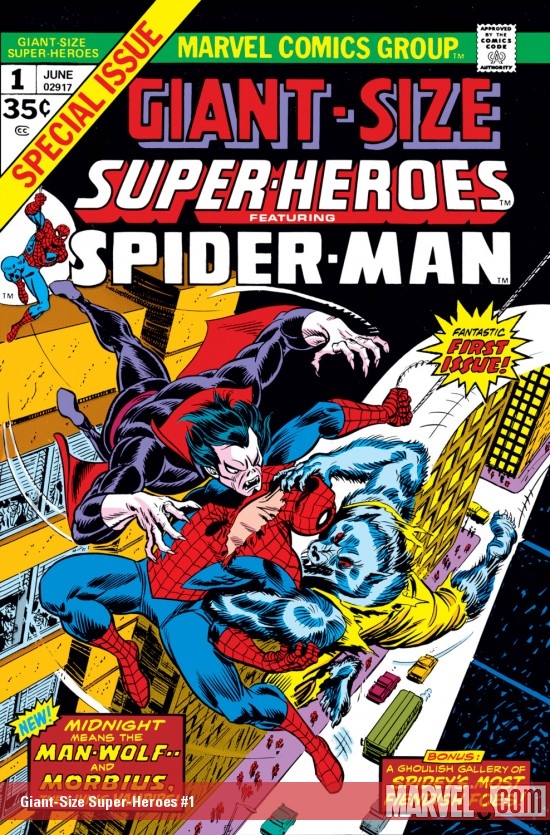
Giant-Size June! G-S Super-Heroes #1


Giant-Size Super-Heroes #1 (June 1974)
"Man-Wolf at Midnight!"
writer:Gerry Conway
artists: Gil Kane/Mike Esposito


Karen: We're back with more Giant-Size goodness! This time we'll be yakking about Giant-Size Super-Heroes Featuring Spider-Man. Whew, that's a mouthful. There's some interesting history provided in the pages of this book about the Giant-S
ize titles and their creation. But to really understand the whole giant-size genesis, we have to take a quick look at the first title in the line, Giant-Size Super-Stars #1 (May 1974). This book featured the Fantastic Four versus the Hulk, and was intended to rotate characters through a monthly 52 page book. So the next issue of Super-Stars would feature Spider-Man, and the third would star that bulging barbarian, Conan - the idea was to mimic the popular format of the NBC Mystery Movie, which (for you youngsters) alternated each week between three different detective shows: Colombo, McCloud, and MacMillan and Wife. At least, that was the plan.
Doug: Ha! Throw in Love American Style, the $6 Million Dollar Man, and All in the Family from the other networks, and you've really taken me back to my formative years with television!
Karen: No kidding, my Mom loved Colombo! However, the next month did not see the arrival of Giant-Size Super-Stars #2, but instead Giant-Size Super-Heroes #1. Even weirder, it contained the Spidey story with Morbius and Man-Wolf which had supposed to have been the next issue of GSSS. So what happened? Editor Roy Thomas explains in a text feature in this book that, in order to keep each of the 52 page books on the racks as long as possible, it made more sense to split them into three quarterly titles.

Karen: Then things get really confusing, as Roy says that Marvel will be producing 100 page titles called Super-Giant Conan, Super-Giant Avengers, and Super-Giant Spider-Man! These would all be 60 cent books (unlike the 52 page GS titles, which were 35 cents - hard to believe). Now we all know that eventually we'd get GS versions of all these titles but I'm at a loss when it comes to "super-giants". Another really interesting
fact is that apparently the planned third title in the GS line was supposed to be Giant-Size Super-Teams featuring the Defenders! No, this title never actually appeared, although there's a house ad for it right below Roy's commentary. I'm assuming this became GS Defenders #1.


Doug: It's interesting that DC would continue to experiment with the different sized formats, including the 100-Page Giants and the Dollar Comics on through the end of the decade. Marvel would switch back to Annuals after about a year and a half of these Giant-Size books.

Karen: Of course, eventually it would appear that just about everyone in the Marvel U got their own GS book (GS Man-Thing, anyone?). But I find it amusing that the initial concept, which seemed quite novel, was reworked primarily for economic reasons.

Karen: I guess that's enough background, let's get to the actual story. It can be summed up pretty easily: Morbius and Man-Wolf versus Spider-Man! OK, maybe it's not that easy. Besides the all out, code-approved monster action, there's a couple of funky sub-plots thrown in for good measure: in one, Peter begins to question why he fights crime after a thug basically accuses him of being a thrill-seeker. In the second, Peter is nominated for photographer of the year.
Doug: Not a lot of pay-off to either of those subplots. I guess they were just tossed in as a Peter's-always-got-problems sort of thing. The one thing I did get a sense of was that this story was supposed to dovetail with the rest of the Spider mags and was never intended to be any kind of standalone or jumping on point.
Karen: Doug, as we discussed in some previous posts, these "monsters" were about as scary as Count Chocula and Fruit Brute! (Doug: Fruit Brute -- the forgotten cereal monster! That's awesome!!) To me these two were just like our usual super-villains -not especially frightening at all. John Jameson -aka the Man-Wolf -is like so many other tragic Marvel characters, a victim of a terrible transformation. Morbius as shown here is less sympathetic; in fact he's killed several people by draining them of blood. Still, Morbius wants to be free of his vampirism, and so he manages to gain some control over Man-Wolf. Morbius' plan seems to be to use Man-Wolf to engage Spider-Man, while he seeks out a blood doctor that might be able to cure him. Now how he knew that Spider-Man would be coming after him, I have no idea! Maybe he has a vampire-sense?! Then again, I guess the extra help couldn't hurt.
Doug: The story set-up was a bit too neat, and felt rushed. I like a story with some foreshadowing, and this one just sort of blew up out of nowhere. It was good to see these monster-guys team-up, but I guess it could have been better.
Karen: Unfortunately for Morbius, Wolfy is sadly inadequate when it comes to taking on Spidey - he gets caught in web rather quickly. Spidey heads to the blood doctor's lab and sure enough, Morbius shows up! He tricks Morbius into thinking that their fight has destroyed the doctor's equipment, and that he can no longer cure him. Although....wouldn't it be a good idea to cure him? I mean, he is going around sucking people's blood! OK, another thing I won't think too deeply about.

Doug: I agree with you -- Man-Wolf was a real pushover. There wasn't the tension that we saw in his first appearance, in Amazing Spider-Man #124-125. The same goes for Morbius. Again, you're right -- hasn't Reed Richards spent years trying to cure Ben Grimm and Bruce Banner? Why wouldn't Peter Parker have been more altruistic?

Karen: So Morbius takes off and all is right with the world. Oh, those two sub-plots? Well, Spidey realized that the reason he fights bad guys is because certain bad guys are too tough for the cops. And sadly, Peter did not win the photographer of the year award. I heard it went to some kid named Olsen.
Doug: Gee whiz, Superman!

Karen: Enjoyable enough but a bit light storywise. The Kane art here is adequate but certainly not his best.

Doug: Yeah, I don't know if Kane rushed it or if Esposito's inks were subpar, but something was off a bit. I'll say one thing for the art, though -- I'm glad I read this from the original comic and not from a reprint. For Gil Kane's art in particular, the new coloring processes and slick paper don't do it any favors. Kane's at his best on muddy newsprint. And it was a fun little diversion, but probably better the very first time I read it, some 36 years ago.


Sunday, June 13, 2010

Dr. Zaius, Dr. Zaius...Oh Dr. Zaius!


Karen: A new addition to my ever-growing (and now bursting at the seams) Sanctum is the one and only Dr. Zaius, that keeper of truth and protector of all things simian! I found the esteemed doctor at a local toy store for the paltry sum of $45. It's a Sideshow 12" figure and came with a nice collection of accessories, including some sacred scrolls and even a mini-lawgiver statue! Off to the side of the doctor is some Kubrick Planet of the Apes Gorillas, featuring General Ursus, who had that awesome-looking helmet! Unfortunately though, Ursus never warranted his own theme song.

Friday, June 11, 2010

The Distinguished Competition: June 1976 Cover Logos!

After our 3-installment examination of Marvel Comics' cover logos hitting the stands in the late spring of 1976, it seems only fair to see what DC had on the spinner racks at the same time. One thing you'll notice right away is that while Marvel was boldly announcing that their mags were "Still only 25c!", DC had already made the switch. That, coupled with the fact that many books you'll be looking for simply aren't here (bi-monthly publishing schedule) will make this somewhat of a different adventure than the one we shared a couple of weeks ago.

Doug: I've always liked the Action Comics logo. It's dynamic, familiar, etc. The red on this particular cover is striking. What I don't understand, though, is why the same logo is reprinted in the banner across the top of the comic. Marvel merely printed the name of the book so that it could be seen in the spinner racks. This seems like unnecessary duplication. Another gripe (remember, I said I liked this) is the addition of "Superman's" to the logo. Hello... unless you've been on Planet X for the past 50 years, you know Superman is in Action Comics! Also as part of this cover is DC's penchant for giving the buyer two stories in one book, as evidenced by the plug for the Mr. Mxyzptlk yarn. Personally, I always felt like this was the main reason why characters at DC were so flat. When you've got problem/solution/resolution all going down in only 10 pages, it's no wonder there was little character development!

Karen: I hardly ever bought Action, and the logo probably didn't help inspire me to give it a chance. It just sort of sits there.


Doug: Next to the Iron Man logo, this one's about as good as it gets. I especially like the nod to the Golden Age name, the Bat-Man, by separating the compound word. Perfect!

Karen: Yup, just about perfect. The bat shape and head really is what makes it work.

Doug: Which brings us to our next entry. While I don't have a real attachment to the B&B logo, it's OK... I'd like to focus in on the Batman logo here. I think this one's a bit older -- maybe hearkens back to the television show days (?) -- but awesome nonetheless. While I think I like the logo above a bit better, this one's awfully good, too.

Karen: Agreed, the B&B logo is yawn-inducing, but I like this Batman one.

Doug: Ouch. 40% of the cover devoted to this?? Man, this would drive me away from Hawkman, Adam Strange, etc. Whose idea was this???

Karen: This reminds me of those old Marvel Triple Action covers I think we looked at long ago, where two-thirds of the cover was logo! It also reminds me of the time period in the 70s when Marvel was using a framing device on covers, which again cut down on the art.

Doug: Why, oh why, when you have the classic logo and a Neal Adams drawing beside it all up on the banner at the top of the page, would you slap this boring monstrosity (that again gobbles up much of the cover space) front and center? I need to find out who the marketing guru was at DC in this period. It's no wonder Marvel was kicking their rear ends.

Karen: Craptastic.

Doug: This logo has been around since the Showcase #4 revival, so going on 20 years by the time this hit the stands. It's OK, not great. Marvel's logos looked more like they were actual fonts; DC's seem to look more hand-drawn. Which is not to say they weren't or that's bad; but it is to say that Marvel's lettering had more of a polish to it. My opinion... Also notable on this cover is the fact that there's a Green Lantern story. Why, you ask? For some reason GL's own mag, which was bi-monthly at the time, did not have a June/July issue. So the Emerald Guardian showed up over here. Go figure.

Karen: Another one that does absolutely nothing for me. This brings back all the feelings I had as a kid -that Marvel was dynamic and cool, and DC was run by a bunch of boring old guys.

Doug: The first of many of the DC non-superhero titles. I never, ever got into DC's war/horror/romance/science fiction comics. It just wasn't my bag. That's not to say that I didn't enjoy those genres of entertainment in other forms like movies or television -- but for my 10-year old brain, comic books were where the superheros were. I do like this logo -- I like that it's tattered and looks to be shaken up a bit. The red/yellow combo is a bit much. Something more subtle along the lines of brown or army green might have been more appropriate. It would have stood out on the racks, though -- I'll give them that.

Karen: Aside from Batman, this is the most interesting logo we've seen so far. Somebody actually put some effort into this one.

Doug: Another book I never bought. Which is a shame, because some of these titles had great creative talent working on them. My loss. I love the logo, however, and the tag line "Do you dare enter..." is great. Good stuff -- well thought out.

Karen: I bought some of Marvel's horror and sci fi titles, but never any DC. This logo is a keeper.

Doug: Maybe you're thinking, "What? Why didn't you crop this one, ya lazy so-and-so?!?" Well, if that's what you're thinking, then you are not a true fan of DC comics (from any era), my friend! Why in the world would I want to crop this and remove the GORILLA?? Because we all know everything's better with gorillas. This has always been one of DC's better efforts. The design, color scheme, tilted angle are all excellent. The roll call of which characters can be found inside is wonderful as well. Not only is this particular cover ridiculously cool, but the overall design is outstanding and indicative of the time it was published.

Karen: Gorillas! Yes! Now if only I could find my copy of DC Super-Heroes Battle Super-Gorillas. That stuff was like gold when I was ten. As for the JLA logo -a classic! I love the slant of the words, the stars, and the red,white, and blue motif. To me, "Justice League" should always be followed by "America" - it's just so awesome.

Doug: This brings us to the conclusion of the first half of our jaunt through June 1976, DC-style. We'll have nine more covers to look over a bit later. And to exit this post, we have another nice logo. The style is good, the banner beneath the title is good, and Kirby gets some love (although by now he'd been back at Marvel for awhile) with the Kamandi portrait at the top of the cover. Good job!

Karen: Nicely done, and sort of reminds me of the Ka-Zar logo we looked at.

Thursday, June 10, 2010

Can I Get a Little Relevance Here?

Doug: A couple of weeks ago Karen and I were discussing potential blog posts when the topic of socially relevant songs came up. We bandied about several titles, and who knows? Perhaps we have a "Top 10" or a "5 to Love" sort of post in your future.

But what got me thinking about it again was this little ditty from Styx (it was only a short while ago that I profiled them as one of Illinois' famous Bronze Age bands) that came over the iPod while I was cutting the grass yesterday.
It made me think how it could very well have been written in reaction to our political climate in the States today. You have the line about gasoline prices, the selfishness of youth -- undefeatable, living in the moment... Then you get to the line about the Great Society -- is that pride in the reforms of the Lyndon Johnson administration, or is it entitlement? And how about the distrust and misinformation propagated by the left against the right, and vice versa?

So see what you think -- the lyrics are below, and if you click here you can catch a sound clip of the introduction.


Borrowed Time
Written by Dennis DeYoung and Tommy ShawLead Vocals by Dennis DeYoung
From the album Cornerstone, released in October 1979


Yeah yeah!
Don't look now, but here come the '80's!

I was so cool back in '65
I had it made 'cause I understood what to do to survive
I had my car, and I made the scene
Didn't give a damn about no gasoline
They can go to hell

My friend we never thought about the world
And its realities
The promised land was ours
We were the Great Society

I'm so confused by the things I read,
I need the truth
But the truth is, I don't know who to believe
The left says yes, and the right says no
I'm in between and the more I learn
Well, the less that I know
I got to make a show

Livin' high, living fine
Livin' high on borrowed time

Yes! No!
Yes! No!
No! Yes!
No! Yes!

Faith be with me now
I'm just a dreamer in a dreamland
Faith be with me now
I'm just a dreamer in a dreamland

'Cause we're
Livin' high
Livin' fine (You know I'm livin' fine)
Livin' high (Yes I'm livin' high)
On borrowed time (On borrowed time)

Livin' high (Whoohoo!)
Livin' fine (Ahhh!)

Livin' high
On Lake Shore Drive (Midnight ride)
Livin' high (We're livin' high)
On Leslie Lane (Let's go back and play it again!)
Livin' high (We're livin' high)
On Red Bud Trail (On Red Bud, Red Bud Trail!)
Livin' high
On Central Drive (He's on Central Drive!)
Livin' high (We're livin', livin' high)
On Prestwick Drive (Catch me on Prestwick Drive!...)
Livin' high (...gettin' in and drivin' my Mercedes...)
Livin' fine (...up and down and up and down -- sh*t! I don't....)

Wednesday, June 9, 2010

Female Trouble: Guardians of the Galaxy, part 3


Defenders #28
(Oct. 1975)
"My Mother, the Badoon!"
Writer: Steve Gerber
Artist: Sal Buscema
Inkers: Frank Giacoia and John Tartaglione

Karen: Welcome back to the third part of our Defenders/Guardians review. You may have noticed the unusual title for this issue - another sign of Steve Gerber's sense of humor. It has to be a reference to what some people consider to be the worst TV show of all time, My Mother the Car. Sadly, I have never seen this show but its legend lives on.

Doug: Nope, I've not seen it either. However, I do recall Car 54, Where Are You? with a young Fred Gwynne co-starring before he went on to fame in The Munsters!

Karen: I particularly like the cover to this issue: it's a great design, with small shots of each Defender in action (even if they are somewhat misleading), and a spectacular full-body shot of Starhawk, who was a brand new character when the issue premiered.


Doug: This was a motif applied often in the Bronze Age -- not always successfully. But here it is nice, for all the reasons you state.

Karen: An
yway, on to our comic: when we last left our heroes, the Captain America was being boarded by the nasty Badoon while Dr. Strange sat unconscious, hooked up to the ship's computers. Martinex, Nighthawk, and Charlie-27 (who is now wearing a mask for some reason) make a valiant effort but Nighthawk winds up getting captured and the two Guardians stand down to save his life. Boy, I have to say, I always wondered what the heck Nighthawk was doing on a team with Dr. Strange and the Hulk. Seriously, the guy can fly and is twice as strong at night. That's it. Don't get me wrong, I did like his personality, but power-wise, he was unnecessary.

Doug: When you look at the roster of the early Defenders, including those members you stated as well as Namor and the Surfer, I suppose Nighthawk was the "usual joe" that rubes like me could relate to. Plus he had a cool costume! I am glad t
hey didn't play out any sort of inferiority complex with him, though.
Karen: The Badoon take notice of Dr. Strange, who has used his astral form to locate the missing Vance Astro and Valkyrie. They are now in the company of the mysterious being known as Starhawk. They discover that they are on the homeworld of the Badoon -which is now populated entirely by the female of the species! The creatures who attacked them in the previous issue were females driven mad by a mating lust. It seems many centuries prior the two sexes split, as neither could stand the other -more commentary from Gerber or just a joke? In any case the females are nothing like the warlike males, although they are relatively apathetic. I had to laugh at the way the 'civilized' females were portrayed by Sal Buscema. Although reptilian, they have hair -and the queen has quite a bouffant !

Doug: Some
times backstory or origin-type exposition is lame or seemingly unnecessary, but in this issue and the last couple Gerber's "storytelling" has been fun. It's really been well-done. And you're right about Sal -- funny stuff. I imagine some of these guys just hated drawing certain types of characters and had to amuse themselves to get through the assignment.
Karen: Back on the starship, the Badoon find Dr. Strange and assume he is dead, but in reality, his life signs have just dropped to a minimum as he voyages in his astral form. The badoon take Nighthawk, Charlie, and Martinex to Earth to execute them.

Doug: Isn't that a staple of being a bad guy? Never, ever off an enemy on the spot. Transport them, come up with some sort of torture device, even let 'em go just to mess with their heads. This is perfect!

Karen: Doc sends his astral form out to find Hulk and Yondu, who are forced into televised combat on what previously appeared to be a world of medieval-level development. I'm sure the temptation to insert Monty Hall into a Defenders story was too great for Gerber. Yondu fights some hot-rodding robots and destroys them. We'll have to wait for next iss
ue to see what old Greenskin does.

Doug: I really enjoyed this scene. For some reason I like Yondu -- he's very visually-appealing. The whistling-with-th
e-arrows deal is sort of weird, but I like the costume and love the fin on his head! I couldn't help but think of all the "Planet Hulk" stuff when I saw Jade Jaws in that suit of armor.

Karen: As the issue comes to a close, Strange manages to mystically transport Astro and Val to Earth, right in time to see their compatriots face a badoon firing squad!

Doug: Like I said, shoulda deep-sixed 'em when ya had the chance.

Karen: Another fun issue
, although I felt this one dragged a bit in comparison to the previous two. Still, it reminds me of why I enjoyed Marvel Comics so much in the 70s: there's a sense that anything can happen. It's fun and exciting, but also provocative. Gerber manages to inject a lot of social commentary into his stories, but still keep them entertaining.

Doug: I agree -- this series we're looking at is a case of a writer and artist clicking. There aren't any glitches here at all, and other than the Colletta inks we've both commented on over the past two issues (he's not on the job here, but returns next issue), these books are really quite solid.

Tuesday, June 8, 2010

Bronze Age Babies Bulletins


Doug: Happy Tuesday, everyone. Today we have three items to toss your way -- a newsflash, an opinion, and a conundrum. In that order...
Doug: I don't really buy action figures anymore. The increased price of oil a couple of years ago that seemingly pushed the price of new figures out of my budget range, coupled with the switch by Hasbro to the 3 3/4" line ended my love affair with Marvel Legends. And although I really like what Mattel is doing with DC's 6-inch line, I just didn't want to jump into that with the (again) higher prices. However, having seen what Mattel has been doing as exclusives for Comicon International has me itching. Last year it was the Wonder Twins; this summer it's Plastic Man.

Now I'm no Plastic Man fan, but this package/figure/presentation is just incredible. You can read the full review at Action Figure Times.

Doug: I was at a comic shop yesterday and spied Avengers #1 on the shelves. I took a gander at it and put it back after only a few page turns. I have long argued that since comics are a visual medium, it's the art that grabs a potential buyer. Yes, story is important, and perhaps good art doesn't save a bad story (I'll say that a good story can be killed by bad art!), but if the reader/buyer doesn't feel an excitement upon laying eyes on the printed page then a potential sale may be lost. That being said, I've long held a disdain for the artwork of one John Romita, Jr. and his work on Avengers #1 didn't change that opinion. I just find his work unreadable -- it's so scratchy at times, so unrealistic (yeah, Gil Kane was unrealisitc, but the guy could move a story with dynamic camera angles and emotional characters). So even as a longtime Avengers fan, I'll continue to pass on my favorite title, which has turned into the exact thing I despised about the X-plosion of titles and characters that drove me away from the once-merry mutants.
Oh, and speaking of mutants, could someone please inform the powers-that-be that Mr. Wolverine is not an Avenger? I'll thank you for doing so...
Doug: Which brings us to our last point of interest today. Allow me to reprint a brief e-mail exchange Karen and I shared this morning:

(Doug) Good morning -

Boy, was I disappointed when I went to the comic shop yesterday. It was part of a chain that has about 1/2 dozen stores around the south suburbs. The oldest issue I saw in the longboxes was from the late 1980's, so it was a total strike-out in terms of finding any Bronze Age reader copies.

(Karen) Isn't it sad when an 'old' back issue is from the 1980s? There are four stores in our area and the one nearest us is the smallest. They have about as many boxes of comics as I do, and like the store you mentioned, most of their books are from the last two decades. Fortunately they have a much larger store about 20 miles south of us that has back issues from the 70's (wow, ancient history!), but the selection is spotty.

(Doug) Yep -- I must be a dope, because I thought I was going to march right into that store and snag 5-10 unbagged ratty-looking reader copies of Bronze Age glory for around $10. Didn't happen.

Doug: So, what's a Bronze Age enthusiast to do? If you want long runs of a title, there are always the Essentials or Showcase Presents -- these are great, cheap, etc. But if you want some color in your four-color fun, then you are looking at trade paperbacks, and I don't always like the color reproduction in those (too bright and glossy). Do any of you face these problems with your local comic shops? Seriously, I just wanted some musty, dog-eared reader copies. That's not so hard, is it?

Monday, June 7, 2010

Giant-Size June!! G-S Avengers #1


 Giant-Size Avengers #1 (August 1974)
"Nuklo -- The Invader That Time Forgot!"
Roy Thomas-Rich Buckler/Dan Adkins


Karen: Welcome all, to our first installment of what we affectionately call 'Giant-Size June'! We'll be looking at four of Marvel's Giant-Size books this month, all first issues of particular titles. To get us going, we'll start here with Giant-Size Avengers # 1.

Karen: First I have to say, I loved the Giant-Size books. Whether they called them Giant-Size, King-Size Specials, or Annuals, oversized comics were always a treat. Somehow by virtue of page count alone, they seemed special -although frankly, many had pedestrian writing and/or art. Some were stuffed with reprints as well. But perhaps it was also the fact that these books typically came out around summer time that made them so special. In any case, I was a sucker for these books (and the Treasury editions, which were really giant-size).
Doug: You are so right -- any book in that large format was just a treat. For the most part I didn't care for the reprints that eventually swallowed up the coolness factor -- I was more in favor of the "book-length story!!" that was often advertised. It seemed that the reprints came either from the Golden Age or from the very early Silver Age; I've long argued that in regard to the foundational years of the Marvel Universe, most of the titles seemed to hit their stride in the second or even third year of publication. For the most part, you can have that early stuff!
Karen: I think that's pretty common not only with comics, but TV shows, musicians - you have to work on mastering your craft. I'll say for sure that I find the first ten issues or so of X-Men completely unreadable.

Karen: There's a little bit of a story behind
Giant-Size Avengers #1. Apparently, even though Steve Englehart was the writer of the regular Avengers title at the time, editor Roy Thomas, who had been the long-time Avengers scribe preceding Englehart, felt strongly that he wanted to do this first giant-size issue. Englehart wasn't happy with that decision, but then, Roy was the boss! So instead of getting a story that would feed into Englehart's current Avengers storyline, we get this standalone tale that takes us back to Marvel's Golden Age.

Doug: Yeah, this was a problem on a couple of fronts. First off, while Roy was, at the time, the dean of Avengers scribes, this particular line-up was the one Englehart had made his own. So to that degree Roy was cooking in someone else's kitchen (one need only read the clumsy dialogue coming forth from Mantis to see what I mean). And you're right about it being self-serving. I think we all know about writers and their pet characters... Shoot, in current Avengering, we've had a steady diet of Bendis' fave characters. But Roy -- Roy didn't give us a pet character. No -- he gave us a pet era! But it sure worked out OK at Marvel and even later at DC.

Karen: I have to comment on the art. The issue is drawn by Rich Buckler and 'embellished' by Dan Adkins. Buckler is at the height of his 'Kirby-Clone' stage here and frankly, it's distracting. Every single facial expression just screams Kirby, as well as the huge hands and fists, the posing, etc. It's quite jarring to be reading a 1974 comic by someone other than Kirby but seeing Kirby art. I'm glad he eventually developed his own style - which I thought was quite good.

Doug: Allow me to simplify: the art in this book is ugly. It's ugly. I commented to Karen offline, friends, that this art was as shocking as if one had peeled back the lovely Johnny Romita cover only to find Don Heck lurking beneath. And you're right about Buckler later -- those two mini-series he did in the late 1980's where he told the origins and histories of the Sub-Mariner and the Original Human Torch were just great. Beautiful stuff.


Karen: Although I have always enjoyed Roy's work, there doesn't seem to be a lot to this story. The Avengers encounter the Whizzer, a World War II era hero, who it turns out has a gigantic son, Nuklo, who is a walking nuclear bomb. Nuklo has been kept in stasis for two decades and emerges from his capsule as a huge glowing man, although one with the mind of an infant. He somehow splits into three beings and the Avengers split into teams -Cap and Iron Man, Thor and Mantis, and the Vision goes solo - to nab him. Eventually he is re-integrated and disabled.

Doug: I don't get why, in Avengers #153 (cover dated November 1976), Gerry Conway basically used the same plot in the regular mag. Avengers #153 would continue into Avengers Annual #6, which was originally scheduled to be released as Giant-Size Avengers #6. Of course, Conway was also the editor on Avengers then, so he could do whatever he wanted. Lot of that going around, I guess!
Doug: The main story in this book was OK. As we've hinted, it had its problems. Maybe I was dense or not paying close enough attention, but the whole 3-in-1 thing got by me until the climax. I felt Mantis had lost her voice, and Iron Man had one line, a dig actually, directed at Cap that seemed more appropriate for today's characters than 35 years ago. And the whole "hex sphere" thing just continued in that long line of undefined powers for Wanda.

Karen: Probably more interesting than the main story was the subplot, which revealed that the Whizzer, and his deceased wife, Miss America, were the actual parents of the Scarlet Witch and Quicksilver. It made a teeny bit of sense, seeing as how Quicksilver and the Whizzer shared the same powers. It also gave Marvel what I believe would have been its first legacy characters. It was one of Thomas' early steps towards integrating the World War II and 1950s stories into a unified Marvel universe. We also get mention of the All Winners Squad, and the info that the Cap and Bucky on that 1950s team were actually the second men to bear those names. This was another tie-in, as Englehart had just done a story in Captain America that featured the commie-chasing Cap of the 50s. Thomas has always loved to bring everything together!
Doug: I wholeheartedly agree with you -- this was the most fun part of the book. The Whizzer went from being somewhat weird and out of place at the beginning of the story to a very sentimental character by the end. You've encapsulized my general emotions, but I did want to add one of those little "Marvel time" problems: When it was stated that Nuklo had been in the stasis tube for 25 years, and that he is the older brother of Wanda and Pietro, that would make the twins, what, 22 or so at this time? Just curious to me -- I'd have had them a few years older, I guess.

Karen: Of course, years later we would be told that Magneto was the true father of the twin mutant Avengers, and this actually (to my mind) made more sense than this story. However, I'm sorry to see the legacy aspect gone. That was kind of cool.
Karen: The remainder of the issue contains reprints of a 1940s Human Torch story, and a Wasp solo story that I'm guessing was from Tales to Astonish. Neither was too terribly exciting. But the issues of GSA to come would be great - Englehart would weave his storylines from the regular title into this one, and we would even get some gorgeous Dave Cockrum art. Now those were books I read over and over!

Friday, June 4, 2010

June 1976: Still More Marvel Comics Cover Logos!

Doug: Closing time, kiddies! Today we finish out our alphabetical look at Marvel Comics that were on the shelves in the spring of 1976, specifically cover-dated June. We still have some of the heavy-hitter titles, as well as some second-stringers. As in the past, we're criticizing the cover logos as well as the corner boxes, for my money the most charming aspect of Marvel's covers in the Silver and Bronze Ages. So, without further delay...


Doug: I'm not sure what to make of this one. I've always liked, not loved, but liked Moon Knight -- thought he had a cool costume. But this cover is sort of just... yuck. Too many words, the black text box clashes with the "Still Only 25c" call-out, and the font just isn't appropriate for what I'd think if I was going to advertise a character named "Moon Knight". So I'm just pretty indifferent about this.

Karen: Ditto.


Doug: Hate to be a wet blanket, but I have to claim indifference to this one also. It's just sort of there. There's nothing about this logo that cries out "This is a martial arts book!" to me. As for the corner box art, I always thought Shang-chi looked funny. Of course, years later after watching The Karate Kid, I understand. Hey, I was a pretty sedentary kid, and not one who would have signed up for karate lessons!

Karen: There's just too many words - "The Hands of Shang-Chi, Master of Kung Fu"! Who wrote that, Roy Thomas?

Doug: Mom always said, that if you can't say something nice, don't say anything at all. I can't even say that I like the corner box. I just always felt that the expression on his face, sort of a laughing yell, was weird.

Karen: Yet another 'blah' logo. Never really cared for the whole 'Power Man' ID - and evidently neither did Marvel, as he's just known as Luke Cage nowadays.

Doug: Now we're talkin'!! Yeah!! Great logo, great corner box... It just seemed like the books above hit the shelves with little inspiration behind the titles. This one has a great font, great "burning" background, and the figure is quite dynamic! This is one of Marvel's best offerings.

Karen: It certainly invokes the concept of the character! I'm still amazed that Marvel put out a title with "Satan" in the name. I guess there wasn't as much fear of publicity or a backlash then like their might be now.

Doug: But, then we're right away back to ho hum. I will say, though, that I love the orientation of Doom to Namor. It's perfect. Are there two more volatile personalities, outside the Hulk, in the Marvel Universe? As Doom's lording it over the Sub-Mariner was a staple of this title, the corner box here is excellent.

Karen: SVTU, one of my favorite 70s books! Yup, it's a lame logo, but man that book was awesome!

Doug: I'm mixed on this one. Of course this logo was on the cover forever, but I do think there were improvements later on. I always thought the H looked like a couple of paper bags next to each other, and I always wondered if some frost giant took a bite out of the O. I do like the regality of the Thor figure, which I'd mentioned some months ago when we looked at the corner boxes of 1972.

Karen: It's a classic logo, in my opinion. It has a certain starkness to it, and a kind of ancient-quality, as if the letters were carved from stone -notice the missing parts. I dig it.

Doug: You could probably argue that this one's a Batman rip-off, and I think youAlign Center'd have some steam. But it's really fitting, from the background to the font to the lay-out of the words. Another winner! And Colan's moody Count in the corner box is right on.

Karen: Or you could argue Batman's a ripoff of Dracula! In any case, it goes well with the title, although again -too wordy! That "Lord of Vampires" doesn't need to be there. It's Dracula, we get it already!

Doug: Love this one. I love the slanted letters. I love the faces piled on each other in the corner box. And even the plainness of "The All-New, All-Different" works here.

Karen: Ah yes, can you feel the waves of nostalgia emanating from this logo? I'm in total agreement with you on this one Doug.

Doug: I'm no dummy -- I know this one's Karen's baby, and I'm smart enough to get out of her way. So finish it up, Miss!

Karen: My pal Adam! I always thought this was a memorable logo, although it honestly has that sort of primitive look that is probably better suited to Conan or Ka-Zar. Nothing about it screams, "outer space adventure!" or "Paranoid schizophrenic superhero!" But it works.

Doug: This was a fun little exercise, and I hope everyone had a good time. I know for me it brought back the thrill of seeing the very top part of a book peeking out on the spinner racks. Maybe we'll do this with DCs sometime in the future.

Thursday, June 3, 2010

Thanks For the Love!

Our friend ol' Groove over at Diversions of the Groovy Kind was nice enough to toss a kudo or two our way over the holiday weekend and today we'd like to do an off-day post just to say "Thanks, Groove!!"

As part of the award, we are now supposed to tell seven things about ourselves. Since this is a partnership, I think we'll split this one up 3 and 3, with our seventh nugget about the blog itself. So, here you are --

1. Doug's a high school social science teacher and former coach. Among his few claims to fame, he counts coaching at the state level in four different sports part of his life's thrills.

2. Karen's first comics convention of any kind was the 1975 San Diego Comic-Con, at the El Capitan Hotel, where she met both Stan Lee and Jack Kirby.

3. Doug's about to become bankrupt, as he has a son heading off to college in August.

4. Karen used to work in a forensic DNA lab, and can say unequivocally that it looked nothing like the labs on CSI.

5. Doug's pretty good friends with DC artists Don Kramer and Mike Babinski -- known Don since high school and had Mike as a student over 15 years ago!

6. Karen once celebrated Thanksgiving in Australia, and dined on crocodile and kangaroo meat. This gave her an increased appreciation of turkey.

7. So, the nugget about our blog? Believe it or not, and I know you'll find this impossible since this is such a seamless production day-in and day-out, but Karen and I have never met. Nope -- not face-to-face and never even shared a phone call. Blogging about comics is a labor of love for each of us, and this product is due to modern technology. So whadaya think of that?

As part of this love-in with the comics blogging community, we are to steer you toward seven other blogs we think are swell. So, in alphabetical order, we'd recommend to you:

Comic Coverage (sadly, now defunct)

Fantastic Four Stuff (a neat place to see FF memorabilia and original artwork)

Kingdom Kane

Marvel Genesis

Mighty World of Bronze Age Marvel

Silver Age Comics

Spider-Man Reviewed


So check out these other great bloggers, and again -- thanks to Groove and to all of you who are reading our blog regularly. As we approach our second year, we are just having a great time and hope to do this for many months to come. Have a great day!

Related Posts with Thumbnails