Showing posts with label Dave Cockrum. Show all posts

Tuesday, September 20, 2016

Would You Rather...? Great Bronze Age Runs


Doug: Here's a poser for you, spinning out of last weekend's conversation on our buying zeniths. In terms of greatness, readability, sustainability, influence, and yada yada yada, would you rather go to the first 50 (I use that term somewhat loosely) issues of the All-New, All-Different X-Men, or the Avengers encompassing the "Kree/Skrull War" through the "Celestial Madonna"? I don't know about you, but that's a tough choice for me.

I'm going to have to lean toward the X-Men on the greatness of the art alone. And then there was the awesomeness from issues 97-104 as classic baddies like the Sentinels, the Juggernaut, and Magneto rose up to attack our new band of mutants.

Of course, on the other side there's Neal Adams. And the bi-weekly "Avengers/Defenders War". And Englehart's time/space opera that ran from Avengers #129-135 and included three Giant-Size issues. Can I reconsider?

For our purposes, your "50"-issue runs are:

Giant-Size X-Men #1
X-Men #s 94-143
X-Men Annual #3


Avengers
#s 89-135
Giant-Size Avengers #s 2-4


Friday, June 5, 2015

Who's the Best... Comics Artist?


Doug: Back on May 22 Karen hosted a conversation about Marvel Team-Up #70, featuring Spidey, Thor, the Living Monolith, and the art of John Byrne. Some comments were made along the lines of Byrne being the consummate comics artist, really mastering all of the characters at Marvel and DC (as well as in his own output for Dark Horse). So, knowing what we do around here with inspiration, today we'll chew that fat some more. Who, in your own esteemed estimation, is the best comic book artist. And if you want to define that feel free. My take on it is more along the lines of figures and faces. But if you heard "storyteller" when you read today's title that's fine, too. You all know we can keep a few plates spinning in a day's talk.


Thursday, June 4, 2015

Guest Post - Inaugural Post: If I Had a Buck...

Doug: Boy, does Martinex1 have a cool topic for you today, kids! About two weeks ago a few emails landed in the BAB inbox with the title "The $1 Challenge". Unfortunately, I was too busy initially to give them a once-over. But when the time presented itself, I was asking "What the heck was I waiting for??" I hope today's going to be a fun conversation -- and we have a few more of these in the queue for our later amusement. Here we go.


Mike S.:One of my favorite topics on the BAB site is the “This Cover Made Me Buy This Book” feature. It never ceases to surprise me how much good conversation and memories can be generated from a single cover.  I have a slight variation on that approach, with a little game I call, “If I Had A Buck…” Back when I was a kid, I would scrimp and save, do extra chores for allowances, and work at my paper route just to have a little extra change (used mostly to buy comics, Slurpees, and candy). There were so many instances when I went to the local drug store that I said to myself, “If only I had a dollar; if I had a buck I would buy FILL IN THE BLANK”. A nickel was often the difference in being able to buy two, three, or four comics.  Should I get the Annual, or two of the “Still Only 25 Cent” issues? How do I mix or match to get the most out of my money? I would have loved to buy everything on the rack, but that was impossible.  

So this game that I propose is a mixture of history, cover art, an alternate world, and a little money. Let’s start with some history…

Carol Danvers has been a part of Marvel’s cast of characters for nearly fifty years, making her 1968 debut in Marvel Super Heroes #13 as an Air Force officer in charge of security and a foil to the original Captain Marvel.  Her persona has evolved much over the years, from a magazine editor to an Avenger, from Ms. Marvel to Binary to Warbird to Captain Marvel, from a legacy type character to a heroine currently more popular than her namesake.

In 1977, she first headlined her own title, Ms. Marvel, in a mostly forgettable and relatively short lived run. The series attempted to add a feminist character to the Marvel ranks. The modern approach may have been initially short circuited by clichés and a peekaboo costume. Following Gerry Conway’s intro, Chris Claremont took over writing duties with the third issue and shepherded the series through its finale.  Along the way Carol evolved into a true headliner with a lot of nuance, a compelling voice, and layered tales that set a foundation for the character’s decades of action.
But it is the art of this series that intrigues me. For so few issues (23 in all), the title seemed to tap into every available talent. The interiors were penciled by John Buscema in the first issues, Jim Mooney in the most issues, and intermittently by Keith Pollard, Sal Buscema, Carmine Infantino, Dave Cockrum, and Mike Vosburg. I am sure that inconsistency may have played into Ms. Marvel’s lack of longevity, but at least it was top notch along the way.

The cover art for the series was phenomenal and had an even broader list of creators  I counted nine different cover artists for the book (in alphabetical order): John Buscema, Sal Buscema, Dave Cockrum, Ed Hannigan, Al Milgrom,  John Romita,  John Romita Jr., Jim Starlin, and Ron Wilson. In my opinion this book had some of the best action covers of that era. The design benefitted from the flaming logo, the action oriented corner box, costume designs, colors, and of course that headliner talent.

So here is the question I have for all of you: If you had a dollar (and only one dollar) and walked into my alternate world corner store where the spinner rack had only nine issues of Ms. Marvel (the nine issues listed below), which would you purchase and why? And please note that some comics have 30 cent price points while others are at 35 cents; you can buy three but possibly not all three of your favorites.

So one hero, one title, nine covers, nine creators, and one dollar…

Ms. Marvel #1  John Romita cover
Ms. Marvel #3  Al Milgrom cover
Ms. Marvel #5 Ed Hannigan cover
Ms. Marvel #8 Ron Wilson cover
Ms. Marvel #10 Sal Buscema cover
Ms. Marvel #12 Jim Starlin cover
Ms. Marvel #13 John Romita Jr. cover
Ms. Marvel #15 John Buscema cover
Ms. Marvel #16  Dave Cockrum cover

I selected covers not only that matched the varied talent, but that I thought had a luring appeal. I would love to read your thoughts on Ms. Marvel, the series, the art, the stories, her history, character changes, and the covers.  Open the floodgates. Maybe next time I will make the game more challenging with more titles, artists, and price breaks. I will jump in later and share the issues I bought and my reasoning. Cheers all!


Monday, January 26, 2015

BAB Firsts - Face-Off: The Thomas/Adams X-Men vs. the Claremont/Cockrum X-Men


 This post was originally published on November 18 2010


Doug: New feature today, kiddies. Lately we've been discussing great arcs, the X-Men done-in-ones of the Claremont-Cockrum era, and tomorrow ol' Neal Adams will be part of our topic. So we thought -- what the heck -- why not give you another opportunity to sound off on the pros and cons of two of the most renowned runs of the late-Silver and Bronze Ages?

Doug: Today we're asking for feedback on the run that failed to save the X-franchise: issues 56-63 and 65 (May 1969-February 1970). Thomas' formula for character development, along with Adams' engergizing of the book with his dynamic panel lay-outs, realistic styling, and the creation of Havok all combined for a winning prescription in one of the most highly regarded runs of all time; alas all of that didn't save our Merry Mutants from reprint-purgatory.

Doug: However, Mssrs. Claremont and Cockrum also set the comics world on its collective ear with their interpretation of the All-New, All-Different X-Men in a run that covered
X-Men #'s 94-107 (August 1975-October 1977). Talk about characterization! Chris Claremont further cemented Cyclops' role as the brooding, sometimes self-deprecating leader and under his pen Wolverine would become a superstar. Dave Cockrum was able to transfer the energy he'd brought to DC's Legion of Super-Heroes, and introduced beloved characters of his own creation in Storm and Nightcrawler. One of the real blasts of this series was watching the new team confront the old enemies: Count Nefaria, the Sentinels, Juggernaut, and Magneto.

Doug: So, you're heading to the longbox for a little X-fix. For which run would you reach?


Wednesday, January 14, 2015

BAB Firsts (the 1st Dressed for Success): Part One: Do Real Men Wear Pink?


 This post was originally published on September 4 2009


 Doug: Hey, it's our inaugural look at the good, the bad, and the ugly of superhero suits. Karen's been wanting to do this, but since she's out of town on vacation, I'll get it started. Most of these folks, bulging in all the right places, look good in their longjohns. But, what about the longjohns themselves? Hmmm... not always a good situation, to say the least.

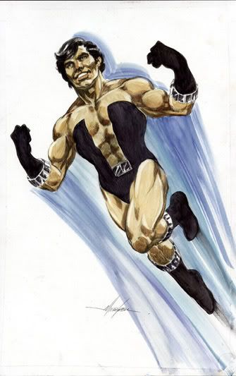
Doug: We kick it off with the leader of one of our favorite groups, the Legion of Super-Heroes -- Cosmic Boy! What do you look for in a leader? Someone who can play diplomat, someone who's tough? How about a guy who can delegate tasks, or who isn't afraid to admit when he's wrong? A fellow who is the first into battle, and the last to leave, making sure that all of his charges have made it out safely? I'd like a man who can handle the simple jobs, like inventory of resources, but also make the really difficult decisions. And it shouldn't matter that he actually looks good in pink...

Doug: It's interesting that when the creators of Adventure Comics #247 (April 1958, whether writer Otto Binder, cover artist Curt Swan, or interior artist Al Plastino) sat down to dream up the Legion of Super-Heroes that would torment our young hero Superboy, they chose some pretty odd color combinations for these three new antagonists. Saturn Girl originally wore a yellow top accented with black over a green skirt, Lightning Boy (-Lad by their next appearance, in Adventure Comics #267) wore a red shirt with yellow sleeves over green trousers, and then there was Cosmic Boy -- a pink top with a sort-of black vest around it, over lavender trousers. By that second appearance, Saturn Girl was dressed in her familiar red/white pantsuit and Lightning Lad was in his blue/black/auburn outfit. But ol' Cos -- he got to stay in the pink and black.

Karen: Those original costumes the trinity wore were just hideous. I don't know who chose the color schemes but they should have been shot. Fortunately Lightning Lad soon got a much better costume (and an even better one when Cockrum began drawing the book), and Saturn Girl had at least an acceptable outfit, color-wise. But Cosmic Boy really got screwed over. The whole outfit is just, well, dorky.

Doug: The next major costume change for Mr. Rokk Krinn didn't occur until 1974 as a continuation of the major renovations of then-new Legion artist Dave Cockrum. Gone would be the pink, as well as most of the rest of his clothes!!


Karen: We can blame artist Mike Grell for this one. He mentions in an article in Back Issue 33 (April 2009) that Cockrum had revised so many costumes, that he felt that Cosmic Boy looked out of place in his old one. He wanted to keep him recognizable so he kept the black part of the costume, and replaced the rest with flesh - not realizing that he had essentially given Cos a bustier! I always thought he looked like a male stripper in this outfit!

Doug: Keith Giffen, along with author Paul Levitz, were the next to take a crack at redesigning the look of Cosmic Boy. After the Crisis, DC wanted to revamp several key titles, giving us Frank Miller's Batman: Year One, John Byrne's Man of Steel, and George Perez's take on Wonder Woman in a series renumbered to a new first issue. One of the major players in Legends, the mini-series that would re-launch characters not in the above books, was Cosmic Boy. In fact, he was not only one of the supporting stars there, but he was featured concurrently in his own mini-series, titled simply Cosmic Boy. So, what did Levitz, Giffen, and cover artist (and then-Legion artist) Steve Lightle do? Well, of course -- they brought back the pink!!

Karen: Maybe they were all fans of Good and Plentys??

Doug: Lordy, I hate Good and Plenty!! But that is funny -- the picture to the left is exactly those colors!


Doug: Finally, finally, Rokk got a costume that didn't look so, so... well, whatever. Anyway, umpteenth re-boot artist Barry Kitson put Cos in a nice midnight blue and black outfit, still paying homage to the circles-on-the-chest motif that the character had worn for nearly 50 years. It was a nice change, much more believable and attractive than anything Mr. Krinn had previously worn.

Karen: Although I didn't enjoy this umpteenth revision of the Legion, Cos' costume did look nice. Hard to go wrong with blue and black.


Doug: I'll admit to never having seen Smallville (I was told early on that this was a mistake -- that it is really quite a good program). So I can't say much here other than Ryan Kennedy played Cos alongside Saturn Girl and Lightning Lad in an episode that aired in January 2009. This is certainly the most toned-down outfit in our portfolio of garish costumes!

Doug: So, what's the verdict on Cosmic Boy's sense of fashion? I vote for "Fashion Disaster".

Karen: I have to agree with you on this - I wouldn't say his costumes were dreadful, but they weren't good either!


Monday, December 15, 2014

Arc of Triumph? Marvel Fanfare 1-4


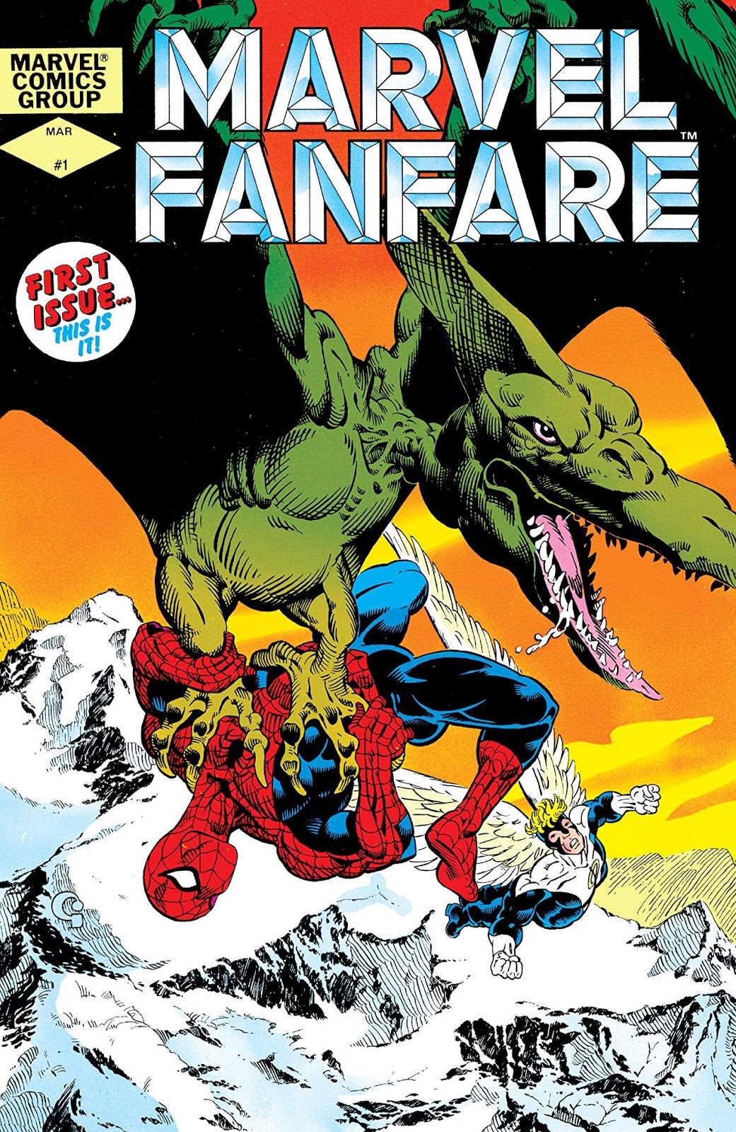
Doug: Now I know we've never discussed Marvel Fanfare around here, because when I set up the post's labels it didn't come up as an auto-fill. I have this series in a trade paperback called X-Men: The Savage Land. It may actually be the first tpb I ever purchased. I read it way back when I was in college, but to be honest have little memory of the story beyond the incredible art by Michael Golden, Dave Cockrum, and Paul Smith. Does this ring a bell with any of our readers?


Thursday, July 3, 2014

Blue Ribbon Digest - the X-Men

Doug: We're back again with another opportunity for our readers to choose 7-8 issues of a beloved Bronze Age title to fill the covers of our own custom "Blue Ribbon Digest". If you missed our turn on the Avengers about 10 days ago, we charged readers with the task of choosing a handful of stories from the parameters of our interest -- 1970-1985. The stories need not be complete; some went that route, while others decided to get a nice sampling of writers and artists, characters and events. It's really up to you how you want to go about this.

Doug: I was giving this some thought ahead of writing today's post, considering what I thought was essential X-reading from that period. I think most of us would agree that Giant-Size X-Men #1 all the way through X-Men #143 is pretty darned essential; but what would give a reader a true appreciation of that era in the team's history? Whereas the last time we did this I would have used a smattering of Avengers issues, this time I think I'm going to zero in on one storyline and take your pulse on that.

Doug: If one were to open up a book of this sort and be faced with X-Men #111 and read consecutive issues through #117 I don't think you could lose. While many regard the "Dark Phoenix Saga" as the zenith of the Claremont/Byrne/Austin collaboration, and I would not disagree, I'd offer this run of seven issues as my X-Men primer. Think about it -- classic villains in Mesmero, Magneto, and Sauron, some real growth in characterization for all the team members, tie-ins between the current team and the original five, and concluding with a story featuring Professor X. Oh -- did I mention the art is spectacular? What's not to like?


Wednesday, June 25, 2014

Spotlight On: Dave Cockrum


Karen: We've frequently discussed the work of this fabulous artist, whether it be his outstanding early years on DC's Superboy and the Legion of Super-Heroes, or his revival of the X-Men with Len Wein, and later, Chris Claremont. Cockrum was a wonderful costume and character designer, creating new looks for many of the Legionnaires that have persisted for years, as well as designing most of the original all-new, all-different X-Men. He created dozens of other characters' looks though, including the striking black outfit for Ms. Marvel. Cockrum was an artist who could handle big team books and do them well. He excelled at action, but also knew how to portray quiet moments. Although Cockrum did not have particularly long runs on any single book, he had memorable ones on the Legion and X-Men, and he also drew many covers for Marvel in the late 70s. His style is instantly recognizable.


Karen: Dave Cockrum passed away in November 2006. But he left an incredible legacy, one that we here at the BAB continue to delight in and will take the opportunity to discuss whenever we have the chance -like today. Please share your thoughts on the work of this talented artist.


Thursday, June 19, 2014

Back When We Liked Wolverine

Karen: When I attended the Phoenix Comic Con a couple of weeks ago, I went to a panel on Wolverine that featured writers Chris Claremont and Len Wein. I mentioned some of what happened at that panel in my Phoenix Con report, but at the very end of the panel, a young girl, maybe all of 11 or 12, came to the microphone to ask the final question. She began by thanking the two men for creating her favorite super-hero. Before she could go any further, Claremont then asked her a question: why was Wolverine her favorite? The girl hesitated for only a moment before answering that, besides looking cool, she liked the way he thought, the way he responded to things and dealt with the world. It made me laugh a bit. All of us older fans had spent the last hour bemoaning how Wolverine wasn't cool any more, how he'd been ruined by needless origin stories and relentless over-exposure. But to this kid, he was still a bad-ass, a symbol of individualism and rebellion.


Karen: After the con, I kept thinking about this. I tried to remember what it was like when I really did like Wolverine. It seems like it was so long ago. His over-exposure began way back in the 80s and has only snowballed since. Along with the runt appearing in practically every book Marvel put out, his powers also took a huge leap up; the guy who was knocked out by Moses Magnum was now surviving nuclear explosions, and being torn in half by the Hulk. To top it all off, every ounce of mystery was stripped from the character -every detail of his life was laid out, and it seemed like he knew every character in the Marvel U from his past life as a secret agent, or ninja, or whatever. It was all too much.

Karen: But there was a time that I liked Wolverine! I just had to dig deep. At the con, the panelists had been asked at what point did they realize Wolverine was something special, becoming a star. Two moments came to mind for me instantly. The first was from X-Men #98 (Apr 1976), when Banshee, Jean Grey, and Wolverine had been captured by Sentinels and taken to a space station. Wolverine breaks free, and for the first time, we see him without his costume -and he pops his claws. Banshee stammers, "Yer claws, laddie...Lord above, they're a part of you -we -I -didn't know!" Wolverine calmly responds, "Why should you, Irish? None of your business." I think I was as stunned as Banshee!  But I was also fascinated. I don't think it had even occurred to me that Wolverine's claws were anything but a part of his suit. At that point in time, it was pretty shocking, having a hero who had real claws -not little claws on the ends of his fingers but enormous metallic blades shooting out of his arms! Non-lethal attacks were still the rule of thumb, and we still had heroes like the Black Knight, Swordsman, and Valkyrie who always proclaimed they were using "the flat of (their) sword" on their opponents. But you never heard any such proclamation from Wolverine! And his lethal weapons were a part of him. I'm sure I couldn't verbalize why this was so amazing to me when I was 12 or so, but it was.

Karen: The second moment when I really gained an appreciation for Wolverine was in X-Men #133 (May 1980) -although the final panel of the previous issue, showing an angry Wolverine rising out of the sewer, vowing vengeance on the Hellfire Club, is the indelible image from that storyline. The X-Men had been captured by the Hellfire Club and Wolverine was assumed dead, wiped out early in the fight. But the foul-tempered Canadian wasn't that easy to get rid of. He returned and tore through a bunch of Hellfire goons like they were nothing. But it's his fire, his indomitable spirit, that really caught my attention. Wolverine refused to be beaten, and despite his limited powers -remember, he wasn't godlike back in 1980! - he was ready to take on the entire Hellfire Club. That attitude was very appealing.It's a quality I like in any number of characters (Ben Grimm has it too, although he's more never-say-die rather than blood-thirsty), but Wolverine, before he was invincible and unstoppable, played this part very well. He was the underdog rebel who didn't care about the odds.

Karen: Maybe that's the key, the reason why that 12 year old girl at the panel likes Wolverine, and the reason my 12 year old self liked him so many years ago. Maybe at his core, the character still represents defiance and individuality, despite all the twists and turns he has taken in 40 years. It's easy to criticize what's been done with him from a vantage point that spans his entire career, but when you break him down to his essence, perhaps he is still that scruffy outcast, the one who never quite fits in with everyone else, and seems just a little dangerous. What can't be denied is that Wolverine is a true original, a cool and intriguing character, and that's proven by his popularity and longevity. Even if those of us in the older  generation aren't always pleased with the changes that have been made...


Karen: Let's open the floor now. What are your earliest memories about Wolverine, early impressions and overall thoughts on the character?
Related Posts with Thumbnails