Showing posts with label IDW. Show all posts

Monday, July 25, 2016

BAB Book Review: Jack Kirby's Thor Artist Edition


Jack Kirby's Thor Artist Edition 
IDW Publishing, July 2016

Doug: On July 16th I returned home from my annual work at the United States Holocaust Memorial Museum in Washington, DC. While it was great to be back home after what had been 11 days away, it was also wonderful to finally lay eyes on this book. I'd ordered it many months ago, and as seems to be true with projects of this ilk I sat through a few publication delays. It arrived just a couple of days before I did, but trust me -- the wait was worth it!

For those of you who were with me a few weeks ago when I offered my thoughts on Frank Miller's The Dark Knight Returns Gallery Edition, I will again be using photographs of this text as opposed to scans. Similar in size to John Romita's Amazing Spider-Man Artifact Edition (and larger than the Dark Knight book), this is a cumbersome tome.

To get things rolling, how about this two-page spread to greet the reader/viewer?


To you stats geeks, here's the "tale of the tape" -- from the good folks at Comic Book Daily.com:

Jack Kirby’s The Mighty Thor Artist’s Edition
Includes Journey Into Mystery #s 111, 117-118, Thor #s 134-135, Thor Annual #2, plus a gallery of covers, splashes and pages.
  • Publication Date: July 06, 2016 (solicited for May 2016)
  • Publisher Series Number: 42
  • ISBN: 978-1-63140-603-4
  • Diamond Item Code: JAN160388 (In Stock)
  • 15″ x 22″
  • 160 pages
  • $125 USD
  • Initial Reported Sales: No data available yet
  • Variants: none
Right after the frontispiece pictured above you'll find the Table of Contents, which is really nice, and I display it for those of you who might consider at some point purchasing this volume. I especially like that it shows the inkers involved in these artifacts. Toward the end of the post I'll show you some of the samples from the "gallery section", which really, really enhance the already wonderful offerings contained between these covers. Think about it -- six complete Jack Kirby Thor stories!


Once you're into the nitty gritty of the book, this is what greets the reader:


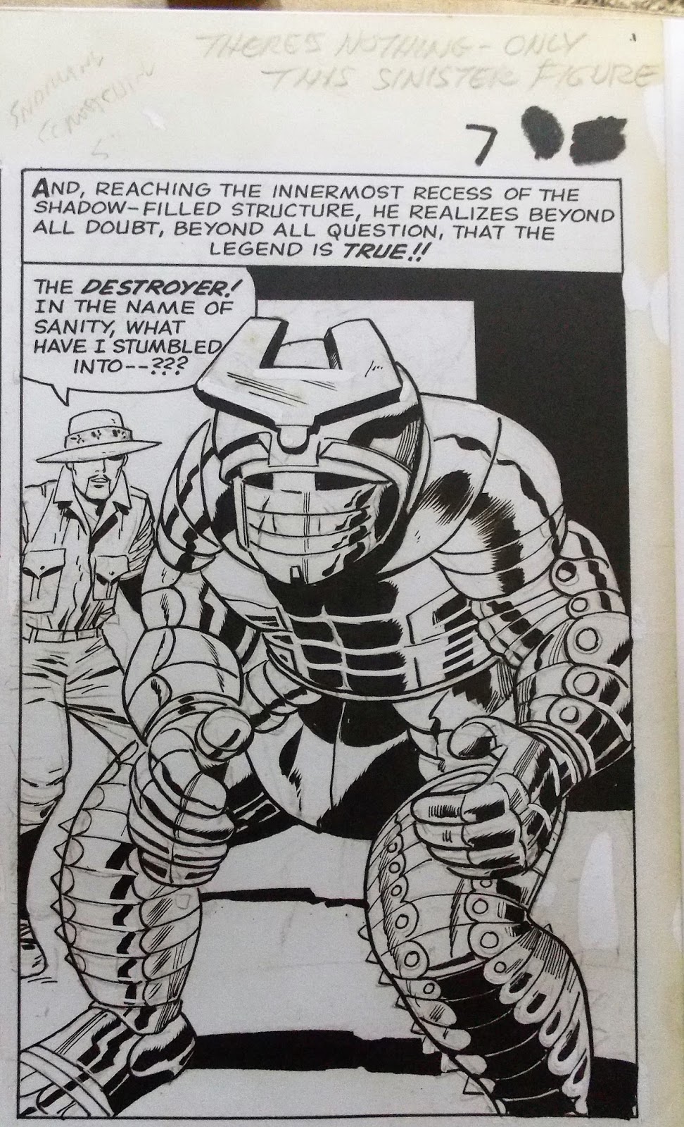
Oh, you said you wanted words? Well that splash sure had 'em! I love the way the page is marked up at the top, and it's amazing the lines that get lost in the printing process. I also enjoyed seeing the trim size of the final product (here at 6 1/4" x 9 1/4"). That brings me to something many of you are already wondering... what of Kirby's margin notes? Karen and I discussed offline how great this book should be, especially in light of the ongoing conversation of who did what creatively between Stan Lee and Jack Kirby. Personally, I've always felt that Kirby was the storyteller and Stan was the wordsmith. Does that give one man more credit than the other? To me, no. The symbiosis of their collaboration, the gestalt of the work, is what matters. All the rest seems minutiae in the face of the greater work. My opinion. However, I'm sorry to report that some of those margin notes are not fully viewable in this book. I do not know if that's due to trimming at the printer five decades ago, or trimming in the photo process by IDW Publishing (I assume the former). However, there are abundant pages where Kirby's notes are complete, as in the examples below:


I included the image of Balder below (in civvies, no less) because there's some crazy white-out on his jaw/mouth. I hope my photographic reproduction shows it, as it really leapt off the page at me while looking through.


Here's another shot of the Destroyer, in a great splash from Thor Annual #2; he's a great looking character, one of my favorite Thor villains. And dig the Kirby Krackle!!


A favorite panel in the book. One can see how Kirby might have been an influence on the likes of John Buscema (which he was -- many of you know that Stan handed stacks of Kirby-drawn books to artists new to Marvel, regardless of their pedigree).


Splash pages. What would a Lee/Kirby Thor book be without the Odinsleep? And how about the Big G? Wowza!


Quicksilver and the Scarlet Witch made a cameo in Thor #134. Kirby didn't handle them during the Kooky Quartet era, so it's interesting to see his take on the twins. As I said above, note Kirby's extensive margin notes on this page, lost forever to the trimming of the page at some point in the reproduction process.


The High Evolutionary and Kirby machines. That wolf ain't gonna be pretty once the High Ev. gets done with him!


Yes, you in the back of the room. You say you're in need of some more Kirby Krackle? Why... by all means...


As noted above, the end of the book contains a gallery section of awesome covers. I really got a kick out of these, with all their paste-up/white-out/stat glories! I also own the Marvel Covers Artist Edition, and the use of paste-ups was predominant on Marvel's covers. Obviously the logos, corner box art, etc. would have been stats. But you might (or might not) be surprised at how often art was glued onto the cover's bristol board.


Lastly, this Artist Edition contained several of the very earliest Thor pages, from Journey Into Mystery #s 83 and 85. It was a nice idea, and really showed the evolution of the character not only in Kirby's mind, but also from the introductory inks of Joe Sinnott all the way through much of the pages shown in this volume, inked by Vince Colletta. Specifically in regard to Vinnie, and I'm sure many of you want to ask, is it possible to see where Vinnie erased Jack's pencils? I've only been through the book twice, and haven't actually read from it. I also didn't take any sort of care as to "proper lighting". But my first impression is that "no", you can't really see any erasure marks. I will scrutinize further, but can report that I did initially feel disappointed that I could not find any evidence of Kirby's original intentions.

Why not close with a bang? One of the best ongoing tussles in all of Marveldom...


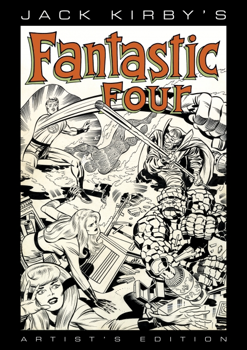
Doug: EPILOGUE!! On July 21st IDW Publishing announced at the San Diego Comicon that 2017 will see the publication of the first volume (read that again, effendi) of the Jack Kirby's Fantastic Four Artist Edition. The book will contain Fantastic Four issues #s 82-84 and Annual #6, all inked by Joe Sinnott. You know this guy cannot wait for that. In fact, I've recently fired up the sell-off machine again, so some books and action figures are going to get converted to cash for this baby. Of course I'll let you know if and when I have it in hand.

Monday, February 8, 2016

Where No Ape Has Gone Before: Star Trek/Planet of the Apes: The Prime Directive


Star Trek/Planet of the Apes: The Prime Directive
Written by Scott Tipton and David Tipton
Art by Rachael Stott
Colors by Charlie Kirchoff
Published by IDW

Karen: It was almost exactly a year ago that I reviewed the first two issues of this series in a post. I liked it, but being an infrequent visitor to my comic shop, I didn't pick up the remaining three issues in this series. At some point last year I did grab the TPB and over the Christmas holiday I took it from my reading stack and sat down with it. And I thoroughly enjoyed it! POTA was the first science fiction franchise I fell for as a kid, with Star Trek following soon after. As a fan of both, I felt the writers and artist were able to capture  the tone of each to make this book feel like a true meld of the two.

Karen: The time is right after the events of the first Apes film, and sometime during the original series of Trek, after the first season episode "Errand of Mercy," in which the Federation and the Klingon Empire were forced into a peace treaty by the Organians, a powerful race of energy beings.  The Klingons have discovered an artificial space portal that leads to another dimension -an alternate reality? - and have been sending ships back and forth. The Enterprise uncovers this and follows them through, only to find what appears to be another Earth, although Spock's scientific instruments indicate that it is the year 3978 in this other universe. However, the sensors also indicate a primitive civilization. Intrigued by what the Klingons could be doing here, Kirk, Spock and company beam down. From a distance they spy their old friend,  the Klingon Commander Kor, talking to...apes!


Karen: The Enterprise crew soon figures out that the Klingons are supplying these gorillas with firearms. We saw this sort of behavior from the Klingons on the show before, most notably in the episode "A Private Little War." Back on board the Enterprise, Kirk and his officers go over the information they've gathered about the planet, and indications that a nuclear war in the past helped lead to the current condition of apes being dominant over humans. Kirk decides that even though this isn't their universe, the Prime Directive, the order which states that Starfleet personnel cannot interfere with the development of other civilizations, is still in effect. The Klingons, however, have no such rule; just the opposite in fact. Constrained by the Organian Treaty, they must be using the portal to seek out new planets in this universe to conquer or gather resources from. Kirk decides that they have to stop the Klingon efforts on this Earth. They prepare to beam back down and he tells Spock to have the computer put them near some landmark that they can identify. Oh boy...

Karen: The team materializes on a beach, with the classic shot of the demolished Statue of Liberty to greet them. Stunned, they take a moment to gather themselves, then notice human footprints and horse tracks in the sand. Following these, they find the still shell-shocked George Taylor and Nova. Taylor at first thinks that Kirk and company have been sent from his Earth, his time, but Kirk tries to explain, although it's obviously complicated. Taylor doesn't care where they are from though -he wants their help in taking the planet back from the apes. 

Karen: Here is where the story really starts to pick up. Kirk has to balance the need to stop the Klingons with trying to protect the ape culture, all while keeping an eye on Taylor. And that's not easy. Taylor manages to break off and get himself beamed up to the Enterprise. There is a fun fight between Kirk and Taylor -who wouldn't want to see prime of their lives Shatner and Heston go mano a mano? 


Karen: Our two favorite chimps, Cornelius and Zira, are also around, and it's a treat to see them interacting with McCoy, Scotty, and the rest. The first issue was almost all set-up.I felt that by the third book the voices were all there, and things were moving along very smoothly. The art also captured the likenesses of the actors well enough that I wasn't ever wondering who a character was supposed to be. It was always obvious.


Karen: The story may tip a little more towards the Trek side but there is plenty of POTA here. The scenes between Commander Kor and the rogue gorilla general, Marius, are excellent. The confrontation between Marius and General Ursus, from Beneath the Planet of the Apes, is also a highlight, and it feels like we are getting some great backstory on Ursus, who had always seemed fairly one-dimensional. Poor Dr. Zaius only makes a brief appearance though. The ending caught me by surprise, but in a good way. I don't want to say much more than that.

Karen: This  book probably gave me more pure, unadulterated reading pleasure than any other comic I've read this year. The love and respect for both series came through. I would highly recommend it for fans of either series. If you like both of them though, you will truly enjoy this.

Saturday, November 14, 2015

I'm Just Waiting on a Friend


Doug: How are you at waiting?

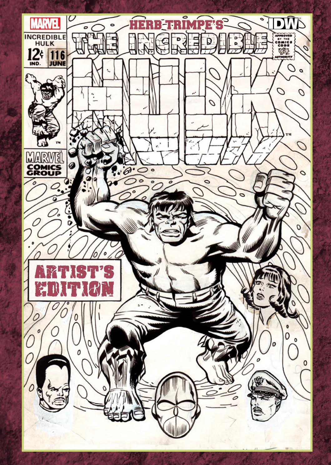
Doug: I'm terrible at it. Like right now. Back in June I pre-ordered IDW's Herb Trimpe's Hulk Artist Edition. The thing was supposed to ship back in September, but you know how that goes. I saw earlier in the week that it shipped on the 11th. But as we all know, that was Veterans' Day, so even if it did ship it would not have been until Thursday. I've heard nothing from the company, there has been no further charges made past the nominal deposit I'd made months ago. So I'm really not out anything other than $5. But I still hate waiting.

Doug: I've also become really curious about the Rich Buckler retrospective we told you about a year ago. That's right -- I said A YEAR AGO! I've inquired twice about this book, neither time getting a response. I did make a deposit with the Kickstarter or GoFundMe or whatever it was. Silly me.

Doug: Shoot, I get impatient just waiting for an order from Amazon. How about you?


Thursday, May 28, 2015

Caveat emptor -- Ruminating on Internet Buying

Doug: Recently I had a purchasing experience that I'd rate marginal at best. In the midst of my dissatisfaction I complained to Karen, who in turn told me of some past troubles of her own. So we thought, what the heck? -- let's bring this over to our readers for some praises and pans of your own!

Doug: Below you can find my controlled rant that I decided to post on two ratings sites. I do read such sites most of the time to gain information about products and/or companies, but in this case did not do my homework ahead of time. But I wanted to be sure that future shoppers would have access to my experience. Here it is:
I used the Internet to shop for IDW's John Romita Amazing Spider-Man Artifact Edition. Two Cats Comic Book Store in San Francisco by far had the best price I could locate. In fact, they were over 20% better than the dealer with whom I usually place orders for books of that price/value. I placed my order via the Two Cats website early on May 1 2015, a Friday. My PayPal account showed a deduction later that same day. However, the next communication I had from Two Cats was on May 7 when in checking my account on their website it showed the order was "In Preparation". I phoned the store directly on May 12 to inquire about the situation -- eight business days after my order. I was told by the female clerk that "it takes time to get orders ready". My thought was, if it takes that long perhaps Two Cats should not offer Internet sales.

The next day, May 13, my account showed that the book had shipped. However, I never received an email in confirmation, no tracking number, etc. I had asked the clerk the previous day how the package would be shipped -- she stammered around and finally concluded that it must be through the U.S. Postal Service. Needless to say, I had no confidence that a) the package had truly been shipped, and b) it would arrive safely (the latter statement is no reflection on the USPS, who I've used 100s of times for eBay business).

The book arrived today, May 19 -- 18 days after my order. To say I am disgruntled at the time it took to receive such a costly book would be an understatement. When I have purchased Artist Editions from other dealers, they have come in large boxes with several cubic feet of static-free packing peanuts cradling the books' outer boxes. Not so here. My book was in it's storage box, and then a makeshift box of corrugated cardboard was wrapped around that. That's it -- no liner, no cushioning, nothing. Obviously the book's storage box is dinged up on all four corners. The book itself is fine, although I'm not convinced that part of the delay was due to the employees perusing it over a week-and-a-half's time. Let's just say the spine didn't creak when I first opened the book.

So while other reviews for Two Cats seem positive in terms of the in-store experience, I will not place any future orders via the web, regardless of the price. In retrospect, I'd rather have paid retail price for my book but gotten it in 3-4 days. Live and learn, I guess.

Doug: I've included some photos of the packaging so that you can see how flimsy it was, as well as damage to the inner box. What makes me mad about that is that the inner box was designed for long-term product storage -- that it's cushioned on the edges is perfect, as these books are huge and heavy! But I've been able to give the book a thorough look-over (as has my eldest son, in wide-eyed amazement), and it's come through the shaky passage in great shape. As I've said previously, I cannot recommend these books from IDW enough -- they are a peek straight into the creative process of comics history. Just wonderful!


Doug: So while I would not steer you toward Two Cats Comics, I would sure like to sing the praises of a few other Internet vendors with whom I've had nothing but success stories to tell. The guys and gals at In Stock Trades are fabulous beyond belief, both in pricing and in shipping speed. After Amazon (and recently to be honest, before), they have been a steady go-to for the trades and hardcovers I purchase. Remember -- it was In Stock Trades from whom I purchased by first four Artist Editions. The care they took in packaging the books is detailed above, and you can see the photos on the link just above.

Doug: Other dealers who have been solid are Cheap Graphic Novels -- check out their Bargain Bin (I have!) and Tales of Wonder. I've snagged some great deals from both of these companies. I'll also give a shout-out to Edo Bosnar for tipping me off to the folks at The Book Depository in the UK, who will ship those lovely little digests of Marvel love for free. Those things are just great!

Wednesday, February 18, 2015

Editing Michelangelo - IDW Artist Edition Review (cont'd)

Doug: Frequent commenter Martinex1 wondered aloud (well, he typed his mystification...) about the existence of an unpublished cover to Silver Surfer #2. I had made mention of that in my review of IDW's John Buscema Artist Edition, which you can see immediately below this post, or at this link. It was cruel of me to do so and leave everyone hanging, so I'm back with a couple of photos. The first one will be of the rejected cover, followed by the version you have probably seen online or perhaps on a reprint you own. I'd invite commentary from our readers on the merits (or demerits for that matter) of both covers. Those of you who might have been unclear on what I meant by "paste-up" in the first post today should have a better idea when you look at the published cover.

Doug: But in hindsight, it does seem a bit funny that someone would reject anything done by the Michelangelo of Comics. So fire away -- hopefully we get another lively conversation going.


John Buscema's original cover draft that was rejected for Silver Surfer #2
 
The published cover to Silver Surfer #2

The cover as it appeared on newsstands in 1968.

If There's an Original Art Heaven, This Must Be It - A BAB Book Review


Doug: Wow. Just WOW! If you've been around here for the past week, you know I've discussed my sales of original art and the income said sales netted. You'll also recall that I decided to treat myself to a couple of purchases that ordinarily would fall waaaaaaaayyyy outside my budget. But hey -- when a guy comes into $6000, what's he to do? That's right: scoop up a couple of IDW's Artist Editions, that's what! And I did. Last Saturday I remarked during our conversation about all of the cool John Buscema art with which I've recently parted company that my order from InStock Trades arrived that very afternoon. I was like a kid on Christmas morning! And today I want to tell you and show you (to the best of my ability) what I bought. I'll be using straight photography from my iPhone today, as I did not want to incur a hernia trying to lift these tomes onto a scanner.


Doug: We briefly batted around some ideas about shipping in last weekend's conversation. Let me tell you -- the boys in Memphis who packed my books left no doubt that those babies would get here safe and snug. I've included several photos of the packaging, just because I was so overwhelmed at the care. That photo above to the right is the bottom quarter of the Gil Kane box, and I'd say there was a good 4" of static-free packing peanuts between it and the top of the box. The John Buscema box, resting just below the Kane box, itself sat on an inch of packing peanuts. Soft landings, to be sure!


Doug: Even the interior boxes are reinforced, as you can see a cushion around three sides of each volume. The design guys at IDW just did a fantastic job here. Obviously the labels on the outside tell the warehouse folks what to pull, but it's not an unattractive box to use henceforth for storage. And I am pretty sure that will be necessary, as these books are massive and heavy! Each book's tale of the tape goes like this:
Gil Kane's Amazing Spider-Man (216 pages) - 12.5" x 17.25" x 1.25" (it is seriously a thick book!)
John Buscema's Silver Surfer (144 pages) - 12.5" x 17.25" x 7/8" (looks like a 98 lb. weakling next to the Kane volume!)
Doug: The art directors at IDW really made each of these books seem top-shelf with the outer color schemes on the covers that carry over into the frontispiece and table of contents pages. I've included a couple of looks below:


Doug: Here are the contents of each book:
Gil Kane: Amazing Spider-Man 96, 97, 98, 99, 100, 101, 102, 121 (all complete), and pages from 89 (10 pages of Spidey vs. Doc Ock), 92, 103, 104; 96, 101, 131, 149 (covers), John Romita's covers to 121 and 122 are included because of their significance to this compilation, and 122 (pages 1 and 23).
John Buscema: Silver Surfer 5, 6, and 8 (all complete -- issues 5 and 6 were double-sized at 39 pages apiece), and pages from 1 (3 pages, including the transformation sequence from Norrin Radd to the Silver Surfer), 7 (1 page), 9 (3 pages with the Ghost and Mephisto), 12 (1 page), 13 (3 pages), 14 (10 pages with Spider-Man), 15 (5 pages with the FF), and 16 (splash); 1, 2, 2 (unpublished), 9, and 10 (covers).
Doug: You may be asking yourself "How did they get all of this original art, and what happened if they couldn't?" In the Gil Kane book there are a few pages that are photocopied from some other source -- it's clearly noted at the bottom of the page that the original art was unavailable so a scan was used. That thought occurred to me as well, just based on the Avengers page I sold a couple of weeks ago. No one would have had that to photograph. So speaking of photographs, that's what these books are chock full of -- high quality photos of the original art, shot in full color. The blue line shoes up, light pencil lines are there, as are margin notes. Residue from tape is present, and White-Out is, too. The first page I want you to look at (and clicking on it will give you a larger view) is this Spidey page. Check out all the White-Out in Gwen's hair, as well as on her nose:


Doug: I've heard some collectors quibble about such blemishes on the art page, but I LOVE IT!! For me, the attraction of the original page was seeing the process of creation -- erased pencil lines, White-Out, blue line pencil, paste-ups when just a panel needed editing, etc. My excitement level went through the roof whenever I received a page I'd purchased and some of those sorts of "issues" were present. It's still a work of art -- I perceived it to be more dynamic when I could get into the minds of those whose hands had crafted it.


Doug: The choice for paper is perfect. It's a reasonably heavy stock, but with a matte finish. You can tell from my photographs, which were shot with only natural light on a mostly cloudy day that there is no glare. It was a perfect choice for really exposing the nuances of the original pages.


Doug: As to choices for content, I can't think of a better package than what made it into the Gil Kane book. That we get to look at two of the best storylines of the early Bronze Age in the Green Goblin drug issues and the six-armed Spidey/intro. of Morbius is just awesome. And that they went that extra mile and included Amazing Spider-Man #121 is a bonus beyond my ability to express gratitude. I paid the MSRP of $125 for the Kane book and I'm not at all going to quibble about it.


Doug: I'd lie if I didn't say the Silver Surfer book would have reached the stratosphere had it included the original art for issues 1 and 4, that fourth installment being among my very favorite comic books. But again, I understand that the major factor in production is accessibility to the art in the first place. So the inclusion of issues 5 and 6 is a fine decision -- I'm not going to scoff at the opportunity to indulge myself with 78 pages of Big John originals. I think the fact that the editors could include the two-page transformation scene from the inaugural issue is some nice icing on this cake.


Doug: So what's next for me? Depending on how my sales continue, I definitely still have my eyes set on the Joe Kubert Tarzan Artist Edition. As of my recent order from InStock Trades, the Tarzan book was still discounted nicely. Also of major interest is the volume that reprints several Marvel covers from the Bronze Age and beyond. Having watched a YouTube review of the book, it's really representative of Marvel's great stable of artists -- Arthur Adams, John Buscema, John Byrne, Gene Colan, Jack Kirby, Frank Miller, George Perez, both Romitas, George Tuska, Mike Zeck, and many more. Take a few minutes to watch that video -- the reviewer does a nice job of showing samples of all of that luscious artwork. NOTE (2/17/15 9:30 PM CST): Well, I had a guy who owed me quite a bit of money pay up -- now I can ship his art out! And I will confess that I gave into the temptations I just discussed. Yep -- the Tarzan and Marvel Covers books will be coming my way very soon.


Doug: Lastly, here's a listing of all of the Artist Editions from IDW. It's a great cross-section of the talent that has brought so much joy to all of us. I know several of our regular readers will see artists on that list whose work you've especially enjoyed. As I've said a few times today, these books aren't for everyone price-wise, but if you have that love of original art as I do, and if resources present themselves such that you can treat yourself, I highly recommend these volumes for your collection/library. I think once you open that outer box, you'll join me in feeling live you've gone to Original Art Heaven.


Related Posts with Thumbnails