Doug: After a short break, we're back with two more installments in our inspection of the logos and corner boxes of Marvel Comics that were released in the summer of 1979. As we said at the beginning, most of these books are from June, but due to bi-monthly schedules a few actually hit the shelves in July. We'll finish this operation on Thursday.
Doug: The MTU and Spider-Man logos are somewhat plain. The Black Widow logo is a lot more imaginative, even dynamic, but I'm not quite sure what "look" they were going for. It's interesting, but I'm just not sure it's appropriate. I like the Widow pose in the corner box, but wish the image was larger.
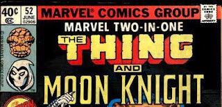
Doug: I have always liked this Thing logo, and the Perez headshot in the corner is strong as well. The Moon Knight font is OK, and I think this is one that looks hand-lettered; we'd commented on this when we did the DC covers several weeks ago. Nice color scheme, too, by the way.
Doug: Great improvement with the corner art, not so hot with the title. And this is one of those titles where the wording takes up a full third of the cover space. Hand-lettered, too.
Doug: Here's another licensed title, and even though I never really got into the toys or the comic, I've heard good things about it (especially Michael Golden's art). I think the font here is really good -- somewhat futuristic, and the line that runs through the center of all the letters really makes it. Nice, powerful pose on the figure in the corner, too, and the smoking hands just add to that atmosphere.
Doug: I'm not sure why, but we got a 2-for-1 of Ms. Marvel this month. You'll notice that issue #25 was the last in the series. I always thought the logo was good -- very dynamic. I don't so much care for the corner art -- Infantino, maybe? I don't think it's Cockrum. What I don't know is why they chose to make the word art so small on the final issue. The cover is somewhat stylized, with Carol fighting Mystique. It's all girl, too, with the color scheme.
Doug: Love the emphasis on the word "and" in this logo. Two great characters, together -- that's what the tilt of the letters and the powerful center say to me. Note that they still have the rivets in Iron Fist -- that just cracks me up! Is the Luke Cage logo by Byrne? Any opinions on the Danny Rand logo?
Doug: Here's another of Marvel's magazines, and perhaps the longest running of them all. I guess there's nothing special about the lettering, although "The Savage Sword of" is nice. I like the ferocity of Conan in the corner box -- a nice touch even on the mags!
Doug: As we said earlier, there weren't too many reprint titles still on the stands from Marvel Comics. I guess of all the ones that could have still been in print, this one is curious. Can we explain it away as competition against DC's military titles? The cover logo hearkens back to the earlier days of Marvel Triple Action Starring the Avengers -- took up half the cover! Nice, vintage Kirby art on ol' Nick Fury.
Doug: One more installment, kids! See ya next time.


6 comments:
I think the Luke Cage logo is from Frank Robbins.
Darpy
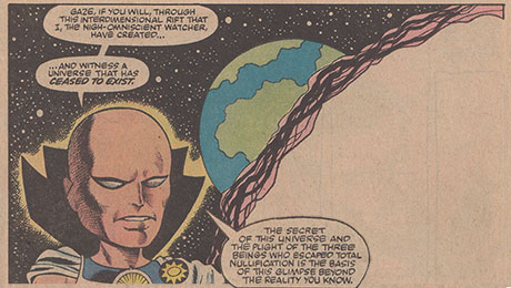
This is sort of off-topic, but I just had to say how much I loved that issue of MTU, and the three others that followed. That had to be one of the best story arcs of the entire series.
As for Micronauts: the first dozen or so issues at least were absolutely fantastic. And it wasn't solely due to Golden's beautiful art - Mantlo was at the top of his storytelling game here. Great stuff.
The "last issue" cover of Ms. Marvel wasn't actually published as that. It was published in the interior of an issue of Marvel Superheroes about 15 years later , so you can't assume they would have really published the cover that way.
Love the site -- Found out about it from http://www.comicsbronzeage.com/
Scott --
That's an interesting bit of comics history. Thanks for sharing, as I had no idea. I used the Comic Book Database as my resource for the month/year I chose.
And Andrew Wahl does a great job, doesn't he?
Best,
Doug
PS: Darpy -- I think I should say "good call" on the Cage art. Yes, it sure looks like Frank Robbins. Thanks!
I was just about to point out the Marvel Super Heroes thing, but Scott beat me to it. (I'm jealous of your Galactus hat, Scott. I was looking all over for where I could find one on Comic-Con Preview Night but never found the source! I'm guessing it was at Hasbro, but they were long gone by the time I got there.) FYI, both of these Ms. Marvel issues are included in Essential Ms. Marvel, too, though #25 doesn't have a "real" cover.
Doug: Thanks for the kind words! I love what the Bronze Age Babies are doing, too, of course! As for the Ms. Marvel corner art, I always thought it was Cockrum but I don't know for sure. I'll let you know if I come across a definite answer.
Edo: You already know this, of course, but we share a love of those MTU issues. And I second your praise for the Mantlo/Golden Micronauts, too!
Cheers all,
Andrew
ComicsBronzeAge.com
Andrew --
I could go with Cockrum on that I guess. I can't make up my mind!
Doug
Post a Comment