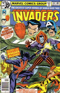
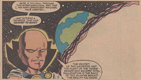
Mike S.: One of my favorite cover genres, and one that always leads me to buy the comic, uses the floating head design. Here are a few nominees and there are dozens more examples. Your job is to find them, share the nominees, and opine. (My favorites are in the sub genre of "Talking Heads" where the disembodied characters discuss the action).
Tuesday, November 10, 2015
Guest Writer: Discuss - Comic Covers/Heads Above The Rest
Mike S.: One of my favorite cover genres, and one that always leads me to buy the comic, uses the floating head design. Here are a few nominees and there are dozens more examples. Your job is to find them, share the nominees, and opine. (My favorites are in the sub genre of "Talking Heads" where the disembodied characters discuss the action).
Subscribe to:
Post Comments (Atom)


26 comments:
Great idea for a topic, and I’m sure there are tons of great examples. The Avengers cover that Mike S shows is a classic. However, whoever did the Avengers covers back in the day must have loved this theme a little too much. They must have more floating head covers than everyone else put together.
Here are but a few:
X-Men #33 (Juggernaut)
X-Men #42 (death of Professor X)
Fantastic Four #172 (Thing vs. Destroyer)
Avengers #117 (Namor vs. Captain America)
Avengers #128 (Scarlet Witch vs. Necrodamus)
Avengers #135 (Vision vs. Ultron)
Avengers #136 (Beast vs. Iron Man)
Avengers #139 (Yellowjacket vs. Whirlwind)
Avengers #154 (Vision vs. Attuma)
Avengers #172 (Hawkeye shooting an arrow)
Avengers #186 (Scarlet Witch vs Modred)
Yep, dbutler mentioned several of those that I thought of, including the first one that came to mind (even though I've never had the issue), X-Men #42. I definitely agree about Avengers #172, which is one of my favorites.
And dbutler is certainly right about this being a popular cover feature on Avengers. Besides the ones he mentioned, there's also Avengers #213, Avengers #225,
Avengers #270, and Avengers #280. (By the way, I wouldn't count Avengers #186, as that looks more like one of those sidebar, "roll-call" row of heads, which was often common on JLA covers in particular, and basically a different cover genre altogether.
Another good one is the cover to X-men #117, and I also fondly recall the cover to Fantasic Four #210 (and there's also the somewhat similar, and frankly better cover to FF #257).
Y'know, I always loved a good floating-head cover.., not particularly overdone if I recall, but they always seem to be done just right, timing-wise.
Looking at the covers.., DC didn't utilize it as Marvel did, 'course some mags like the JLA covers typically had the head line-up on the side cover margins, so I suppose it made it rather superfluous. I do recall Worlds Finest 176 floating heads, but all-in-all was just more 'Marvel Comics shtick' which we grew up with and loved.
Fun topic, Martinex1! And dbutler has given us a pretty good list. Can't think of any yet at this early hour to add, but I'm with Edo in praise of Avengers 172 (the first such cover example which jumped into my head).
Incidentally, one must wonder if this cover motif was primarily a Marvel trait. I find it hard to bring any DC 'floating head' covers to mind. So often, with books like JLA, they used the "roll call" design as Edo mentioned...
Say,david_b, I fully agree with your comments...your mind is quicker than mine this a.m., and your typing fingers most likely as well... :)
Many great mentions so far of floating heads covers.
I always also enjoyed, as others have mentioned, the roll calls we generally got in the DC team books. Marvel employed it sparingly -- the one time that stands out was in the midst of the Serpent Crown/Kang arc that ran in the #140s. Am I correct in recalling an Avengers line-up on one side of the splash and a Squadron Supreme line-up on the opposite side?
Doug
As others have said, a great topic. A personal favourite has always been West Coast Avengers Limited Series #1. I was so excited to see that cover on the racks back in the day.
Sorry, I would include a hyperlink but can't seem to do it on my phone.
I envy you, Colin, and everyone else who can comment from their phones. I can never get the log-in to work, and then I lose my comment. It's been an ongoing hassle.
Doug
Just thought of another: Spiderman Annual 5, with all the floating heads receeding into the distance. With green "Time Tunnel" swirls, as well!
Doug- I share your phone post woes; have lost many comments that way. Think I have it figured, though. Try signing as name/url and just type your name. Usually seems to work...
Ah, I just tried it again a few times based on your suggestion, Redartz. No dice.
Doug
Hmmm, well, for DC stuff, the ones that jumped to mind are:
All-Star Squadron #20 and All-Star Squadron #38
Batman & the Outsiders #20
and Infinity Inc. #29
I'm sure there are more, but these are the ones immediately came to me.
Mike Wilson
Great topic! I just get a kick out of the various expressions of shock and horror displayed by the floating head heroes as they gaze on some predicament of their comrades. The bad dudes just look mean and nasty.
Tom
How about Avengers #19: The Coming Of The Swordsman! Was this the first Marvel floating heads cover?
dangermash, that wasn't even the first Avengers cover with floating heads: that honor goes to Avengers #9.
I love that Avengers #9 floating head cover, just for the fact that Janet Van Dyne's floating wasp head is so miniscule. I didn't notice it at first and then realized that is a tiny head and Giant Man's is bigger than the rest. I don't think I ever saw that again.
I hope someday Marvel creates a character who's power is to just be a floating head observing and commenting on things. The head could yell out hyperbole and superlatives. It would be perfect.
My favorite FH cover is probably Defenders 26 with the team watching the Guardians of the Galaxy. A close runner up is Avengers 154 with Cap, Wonderman, Wanda, and Iron Man having a whole dialogue about the action they are observing. With dialogue like, "Good Lord! This can't be happening" "Can anyone save my husband before it's too late"? "Quick somebody roll my head at Attuma!"
Doug - not sure if this is a reason for my seamless phone access but I use an Android phone and Chrome keeps me logged in here permanently, no questions asked.
However, as you may have noticed, I have issues with duplicate posts that I can't seem to prevent.
OMG Martinex1, the 'floating head' superhero..
If I ever, EVER get my time machine working, I'd zip back to 1974 and call Steve Gerber. It would have been a perfect character for Howard the Duck, versus Dr. Bong or the Deadly Space Turnip.
C'mon, seriously.
"Bwahahahaha...."
Hey Martinex and david_b, Gerber could have added this floating head character to the Headmen!
D'oh! Redartz, you snagged my very first thought yet again!
Avengers #60 is probably still my favorite FH cover. For some reason (John Buscema's great face work?) it always made me think that maybe, just maybe, superhero head gear like Cap's and Hawkeye's might actually be able to look cool on a real live person.
Five years or so down the road, though (although it seems like a decades-longer span from the perspective of glacially-crawling youth-years), the very first Avengers book I got for myself off the rack as I started to purchase my own comics more frequently was #128, with Wanda and several great floating heads-- and a terrific dark purple background color. The convention totally worked on me, because it was an unqualified instance of The Cover Made Me Buy This Book.
Honestly? It's the silliest convention ever, because it just can't be resolved sensibly at all. Obviously, the heads aren't actually IN the scene. . . and yet they're reactions and observations are those of characters who are present and involved. Myself, I never thought of them as "floating" heads as much as "superimposed" heads. Like, the heads are all watching on a table-top viewscreen, maybe, and their reactions have simply been edited onto the cover for our benefit-- since we can't visually cut away. . . (I may really be going through major contortions of justification with that, tho. . . )
HB
Floating talking heads!?! I feel like I just got Byrned.................
(867-5309...I got it, I got it, I got your number on the wall).
Wow, Prowler, that's a loaded pun - it works the same regardless of whether you're thinking of David or John...
Not my favourite artistic convention, but I have great nostalgic fondness for many of these covers, and several of them are quite powerful. The Avengers wedding cover by Buscema is very memorable, and the Spidey picture frame cover as well.
My favourites of the genre (because he still is my favourite superhero artist) are the 70s covers by Kirby. I have often wondered about many of his 70s commissioned covers; how exactly were they arranged long-distance and what kind of references did he use to illustrate unknown (to Kirby) characters. We know that Marie Severin and the editors often sent sketches and detailed notes. I suspect that artists like Kirby often produced dynamic action scenes and then were forced to shoe-horn in other characters, especially with the team books.
In a way, the corner boxes and later circles used by Marvel were an aspect of this attempt to advertise all the characters and keep them "above the fold" and visible to prospective buyers.
Some of my favourite Kirby floating heads are on his 70s FF covers. Here are all of them (floating heads in 172, 177 and 190).
I like the JLA side-bar heads as well. Some of my favourite 80s covers are the ones Kubert and Perez did for the JLA/All-Star Squadron crossovers, where the heroes seem to be looking on in horror.
Post a Comment