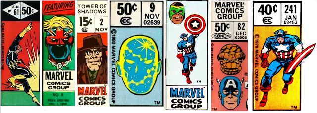
Martinex1: Marvel really had something special going on in the upper left hand corner of their comics. From nearly the beginning, they carved out space on the cover to identify the characters within. The heroes were easy to see on the shelved newsstands as the comics were layered for visual access. The company quickly realized that they were onto something as they even advertised to "Watch for the Greatest Symbols in Comics!" It may have been Stan at his hyperbolic best, but I have to say that there were actually times that the corner box made me buy a comic. Looking back at the history of that iconic marketing tool that lasted decades, I cannot believe how many variations existed. In this post I share more than one-hundred examples, and I dare to say that I have only scratched the surface.
During my comic purchasing peak, I inspected the cover and looked for the sometimes subtle changes in the corner box. My favorites varied from the John Byrne floating head depictions to the rotating spotlighted team members in books like the Micronauts. One of the most clever examples included a run on the Incredible Hulk in which the Hulk in the corner box transformed from a scientist into the rampaging character if the reader handled sequenced issues as a flipbook. (The proof of that down below came from the thejadegiant.com website).
What were your favorites? Which were the best? And which were the worst? Enjoy!


26 comments:
Great topic, Martinex.
Looking over the images you've posted, the images that pluck at my nostalgia strings the most are the classic Spider-man one (the third one in the second row of Spidey images, on issue #83) which adorned ASM for pretty much all of the 1970s - seeing that was always a clear signal to the young me to snatch that book from the spinner rack; and the X-men featuring their heads arranged in a triangle, drawn by Byrne. And yes, I love all of the Byrne floating head corner box images.
Also, I know it was a lot of work getting all of these images together, but I'm still a bit surprised you didn't include two of the most iconic, the ones that appeared on most issues of the Avengers for a considerable part of the 1970s, featuring just the Vision. That latter one in particular also evokes some strong memories and associations for me.
Trying not to be nostalgic and judging them by their aesthetic appeal alone, I think my favorites are those for the Micronauts (the first one, from issue #10),the one of Spider-man hanging from his web upside-down, and the Iron Man one from the Michelinie/Layton years (in which he's running).
Like Edo, the X-Men triangle/arrow shaped formation of heads is one of my favorites. The most amusing corner box in this selection has got to be Devil Dinosaur - just the way he has one foot up on a rock. I suppose the most unusual "corner box" was when Fantastic Four featured the four heads in circles on either side of the FF masthead. Another of my most favorite corner boxes was the chimpanzee face that appeared on Marvel UK's Planet Of The Apes #1-49 - POTA #5 was my first ever Marvel comic so that was the first corner box I ever saw. And I also liked the Captain Britain corner box (shown in today's selection) which appeared on CB #1-13...in just two weeks it will be 40 years exactly since Captain Britain #1 came out on October 6th, 1976.
I have always been puzzled by the Iron Man image (you have it from ish 131) in which Shellhead has that awkward head tilt. It always looked to me like he was being shoved backward; it was half power-pose and half "WTF?!" pose. Any idea who did it?
Holy cow, Martinex! You must have scanned a whole long box there. But to great effect; excellent topic. I always liked those corner boxes, from the original Silver age versions to the later 80s/90's versions. They really did set Marvel books apart from the other comics on the stands, and it was a neat, clean design element with room for imagination and experimentation (which is displayed nicely in your array).
My favorites: like Edo, the classic Spider-Man standing pose is tops. Particularly the lanky Ditko version. Also loved Kirby's Fantastic Four boxes when he rotated the full figure pose among the 'floating heads', the Invisible Girl example you show is a real winner.
Other great ones: Byrne's Avengers, Silver Surfer (both versions), Romita's running Spider-Man and Smith's Conan.
Also liked the 'corner circles' that graced Marvel covers in the early Bronze age, although I prefer the boxes. They always bring back memories of the first comics I bought when starting in the hobby.
Then there were the fun twists occasionally played upon those corner boxes. Walt Simonson twisted it out of it's place on an Amazing Spider-Man cover featuring Speed Demon, when the villain's velocity displaced the whole logo. That Hulk progression is another great example...
Cool topic Martinex! Love the corner boxes. The Hulk flipbook concept is pretty neat. I don't know what my favorite would be. For the groups like Avengers, Defenders, X-Men, etc. I used to like to see if the heads depicted in the corner boxes kept up with the ever-changing lineups. And William P., I always liked that Shellhead image. But, now that you mention it, it is kind of awkward. Maybe it's meant to be a defensive stance. Stand back or I'll shoot(?)
And...more confessions of a comic cut-up. After destroying my comic covers to make wall pin-ups, the leftover corner box art was great for making custom birthday cards for my fellow comic geek friends.
Tom
Great job assembling that rogues gallery, Martinex. Like Edo, I still found myself looking for ones that aren’t there, which shows how many there were.
I’d go for both of 70’s Avengers Vision ones. The one where he doing his intangible thing marks most of my collection at the time, but I preferred the one where he was standing arms folded like a chess piece. No one stands still like the Vision !
I always hated that weirdly prancing early Hulk one – Kirby drew it – where he’s sort of jumping about like a child.
I love the Cap one you have towards the bottom where he is running and holding his shield up. I think it’s Steranko, isn’t it?
I hated the Kirby one on every issue of the Silver Surfer. You know the one, where it looks like he’s doing the Twist.
Not keen on that Warlock one (pictured). I preferred the one from Strange Tales, where he was kind of akimbo like he was flying through space.
Quite often, when I buy up old comics on ebay, I find these boxes have been cut out, often neatly and lovingly, which makes it all the more infuriating. Like the MVS. Does anyone know why this happened? Was there some kind of sticker/trading card type book? Surely Tom can't be responsible for all of them??
Richard
Some of my favorite MIA corner boxes, all from 1972-1974: Son of Satan by Trimpe; Capt. Marvel by Starlin; Ragin' Luke Cage, Black Widow, Daredevil, Brother Voodoo, all by Romita; Conan by Buscema; Kull by the Severins. Also, since these were all circular, can we really call them "boxes"?
My all-time fave format was the rectangular box from the late 60s -- it just screams Marvel to me.
Really cool idea for a post!
The Iron Man corner box commented on by William above is a phoney! It seems to be a mash-up of different elements. The 25c price font is of the type that was only used during Marvel's 1-2 month flirtation with double-sized issues in 1971 (when they went from 15c - 25c - 20c). The Iron Man issue of this period was number 43 not 131. Also (and this is for real anoraks only) the Curtis code given (02461) is for Uncanny X-Men.
That stuck out to me straight away. What a useless skill, eh?
Ha ha Darren. You win the BAB no-prize for your almost mutant like power of sniffing out forgeries. Cheers! Let us know if you catch any other anomalies.
I've always been partial to that Wally Wood Daredevil with his arms crossed, and the Frank Miller Daredevil where he's coming right out of the box swinging his grapple. (I don't see it pictured above though).
Another great effort in assembly, Martinex!
I'm glad Colin brought up the FF logo that had the four headshots floating around the book's title.
I have always enjoyed the rotating corner box employed on FF mags in the Silver Age, with a different member of the team getting the full body shot amongst the smaller headshots.
As others have remarked, the switch from the "stoic Vision" to the "action Vision" was striking, and welcome. Loved that image!
I also enjoyed the corner box when Peter Parker hit the stands. Simple, but the raising of the mask seemed to fit so well with the book's title.
Fun topic today, and again -- great imagery!
Doug
There are so many awesome corner boxes I can't even decide, but I just had to say, awesome job Martinex! Very cool.
I'm partial to the Spidey images, of course; I like the original Ditko one, the Spectacular Spider-Man one where he's taking his mask off, and the first one with the black costume (is that by Ron Frenz?)
That Moon Knight image looks pretty cool too.
Mike Wilson
Here's a nerdy question -- how many of you, on the corner boxes where the issue number is also visible, can "see" the entire cover in your mind?
Doug
Thanks to all for the kind comments today. I have to say that assembling the images was not that difficult as I pulled every possible example online that I could find and then just tried to organize them into some reasonable fashion for viewing. There were many I missed but after what seemed like endless hunting I thought that's at least enough for discussion. Like you, though, some of my favorites are missing like the Vision / Avengers examples. I also wanted to highlight the rotating Squadron Supreme's character boxes and the rotating Micronauts boxes. I really enjoyed those changes month to month and how they were reflective of the storyline. But then I forgot about those. Ugh, I think old age is creeping up on me.
To answer Doug's question, even as I was looking I tried to recall the covers and could on most, with some of the exceptions being the Irving Forbush, Conan, and Captain Universe. (As well as the above mentioned fake Iron Man).
I really like the X-Men heads particularly in the triangular pattern previously mentioned. My least favorite though is the X-Men group shot from Cockrum's second run. I cannot put my finger on it but it never looked right to me; maybe the characters seem too happy for some reason. And that 90s close up of Spidey is strange; I cannot get past his neck (or shoulder or back muscle or whatever that lump is there). It just looked off.
I do love the corner boxes though and wish there was somewhere to go to see them all easily. Are there any shown that you have no idea where they came from or what book they are associated with?
I started collecting comics in the summer of 1986 at age 10. I'm ashamed to say it took until relatively recently to realize the contemporaneous compartments that separated the cost from the issue/date were shaped like the letter M! DUH!
My vote is for the triangular array of X-heads of the late 70s, or the classic 60's X-men standing slightly offset in a line from X-men #1-6. I associate those with the joy of comic book collecting. (The earliest I ever had were 4 & 6).
Of the corner boxes depicted, the ones I'm most familiar with from my childhood/adolescence are the Spider-Man selections--3rd row, 6th and 7th corner boxes (the black-costumed Spider-Man running, and McFarlane's Spidey dangling from a web upside down).
Personally, I prefer corner boxes featuring a full character, the entire body in a pose, rather than just the disembodied heads. I'm also more partial to the ones from the late Sixties and early Seventies, as they have a more "classic" feel to them than the modern ones.
I think those Hulk corner boxes with him changing are quite ingenious (from issue #s 292-300). I wonder how many people who collected the Hulk at the time, and had that string of nine consecutive issues, realized that the corner boxes were done in the style of a flip book?
Doug, in answer to your question, yes, where I can see the number, the cover springs unbidden into my mind’s eye every time….. if it was one I had at the time! If it’s one I acquired in the last few years, no chance. Some I associate more with the era, for example that Iron Man 148 is so Bob Layton, it summons all the covers from what was surely that best-of-all-eras for Shellhead.
An irony: so many of them are Kirby, but one of my faves is the Black Panther one, where the art inside is all Kirby, but that corner pic is not (looks like Kane to me, probably from Jungle Action).
Richard
To answer your nerdy question, Doug, I can definitely visualize the Spidey covers; also Conan #1 and the "new" X-Men covers. And wasn't Captain America #241 the Punisher issue, with that cool Frank Miller cover?
Mike Wilson
Mike W.- you beat me to it! Good call on Cap 241. And yes, Doug, I too visualize those covers, another nerd heard...
In The Eternals corner box Ikaris had short hair but in the comic itself he always had long hair (well, shoulder length). And it was a long time before Valkyrie was added to The Defenders corner box despite the fact that she had been in the team almost since the beginning.
Hmm well like most of the BAB community here I'd go with the Spidey boxes. I also loved those which featured Thor, and the Thing on the FF box was great too.
- Mike 'needs to stand on a box to see the box' from Trinidad & Tobago
Great topic. Wish I'd gotten here sooner. I loved the corner boxes and I'd have to give my nod as fave to the Fantastic Four. I always thought they way the cycled the members through with different full-figure poses was nifty and spoke to an eye for small detail. The Avengers always got the most interest from me as it often was a signal of sorts for who would last as a member.
Rip Off
So many memories and so many great corners, the one that (surprisingly) evoked the most emotion was the Peter Parker the Spectacular one (that Mike Wilson mentioned).
My favorite Silver Age Corner Box- Kirbys X-Men
My favorite Bronze Era Corner Box- Byrnes Avengers Terry Austin inked heads!
Thanks for commenting Dusty Abell! Enjoyed your work on Green Lantern Corp Quarterly! Appreciate your input.
Post a Comment